Made With Gsap 以宽松、高对比的界面展示精选 JavaScript 动效。醒目的大字与动态媒体构成浏览主线,荧光绿 CTA 则带来克制而鲜明的强调。
North star · Keep the interface quiet and spacious so animated previews and oversized type carry the visual energy.
The page uses a restrained monochrome foundation: a white opening canvas gives way to long near-black sections, with white and muted gray text defining hierarchy. A small lime pill is reserved for the primary join action, rather than spreading accent color throughout the interface. LayGrotesk carries the expressive work: large, tightly tracked headlines sit alongside readable body copy, while PPNeueMontrealMono gives navigation and utility labels a compact, uppercase, technical character. The hero is unusually open, placing a dark motion preview between widely separated headline fragments and leaving generous space around it. Farther down, centered explanatory copy and interface previews sit within the dark field; later feature cards and a pale latest-effects panel create contrast without changing the minimal visual language. Media previews are the main source of imagery and color variation, so keep their framing clean and let the effects provide movement. Rounded pills, soft card corners and subtle transitions temper the otherwise flat, editorial layout.
Display and editorial text, headings, body copy, and prominent text links.
Aa 设计
PPNeueMontrealMono
网络字体 · 字重 500 · 占比 17%
免费替代:Space Mono
Navigation, captions, technical labels, and compact interface metadata.
角色
示例
字号
字重
行高
字距
特大标题
Oversized campaign-scale display lettering in motion-led moments.
Made With Gsap
250px
500
0.8
-0.04em
一级标题
Primary hero headline and major page statements.
Made With Gsap
120px
500
0.95
-0.02em
二级标题
Section-level editorial headings and feature statements.
Made With Gsap
48px
500
1.02
-0.02em
三级标题
Feature and supporting section headings.
Made With Gsap
47.5px
500
1.02
-0.02em
四级标题
Strong card titles and compact feature headlines.
Made With Gsap
44px
700
1.2
0
正文
Explanatory copy, descriptions, and supporting links.
The quick brown fox 敏捷的狐狸
18px
500
1.4
0
辅助文字
Uppercase technical labels and small section metadata.
The quick brown fox 敏捷的狐狸
13px
500
1.49
0
导航
Uppercase navigation items and compact utility controls.
The quick brown fox 敏捷的狐狸
13px
500
1.62
0
代码
Small uppercase effect metadata and technical labels.
const style = 1;
13px
500
1.49
0
间距与布局
基准单位 1px · 密度:宽松
180px版块间距
15px元素间距
—卡片内边距
688px内容最大宽度
3px
5px
6px
10px
13px
14px
15px
16px
18px
25px
50px
62px
70px
87px
124px
180px
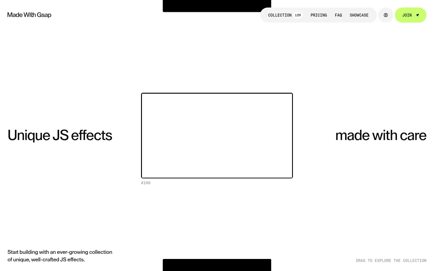
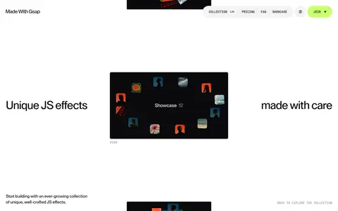
The opening section is a broad white canvas with navigation at the top, a centered dark media preview, and headline fragments aligned far to either side. Supporting copy and an exploration cue sit low in the hero. The page then changes to long, near-black bands with centered explanatory content, embedded interface imagery, and later feature cards. A pale latest-effects panel interrupts the dark run. Layouts feel spacious and editorial rather than densely packed; use the measured 688px page max width where content is constrained, while keeping hero media and section backgrounds broad.
圆角与层次
按钮 · 50%
卡片 · 20px
图片 · 4px
导航 · 9999px
链接 · 9999px
没有测到阴影:页面是扁平的,层次靠底色和描边区分。
The interface is mostly flat, with contrast between light and dark section surfaces doing the structural work. There are no measured shadows. Use rounded pill controls, gently rounded feature cards, and slightly rounded media framing; rely on overlap and surface contrast for depth instead of adding conspicuous borders or elevation.
组件
下面的预览按实测的按钮、输入框、徽标、卡片样式重建(字体用替代字体)。
Floating navigation
Compact uppercase mono links sit in a pale rounded pill near the top right; pair them with a separate lime JOIN pill and restrained brand text.
Hero motion preview
A centered, dark framed media window sits between widely separated headline phrases on a large white canvas.
Scroll exploration cue
Place a small uppercase mono drag-to-explore instruction near the lower edge of the opening section.
Dark editorial section
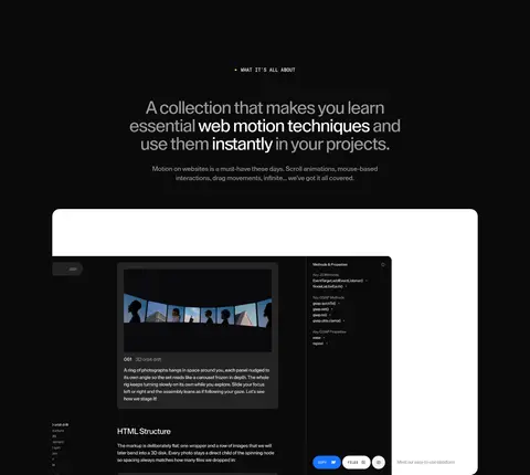
Use near-black full-width bands with white centered headings, muted explanatory copy, and generous separation around embedded previews.
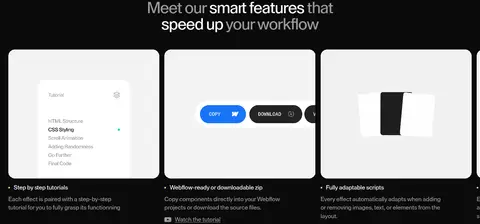
Feature preview cards
Arrange preview imagery in softly rounded light cards, with concise titles and small explanatory text beneath.
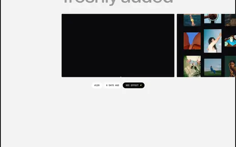
Latest effects panel
Contrast the dark page with a pale panel, oversized two-line heading, media previews, and compact effect metadata.
Imagery · Use animated effect previews as the page’s primary imagery: framed website snippets, interaction demos, and small interface showcases. In the hero, keep a single dark media window prominent against white space; later previews can sit inside pale cards or dark embedded panels. Media may contain its own colors, so preserve the monochrome shell and avoid treating screenshot colors as brand accents.
Use near-black and white as the dominant page surfaces.
Reserve Electric Lime for the primary action.
Give the hero generous empty space around its media.
Use LayGrotesk for expressive headlines and body copy.
Set navigation and utility labels in uppercase mono.
Let effect previews provide the page’s visual color and motion.
✕ 不该做
Do not fill the page with additional accent colors.
Do not compress the hero into a dense conventional banner.
Do not add conspicuous shadows to otherwise flat surfaces.
Do not use mono typography for long-form explanatory copy.
Do not treat colors inside media previews as brand palette.
Do not make every section use the same background.
给 AI 的提示词
想快速出一个同风格的新页面,把这段话连同 DESIGN.md 一起发给 AI。
Build a new page in the Made With Gsap visual style: a spacious editorial shell with a near-black Midnight Ink (#0a0a0b) and Gallery White (#ffffff) foundation. Use Electric Lime (#c9fe6e) only for a primary pill CTA; use Soft Ash (#999999) for muted supporting text. Set expressive headlines and body in a LayGrotesk-like sans, with compact uppercase mono navigation and labels. Keep the hero open, with headline fragments around a centered dark motion preview and supporting copy low in the section. Alternate broad light and dark surfaces to organize content, and use effect demos as the main imagery. Favor rounded pills, softly rounded cards, flat surfaces, and restrained transitions. Avoid extra accent colors, heavy borders, and decorative shadows.