North star · Let cinematic content artwork carry the color while a near-black canvas and clear white typography keep the experience focused.
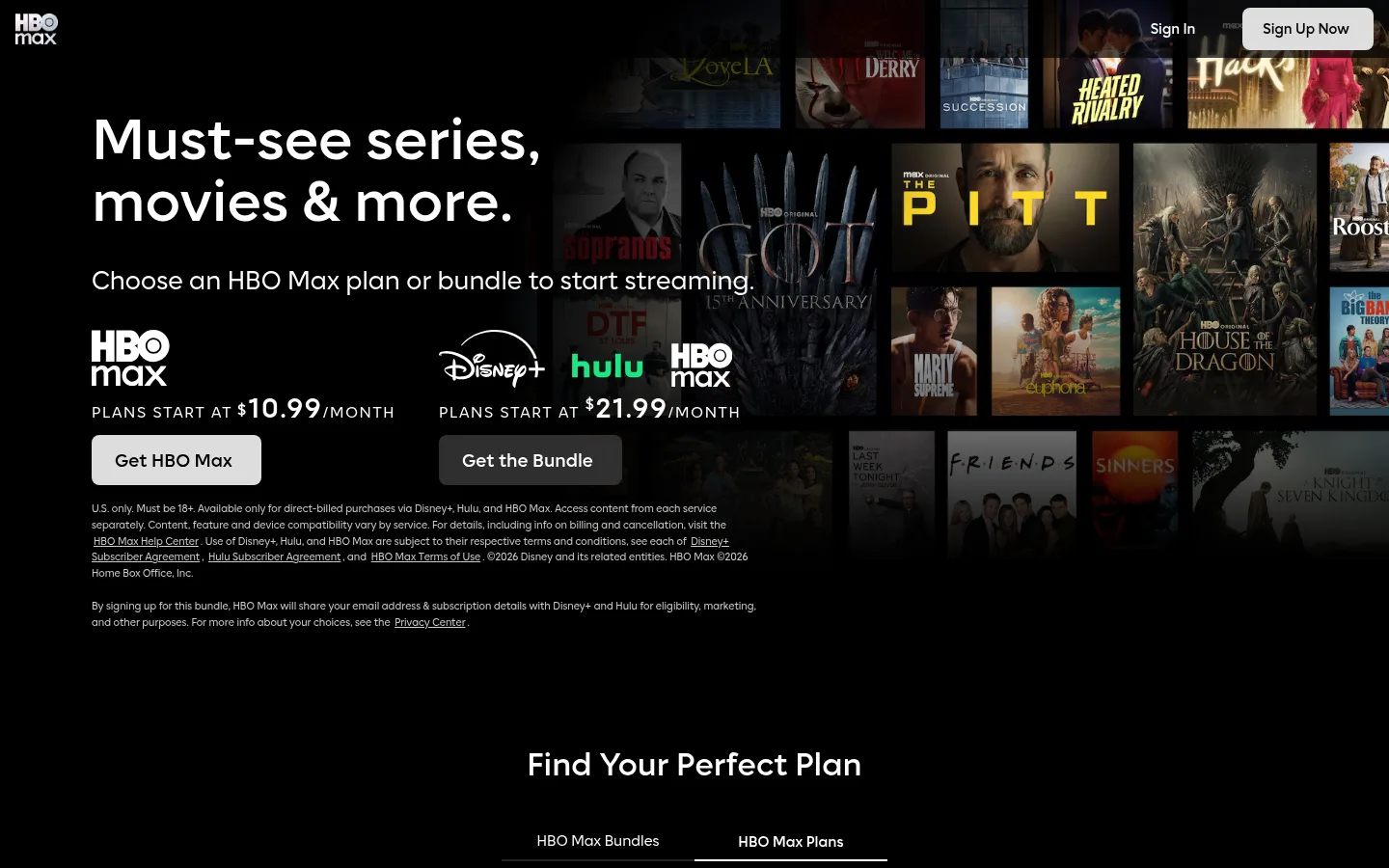
The page uses a near-black canvas to make its large entertainment images feel cinematic and keep white messaging immediately legible. A deep plum surface appears in measured section data, while the screenshots are predominantly black; use the plum as a subtle dark surface rather than a competing background. The opening hero pairs a large, left-aligned headline and short supporting line with a broad collage of show artwork on the right. White filled buttons stand out against the dark interface, with outlined alternatives for secondary choices. Max Sans supplies a clean, contemporary voice across oversized display headlines, compact navigation, body copy, and small legal text. Below the opening, the page alternates pricing cards, horizontal content shelves, broad promotional banners, category features, and an FAQ. Most color comes from the supplied title artwork, not from interface accents; keep those cyan, green, and blue tones confined to media treatments. Generous black gaps give dense image shelves room to breathe.
配色
点色块复制色值。用途说明来自对页面的实测位置(背景、文字、描边、按钮)与截图判读。
品牌色
强调色
表层色
中性色
功能色
页面底色 · Screen Black表层 · Plum Shadow表层 2 · Card Graphite表层 3 · Panel Charcoal主文字 · Spotlight White次要文字 · Soft Silver弱文字 · Pale Silver描边 · Divider Charcoal强调 · Electric Cyan强调 2 · Deep Teal强调 3 · Vivid Green
All page typography, from display headlines and navigation to subscription controls, captions, and legal copy.
角色
示例
字号
字重
行高
字距
特大标题
Large, light-weight hero or promotional display headline.
HBO Max
72px
300
1
0
一级标题
Primary page headline introducing the streaming offer.
HBO Max
64px
700
1
0
二级标题
Major section heading, including page-level content group titles.
HBO Max
56px
100
1.6
0
三级标题
Prominent section or content-category heading.
HBO Max
35px
600
1.35
0
四级标题
Smaller card, plan, or subsection heading.
HBO Max
28px
400
1.35
0
正文
Supporting content and compact plan or feature descriptions.
The quick brown fox 敏捷的狐狸
14px
600
1.35
0
辅助文字
Small metadata, image labels, and fine-print information.
The quick brown fox 敏捷的狐狸
11px
400
1.5
0
按钮
Bold labels on subscription and bundle calls to action.
The quick brown fox 敏捷的狐狸
16px
700
1.1
0
导航
Top navigation and high-priority navigation labels.
The quick brown fox 敏捷的狐狸
15.5px
700
1.35
0
链接
Compact footer and supporting text links.
The quick brown fox 敏捷的狐狸
11px
400
1.5
0
眉题
Uppercase, letter-spaced promotional or category label.
The quick brown fox 敏捷的狐狸
17px
400
1.35
0.1em
间距与布局
基准单位 2px · 密度:适中
48px版块间距
2px元素间距
—卡片内边距
1140px内容最大宽度
2px
3px
4px
8px
10px
12px
13px
14px
15px
16px
18px
20px
24px
28px
48px
56px
The page uses a wide desktop composition within a measured maximum width of 1140px and a 12-column grid. The opening hero is left-aligned, with copy and plan calls to action opposite a wide collage of title artwork. Lower sections alternate centered content shelves, promotional splits, pricing cards, and broad category banners. The comfortable rhythm uses a measured 48px section gap, with compact internal spacing for controls and labels. Keep the full page visually spacious through large black intervals, even where card rows are dense.
圆角与层次
按钮 · 8px
图片 · 4px
导航 · 8px
链接 · 8px
lg · media
lg · media
lg · media
The interface is mostly flat, relying on contrast between black canvas and charcoal cards rather than layered shadows. Use thin charcoal borders to separate cards and FAQ rows, and reserve measured colored glows for media artwork. Keep controls legible with solid white fills or white outlines; avoid adding broad, decorative interface shadows.
组件
下面的预览按实测的按钮、输入框、徽标、卡片样式重建(字体用替代字体)。
Hero and subscription offer
Left-aligned headline and supporting copy beside a fading title collage, with white-filled primary buttons and compact price details.
Plan selector
Dark pricing cards arranged in a row, with bold plan names, feature lists, and white-filled yearly or white-outlined monthly actions.
Content shelf
Horizontal row of landscape title artwork with short labels, set directly on the black canvas.
Category banner
Wide, cinematic still with a short category eyebrow and title, followed by a row of related artwork.
Promotional feature
Broad split composition pairing concise subscription messaging with branded service marks and featured title artwork.
FAQ accordion
Compact stacked questions on a dark panel, separated with fine charcoal lines and aligned chevrons.
Footer navigation
Small, centered utility links and language selection in muted tones against the black page canvas.
Imagery · Use cinematic entertainment stills and poster artwork as the main visual expression, arranged in tight horizontal shelves, tiled collages, and wide promotional banners. Hero imagery fades into the black background so copy remains readable. Category banners can feature a large character or cast image alongside a short label. Artwork supplies most of the page's vivid color; gradients and colored glows are media treatments, not a reason to brighten the interface.
Use white for primary headings, navigation, and actions.
Let licensed title artwork provide most visual color.
Arrange entertainment artwork in clear horizontal shelves.
Use compact labels beneath media tiles.
Separate dark cards with fine charcoal borders.
Reserve colored glows for media treatments.
✕ 不该做
Don't use bright gradients as general page backgrounds.
Don't let artwork overpower readable hero copy.
Don't add decorative color to standard navigation.
Don't crowd dense image rows without black breathing room.
Don't replace the dark canvas with light card-heavy surfaces.
Don't use heavy shadows on ordinary interface cards.
Don't make secondary captions compete with headlines.
给 AI 的提示词
想快速出一个同风格的新页面,把这段话连同 DESIGN.md 一起发给 AI。
Build a new entertainment page in the HBO Max visual style. Use Screen Black (#000000) as the dominant canvas and Spotlight White (#ffffff) for key text and primary actions. Use Card Graphite (#272727), Panel Charcoal (#1a1a1a), and Plum Shadow (#120c1d) sparingly for dark surfaces; use Divider Charcoal (#3a3a3a) for subtle separators. Treat Electric Cyan (#02d5e8), Vivid Green (#1ee682), and Slate Blue (#4e6883) as media-only accents, not interface colors. Set type in Max Sans or a close Inter substitute, pairing oversized clear headings with compact labels. Build broad, left-aligned hero messaging alongside cinematic title artwork, then use image shelves, promotional banners, pricing cards, and compact FAQ rows. Keep the page flat, high-contrast, and spacious between dense media sections.