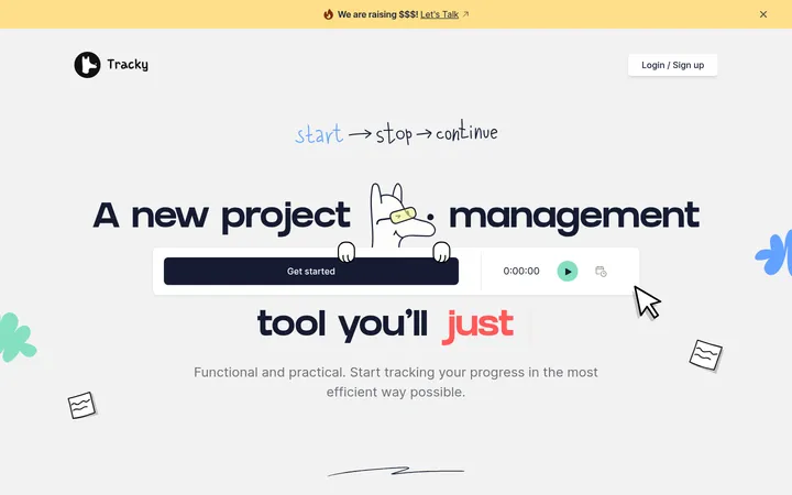
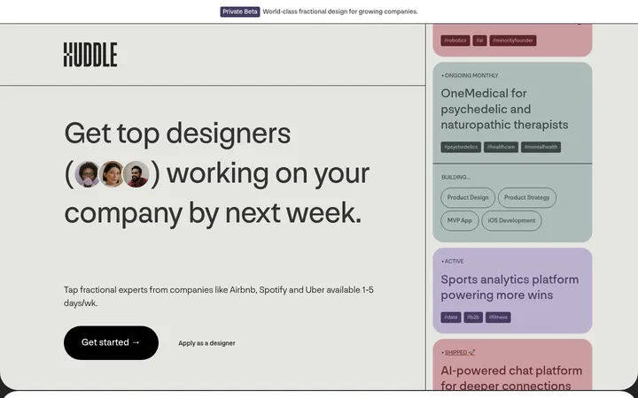
North star · Keep the interface itself quietly charcoal and let the colorful bookmark imagery provide the page’s visual energy.
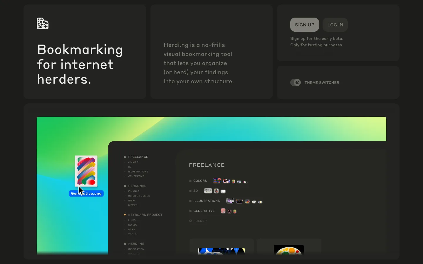
The page is built on a warm charcoal canvas, with closely related dark surfaces defining cards and section groups rather than conspicuous outlines. Off-white provides crisp headline contrast, while two muted gray tones carry supporting copy and small labels. The restrained interface palette lets the vivid green-to-cyan imagery inside the product preview stand out; treat those colors as demonstration content, not as core brand accents. Styrene is used throughout at a regular weight, with an oversized, naturally wrapped hero headline and compact uppercase button labels. The layout uses a wide, centered frame and asymmetrical card grid: introductory copy and headline sit beside account actions, followed by a broad product showcase and compact feature panels. Rounded cards, generous gaps between major blocks, and tighter spacing within cards create a comfortable rhythm. Shadows are subtle and inset, so depth comes mainly from tonal layering.
Used throughout headlines, body copy, buttons, links, and interface labels.
角色
示例
字号
字重
行高
字距
一级标题
Large, naturally wrapped hero headline.
Herdi.ng
45px
400
1.12
0
二级标题
Section-level explanatory statements and feature headings.
The quick brown fox 敏捷的狐狸
27px
400
1.56
0
三级标题
Compact card titles and subsection headings.
The quick brown fox 敏捷的狐狸
20px
400
1.56
0
正文
Introductory copy, feature descriptions, and supporting text.
The quick brown fox 敏捷的狐狸
14px
400
1.56
0
按钮
Uppercase sign-up and call-to-action labels.
The quick brown fox 敏捷的狐狸
15px
400
normal
0
链接
Small navigation or attribution links.
The quick brown fox 敏捷的狐狸
15px
400
1.56
0
间距与布局
基准单位 4px · 密度:适中
48px版块间距
4px元素间距
—卡片内边距
1280px内容最大宽度
4px
8px
12px
15px
16px
30px
32px
34px
45px
48px
64px
80px
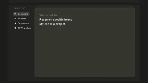
A centered page frame uses the measured maximum width of 1280px and a comfortable modular grid. The opening block arranges headline, description, and account actions in adjacent cards; a wide product preview follows, then a two-column how-it-works area and compact feature cards. Later content combines a narrow audience list with a broad example panel. Major sections follow the measured 48px rhythm, with tighter internal spacing. Keep alignment left-led and preserve the intentionally uneven card proportions.
圆角与层次
按钮 · 50%
卡片 · 16px
图片 · 8px
inset · other
The interface relies on neighboring charcoal tones and rounded surfaces rather than visible borders. Cards use measured radii of 16px, media uses 8px, and buttons use pill-like shapes. A subtle inset shadow adds restrained depth; avoid strong floating shadows or high-contrast outlines.
组件
下面的预览按实测的按钮、输入框、徽标、卡片样式重建(字体用替代字体)。
Hero card
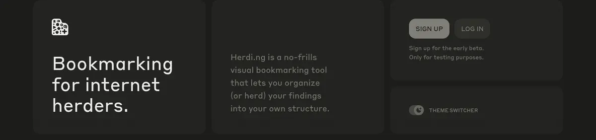
Large headline and small brand mark on a dark rounded panel, paired with an adjacent muted introductory paragraph.
Account actions
Compact uppercase SIGN UP and LOG IN controls; the primary uses a light muted fill, while the secondary stays dark.
Theme switcher
Small pill-shaped toggle presented in its own understated dark panel.
Product showcase
Wide, rounded dark container holding an interface preview; vivid green and cyan are confined to the mock-up.
How-it-works block
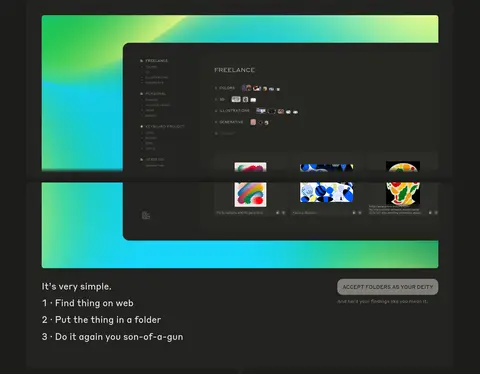
Short numbered steps paired with a concise action button and supporting line.
Feature cards
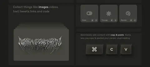
Compact grid panels combine short copy, interface controls, and visual examples on closely related charcoal surfaces.
Attribution footer
Small, subdued creator credit and link in a simple full-width dark band.
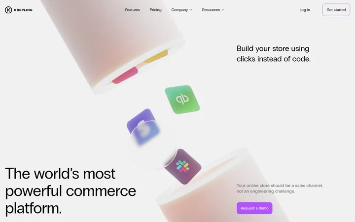
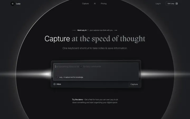
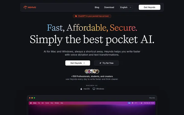
Imagery · The main visual is a large embedded product-interface preview, framed by a vivid green and cyan gradient visible within the mock-up. Smaller cards show collected visual references and interface examples. Keep image content inside rounded dark panels and avoid turning illustration colors into page-wide brand accents. The screenshots show no dominant photography or video.
Reserve off-white for the strongest textual contrast.
Keep explanatory copy muted and clearly secondary.
Use surface-tone changes to separate cards without prominent borders.
Let the product preview carry the vivid green and cyan.
Keep button labels uppercase and concise.
✕ 不该做
Do not spread mock-up colors across the interface as brand accents.
Do not introduce bright white page backgrounds.
Do not add heavy borders or dramatic drop shadows.
Do not make every card the same size or visual weight.
Do not use bold typography where the measured type is regular.
Do not crowd the gaps between major content blocks.
给 AI 的提示词
想快速出一个同风格的新页面,把这段话连同 DESIGN.md 一起发给 AI。
Build a new page in Herdi.ng’s calm, dark visual style. Use Warm Charcoal (#232320) for the main canvas, Deep Umber (#1c1c1a) for section backing, and related dark surfaces such as Olive Slate (#2e2e29) for cards. Set text in regular Styrene or Inter; use Soft Porcelain (#eeeeed) for key headings and Ash Linen (#afaea6) or Quiet Taupe (#797870) for supporting copy. Keep the frame centered within the measured 1280px maximum width, with a modular, asymmetrical card grid and comfortable section rhythm. Use rounded panels, subtle inset depth, and restrained pill-shaped controls. If showing product imagery, confine bright green and cyan to the mock-up itself. Keep copy and button labels concise, with uppercase action labels.