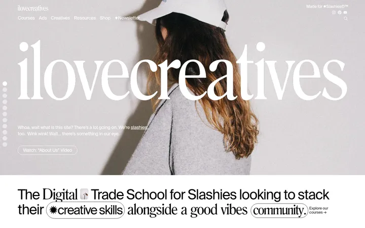
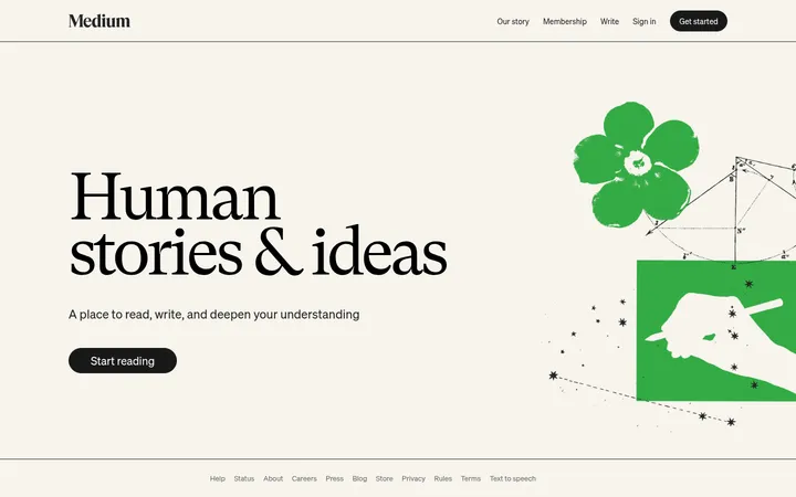
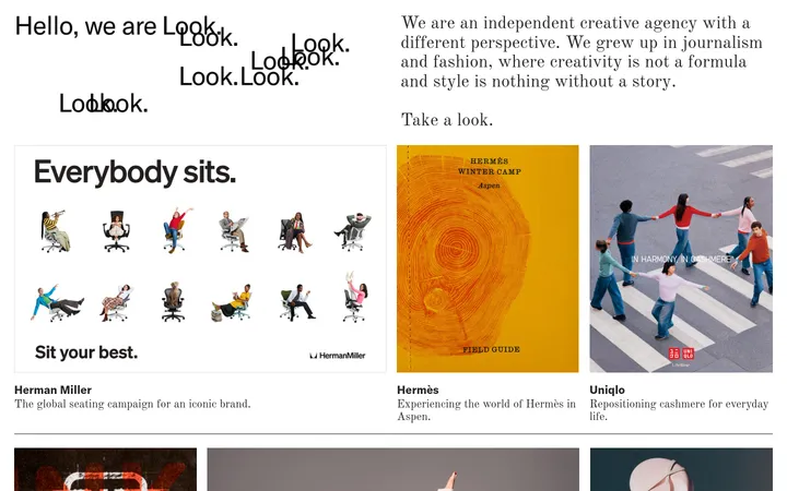
It's Nice That 首页以宽松的编辑式留白呈现创意作品,并用柔和的彩色版块区分内容。多样的故事排布与克制的界面细节,让浏览焦点始终落在内容发现上。
North star · Let each story's artwork lead, using generous white space and restrained, category-specific colour to organize discovery.
The page uses a white canvas as its visual anchor, with dark charcoal typography and occasional pale grey panels for quiet editorial structure. Colour becomes more expressive in section bands: lime, lavender, yellow, pink and warm orange distinguish recurring content categories rather than competing with them. Purple is reserved for small navigational or action accents. Labil Variable provides the clean, lightly tracked sans-serif voice for headings and interface labels, while Bradford adds a more literary contrast to selected story titles and descriptions. The centered masthead and feed give way to an asymmetric, image-led editorial layout; some stories sit in deliberately open space, while category sections use white cards against full-width colour. Photography and graphic artwork retain their own palettes and treatments, so the page feels like a curated creative publication rather than a uniform product catalogue. Large vertical gaps separate editorial sequences and preserve a calm browsing rhythm.
配色
点色块复制色值。用途说明来自对页面的实测位置(背景、文字、描边、按钮)与截图判读。
强调色
表层色
中性色
功能色
页面底色 · Gallery White表层 · Feed Mist表层 2 · Near-Black Panel表层 3 · Rose Band表层 4 · Fresh Lime主文字 · Editorial Ink次要文字 · Caption Grey强调 · Signal Violet强调 2 · Link Violet强调 3 · Lilac Band
Compact captions, metadata, and selected interface labels.
Aa 设计
LabilVariable
网络字体 · 字重 400 · 占比 46%
免费替代:DM Sans
Primary headings, body copy, navigation, and buttons.
Aa 设计
Bradford
网络字体 · 字重 400 · 占比 7%
免费替代:Cormorant Garamond
Literary story headlines and selected editorial card copy.
角色
示例
字号
字重
行高
字距
一级标题
Lead editorial headlines and prominent feature titles.
It's Nice That
40px
400
1.2
0.025em
二级标题
Category headings and secondary story titles.
The quick brown fox 敏捷的狐狸
25px
400
1.28
0.032em
正文
Story descriptions and longer editorial copy.
The quick brown fox 敏捷的狐狸
18px
400
1.28
0.056em
辅助文字
Dates, labels, and compact supporting metadata.
The quick brown fox 敏捷的狐狸
13px
500
1.4
0
按钮
Search and Explore action labels.
The quick brown fox 敏捷的狐狸
13px
400
1.46
0.077em
导航
Small utility and primary navigation labels.
The quick brown fox 敏捷的狐狸
11px
400
1.45
0.091em
链接
Story-category links and compact editorial links.
The quick brown fox 敏捷的狐狸
13px
500
1.4
0
间距与布局
基准单位 2px · 密度:适中
60px版块间距
8px元素间距
10px卡片内边距
1080px内容最大宽度
1px
5px
8px
10px
16px
20px
40px
60px
The measured content width is capped at 1080px, centered within a broad white canvas. A slim promotional strip sits above a centered masthead and compact feed panel; the lead feature then receives substantial breathing room. Editorial lists mix columns and staggered cards instead of forcing every story into an identical grid. Full-width pastel category bands interrupt long white stretches, with inset white cards and aligned content. Measured section spacing is generous, while card padding and gaps stay comparatively compact.
圆角与层次
按钮 · 9999px
xl · button
xl · other
The interface is predominantly flat: white cards and coloured section bands are separated by space and contrast rather than visible outlines. Avoid adding decorative borders or heavy shadows to story grids. The measured large shadow belongs to a button-level sample and is not a defining page-wide treatment; keep layering subtle and reserve floating appearance for specific controls.
组件
下面的预览按实测的按钮、输入框、徽标、卡片样式重建(字体用替代字体)。
Promotional navigation strip
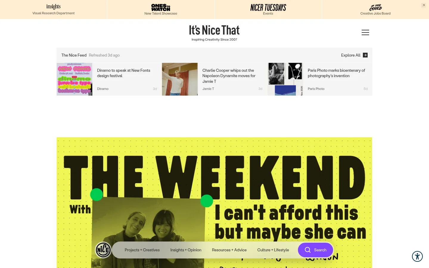
Four adjacent promotional links occupy a pale warm-toned band above the masthead, using compact brand marks and short descriptors.
Centered masthead
Place the publication wordmark and short tagline centrally on white, with a simple menu icon aligned to the right.
The Nice Feed
A pale grey horizontal panel presents a refresh note, several compact story previews, thumbnails, and an Explore All link.
Lead story feature
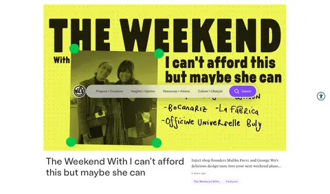
Give the lead article a large artwork area, followed by a title, concise description, date, and editorial category links.
Editorial story cards
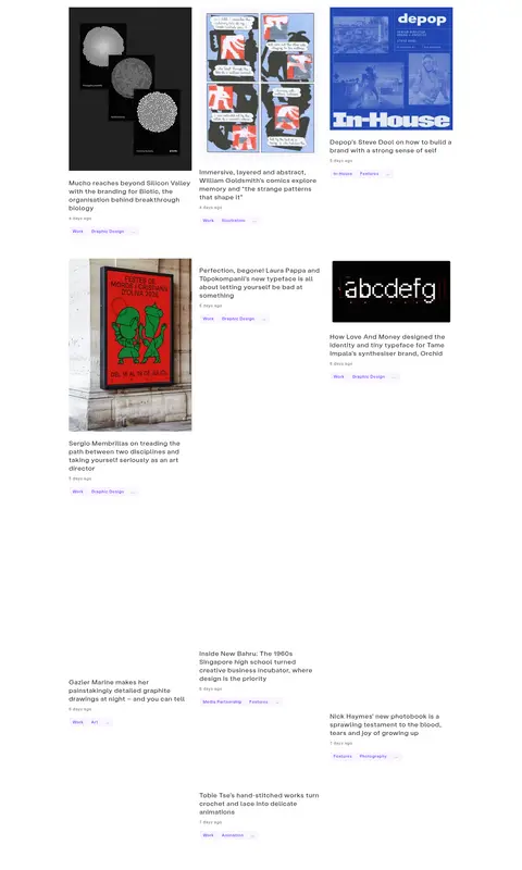
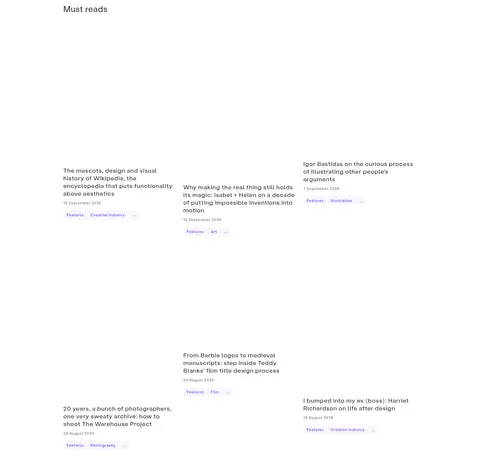
Combine artwork and concise headlines in varied column layouts, using white surfaces and restrained metadata.
Colour-band category section
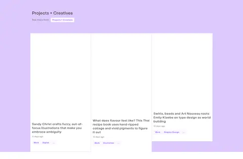
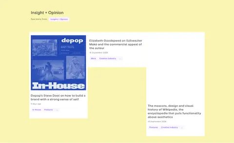
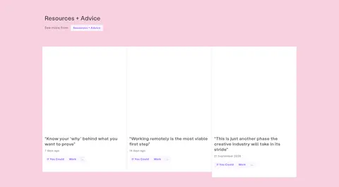
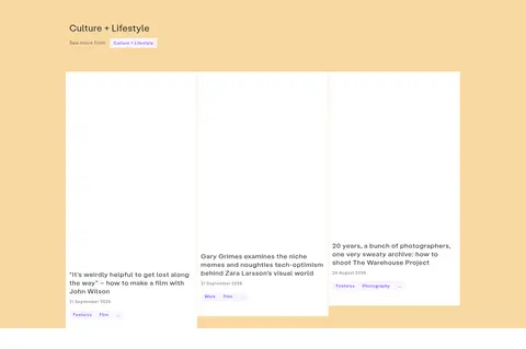
Use a full-width pastel band with an inset category heading, see-more link, and white story cards.
Explore CTA
Show a compact white content card with a short introduction and a soft lilac Explore button.
Imagery · The homepage foregrounds varied creative work: editorial photography, graphic design, illustration, book and identity projects, and visually distinctive campaign artwork. Images sit directly in story cards or dominate the lead feature, with no single uniform colour treatment imposed across them. Preserve each artwork's original palette and crop confidently; the surrounding white canvas and pastel bands provide the framing.
Use pastel bands to identify editorial categories.
Let artwork retain its own palette and visual character.
Mix image-led grids with staggered editorial cards.
Use Labil for interface text and Bradford selectively for editorial contrast.
Keep metadata small, muted, and close to its story.
✕ 不该做
Don't turn every section into the same rigid card grid.
Don't use purple as a large page background.
Don't add heavy borders or broad shadows to editorial cards.
Don't force a uniform colour filter onto varied artwork.
Don't crowd the page with dense controls or oversized navigation.
Don't apply the serif face to all interface and body copy.
给 AI 的提示词
想快速出一个同风格的新页面,把这段话连同 DESIGN.md 一起发给 AI。
Build a creative editorial homepage with a quiet white canvas (#ffffff), dark editorial text (#2b2b2b), and compact muted metadata (#676767). Use Labil-style sans-serif for navigation, headings, and controls, with selective Bradford-like serif headlines for editorial contrast. Start with a slim promotional strip, centered masthead, and pale feed panel (#f4f4f4); give the lead story generous space and prominent artwork. Mix editorial grid and staggered card layouts rather than repeating one template. Separate category feeds with pastel bands such as Fresh Lime (#d3f6a8), Lilac Band (#bc94fb), Lemon Band (#f4ec64), Rose Band (#f4a3c3), and Marigold Band (#f3b444). Use Signal Violet (#8147ff) sparingly for actions. Preserve artwork palettes, keep cards flat, and prioritize whitespace and story discovery.