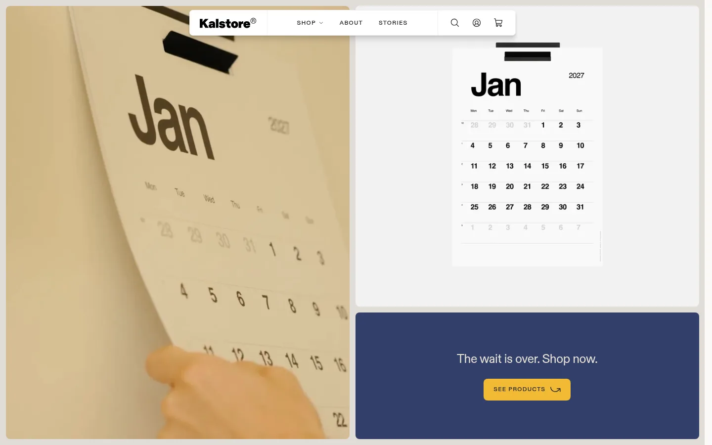
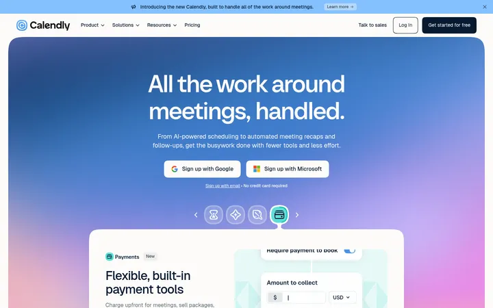
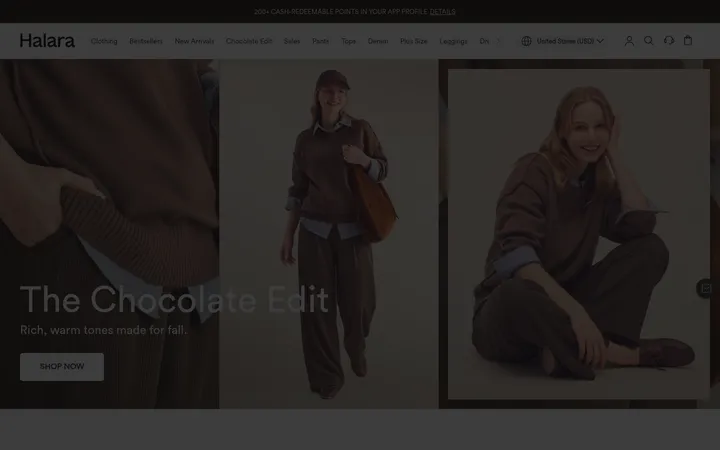
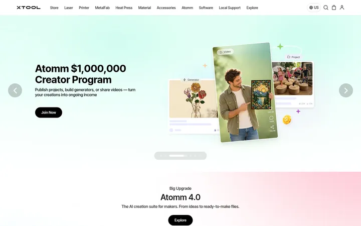
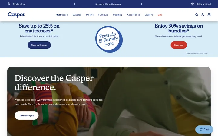
North star · Let the paper products and their in-use photography lead, using warm neutrals, restrained accents, and clear modular sections to frame them.
The page balances a warm off-white canvas (#faf9f7) with charcoal text (#242424), keeping product names and headlines crisp without making the storefront feel stark. Pale gray and beige bands provide quiet transitions; dusty blue and burgundy appear in larger promotional panels, while mustard yellow is reserved for purchase-oriented buttons and sale badges. ABCDiatype carries the whole interface: large, tightly tracked display and heading styles sit alongside small uppercase navigation and eyebrow labels. Layout alternates between compact product cards and broad, image-led sections, with generous open space around editorial copy. Photography shows calendars in use and paper details, while product images are presented cleanly against light backgrounds. The visual mix stays functional and tactile: flat surfaces, fine borders, rounded corners, a lightly elevated navigation bar, and a very dark footer that anchors the long page.
All interface, navigation, product, editorial, and display text
角色
示例
字号
字重
行高
字距
特大标题
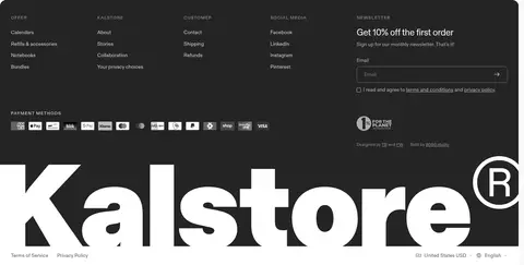
Oversized brand or editorial display moments, including the large footer wordmark treatment.
Kalstore®
140px
500
1
-0.04em
一级标题
Primary product-category and major campaign headlines.
Kalstore®
82px
500
1
-0.03em
二级标题
Large section headlines and prominent promotional copy.
Kalstore®
71px
500
1
-0.03em
三级标题
Secondary editorial or product-section headings.
The quick brown fox 敏捷的狐狸
25px
400
1.25
-0.02em
四级标题
Supporting headings and smaller feature titles.
The quick brown fox 敏捷的狐狸
22px
400
1.3
0
正文
Product descriptions, supporting copy, and everyday interface text.
The quick brown fox 敏捷的狐狸
14px
400
1.4
0
辅助文字
Small product details, badge labels, and fine print.
The quick brown fox 敏捷的狐狸
12px
400
1.3
0
导航
Compact uppercase navigation and menu labels.
The quick brown fox 敏捷的狐狸
12px
500
1.3
0.1em
链接
Product category links and editorial calls to explore.
The quick brown fox 敏捷的狐狸
19px
400
1.35
-0.02em
眉题
Small uppercase section labels above or beside content.
The quick brown fox 敏捷的狐狸
12px
500
1.3
0.1em
间距与布局
基准单位 4px · 密度:紧凑
40px版块间距
4px元素间距
40px卡片内边距
—内容最大宽度
4px
5px
6px
8px
10px
12px
16px
18px
20px
24px
30px
40px
52px
64px
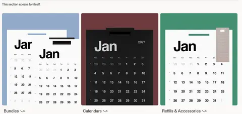
A long, modular storefront uses alternating two-column promotional areas, product-led category blocks, and compact card grids. The opening pairs large calendar imagery with a message panel; later sections switch between single-column editorial statements and product showcases. Content aligns mostly left, with navigation floating over the opening composition. Sections have clear breathing room and fine separators rather than dense framing. The measured spacing scale is compact, but generous open areas around large headlines and photography keep the page from feeling crowded.
圆角与层次
按钮 · 8px
输入框 · 8px
卡片 · 8px
图片 · 8px
徽标 · 4px
导航 · 7px
链接 · 8px
lg · nav
Most cards and section panels are flat, relying on background color and spacing instead of strong shadows. Thin light-gray rules separate content areas, and measured components use rounded corners. The floating navigation is the notable elevated element, with a soft shadow; product imagery and promotional panels provide depth through overlap rather than stacked card effects.
组件
下面的预览按实测的按钮、输入框、徽标、卡片样式重建(字体用替代字体)。
Floating navigation
A white navigation bar sits over the opening imagery with the Kalstore wordmark, compact uppercase links, and utility icons; it is the page's clearest shadowed layer.
Ochre CTA
Primary actions use a mustard-yellow fill (#f1ba35), charcoal uppercase 12px ABCDiatype text, and an 8px corner radius.
Outline CTA
Secondary actions use a transparent or light surface, a 1px #d3d3d3 border, uppercase text, and an 8px radius.
Product cards
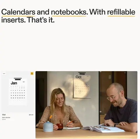
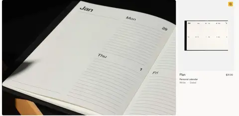
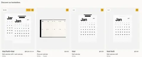
Calendar and planner cards prioritize clean product imagery, concise names, variant details, and price; small badges mark product or offer status.
Sale badge
Compact #f1ba35 badges use dark uppercase text, 4px corners, and short discount messaging.
Promotional panels
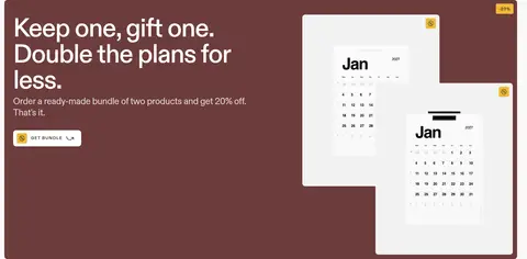
Large split panels combine concise copy and a CTA with calendar imagery over dusty blue or burgundy backgrounds.
Newsletter form
The dark footer newsletter area pairs a clear offer headline with email entry, consent copy, and a subdued outlined field.
Imagery · Photography and video emphasize calendars in real settings: paper texture, people writing, and products displayed on walls or desks. Product cards use clean, bright backgrounds so the calendar layouts remain legible. Campaign panels layer calendar mockups over solid dusty-blue or burgundy grounds. Images are rectangular with softly rounded corners; the photography stays natural and warm, without heavy graphic effects.
Set headlines and navigation in ABCDiatype or a close geometric sans substitute.
Reserve Calendar Ochre (#f1ba35) for purchase actions and offer badges.
Let product photography show paper texture and calendars in real use.
Alternate product grids with broad editorial or promotional panels.
Keep secondary copy quiet and borders fine.
✕ 不该做
Do not turn every section into a colored card.
Do not use gradients or decorative effects absent from the measured page.
Do not use the blue or green accents as dominant interface colors.
Do not crowd large headlines with dense supporting content.
Do not add heavy shadows to product cards.
Do not obscure calendar imagery with unnecessary overlays.
给 AI 的提示词
想快速出一个同风格的新页面,把这段话连同 DESIGN.md 一起发给 AI。
Build a new Kalstore-style storefront page for refillable paper goods. Use Warm Paper (#faf9f7) as the canvas and Soft Ink (#242424) for clear headlines, links, and navigation. Keep ABCDiatype throughout, or use DM Sans as a free substitute; use tight tracking for large headings and compact uppercase navigation. Organize the page as a sequence of calm editorial sections, product grids, and image-led splits. Show calendars in real settings and keep product cards bright and legible. Use Calendar Ochre (#f1ba35) sparingly for primary actions and sale badges. Introduce Limestone (#e0ddd7), Dusty Sky (#90abc8), or Oxblood Panel (#6c3c3c) only in deliberate campaign bands. Favor fine borders and flat surfaces; reserve a soft shadow for the floating navigation. End with a dark, information-rich footer.