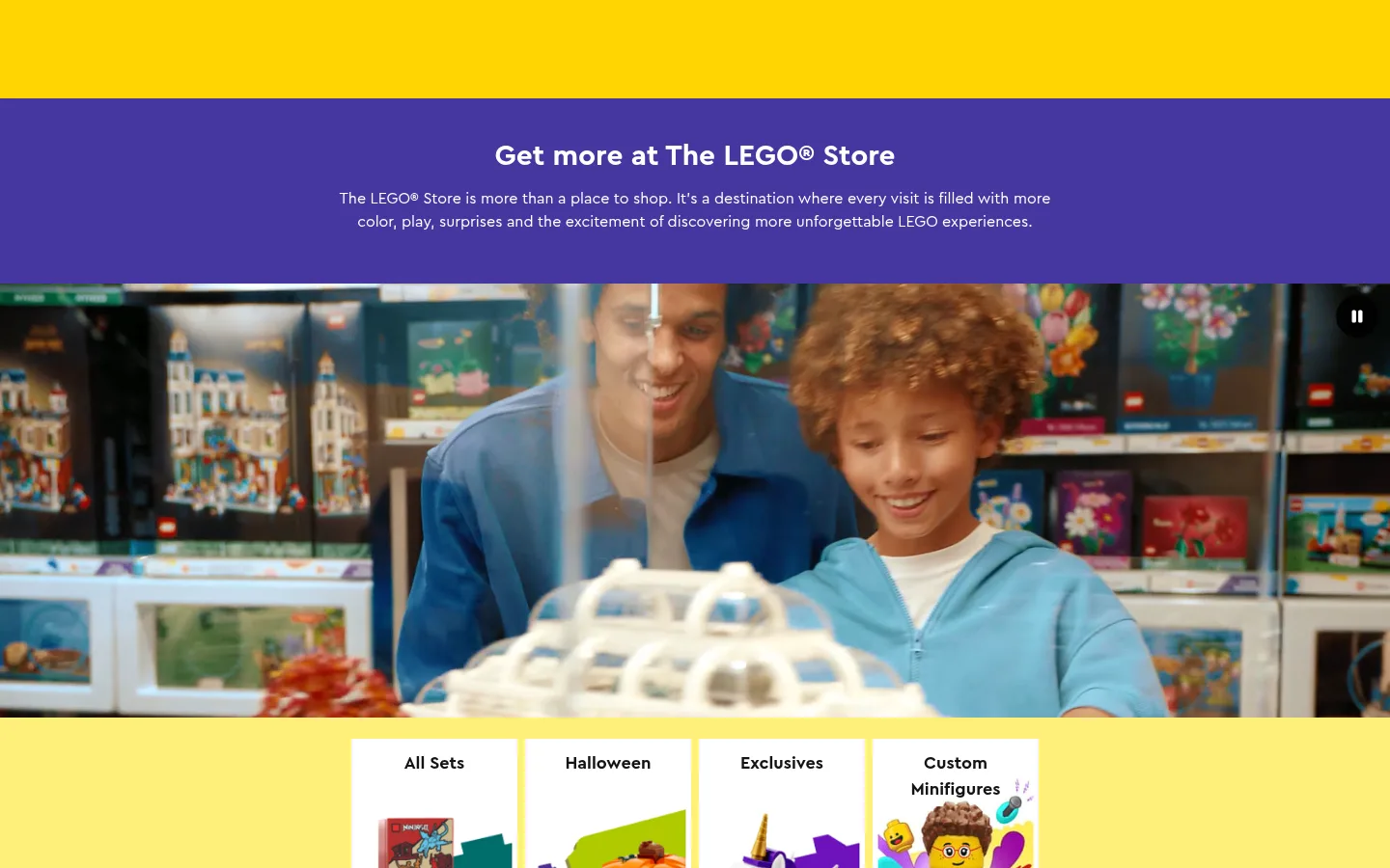
LEGO 美国商城首页以鲜明的品牌色呈现欢迎内容,并串联可直接选购的积木套装与灵感专题。白色商品区与醒目的活动色块、生活方式影像和深色会员页脚交替出现。
North star · Keep shopping information crisp on white, then use bold LEGO color and vivid imagery to make each discovery section feel like a new play scene.
The page balances LEGO’s unmistakable primary-color energy with a white canvas that keeps product browsing clear. Bright yellow and purple establish the opening campaign, while pale yellow carries the category tiles into the shopping content. Orange Add to Bag buttons, blue links, and yellow New badges provide distinct commerce cues; black and deep green anchor editorial and loyalty areas. Cera Pro supplies a consistent rounded, friendly voice, with bold headings and compact, medium-weight supporting text. The layout moves from a full-width video hero to compact category navigation, a dense product grid, and larger image-led category cards. Further down, angled black and white section edges, vivid promotional tiles, and a green membership block vary the rhythm without changing the underlying modular structure. Product photography, lifestyle imagery, and colorful set imagery do most of the visual storytelling. Borders stay light and shadows are restrained, so imagery and color bands—not decorative chrome—create hierarchy.
配色 点色块复制色值。用途说明来自对页面的实测位置(背景、文字、描边、按钮)与截图判读。
品牌色
Signal Yellow
#ffd502
New badges, navigation highlight, and prominent yellow section bands.
Lemon Glow
#ffef7a
Large pale-yellow category backdrop and warm campaign transitions.
Adventure Purple
#4c2f92
Prominent purple store-introduction band; a defining campaign color in the opening view.
Play Aqua
#71ccd5
A colored section surface that adds a cool contrast to yellow and purple campaign areas.
Insiders Green
#004a2d
Deep green loyalty and membership section surface.
Violet Play
#4637a0
Purple section surface measured on the page, complementing the opening campaign band.
强调色
Link Blue
#006db7
Commerce link text, including category and product discovery links.
Build Orange
#f47d20
Primary Add to Bag buttons with dark text.
Action Blue
#005ad2
Button color captured in the measured UI; secondary to the main orange purchase CTA.
表层色
Play Black
#000000
Black campaign and editorial section bands, plus inverse buttons and text.
中性色
Brick White
#ffffff
Main canvas, white product-browsing sections, and reversed text on colored campaign bands.
Brick Ink
#141414
Primary headings, body copy, product details, dark buttons, and footer surfaces.
Soft Divider
#f0f0f0
Subtle hairlines around product cards and other lightly outlined controls.
Quiet Charcoal
#2c2c2c
Muted text, navigation labels, and secondary interface copy.
Control Gray
#424242
Measured control border color; secondary interface detail rather than a major page surface.
功能色
Forest Edge
#003f26
Deep green card border detail associated with the loyalty color family.
文字 背景 对比度 WCAG #141414 Brick Ink#ffffff Brick White18.42:1 AAA #141414 Brick Ink#000000 Play Black1.14:1 不达标 #141414 Brick Ink#71ccd5 Play Aqua9.91:1 AAA #ffffff Brick White#000000 Play Black21:1 AAA #ffffff Brick White#141414 Brick Ink18.42:1 AAA #ffffff Brick White#71ccd5 Play Aqua1.86:1 不达标
字体 字号阶梯:Major Third(比例约 1.275,正文 14px)。示例用免费替代字体渲染,数值为实测。
Aa 设计
Cera Pro 网络字体 · 字重 400 / 500 / 700 · 占比 100%
免费替代:Nunito Sans
All page typography, from campaign headings and navigation to product names, prices, and buttons.
角色 示例 字号 字重 行高 字距 一级标题 Primary campaign or page heading, such as the store welcome.
LEGO
37px 700 1.35 0 二级标题 Major shopping and editorial section headings.
LEGO
30px 700 1.35 0 三级标题 Product group and card titles.
The quick brown fox 敏捷的狐狸
24.5px 700 1.35 0 四级标题 Smaller feature and content-card headings.
The quick brown fox 敏捷的狐狸
19.5px 700 1.5 0 正文 Descriptions, product details, and supporting commerce copy.
The quick brown fox 敏捷的狐狸
14px 500 1.5 0.01em 辅助文字 Compact product metadata, ratings, and secondary labels.
The quick brown fox 敏捷的狐狸
12px 400 1.75 0.01em 按钮 Purchase and action labels, including Add to Bag.
The quick brown fox 敏捷的狐狸
16px 500 1.5 0 链接 Inline links and navigation to sets or content.
The quick brown fox 敏捷的狐狸
14px 400 1.36 0.01em
间距与布局 基准单位 4px · 密度:紧凑
32px 版块间距
4px 元素间距
— 卡片内边距
1376px 内容最大宽度
2px
4px
7px
8px
11px
12px
16px
20px
24px
32px
40px
The page uses a compact modular rhythm on a measured 1376px maximum-width canvas, with full-bleed campaign media and color bands breaking out of the shopping grid. The hero centers its heading and copy above video; category and content cards use four- or three-column groupings, while the product area is deliberately denser. Sections are separated by generous white space and clear bands, with occasional angled edges. Alignment shifts between centered campaign headings and left-aligned browsing content.
圆角与层次 The interface is mostly flat: white surfaces, colored section bands, and imagery define depth. Product cards use subtle light borders rather than pronounced shadows. Rounded pill buttons and small rounded badges supply the main component contours; the footer includes a measured inset hairline treatment.
组件 下面的预览按实测的按钮、输入框、徽标、卡片样式重建(字体用替代字体)。
Primary purchase button Orange pill-shaped Add to Bag action with dark Cera Pro text; keep it visually distinct from secondary browse links.
New badge Compact yellow label with dark text and a small white border, placed near product imagery.
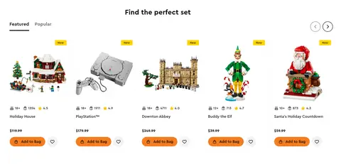
Product card Set image above compact age, piece, and rating metadata, followed by product name, price, and orange purchase action.
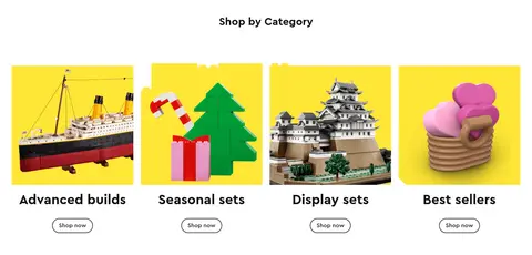
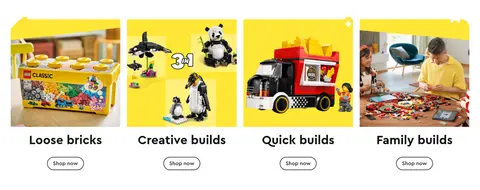
Category tile Bright image-led card with a bold title and outlined pill-shaped Shop now link.
Campaign band Full-width saturated background, centered white heading and brief copy, paired with prominent video or campaign imagery.
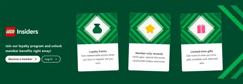
Loyalty panel Deep green Insiders section with member invitation, benefit cards, and white contrast surfaces.
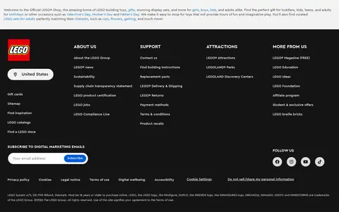
Footer Dense near-black multi-column link area, with LEGO branding, region selector, subscription form, and social icons.
Imagery · Large video and lifestyle photography establish the store experience, while crisp product photography presents individual sets and category choices. Product and editorial cards mix real-life scenes with colorful builds and playful character imagery. Images are usually framed as prominent tiles on white or saturated color grounds; they carry the visual detail rather than relying on decorative overlays.
页面版块 共 10 个版块,按页面从上到下排列,每个都标了类型、布局和交互套路。
该做与不该做 ✓ 该做 Keep product browsing areas predominantly white and easy to scan. Use the measured palette hex values exactly for branded surfaces and actions. Reserve orange for prominent purchase actions and blue for links. Use saturated yellow and purple for campaign moments, not every card. Pair bold Cera Pro headings with concise supporting copy. Let product and lifestyle imagery provide most visual detail. ✕ 不该做 Don’t make every section a saturated color block. Don’t use heavy shadows to separate ordinary product cards. Don’t replace the measured palette with approximate brand colors. Don’t bury product prices or purchase actions in dense prose. Don’t force uppercase styling onto all headings and labels. Don’t treat colors inside product artwork as page-wide interface colors. 给 AI 的提示词 想快速出一个同风格的新页面,把这段话连同 DESIGN.md 一起发给 AI。
复制 Build a new LEGO-style storefront page with a clean white Brick White (#ffffff) canvas and modular shopping sections. Use Cera Pro or a close rounded sans-serif, bold natural-case headings, and compact readable product metadata. Create a full-width campaign moment with Adventure Purple (#4c2f92) or Signal Yellow (#ffd502), then return to white category and product grids. Use Build Orange (#f47d20) for the primary purchase action, Link Blue (#006db7) for links, and Brick Ink (#141414) for core text. Use vivid product imagery and lifestyle photography as the main visual storytelling. Keep cards mostly flat with subtle Soft Divider (#f0f0f0) borders, pill-shaped actions, and small rounded badges. Vary the long-page rhythm with image-led category cards, a dark editorial band, a deep green Insiders panel, and a near-black footer.
DESIGN.md Tailwind v4 CSS 变量 Design Tokens
---
title: "LEGO design system"
variant: extended
source: https://www.lego.com/en-us?age-gate=grown_up
captured_at: 2026-10-12
theme: light
industry: ecommerce
generator: Design DNA (https://four.wiralomi.com/style/lego-com)
ai_generated: true
ai_label: "本文件由 AI 辅助生成:数值取自公开网页的实测样式,命名、用途说明与建议为模型解读。商标归原所有者。 / AI-assisted content"
---
# LEGO · Design System
> A bright, playful storefront built around discovery
**Theme:** light · **Industry:** ecommerce · **Source:** https://www.lego.com/en-us?age-gate=grown_up · **Captured:** 2026-10-12 (1440×900 desktop)
_AI-assisted content: values are measured from the public page at capture time; names, roles and guidance are model-written interpretations. Trademarks belong to their owners._
LEGO’s US store homepage combines a colorful brand welcome with dense, shoppable set listings and editorial inspiration. White commerce sections alternate with vivid campaign bands, lifestyle imagery, and a dark loyalty-led footer.
## North star
Keep shopping information crisp on white, then use bold LEGO color and vivid imagery to make each discovery section feel like a new play scene.
## Overview
The page balances LEGO’s unmistakable primary-color energy with a white canvas that keeps product browsing clear. Bright yellow and purple establish the opening campaign, while pale yellow carries the category tiles into the shopping content. Orange Add to Bag buttons, blue links, and yellow New badges provide distinct commerce cues; black and deep green anchor editorial and loyalty areas. Cera Pro supplies a consistent rounded, friendly voice, with bold headings and compact, medium-weight supporting text. The layout moves from a full-width video hero to compact category navigation, a dense product grid, and larger image-led category cards. Further down, angled black and white section edges, vivid promotional tiles, and a green membership block vary the rhythm without changing the underlying modular structure. Product photography, lifestyle imagery, and colorful set imagery do most of the visual storytelling. Borders stay light and shadows are restrained, so imagery and color bands—not decorative chrome—create hierarchy.
## Colors
| Name | Hex | Token | Group | Role |
|---|---|---|---|---|
| Brick White | ` | `--color-brick-white` | neutral | Main canvas, white product-browsing sections, and reversed text on colored campaign bands. |
| Link Blue | ` | `--color-link-blue` | accent | Commerce link text, including category and product discovery links. |
| Signal Yellow | ` | `--color-signal-yellow` | brand | New badges, navigation highlight, and prominent yellow section bands. |
| Build Orange | ` | `--color-build-orange` | accent | Primary Add to Bag buttons with dark text. |
| Brick Ink | ` | `--color-brick-ink` | neutral | Primary headings, body copy, product details, dark buttons, and footer surfaces. |
| Play Black | ` | `--color-play-black` | surface | Black campaign and editorial section bands, plus inverse buttons and text. |
| Soft Divider | ` | `--color-soft-divider` | neutral | Subtle hairlines around product cards and other lightly outlined controls. |
| Lemon Glow | ` | `--color-lemon-glow` | brand | Large pale-yellow category backdrop and warm campaign transitions. |
| Quiet Charcoal | ` | `--color-quiet-charcoal` | neutral | Muted text, navigation labels, and secondary interface copy. |
| Adventure Purple | ` | `--color-adventure-purple` | brand | Prominent purple store-introduction band; a defining campaign color in the opening view. |
| Play Aqua | ` | `--color-play-aqua` | brand | A colored section surface that adds a cool contrast to yellow and purple campaign areas. |
| Insiders Green | ` | `--color-insiders-green` | brand | Deep green loyalty and membership section surface. |
| Action Blue | ` | `--color-action-blue` | accent | Button color captured in the measured UI; secondary to the main orange purchase CTA. |
| Control Gray | ` | `--color-control-gray` | neutral | Measured control border color; secondary interface detail rather than a major page surface. |
| Violet Play | ` | `--color-violet-play` | brand | Purple section surface measured on the page, complementing the opening campaign band. |
| Forest Edge | ` | `--color-forest-edge` | semantic | Deep green card border detail associated with the loyalty color family. |
### Semantic aliases
`--color-canvas` → ` (Brick White) · `--color-surface` → ` (Play Black) · `--color-surface-2` → ` (Brick Ink) · `--color-surface-3` → ` (Play Aqua) · `--color-surface-4` → ` (Insiders Green) · `--color-text` → ` (Brick Ink) · `--color-text-muted` → ` (Brick White) · `--color-text-subtle` → ` (Quiet Charcoal) · `--color-border` → ` (Soft Divider) · `--color-accent` → ` (Build Orange) · `--color-accent-2` → ` (Link Blue) · `--color-accent-3` → ` (Signal Yellow) · `--color-on-accent` → ` (Play Black)
### Contrast (WCAG 2.x)
| Text | Background | Ratio | Level |
|---|---|---|---|
| ` | ` | 18.42:1 | AAA |
| ` | ` | 1.14:1 | fail |
| ` | ` | 9.91:1 | AAA |
| ` | ` | 21:1 | AAA |
| ` | ` | 18.42:1 | AAA |
| ` | ` | 1.86:1 | fail |
| ` | ` | 13.97:1 | AAA |
| ` | ` | 1.5:1 | fail |
| ` | ` | 1.32:1 | fail |
| ` | ` | 7.51:1 | AAA |
### Gradients
- `linear-gradient(rgb(255, 239, 122) 90%, rgb(255, 255, 255) 10%)`
- `linear-gradient(rgb(255, 255, 255) 90%, rgb(0, 0, 0) 10%)`
- `linear-gradient(rgb(0, 0, 0) 90%, rgb(255, 255, 255) 10%)`
## Typography
| Family | Token | Source | Weights | Role | Free substitute |
|---|---|---|---|---|---|
| Cera Pro | `--font-body` | webfont | 400, 500, 700 | All page typography, from campaign headings and navigation to product names, prices, and buttons. | Nunito Sans |
- **Cera Pro:** Use friendly, rounded sans-serif forms; headings are bold, body copy mostly medium, and labels stay compact. Case is natural, not forced uppercase.
### Type scale — Major Third (ratio ≈ 1.275, base 14px)
| Role | Size | Weight | Line height | Letter spacing | Case | Family | Used for |
|---|---|---|---|---|---|---|---|
| h1 | 37px | 700 | 1.35 | 0 | — | Cera Pro | Primary campaign or page heading, such as the store welcome. |
| h2 | 30px | 700 | 1.35 | 0 | — | Cera Pro | Major shopping and editorial section headings. |
| h3 | 24.5px | 700 | 1.35 | 0 | — | Cera Pro | Product group and card titles. |
| h4 | 19.5px | 700 | 1.5 | 0 | — | Cera Pro | Smaller feature and content-card headings. |
| body | 14px | 500 | 1.5 | 0.01em | — | Cera Pro | Descriptions, product details, and supporting commerce copy. |
| caption | 12px | 400 | 1.75 | 0.01em | — | Cera Pro | Compact product metadata, ratings, and secondary labels. |
| button | 16px | 500 | 1.5 | 0 | — | Cera Pro | Purchase and action labels, including Add to Bag. |
| link | 14px | 400 | 1.36 | 0.01em | — | Cera Pro | Inline links and navigation to sets or content. |
## Spacing & layout
- Base unit **4px**, density **compact**.
- Scale (most used values): 2, 4, 7, 8, 11, 12, 16, 20, 24, 32, 40 px.
- Section rhythm 32px · element gap 4px · card padding — · max content width 1376px.
The page uses a compact modular rhythm on a measured 1376px maximum-width canvas, with full-bleed campaign media and color bands breaking out of the shopping grid. The hero centers its heading and copy above video; category and content cards use four- or three-column groupings, while the product area is deliberately denser. Sections are separated by generous white space and clear bands, with occasional angled edges. Alignment shifts between centered campaign headings and left-aligned browsing content.
## Shape & elevation
- Radius: button `9999px` · card `8px` · media `8px` · badge `4px` · xs `4px` · sm `8px` · pill `9999px`
- Shadow `inset` (footer): `rgb(176, 176, 176) 0px 0px 0px 1px inset`
- Motion: standard transition `0.24s cubic-bezier(0.215, 0.61, 0.355, 1)` on interactive elements.
The interface is mostly flat: white surfaces, colored section bands, and imagery define depth. Product cards use subtle light borders rather than pronounced shadows. Rounded pill buttons and small rounded badges supply the main component contours; the footer includes a measured inset hairline treatment.
## Imagery
Large video and lifestyle photography establish the store experience, while crisp product photography presents individual sets and category choices. Product and editorial cards mix real-life scenes with colorful builds and playful character imagery. Images are usually framed as prominent tiles on white or saturated color grounds; they carry the visual detail rather than relying on decorative overlays.
## Components
### Primary purchase button
Orange pill-shaped Add to Bag action with dark Cera Pro text; keep it visually distinct from secondary browse links.
### New badge
Compact yellow label with dark text and a small white border, placed near product imagery.
### Product card
Set image above compact age, piece, and rating metadata, followed by product name, price, and orange purchase action.
### Category tile
Bright image-led card with a bold title and outlined pill-shaped Shop now link.
### Campaign band
Full-width saturated background, centered white heading and brief copy, paired with prominent video or campaign imagery.
### Loyalty panel
Deep green Insiders section with member invitation, benefit cards, and white contrast surfaces.
### Footer
Dense near-black multi-column link area, with LEGO branding, region selector, subscription form, and social icons.
### Measured component styles
- **Primary button** (“Add to Bag”): background ## Do
- Keep product browsing areas predominantly white and easy to scan.
- Use the measured palette hex values exactly for branded surfaces and actions.
- Reserve orange for prominent purchase actions and blue for links.
- Use saturated yellow and purple for campaign moments, not every card.
- Pair bold Cera Pro headings with concise supporting copy.
- Let product and lifestyle imagery provide most visual detail.
## Don't
- Don’t make every section a saturated color block.
- Don’t use heavy shadows to separate ordinary product cards.
- Don’t replace the measured palette with approximate brand colors.
- Don’t bury product prices or purchase actions in dense prose.
- Don’t force uppercase styling onto all headings and labels.
- Don’t treat colors inside product artwork as page-wide interface colors.
## Agent prompt
Build a new LEGO-style storefront page with a clean white Brick White (## Page sections (top to bottom)
| # | Type | Layout | UX patterns | UI patterns |
|---|---|---|---|---|
| 1 | hero | Centered title and description above full-bleed video, with a saturated purple introduction band. | Brand introduction, Autoplay video, Playback control | Purple color band, Centered white typography, Full-width media |
| 2 | category-nav | Four category tiles arranged in a horizontal row on a pale-yellow field. | Category shortcuts, Visual browsing | Image tiles, Yellow background, Compact category labels |
| 3 | product-grid | Centered heading over a dense multi-column product grid with tabs and carousel controls. | Featured and popular tabs, Product browsing, Quick add to bag | Product cards, Yellow New badges, Orange pill buttons |
| 4 | feature-grid | Centered heading above four large image cards in a horizontal grid. | Category discovery, Shop now navigation | Vivid image tiles, Bold card titles, Outlined pill links |
| 5 | feature-grid | Second four-column category grid with image-led cards and short action links. | Browse by play style, Shop now navigation | Bright product imagery, White space, Outlined pill links |
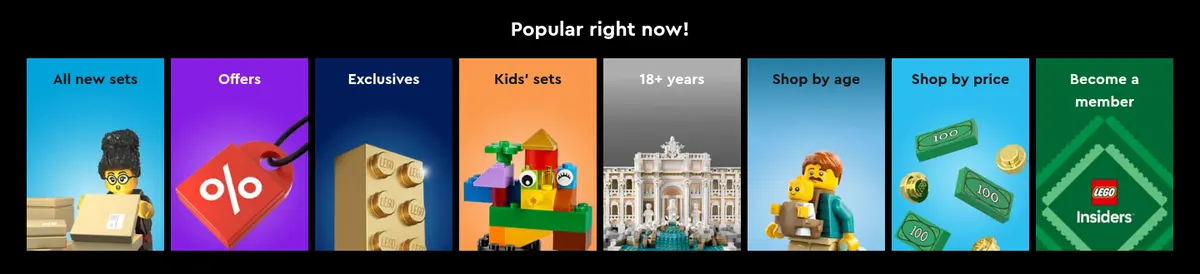
| 6 | category-nav | Horizontal row of narrow colorful category tiles set within a black, angled section. | Browse popular filters, Shop by age or price | Black section band, Bright mini tiles, Centered heading |
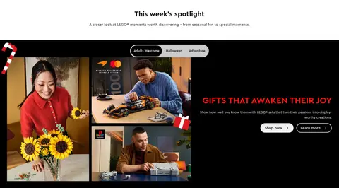
| 7 | video | Centered editorial heading followed by a full-width dark feature panel with layered image content. | Editorial discovery, Audience selection, Dual calls to action | Lifestyle photography, Black background, Campaign copy and controls |
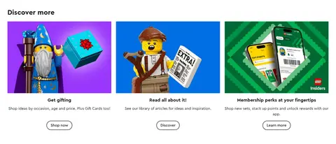
| 8 | content-feed | Three-column content row with image, heading, description, and action in each card. | Gift inspiration, Editorial discovery, Membership discovery | Colorful image cards, Short descriptions, Outlined pill actions |
| 9 | feature-grid | Deep-green membership band with an introduction beside three white benefit cards. | Join membership, Log in, Explore benefits | Green branded surface, White cards, High-contrast membership actions |
| 10 | footer | Introductory copy above a dense near-black, multi-column link footer. | Country selection, Email subscription, Social links | Near-black surface, Multiple link columns, Subscription field |
## Source CSS custom properties (selected)
```css
--ds-color-brand-black: #000;
--ds-color-brand-bright-blue: