North star · Let warm whitespace and cinematic product imagery lead; use green only to direct attention to meaningful actions.
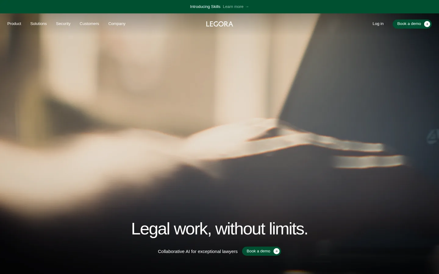
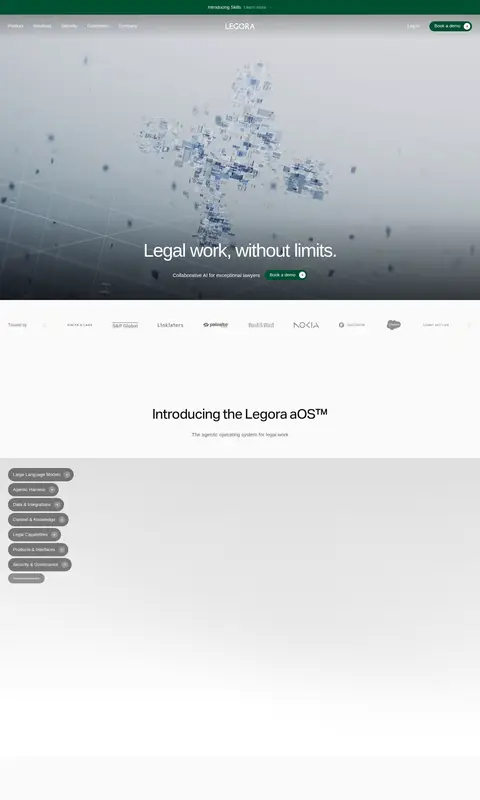
The visual system begins with a warm off-white canvas (#fafaf9), balanced by charcoal text and muted taupe-gray copy. Large stretches of light space alternate with pale gray and warm stone section bands, then resolve into near-black security content for contrast. Deep green (#005032) is a restrained action color, notably in the announcement strip and demo buttons; avoid promoting incidental interface or image colors into brand accents. Aktiv Grotesk sets a clean, modern voice: headlines are large, tightly tracked, and mostly regular or light, while small navigation and body copy remain compact. The layout moves between full-bleed cinematic video, centered headline moments, broad product imagery, and editorial multi-column content. Photography, interface captures, and occasional 3D product visuals carry much of the storytelling. Rounded pill CTAs and compact gray feature chips soften an otherwise flat, spacious composition.
Primary interface and headline family across navigation, headings, body copy, and buttons.
Aa 设计
Aktiv Grotesk VF Variable Regular
网络字体 · 字重 400 / 300 · 占比 2%
免费替代:Inter
Webfont variant used for display and select heading styles.
角色
示例
字号
字重
行高
字距
特大标题
Oversized, light hero and prominent editorial headlines.
Legora
90px
300
1
-0.03em
一级标题
Primary page headline and major feature-section titles.
Legora
56px
400
1.05
-0.04em
二级标题
Section headings such as product introduction and innovations.
Legora
41px
400
1.05
-0.03em
三级标题
Feature, story, and card-group headings.
Legora
33.5px
400
1.2
-0.02em
四级标题
Compact card and supporting content titles.
The quick brown fox 敏捷的狐狸
22.5px
400
1.2
-0.01em
正文
Descriptions, supporting paragraphs, and navigation copy.
The quick brown fox 敏捷的狐狸
13px
400
1.4
0
辅助文字
Small metadata, labels, and fine-print details.
The quick brown fox 敏捷的狐狸
12px
400
1.4
0
间距与布局
基准单位 2px · 密度:适中
60px版块间距
10px元素间距
—卡片内边距
1392px内容最大宽度
5px
8px
10px
15px
24px
30px
60px
A broad, centered composition uses a measured maximum content width of 1392px and comfortable density. The page alternates full-bleed media with centered headline sections, logo strips, product showcases, and editorial grids. Headings are often centered for major brand moments, while detailed copy and cards return to left alignment. The measured section gap is 60px; element spacing is compact by comparison. Large open areas create a slow, premium rhythm, with occasional dense product and compliance panels providing contrast.
圆角与层次
按钮 · 9999px
图片 · 2px
链接 · 9999px
没有测到阴影:页面是扁平的,层次靠底色和描边区分。
The interface reads as mostly flat: the measured data reports no shadows and no defined border color. Sections are separated mainly through whitespace, image changes, and shifts between ivory, gray, warm stone, and near-black surfaces. Buttons and chips rely on pill-shaped silhouettes rather than visible outlines or shadow depth; media uses only a subtle measured corner radius.
组件
下面的预览按实测的按钮、输入框、徽标、卡片样式重建(字体用替代字体)。
Announcement strip
A narrow full-width forest-green bar above the main navigation, with centered announcement text and a small learn-more link.
Overlay navigation
Compact links sit over the hero media, with a centered Legora wordmark and login plus a green pill-shaped demo action on the right.
Hero
Full-bleed video or imagery fills the opening section; a dark lower gradient supports the centered white headline, descriptor, and demo CTA.
Demo CTA
Small green pill button with a light circular arrow detail; repeat it in high-intent locations rather than adding multiple competing accents.
Feature chips
Compact gray rounded labels identify product capabilities within the product showcase; they are subdued, not primary buttons.
Innovation cards
A row of product-story cards pairs rectangular image or interface previews with short headings, concise copy, and understated text links.
Imagery · Cinematic video and photography dominate the hero and major storytelling moments, often framed edge to edge with dark gradients that protect white overlay text. Product sections mix interface screenshots, legal-work environments, portrait photography, and occasional polished 3D visuals. Images are generally rectangular with restrained corner treatment; imagery supplies warmer and cooler hues than the core interface palette, so keep those colors contextual rather than repeating them as UI accents.
Reserve #005032 for primary actions and announcement emphasis.
Use near-black media gradients to keep overlay text readable.
Set major headlines large, lightly weighted, and tightly tracked.
Alternate open editorial areas with focused product imagery.
Keep cards and controls visually flat and softly rounded.
✕ 不该做
Do not add shadows or heavy outlines absent from the measured design.
Do not use bright blue as a brand link or button color.
Do not turn photo-derived hues into interface accents.
Do not crowd full-bleed media with dense navigation or copy.
Do not use uppercase-heavy typography or decorative typefaces.
Do not make every section a card grid.
给 AI 的提示词
想快速出一个同风格的新页面,把这段话连同 DESIGN.md 一起发给 AI。
Create a new Legora page using a restrained editorial system. Set the main canvas to Gallery Ivory (#fafaf9), use Graphite Text (#343434) for primary copy and Muted Taupe (#68655e) for supporting text, and introduce Soft Concrete (#e6e6e6) or Warm Stone (#e1dfda) only for clear section changes. Use Forest Signal (#005032) sparingly for important actions. Build with Aktiv Grotesk or Inter, using oversized tightly tracked headlines, compact body copy, and sentence case. Favor full-bleed cinematic imagery with subtle dark overlays, generous whitespace, and wide editorial layouts within the measured 1392px maximum width. Use flat surfaces, pill-shaped CTAs, and restrained gray chips; avoid shadows, decorative borders, and extra accent colors. Ensure media overlays remain legible and product imagery feels integrated into the story.