North star · Let film imagery and editorial content carry the page, using a quiet charcoal interface and reserving vivid green for meaningful actions.
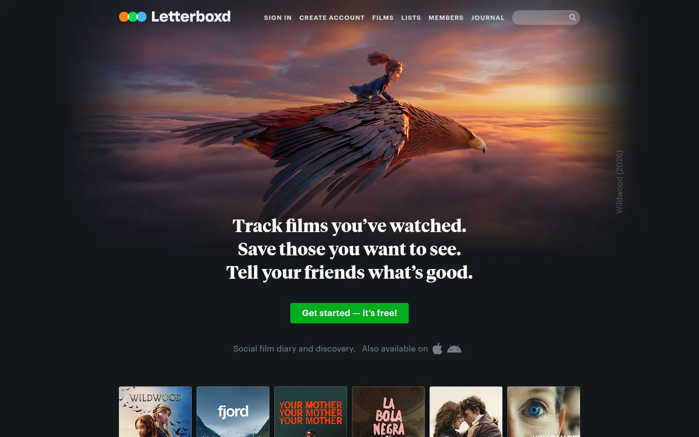
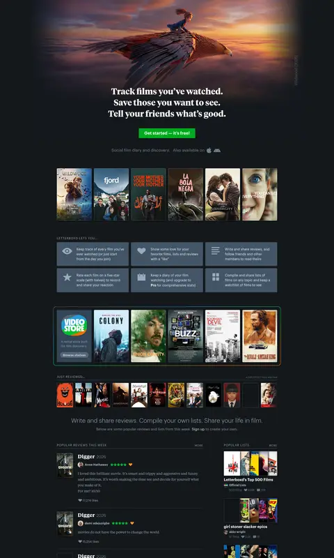
The page is grounded in a near-black charcoal canvas (#14181c), letting film artwork supply most of the color and atmosphere. White serif hero copy creates an editorial focal point, while Graphik sans-serif handles navigation, labels, metadata, and dense feed content. Muted blue-gray text keeps secondary information legible without competing with posters and stills. Saturated green is reserved for the primary signup action and a small progress badge; blue-gray panels group feature explanations, reviews, and stories. The hero combines a cinematic, edge-faded image with centered messaging, followed by poster rows, compact feature tiles, review and recommendation columns, and a multi-column story feed. Content remains relatively narrow and information-rich, with regular section gaps rather than expansive whitespace. Cards rely chiefly on imagery and tonal surface separation, using restrained radii and occasional subtle shadows instead of prominent borders.
配色
点色块复制色值。用途说明来自对页面的实测位置(背景、文字、描边、按钮)与截图判读。
品牌色
强调色
表层色
中性色
功能色
页面底色 · Cinema Charcoal表层 · Deep Slate表层 2 · Night Steel表层 3 · Harbor Blue主文字 · Screen White次要文字 · Slate Mist弱文字 · Frosted Blue描边 · Electric Green强调 · Signup Green
Navigation, body copy, labels, links, feature panels, and most interface text.
Aa 设计
TiemposTextWeb
网络字体 · 字重 400 / 700 · 占比 30%
免费替代:Source Serif 4
Editorial subheadings and selected prominent story titles.
Aa 设计
TiemposHeadlineWeb
网络字体 · 字重 700 · 占比 1%
免费替代:Source Serif 4
Large centered hero headline.
角色
示例
字号
字重
行高
字距
一级标题
Centered, prominent hero statement in bold editorial serif.
Letterboxd
36px
700
1.33
0
二级标题
Light sans-serif section headings introducing major homepage content.
The quick brown fox 敏捷的狐狸
26px
300
1.23
0
三级标题
Compact sans-serif headings for cards and grouped content.
The quick brown fox 敏捷的狐狸
24px
400
1
0
四级标题
Bold serif titles for editorial story blocks.
The quick brown fox 敏捷的狐狸
22px
700
1.2
0
正文
Compact descriptions, reviews, and explanatory copy.
The quick brown fox 敏捷的狐狸
13px
400
1.5
0
辅助文字
Film metadata, bylines, and quiet supporting details.
The quick brown fox 敏捷的狐狸
12px
400
1.5
0
导航
Bold sans-serif primary navigation labels.
The quick brown fox 敏捷的狐狸
15px
700
1.5
0
链接
Small bold uppercase calls to action and section links.
The quick brown fox 敏捷的狐狸
12px
700
1
0.083em
眉题
Tracked uppercase labels above content groups.
The quick brown fox 敏捷的狐狸
12px
700
1
0.083em
间距与布局
基准单位 1px · 密度:紧凑
32px版块间距
7px元素间距
—卡片内边距
950px内容最大宽度
1px
3px
4px
5px
6px
7px
8px
10px
11px
12px
13px
15px
16px
18px
20px
24px
A centered desktop composition uses a measured page maximum width of 950px within a full-width charcoal canvas. The opening hero aligns its headline and action centrally beneath cinematic artwork; below it, poster strips and feature tiles introduce the service. Dense content transitions into a two-column review and recommendation area, then multi-column editorial cards and horizontal film/news rows. The main content uses a measured 12-column structure with compact spacing, while section separation is clearer than card-internal whitespace. The footer breaks into a single full-width dark band.
圆角与层次
按钮 · 4px
输入框 · 9999px
卡片 · 3px
图片 · 0px
徽标 · 2px
链接 · 0px
inset · link, other
md · other, card
inset · other
sm · other
The design is mostly flat: charcoal canvas and blue-gray card surfaces define hierarchy more than elevation. Cards have subtle measured corner rounding, with occasional restrained dark shadows. Thin inset highlights appear on select links and buttons; avoid adding persistent outlines or dramatic layered shadows across every card.
组件
下面的预览按实测的按钮、输入框、徽标、卡片样式重建(字体用替代字体)。
Hero signup
Center a bold white serif message under a cinematic image and pair it with the bright green signup action; keep supporting copy subdued.
Film poster strip
Show a compact, horizontally aligned run of edge-to-edge portrait posters so the artwork itself supplies color and browsing context.
Feature tiles
Group short benefit copy in blue-gray panels with simple icons and muted text, using a dense multi-column arrangement.
Review feed
Present reviews in a compact column with film art, reviewer details, rating cues, and restrained metadata.
Editorial story cards
Use image-led cards on dark slate surfaces, with serif story titles, concise summaries, and small uppercase read links.
Footer band
Finish with a blue-gray footer surface, small muted navigation links, and subdued legal or attribution text.
Imagery · Film posters, stills, and editorial thumbnails are the page’s defining imagery, arranged in tightly aligned rows and card grids. The hero uses a wide cinematic frame with darkened edges and a warm sunset image; its color belongs to the featured artwork, not the interface palette. Later sections mix poster art, still photography, and some video-thumbnail treatments. Keep images crisp, edge-to-edge, and visually dominant.
Let film artwork provide most warm and varied color.
Use Graphik-style sans-serif for dense interface content.
Use bold serif headlines for editorial emphasis.
Group content with restrained blue-gray surfaces.
Keep feeds and poster rows compact and image-led.
✕ 不该做
Do not turn featured artwork colors into interface brand colors.
Do not use green as a large decorative background.
Do not make every card heavily bordered or shadowed.
Do not replace the compact feed with oversized airy cards.
Do not use serif typography for all interface labels.
Do not let metadata compete with headlines and posters.
给 AI 的提示词
想快速出一个同风格的新页面,把这段话连同 DESIGN.md 一起发给 AI。
Build a new Letterboxd-style page on a dominant Cinema Charcoal (#14181c) canvas. Treat film posters, stills, and editorial thumbnails as the primary source of visual color; keep interface surfaces restrained with Deep Slate (#202830), Harbor Blue (#445566), and Night Steel (#2c3440). Use white (#ffffff) serif display headlines against compact Graphik-like sans-serif navigation, metadata, and body copy in Slate Mist (#99aabb) or Metadata Blue (#667788). Center the hero message and use a single Signup Green (#00ac1c) primary action; Progress Green (#00c030) belongs only on small status badges. Organize the rest as dense poster strips, feature tiles, review and recommendation columns, and image-led editorial cards. Favor flat tonal grouping, subtle radii, minimal shadows, and clear section rhythm over spacious marketing layouts.