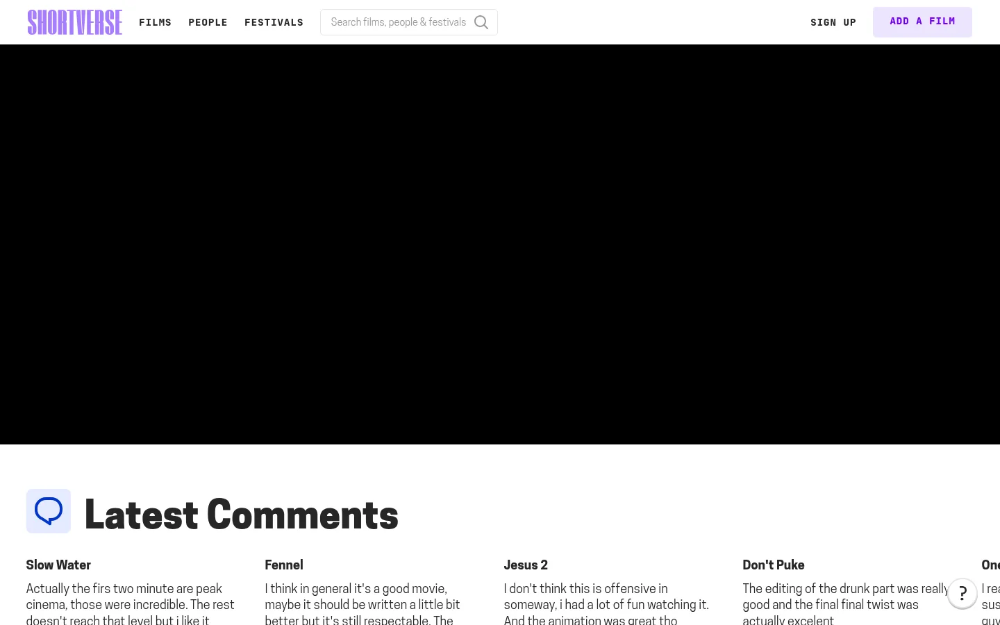
North star · Keep the interface neutral and editorial so film imagery leads; use violet sparingly to signal brand and action.
The page uses a mostly white canvas, with black cinematic bands and pale gray panels creating deliberate shifts between discovery content and platform messaging. Deep charcoal carries most text, while bright violet is reserved for the wordmark, selected controls, icons, and a prominent lower-page signup band. Cooper Hewitt gives headlines and film information a sturdy, humanist feel; JetBrains Mono supplies the uppercase, widely tracked navigation, labels, and calls to action. The content is arranged as a broad, horizontally browsable film index: large featured media, compact comment columns, and repeated rows of film thumbnails. Generous white space separates these dense content groups without introducing decorative card chrome. Film stills bring their own varied color and texture, so the surrounding interface remains neutral and lets artwork lead. Borders are light and functional, corners are subtly rounded, and elevation is minimal.
Headings, film titles, body copy, and editorial links.
Aa 设计
JetBrainsMono
网络字体 · 字重 300 / 700 / 400 / 800 · 占比 23%
免费替代:JetBrains Mono
Navigation, buttons, metadata labels, captions, and eyebrow text.
角色
示例
字号
字重
行高
字距
一级标题
Oversized hero or primary page headline.
Shortverse
54.5px
800
0.88
0
二级标题
Major section titles such as discovery headings.
Shortverse
32px
700
1.5
0.019em
三级标题
Film titles and smaller content headings.
The quick brown fox 敏捷的狐狸
24px
700
1.3
0
正文
Film descriptions and editorial supporting copy.
The quick brown fox 敏捷的狐狸
18px
300
1.3
0
辅助文字
Compact uppercase metadata and film details.
The quick brown fox 敏捷的狐狸
12px
300
1.4
0.012em
按钮
Uppercase calls to action, including film and signup controls.
The quick brown fox 敏捷的狐狸
14px
800
1.5
0.08em
导航
Uppercase, tracked navigation labels.
The quick brown fox 敏捷的狐狸
14px
800
1.3
0.08em
链接
Small uppercase utility and section links.
The quick brown fox 敏捷的狐狸
12px
300
1.4
0.012em
眉题
Uppercase, tracked labels above content headings.
The quick brown fox 敏捷的狐狸
14px
700
2.44
0.088em
代码
Compact uppercase mono-style metadata or utility text.
const style = 1;
12px
300
1.4
0.012em
间距与布局
基准单位 4px · 密度:适中
64px版块间距
16px元素间距
—卡片内边距
—内容最大宽度
2px
4px
8px
9px
12px
14px
16px
20px
24px
32px
43px
140px
Build a full-width editorial page with a slim horizontal navigation header, then broad content bands. Film discovery rows use repeated thumbnail-and-caption units that read as horizontal carousels; comments use multiple compact columns. Keep headings and content aligned to a consistent left edge, with centered alignment only in the signup call to action. Preserve visible white space between rows and sections, but keep each media row information-dense. The measured page does not establish a maximum content width, so avoid inventing one.
圆角与层次
按钮 · 5px
输入框 · 5px
图片 · 50%
hairline · nav
The interface is predominantly flat, with no meaningful card shadows. Separate content through whitespace, background bands, and restrained hairlines rather than raised panels. Buttons use subtly rounded corners; outlines are light and functional. Keep images and text aligned directly to the page surface, without unnecessary layered containers.
组件
下面的预览按实测的按钮、输入框、徽标、卡片样式重建(字体用替代字体)。
Top navigation
White horizontal header with violet wordmark, film-related navigation, search input, signup link, and a pale-violet add-film button.
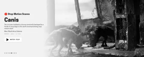
Featured film
Wide editorial feature pairing a light text panel and a large film image, with title, synopsis, metadata, and watch action.
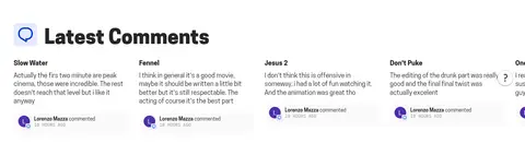
Comment feed
Compact multi-column recent comments with film titles, short review excerpts, and small commenter details.
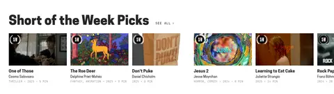
Film carousel rows
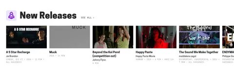
Discovery sections show film thumbnails, titles, creator names, genre or year metadata, and a small see-all link.
Signup band
Centered invitation on a solid #a77eff background, with supporting copy, signup action, and a small illustration.
Footer
Pale-gray footer with brand artwork, grouped platform links, utility links, and a low-emphasis maker credit.
Imagery · Film stills and poster-like thumbnails are the main visual material, shown as landscape crops in browsable rows. The featured film pairs a pale text panel with a large monochrome stop-motion image. Most artwork retains its own color and contrast rather than receiving a unified brand filter. A small illustrated accent appears in the violet signup area and should remain secondary to the message.
Use white space to separate editorial content rows.
Set headlines and film copy in Cooper Hewitt or a close substitute.
Use tracked uppercase mono text for navigation and controls.
Reserve violet for brand marks and important actions.
Keep buttons and inputs subtly rounded and lightly outlined.
✕ 不该做
Do not turn every film item into a raised card.
Do not introduce gradients absent from the measured page.
Do not use violet as the default background for content sections.
Do not apply a uniform color filter to film artwork.
Do not make metadata compete with film titles or imagery.
Do not add heavy shadows or oversized decorative borders.
给 AI 的提示词
想快速出一个同风格的新页面,把这段话连同 DESIGN.md 一起发给 AI。
Create a new page in Shortverse’s editorial film-discovery style. Use Gallery White (#ffffff) as the main canvas, Charcoal Ink (#262626) for text, and restrained gray surfaces such as Soft Screen (#f2f2f2) and Footer Mist (#eaeaea) to distinguish bands. Save Electric Violet (#6c00f4) and Violet Wash (#a77eff) for brand details and meaningful calls to action. Pair confident Cooper Hewitt-style headlines with JetBrains Mono navigation, uppercase labels, and buttons. Organize the content into broad, left-aligned sections with compact film metadata, horizontally browsable thumbnail rows, and generous whitespace between content groups. Let authentic film imagery provide color and texture. Keep components flat, with fine borders, minimal elevation, and subtly rounded controls; avoid gradients and card-heavy layouts.