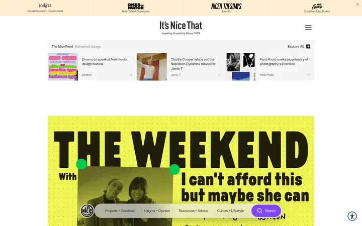
North star · Keep the page feeling like a warm, carefully edited magazine: ivory space, black structure, vivid editorial photography, and small handwritten violet accents.
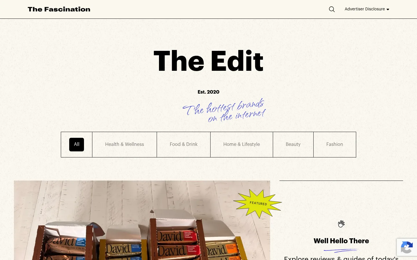
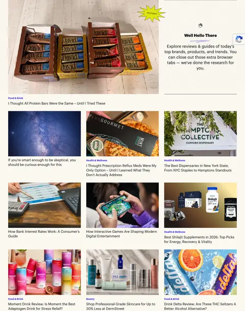
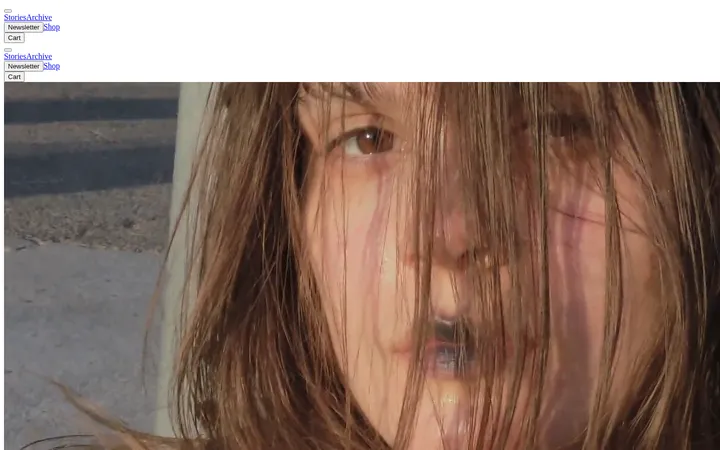
The page uses a consistent warm ivory canvas (#faf8ef) that lets the editorial photography supply most of the changing colour. Black (#000000) anchors the wordmark, headings, body copy, dividers, and the selected category control; violet-blue accents identify category links and handwritten flourishes. Graphik provides compact, confident sans-serif typography for navigation, story titles, and metadata, while Qwitcher Grypen adds an expressive handwritten note beside category headings and the hero title. The opening archive view centers a large masthead and category selector above a featured-story split, then transitions into three-column image-and-caption feeds. Long, full-width category bands repeat with fine black rules and generous breathing room between them. Images remain rectangular and editorial rather than heavily framed. The overall strategy is restrained: rely on strong alignment, repeatable feed structure, and restrained accent colour instead of decorative cards or deep shadows.
Primary sans-serif for the masthead, navigation, story headlines, metadata, and controls.
Aa 设计
Qwitcher Grypen
网络字体 · 字重 400 · 占比 4%
免费替代:Caveat
Handwritten display flourishes beside the archive masthead and lifestyle category headings.
角色
示例
字号
字重
行高
字距
特大标题
Bold masthead and prominent editorial display text.
The Fascination
96px
700
1
0
一级标题
Handwritten archive hero title or expressive page heading.
The Fascination
60px
400
0.55
0
二级标题
Handwritten category-heading flourish.
The Fascination
48px
400
0.55
0
三级标题
Bold category titles and featured editorial headings.
The Fascination
30px
700
1
0
四级标题
Story-card titles and secondary editorial headings.
The quick brown fox 敏捷的狐狸
24px
400
1.33
0
正文
Prominent article descriptions and featured-story supporting copy.
The quick brown fox 敏捷的狐狸
20px
500
1.2
0
辅助文字
Compact category labels and article metadata.
The quick brown fox 敏捷的狐狸
14px
700
2.19
0
按钮
Category controls and newsletter submission action.
The quick brown fox 敏捷的狐狸
16px
500
1.5
0
链接
Story titles, category links, and archive navigation.
The quick brown fox 敏捷的狐狸
20px
500
1.2
0
间距与布局
基准单位 8px · 密度:宽松
32px版块间距
32px元素间距
24px卡片内边距
1344px内容最大宽度
8px
16px
20px
22px
24px
28px
32px
48px
64px
80px
The archive sits within a centered content area measured at a 1344px maximum width, with a spacious overall density. A centered masthead and horizontal category selector lead into a two-column featured-story area; subsequent category feeds use three columns of image-led article cards. Sections repeat down the page with thin horizontal dividers, left-aligned headings, and consistent gaps. Preserve broad outer margins and clear separation between the hero, pagination, category feeds, and footer.
圆角与层次
按钮 · 6px
链接 · 6px
hairline · other
sm · other
The interface is predominantly flat: ivory canvas, black hairline dividers, and rectangular images establish structure without raised cards. Measured article cards use thin black borders in some instances, but the page imagery shows clean, open feed layouts. Avoid prominent shadows; keep layering limited to the featured image and its small burst-style label.
组件
下面的预览按实测的按钮、输入框、徽标、卡片样式重建(字体用替代字体)。
Archive masthead
Centered bold Graphik title, small establishment note, and a short handwritten violet tagline on the ivory canvas.
Category selector
One outlined horizontal strip of category cells; the selected All control is black with white text and a 6px measured radius.
Featured story split
Large lead article image beside a ruled editorial introduction, with a small bright featured badge and linked category/title.
Article feed card
Rectangular story image followed by compact violet category metadata and a black Graphik headline.
Category feed section
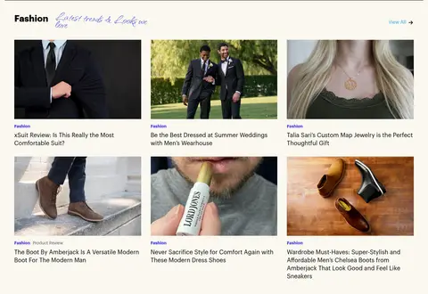
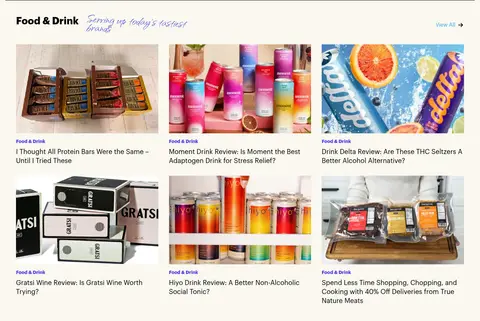
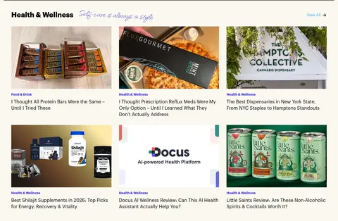
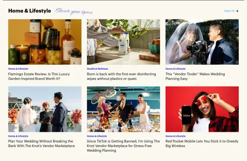
Left-aligned bold category title, violet handwritten phrase, View All link, divider, and a three-column story grid.
Pagination
Compact centered page links separated from the lead archive feed by thin horizontal rules.
Newsletter footer
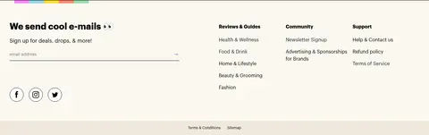
Signup prompt and email form sit beside compact link columns on the same warm canvas, with a subdued lower footer band.
Imagery · Photography is the main source of colour and variety: product packages, people, lifestyle scenes, and editorial environments appear in rectangular crops. The lead feature receives a larger image than the feed cards, while supporting stories use a consistent three-column rhythm. Keep images bright and legible, without adding heavy overlays or decorative frames. The handwritten flourishes are typography, not a replacement for article photography.
Anchor text, dividers, and selected controls with #000000.
Reserve violet accents for category links and short handwritten flourishes.
Lead with a featured editorial image before the smaller story grid.
Repeat the three-column feed pattern consistently across category sections.
Use thin rules and generous whitespace to distinguish sections.
✕ 不该做
Do not introduce saturated section backgrounds.
Do not turn every story into a rounded, shadowed card.
Do not use handwritten type for article titles or long copy.
Do not let accent colours compete with the photography.
Do not replace the category feed with a uniform product-commerce grid.
Do not crowd the masthead or category selector with extra controls.
给 AI 的提示词
想快速出一个同风格的新页面,把这段话连同 DESIGN.md 一起发给 AI。
Build a new editorial archive page in The Fascination’s style. Use Archive Ivory (#faf8ef) as the canvas and Editorial Ink (#000000) for the wordmark, headings, story titles, controls, and thin dividers. Use Story Violet (#4c40e0) sparingly for category labels and short handwritten flourishes; keep the measured minor accents (#2ea3f2, #9333ea, and #454ad3) incidental rather than dominant. Set primary interface text in Graphik or a close sans-serif substitute, with Qwitcher Grypen-style script reserved for brief display notes. Center the masthead and outlined category selector, then give one story a larger split-layout feature before repeating three-column image-and-caption feeds. Separate category bands with fine rules and generous spacing. Keep photography rectangular and vivid, and avoid heavy shadows or card decoration.