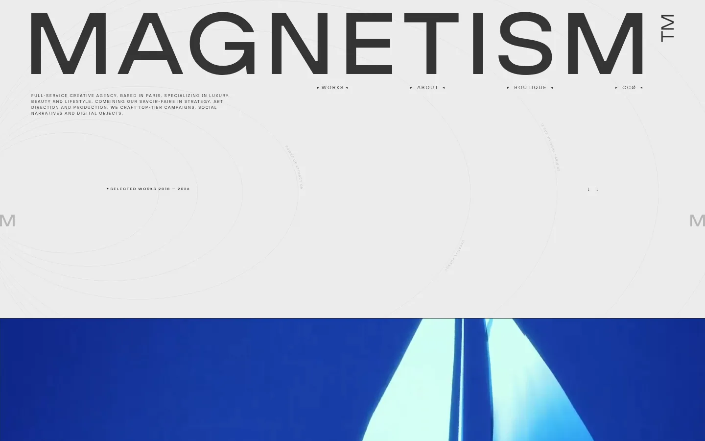
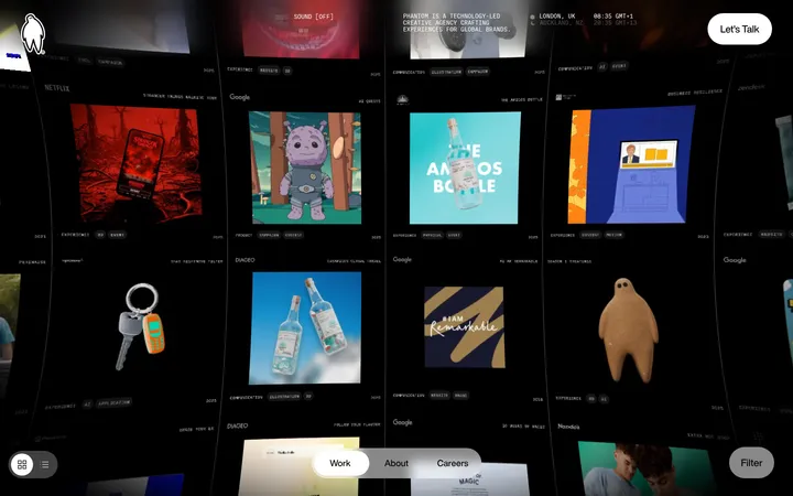
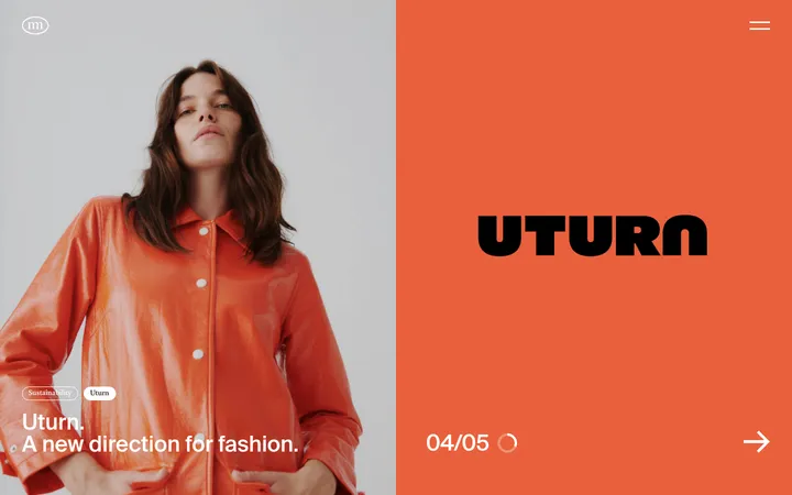
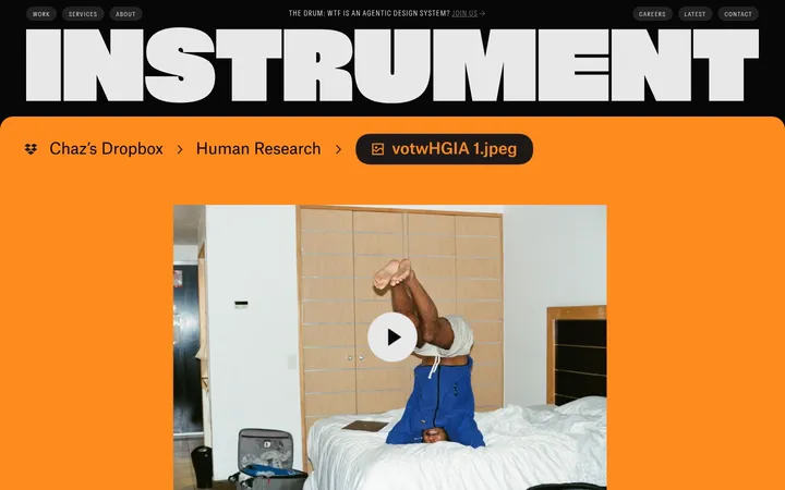
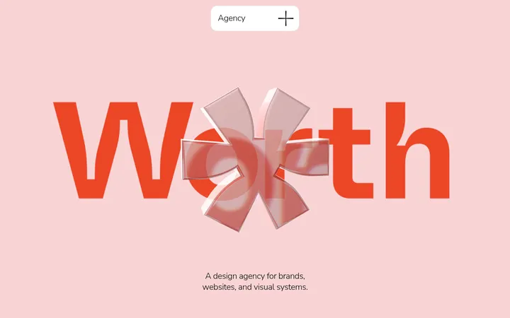
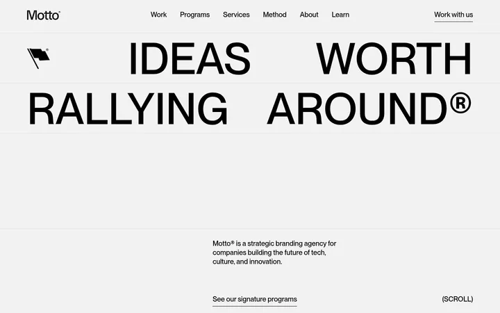
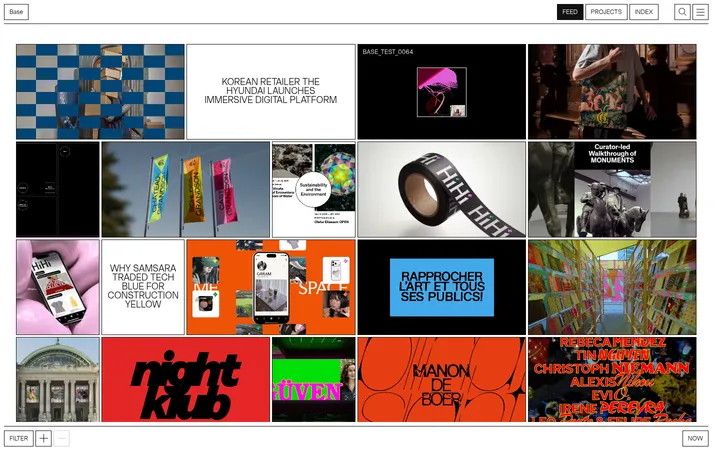
North star · Keep the interface quiet and typographic so full-bleed client work becomes the page’s visual event.
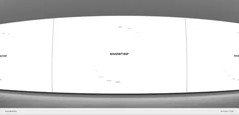
The page uses a pale grey canvas (#ececec) as a continuous backdrop, with near-black (#222222) typography providing the main contrast. Dark charcoal (#343434) appears in subdued interface or inverse contexts, while light grey (#cccccc) is reserved for delicate rules and separators. The visual identity is intentionally quiet: the bright blues, warm tones, and other saturated hues belong to client imagery rather than the agency’s core palette. TT Hoves Pro Trial carries the oversized, widely tracked uppercase wordmark and compact labels; NeueMontreal provides a softer voice for selected headings. A wide, open masthead leads into a sequence of full-bleed project images and video, interrupted by fine caption bands. The overall page stays flat and spacious, with generous vertical gaps and minimal container decoration. Lower sections return to small editorial text, ruled project rows, and an open, restrained footer.
Wordmark, navigation, labels, captions, and most body copy.
Aa 设计
NeueMontreal
网络字体 · 字重 400 · 占比 5%
免费替代:DM Sans
Selected secondary headings, providing contrast to the dominant geometric sans.
角色
示例
字号
字重
行高
字距
一级标题
Large uppercase masthead or primary display statement.
The quick brown fox 敏捷的狐狸
27px
400
1
0.22em
二级标题
Secondary editorial heading, such as a section introduction.
The quick brown fox 敏捷的狐狸
24px
400
1.5
0
三级标题
Uppercase project or section title.
The quick brown fox 敏捷的狐狸
20px
400
1.5
0.1em
正文
Agency description and supporting project or service copy.
The quick brown fox 敏捷的狐狸
14px
300
1.5
0
辅助文字
Tiny uppercase labels beneath project imagery.
The quick brown fox 敏捷的狐狸
10px
400
1
0.22em
导航
Prominent uppercase primary navigation.
The quick brown fox 敏捷的狐狸
27px
400
1
0.22em
眉题
Small uppercase section markers and introductory labels.
The quick brown fox 敏捷的狐狸
10px
400
1
0.22em
间距与布局
基准单位 8px · 密度:适中
64px版块间距
—元素间距
—卡片内边距
1312px内容最大宽度
8px
12px
14px
16px
24px
32px
36px
48px
64px
80px
180px
A wide desktop canvas uses a measured page maximum of 1312px, with content aligned to a consistent outer frame. The masthead is spacious and asymmetrical: an oversized wordmark dominates, while compact introductory copy and navigation sit beneath or alongside it. Selected work follows as a long, single-column sequence of full-bleed media, with compact label bands and occasional supporting portfolio tiles. Large measured section gaps create deliberate pauses. The lower project list and footer remain open and editorial rather than card-based.
圆角与层次
没有测到阴影:页面是扁平的,层次靠底色和描边区分。
The measured interface is flat, with no recurring shadows, gradients, or rounded card treatment. Separate content through whitespace and thin light-grey rules rather than raised containers. Media can visually layer through cropping and full-bleed placement, but the surrounding page remains calm and unembellished.
组件
下面的预览按实测的按钮、输入框、徽标、卡片样式重建(字体用替代字体)。
Masthead
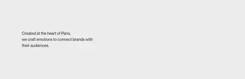
Oversized uppercase Magnetism wordmark on the pale canvas, supported by concise agency copy and compact navigation.
Primary navigation
WORKS, ABOUT, BOUTIQUE, and CCØ appear as spaced, tracked uppercase links without button styling.
Featured project
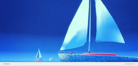
Full-bleed image or video followed or accompanied by a narrow label band naming the work category and client.
Portfolio tiles
Supporting client work uses paired image tiles with fine dividers and small uppercase captions.
More projects list
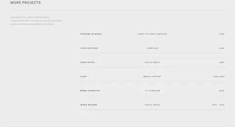
Editorial project rows align project name, work type, and year, using hairline separators instead of cards.
Footer
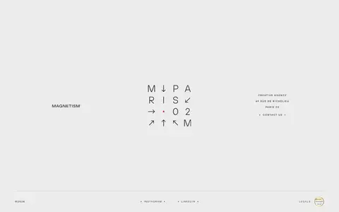
Open contact and social area with agency details, emblem or wordmark, and a fine bottom rule.
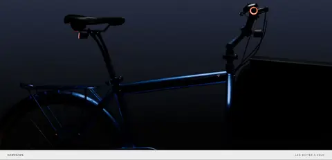
Imagery · Client work supplies the page’s color and visual drama: campaign photography, product imagery, film stills, and video. Project media is broad and immersive, often extending edge to edge, while supporting work appears in paired tiles. Keep image treatment faithful to each project rather than applying a unifying brand filter. Captions sit in restrained pale strips, allowing imagery to remain the focus.
Let oversized, tracked uppercase typography define the masthead.
Showcase portfolio work with wide, immersive media.
Separate content with whitespace and #cccccc hairlines.
Keep project captions compact and uppercase.
✕ 不该做
Do not turn client-image colors into the agency palette.
Do not add decorative gradients or shadows.
Do not place every project inside a rounded card.
Do not crowd the masthead or section transitions.
Do not use heavy backgrounds behind ordinary copy.
Do not make the navigation resemble prominent CTA buttons.
给 AI 的提示词
想快速出一个同风格的新页面,把这段话连同 DESIGN.md 一起发给 AI。
Build a new page in Magnetism’s restrained Paris-agency style. Use Gallery Mist (#ececec) as the continuous canvas and Studio Ink (#222222) for the wordmark, navigation, and primary copy. Reserve Charcoal Veil (#343434) for subdued contexts and Soft Rule (#cccccc) for fine separators. Use a geometric sans such as Manrope for widely tracked uppercase display text, navigation, and compact labels; use a quieter sans for selected editorial headings. Keep the layout broad, spacious, and asymmetrical, with a strong typographic masthead and generous section pauses. Make project photography or video the main source of color and visual energy; do not filter it into brand colors. Favor full-bleed media, small caption bands, simple ruled project rows, and a flat interface without ornamental cards, shadows, or gradients.