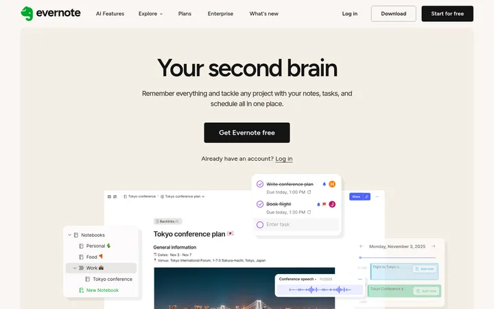
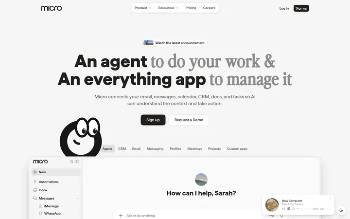
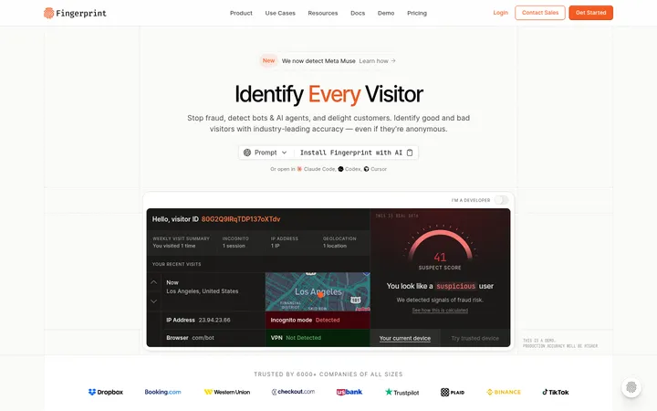
North star · Keep the interface quiet and spacious, using charcoal actions and type to frame—not compete with—the product showcase.
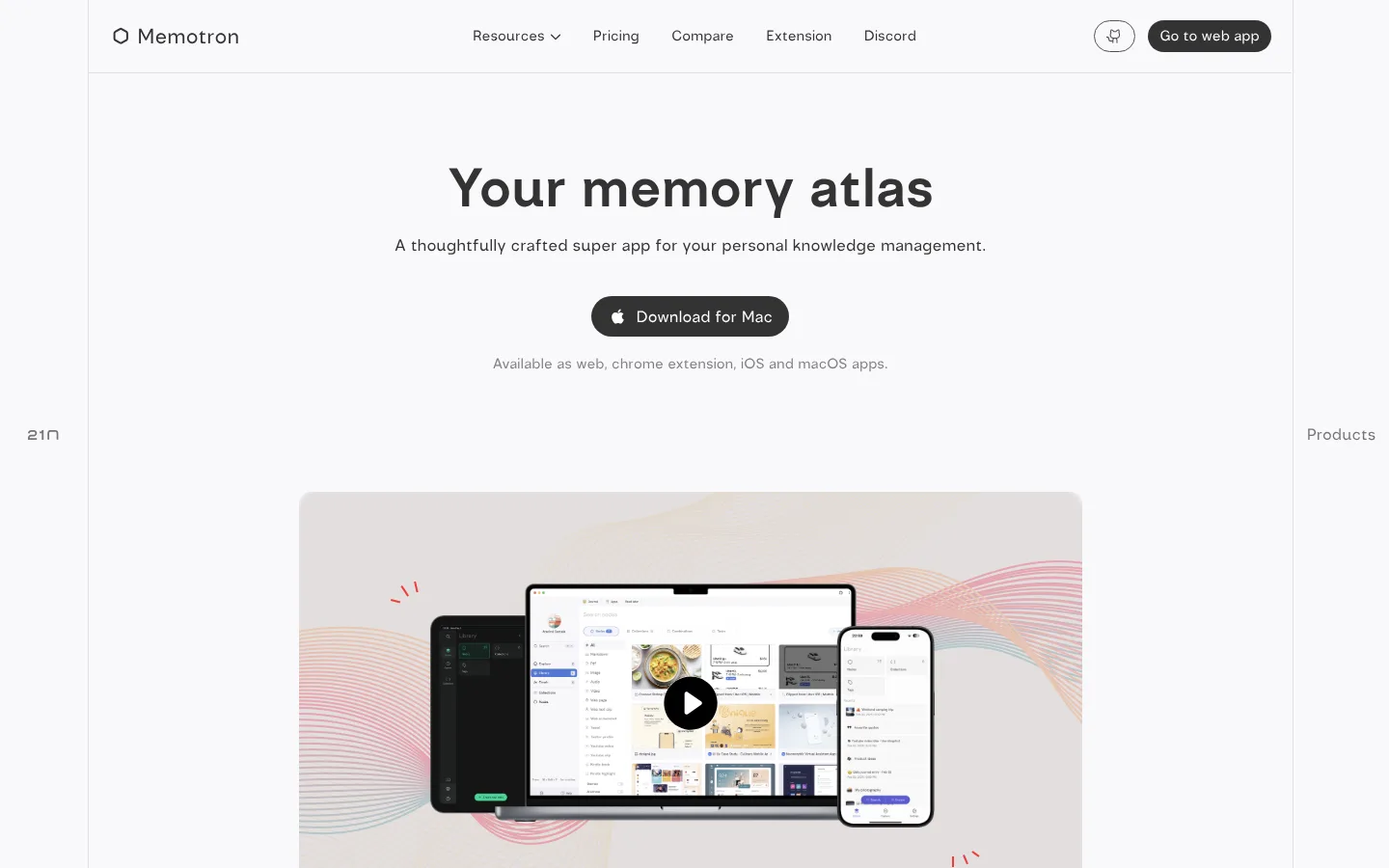
The page uses a pale, near-white canvas (#f9f9fb) as its dominant field, with dark charcoal (#333333) for headline, navigation, and primary actions. White and soft gray surfaces keep the interface tonal rather than colorful; muted gray text supports secondary copy, while fine cool-gray borders separate the header and outer frame. The measured font is Twenty One Native, used consistently from navigation through large, bold display text. The hero is centered, with a concise headline, supporting sentence, pill-shaped download button, and a muted availability note. Broad vertical breathing room makes the product mockup feel like a considered showcase rather than a dense feature listing. The device image introduces warm blush and pastel wave colors, but these belong to the product artwork, not the site's core interface palette. Rounded controls, subtle hairlines, and a flat presentation preserve a calm, lightweight character.
Site-wide type for navigation, display headline, body copy, captions, and buttons.
角色
示例
字号
字重
行高
字距
特大标题
Large bold hero headline, “Your memory atlas.”
Memotron
56px
700
1.07
0
一级标题
Regular-weight secondary hero or section heading.
The quick brown fox 敏捷的狐狸
22px
400
1.5
0
正文
Supporting product description beneath the hero headline.
The quick brown fox 敏捷的狐狸
17px
400
2.21
0
辅助文字
Small muted availability note and compact supporting labels.
The quick brown fox 敏捷的狐狸
15px
400
1.5
0
按钮
Download and web-app CTA labels.
The quick brown fox 敏捷的狐狸
16.5px
400
1.25
0
导航
Brand-adjacent navigation links and header items.
The quick brown fox 敏捷的狐狸
15px
400
1.5
0
间距与布局
基准单位 1px · 密度:适中
90px版块间距
4px元素间距
—卡片内边距
—内容最大宽度
4px
8px
13px
17px
21px
25px
33px
90px
95px
104px
167px
A narrow, centered site frame sits within the viewport, with a slim horizontal navigation bar at its top. The hero content is centered and stacked, followed by a broad gap before the product visual. Keep the page density low: use generous vertical breathing room and short text lines rather than adding dense grids. The measured data does not establish a page max-width, so match the screenshot's contained composition without imposing an invented fixed width. Side labels sit outside the central frame.
圆角与层次
按钮 · 9999px
导航 · 9999px
没有测到阴影:页面是扁平的,层次靠底色和描边区分。
The interface is largely flat, with no measured shadows or gradients. Use thin, cool-gray hairlines to define the navigation and page frame, and rely on whitespace and the product image for separation. Buttons are pill-shaped and filled charcoal; do not add pronounced card elevation.
组件
下面的预览按实测的按钮、输入框、徽标、卡片样式重建(字体用替代字体)。
Top navigation
A slim, framed header with the Memotron mark at left, centered resource links, and a rounded web-app CTA on the right.
Primary navigation links
Use regular Twenty One Native text in charcoal with understated spacing; keep the Resources item visually simple.
Web app CTA
A dark charcoal pill button with white label, matching the measured rounded navigation button.
Hero headline
A centered, bold display line in charcoal, followed by a single centered sentence in regular weight.
Download CTA
A filled charcoal pill with white text and a small platform icon, centered below the hero copy.
Availability note
A short muted-gray caption beneath the download CTA, listing available platforms.
Product showcase
A large centered video-style product image with device mockups, pastel wave artwork, and a circular play affordance.
Imagery · The hero showcase is a framed product visual featuring a laptop, phone, and desktop interface arranged in front of soft pastel wave artwork. Treat it as a product-led image rather than a source for interface colors. Keep the devices grouped and legible, with the play control centered over the laptop display; avoid adding unrelated decorative imagery.
该做与不该做
✓ 该做
Use the near-white canvas as the dominant background.
Center the hero headline, supporting copy, and primary CTA.
Reserve charcoal for important text and filled actions.
Keep supporting copy visibly muted.
Give the product showcase ample breathing room.
Use pill-shaped buttons and subtle hairline borders.
✕ 不该做
Do not introduce a saturated interface accent palette.
Do not use the product artwork's pastel colors as page-wide UI colors.
Do not crowd the hero with extra navigation or copy.
Do not add heavy shadows or layered cards.
Do not make secondary text as prominent as the headline.
Do not invent fixed page dimensions or spacing values.
给 AI 的提示词
想快速出一个同风格的新页面,把这段话连同 DESIGN.md 一起发给 AI。
Build a new Memotron-style productivity page with a restrained, bright visual system. Use Soft Canvas (#f9f9fb) for the main field and Charcoal Ink (#333333) for headline, navigation, and primary actions. Use Clean White (#ffffff) and Mist Surface (#e8e8ea) only for quiet surface variation, Cool Hairline (#dfe2ec) for fine separators, and Quiet Gray (#808080) for secondary copy. Set the page in Twenty One Native or a close sans-serif substitute, with a bold display headline and regular body text. Keep navigation slim and framed, center the hero content, and leave generous space before a clear product showcase. Use rounded dark pill CTAs, minimal borders, and no pronounced shadows. Treat any pastel colors in device imagery as artwork, not interface palette.