North star · Keep the interface quiet and systematic so vivid cultural imagery, not decorative UI, carries the page.
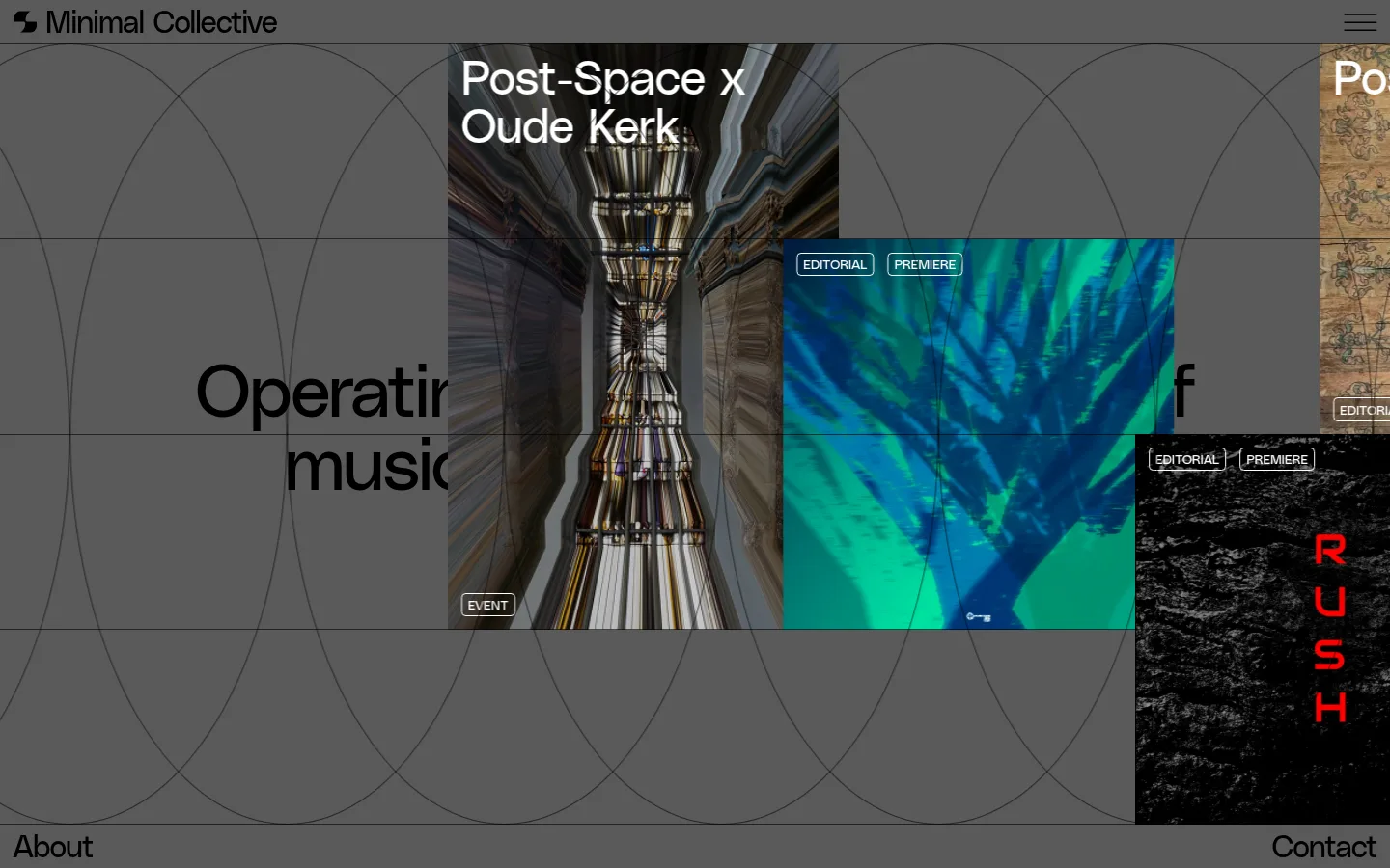
The page is built on a consistent mid-grey canvas (#5a5a5a), with black typography and white reversed text used where image contrast demands it. Black and white are structural rather than decorative: they define the wordmark, headings, metadata, outlined labels and occasional dark signup panels. PolySans is used throughout at regular weight. Large, tightly tracked display and heading styles contrast with compact uppercase navigation and metadata, giving the content an editorial cadence. A twelve-column opening composition introduces the platform with centered copy and overlapping event and music imagery. Lower content shifts into three-column editorial, event, store and project areas, separated by fine dark rules and generous vertical pauses. Images retain their own rich colors and are not treated as a brand palette. The interface stays flat: no shadows or gradients, with thin borders, small outlined labels and restrained rounded controls.
配色
点色块复制色值。用途说明来自对页面的实测位置(背景、文字、描边、按钮)与截图判读。
表层色
中性色
功能色
页面底色 · Canvas Grey表层 · Editorial Black表层 2 · Paper White主文字 · Paper White次要文字 · Editorial Black描边 · Rule Charcoal
All page typography, from display headings and editorial titles to uppercase navigation and metadata.
角色
示例
字号
字重
行高
字距
特大标题
Oversized introductory statement and prominent editorial messaging.
Minimal Collective
76.5px
400
1
-0.029em
一级标题
Primary hero statement and major page-level headings.
Minimal Collective
49.5px
400
0.9
-0.02em
二级标题
Editorial feature and section titles.
Minimal Collective
31.5px
400
1
-0.032em
三级标题
Secondary article, project and event titles.
The quick brown fox 敏捷的狐狸
27px
400
1
-0.037em
四级标题
Smaller card headings and supporting content titles.
The quick brown fox 敏捷的狐狸
22.5px
400
1
-0.044em
正文
Compact uppercase descriptions, metadata and labels.
The quick brown fox 敏捷的狐狸
13.5px
400
1
0
导航
Uppercase primary navigation and interface links.
The quick brown fox 敏捷的狐狸
13.5px
400
1
0
间距与布局
基准单位 2px · 密度:宽松
216px版块间距
2px元素间距
—卡片内边距
1094px内容最大宽度
1px
5px
6px
9px
14px
18px
The opening uses a twelve-column composition with centered introductory copy and media crossing the text field. Subsequent content settles into three-column grids, with fine rules defining cells and occasional wide editorial images spanning several columns. The measured page max width is 1094px. Section changes are marked by substantial vertical pauses, leaving the overall density spacious despite the amount of content. Text is generally left-aligned in content grids; the opening statement is centered.
圆角与层次
按钮 · 5px
导航 · 9999px
链接 · 5px
没有测到阴影:页面是扁平的,层次靠底色和描边区分。
The interface is flat, with no measured shadows or gradients. Thin charcoal rules structure the canvas into columns and section bands. Layering comes from overlapping media tiles and content crossing grid lines, not from card shadows. Buttons and category labels use fine outlines and restrained corner rounding.
组件
下面的预览按实测的按钮、输入框、徽标、卡片样式重建(字体用替代字体)。
Header navigation
A restrained top bar on the grey canvas, with a black wordmark at left and compact menu control at right; separated from content by a fine rule.
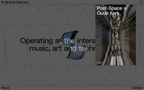
Hero media collage
Centered introductory statement over the grid, partially crossed by overlapping rectangular event and music images with small outlined category labels.
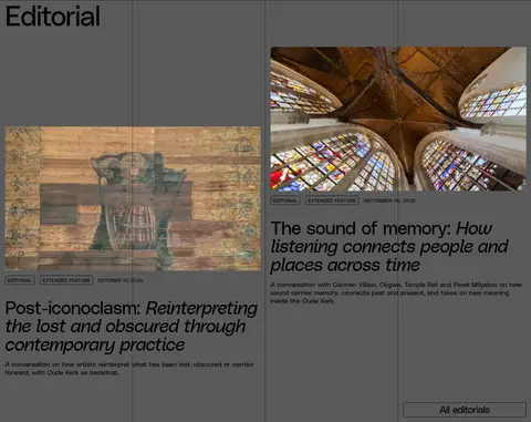
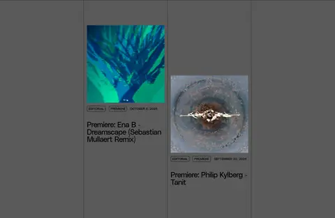
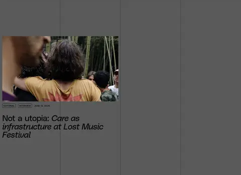
Editorial card
Image-led article tile with compact uppercase category and date metadata, followed by a black editorial title and short supporting copy.
Outlined category label
Small uppercase text inside a thin black or white border, used as editorial, premiere, interview or event metadata.
Section action
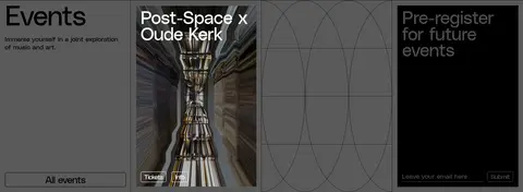
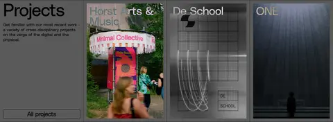
Simple outlined control with black text and border, used for actions such as All editorials and All projects.
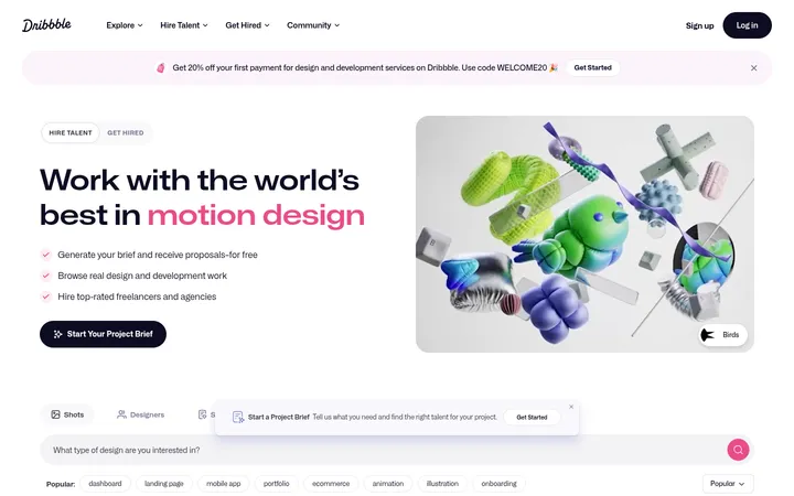
Signup panel
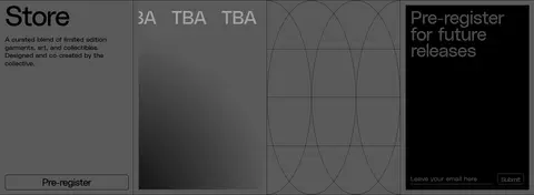
Black rectangular registration panel with reversed text, an understated email field and a compact submit control.
Grid dividers
Thin #242424 rules mark columns and section boundaries while leaving the grey canvas visible.
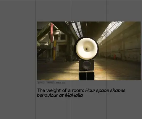
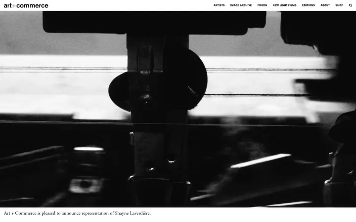
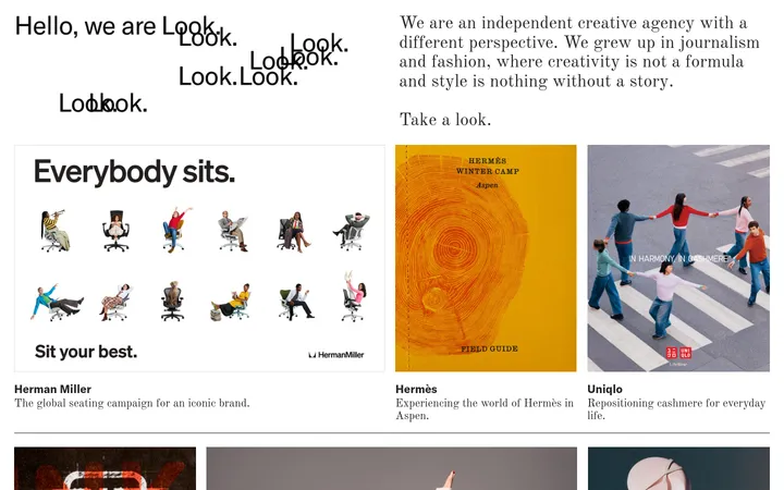
Imagery · Photography, video and artwork are the primary sources of color. The hero layers event and music-media tiles over the grey grid, while editorial cards use architectural, cultural and documentary imagery. Images are cropped into clear rectangular frames and may overlap text or grid cells. Preserve their native color and contrast; do not apply a uniform brand tint or confuse image colors with interface palette.
Reserve vivid color for editorial and event imagery.
Build content from clear columns and thin divider rules.
Use PolySans or a close regular-weight sans-serif substitute.
Keep navigation and metadata compact and uppercase.
Use black or white outlined labels according to contrast.
✕ 不该做
Don't add gradients, drop shadows or raised cards.
Don't introduce unmeasured accent colors into interface controls.
Don't tint all photography to match the grey canvas.
Don't replace the open grid with dense rounded cards.
Don't use heavy typography weights or loose display tracking.
Don't make every section the same image-and-text arrangement.
给 AI 的提示词
想快速出一个同风格的新页面,把这段话连同 DESIGN.md 一起发给 AI。
Build a new editorial culture page in the Minimal Collective style. Use Canvas Grey (#5a5a5a) as the full-page field, Editorial Black (#000000) for primary text and Paper White (#ffffff) only for reversed text or labels where contrast calls for it. Use Rule Charcoal (#242424) for fine grid dividers. Set all type in regular-weight PolySans, or a close free sans-serif substitute; keep display headings tightly tracked and navigation and metadata compact and uppercase. Compose sections on a clear column grid, with generous vertical pauses and mostly flat surfaces. Let native-color photography, artwork and video provide the visual variety. Prefer rectangular image crops, small outlined category tags, restrained outlined actions and occasional black signup panels. Avoid shadows, gradients, ornamental decoration and invented interface colors.