Open Collective以明亮简洁的页面、醒目的深蓝文字和亲切的手绘插画,呈现开放透明的财务协作平台。首页依次说明服务对象、平台治理背景,并用影响力数据建立信任。
North star · Use generous white space, confident navy headlines, and human, transparent financial storytelling without letting decorative artwork overtake the content.
The page is built on a near-white canvas, with deep navy reserved for the main headline and prominent pill-shaped calls to action. Dark slate and muted blue-gray carry navigation, body copy, and supporting labels, while pale gray-blue appears in the footer and restrained borders divide controls and cards. Inter provides a consistent, modern voice: a large, heavy, tightly tracked centered hero headline contrasts with calm, readable paragraphs and compact navigation. The layout uses generous vertical breathing room and centered content, then shifts into two audience cards, a stewardship introduction, a multi-column collective directory, and a softly tinted impact panel. The hero combines a finance-interface illustration with a human hand-drawn figure, adding warmth without disrupting the restrained palette. Hairline borders and rounded card edges define components; shadows are subtle rather than a defining visual effect. Colorful collective artwork and soft section textures are supporting content, not the core brand palette.
Primary page headline and prominent top-level title.
Open Collective
60px
700
1
0
二级标题
Centered section headings, including impact and audience sections.
Open Collective
40px
700
1.5
0
三级标题
Card titles and supporting section-level headings.
Open Collective
32px
700
1.5
0
四级标题
Smaller introductory or descriptive headings.
The quick brown fox 敏捷的狐狸
20px
400
1.4
0
正文
Paragraphs describing the platform, collectives, and impact.
The quick brown fox 敏捷的狐狸
16px
400
1.63
0
辅助文字
Compact supporting labels and footer details.
The quick brown fox 敏捷的狐狸
14px
400
1.43
0
按钮
Pill-shaped primary and secondary action labels.
The quick brown fox 敏捷的狐狸
16px
500
1.5
0
导航
Header navigation and utility links.
The quick brown fox 敏捷的狐狸
16px
500
1.5
0
链接
Prominent bold editorial or stewardship links.
Open Collective
32px
700
1.5
0
间距与布局
基准单位 8px · 密度:适中
64px版块间距
8px元素间距
32px卡片内边距
1280px内容最大宽度
4px
8px
10px
12px
16px
24px
30px
32px
40px
48px
64px
A comfortable, centered long-form homepage uses a measured maximum content width of 1280px and a 12-column-style rhythm expressed through single-column hero content, paired audience cards, three-column collective cards, and a three-column stats arrangement. Sections are separated by generous vertical space, with the hero headline and introduction centered. The footer becomes a multi-column utility area. Keep density low, align card content consistently, and let full-width section treatments frame narrower inner content.
圆角与层次
按钮 · 9999px
卡片 · 12px
链接 · 12px
md · card, other
The overall interface is mostly flat, with thin gray-blue borders defining cards and controls. Rounded card corners and pill-shaped buttons soften the geometry. A measured medium shadow appears on some cards, but the page’s screenshot reads primarily through white space, borders, and tonal section treatments rather than strong elevation.
组件
下面的预览按实测的按钮、输入框、徽标、卡片样式重建(字体用替代字体)。
Header navigation
Compact horizontal header with the Open Collective mark, centered navigation and search, plus a navy pill Sign Up action and an outlined Log In control.
Hero introduction
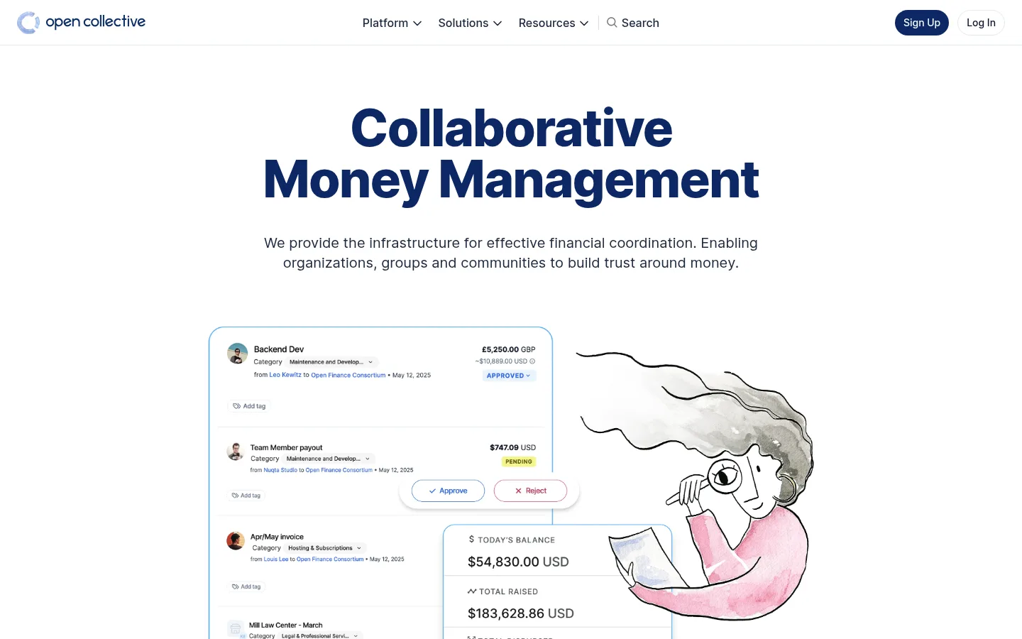
Centered, heavy navy headline above concise centered body copy, followed by a large financial-interface illustration with a hand-drawn human figure.
Audience choice cards
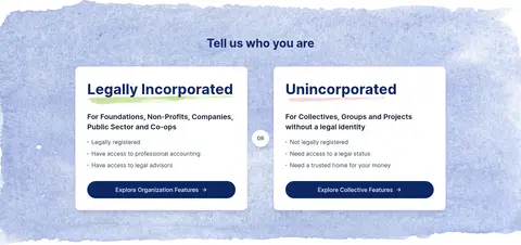
Two side-by-side audience cards on a softly textured band, each with a bold title, short descriptor, bullet points, and a navy pill CTA.
Stewardship directory
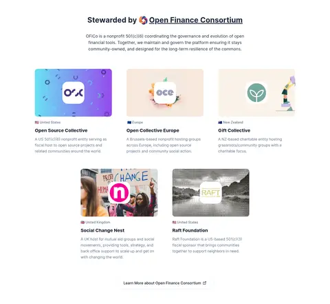
Centered governance introduction followed by collective and organization cards, using image-led thumbnails, location labels, titles, and short descriptions.
Impact panel
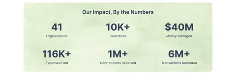
Softly tinted panel with a centered heading and six prominent metrics arranged in three columns across two rows.
Footer
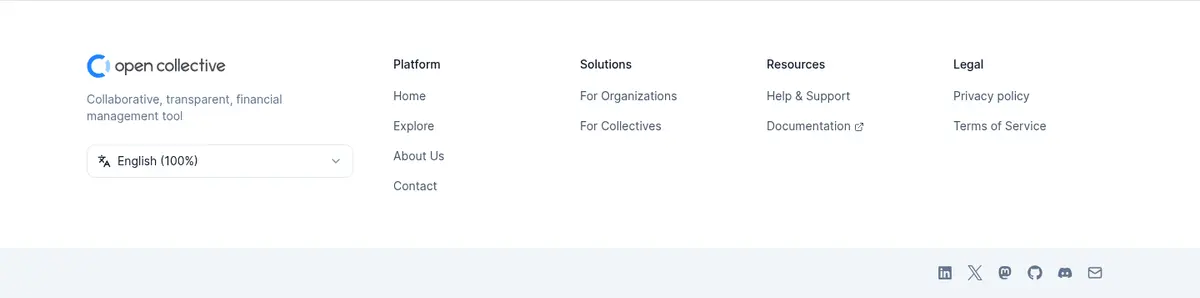
Pale footer surface with brand summary, language control, grouped platform and resource links, legal links, and compact social icons.
Imagery · The hero pairs a product-interface illustration of financial activity with a hand-drawn person, mixing crisp UI details and soft, human linework. Collective cards use distinct organization artwork and logos; these images introduce brighter colors that belong to their subjects rather than the core brand palette. A softly textured blue section band and pale green impact treatment add restrained visual variation.
Keep the main canvas white and leave generous breathing room around content.
Use Collective Navy #0c2764 for key headings and primary pill CTAs.
Use Inter consistently and reserve heavier weights for clear hierarchy.
Center the hero and major section introductions.
Use thin #e2e8f0 borders to define controls and cards.
Treat bright artwork colors as illustration or organization-specific accents.
✕ 不该做
Do not add a strong gradient or dark page-wide background.
Do not let decorative imagery compete with the hero message.
Do not use heavy shadows as the primary way to separate sections.
Do not turn the supporting copy into dense, tightly packed blocks.
Do not mistake organization artwork colors for core brand colors.
Do not replace rounded CTAs with sharp-cornered buttons.
给 AI 的提示词
想快速出一个同风格的新页面,把这段话连同 DESIGN.md 一起发给 AI。
Build a new Open Collective-style page with a bright, spacious canvas in Gallery White #ffffff and a clear, centered content hierarchy. Use Inter throughout, with a bold, prominent headline in Collective Navy #0c2764 and readable supporting text in Midnight Ink #0f172b or Harbor Slate #62748e. Keep navigation compact; use rounded navy pill CTAs with Frost White #f8fafc text, and outline secondary controls with Quiet Divider #e2e8f0. Organize content into generous sections with centered introductions, flexible card grids, and occasional pale Cloud Blue #f1f5f9 surfaces. Use approachable hand-drawn or product-interface illustrations sparingly, keeping any vivid colors within the imagery. Favor thin borders and restrained shadows over heavy elevation, and finish with a structured, light footer.