North star · Use an editorial serif-and-sans hierarchy over a precise ruled grid, reserving dramatic darkness and blue gradients for media and product proof.
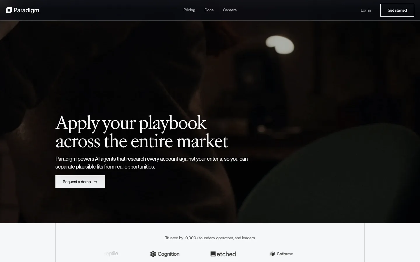
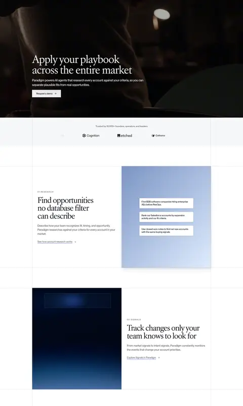
Paradigm balances a cinematic, nearly black hero with a long sequence of pale, finely divided content panels. The hero uses a full-bleed, low-light photographic video backdrop, placing a white serif headline and concise copy over the image; a light rectangular demo CTA provides the main contrast. Across the body, the cool near-white canvas and white surfaces create a calm foundation, with hairline gray borders defining the grid and separating content rather than relying on heavy cards. Atacama supplies the expressive, tightly tracked serif headlines, while Neue Montreal handles navigation, copy, labels, and controls with measured weights and compact tracking. Feature sections alternate text and product-interface imagery, often using soft blue gradients inside the illustrations. Spacious vertical intervals give each topic room, while consistent column alignment keeps the lengthy page structured. The dark footer returns to the hero’s tonal contrast and carries the same restrained typography.
Navigation, body copy, links, labels, and buttons.
Aa 设计
Atacama-b538b26c81f7b413
网络字体 · 字重 370 / 400 · 占比 7%
免费替代:Cormorant Garamond
Large editorial headlines and section titles.
角色
示例
字号
字重
行高
字距
一级标题
Hero headline; large two-line serif statement over dark media.
Paradigm
55px
400
1.15
-0.05em
二级标题
Editorial section headlines and prominent content titles.
Paradigm
40.5px
370
1.15
-0.06em
正文
Feature descriptions and explanatory paragraph copy.
The quick brown fox 敏捷的狐狸
16px
450
1.5
-0.01em
辅助文字
Compact supporting labels and interface details.
The quick brown fox 敏捷的狐狸
14px
500
1.25
-0.015em
按钮
Demo and signup CTA labels.
The quick brown fox 敏捷的狐狸
14px
500
1.6
-0.015em
导航
Small, restrained navigation labels.
The quick brown fox 敏捷的狐狸
12px
500
1.67
-0.01em
链接
Inline feature and resource links.
The quick brown fox 敏捷的狐狸
15px
400
1.39
-0.02em
眉题
Uppercase, letter-spaced section markers.
The quick brown fox 敏捷的狐狸
12px
500
1.67
0.14em
间距与布局
基准单位 8px · 密度:宽松
120px版块间距
16px元素间距
12px卡片内边距
1060px内容最大宽度
2px
6px
8px
12px
16px
20px
24px
32px
40px
120px
190px
A spacious, centered content system uses a measured 1060px maximum width and a recurring multi-column grid. The hero is full-bleed media with left-aligned copy; the following long-form content alternates text and product visuals across split sections. Thin vertical and horizontal rules make the grid visible without adding card-heavy structure. Wide section intervals create a deliberate scroll rhythm, while logo, integration, FAQ, and footer areas stay aligned to the same underlying columns. Overall density is spacious, with compact text inside broad areas of negative space.
圆角与层次
卡片 · 4px
inset · other
md · other, card
xl · card
The interface is mostly flat: thin gray rules, white surfaces, and aligned panels do the structural work. Product cards have restrained outlines and subtle measured shadows rather than pronounced floating layers. Gradient backgrounds belong inside mockups, while the hero image creates depth through darkness and photographic blur.
组件
下面的预览按实测的按钮、输入框、徽标、卡片样式重建(字体用替代字体)。
Hero navigation
Compact white-on-dark header with brand mark, centered navigation links, a login link, and a fine outlined signup control.
Media hero
Full-bleed dark video or photography with left-aligned Atacama headline, concise Neue Montreal copy, and a light rectangular demo CTA.
Logo strip
Centered trust statement and subdued customer marks on a pale band, framed by the page grid.
Alternating feature panels
Editorial text and product mockups swap sides across spacious sections, with thin dividers and selective gradient illustration backdrops.
Integration matrix
A ruled table-like display groups tool logos by category, keeping rows and columns visually light.
FAQ list
A pale section pairs a compact introductory block with vertically stacked questions and simple plus controls.
Dark footer CTA
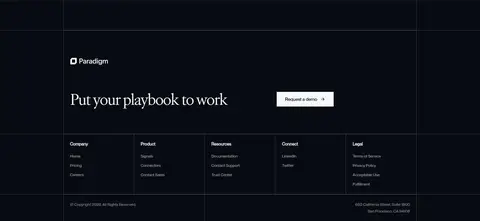
Near-black footer opens with a serif CTA and light demo button, then organizes company links in ruled columns.
Imagery · The hero is a full-bleed, low-light photographic video frame with softly blurred human and environmental detail, darkened to support white copy. Later sections use clean product-interface mockups and data cards, often placed over pale blue gradient fields or deep navy illustration panels. Media is framed as evidence of the product rather than decorative photography; logos and interface details remain small within the wider grid.
Pair Atacama-style serif headlines with Neue Montreal-style interface copy.
Keep the canvas cool and pale, with dark bands used selectively.
Align long-form sections and dividers to a consistent column grid.
Alternate feature copy and product visuals to sustain scroll rhythm.
Use measured gray borders instead of heavy card outlines.
Keep blue gradients inside product imagery rather than broad UI fills.
✕ 不该做
Do not turn the page into a uniformly dark interface.
Do not use saturated blue as a dominant page background.
Do not replace the fine ruled grid with chunky cards.
Do not center every section; preserve the left-aligned editorial structure.
Do not let product mockups overwhelm the headline and copy.
Do not add decorative shadows or rounded pills that disrupt the restrained geometry.
给 AI 的提示词
想快速出一个同风格的新页面,把这段话连同 DESIGN.md 一起发给 AI。
Build a new Paradigm-style AI SaaS page with an editorial, evidence-led feel. Use Cool Paper (#f6f7f8), Gallery White (#ffffff), and Soft Fog (#f0f0f2) for the main content, anchored by Midnight Ink (#080b12) dark bands and text. Use Rule Gray (#d7d7da) for delicate grid dividers. Set expressive large headlines in a light serif similar to Cormorant Garamond and use a clean sans such as Inter for navigation, copy, and controls. Create spacious, aligned sections with alternating text and product-interface visuals. Reserve Muted Periwinkle (#7b95c4), Ice Blue (#dfecff), and Signal Blue (#4c7de8) for restrained gradients inside mockups. Keep the hero cinematic and dark, the CTA rectangular and clear, and cards flat with subtle borders.