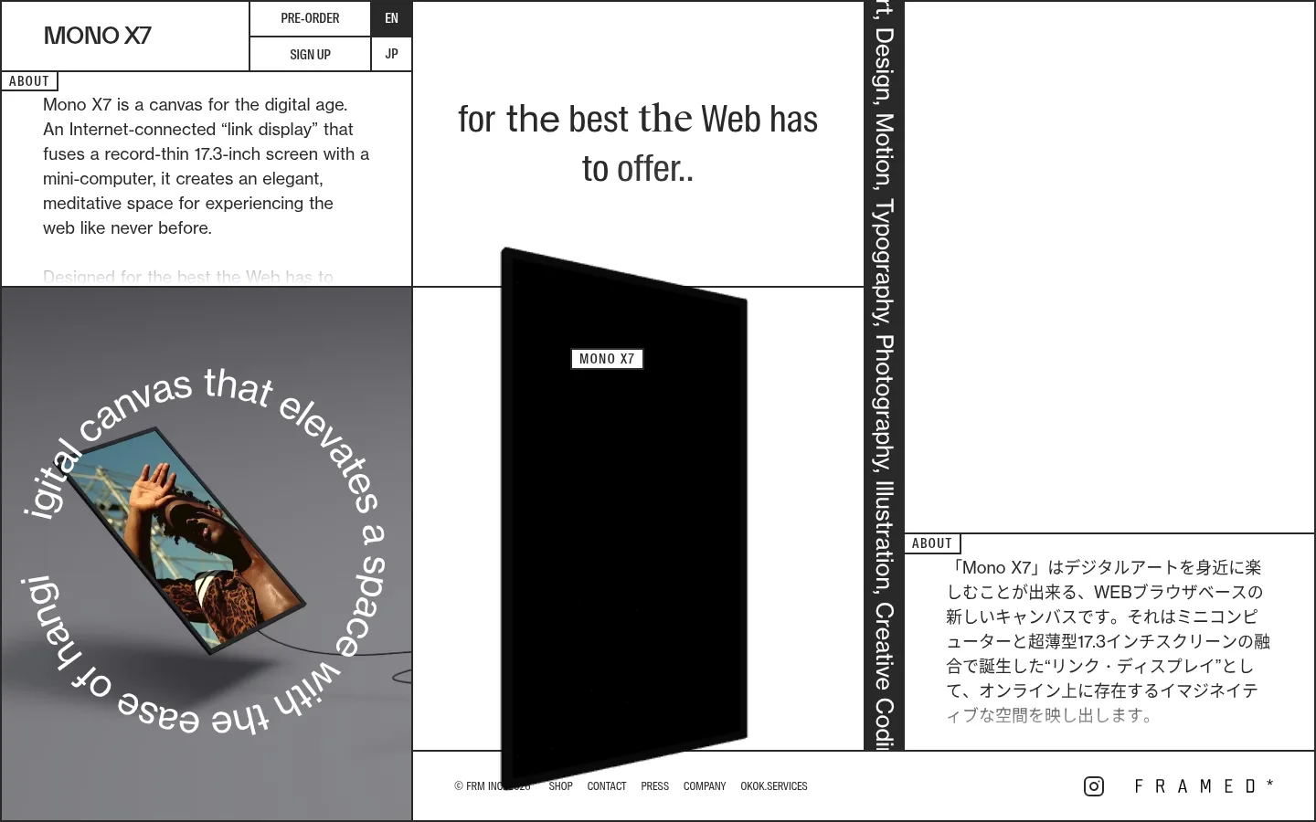
North star · Treat the page as a sharply ruled art exhibition: let a restrained white-and-ink grid frame the product and its imagery.
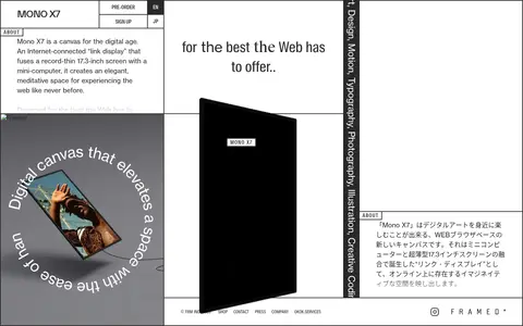
The visual identity is built from a measured two-colour foundation: Gallery White (#ffffff) fills the page, while Charcoal Ink (#292929) defines copy, outlines, and compact controls. The screenshot includes tonal greys and black within product and campaign imagery; these belong to the media, not the core interface palette. Typography pairs light, open NH sans-serif text with condensed S-Condensed labels, creating a contrast between calm product storytelling and tightly packed navigation. The layout behaves like a contemporary exhibition wall: an irregular, border-defined grid mixes product copy, Japanese text, art-led media, a narrow vertical text panel, and a central device image. Large white areas and visible rules keep each module distinct without cards or shadows. Spacing feels measured and comfortable, but the composition remains dense and deliberately unconventional. Use imagery as content within the grid rather than as decoration behind generic interface sections.
Light-weight body copy, supporting headings, product text, and close control.
Aa 设计
S-Condensed
网络字体 · 字重 300 / 500 · 占比 10%
免费替代:Roboto Condensed
Condensed navigation, uppercase labels, captions, buttons, and eyebrow text.
角色
示例
字号
字重
行高
字距
一级标题
Product title and prominent display heading.
FRAMED*
40px
300
1.34
0
二级标题
Supporting section headings and editorial statements.
FRAMED*
32px
100
1.25
-0.02em
三级标题
Compact uppercase display labels.
FRAMED*
28px
100
0.9
-0.05em
四级标题
Secondary product or content headings.
The quick brown fox 敏捷的狐狸
25px
300
1.27
0
正文
Product introduction and explanatory copy.
The quick brown fox 敏捷的狐狸
18px
300
1.5
0
辅助文字
Small uppercase captions and supporting labels.
The quick brown fox 敏捷的狐狸
12px
300
1.34
0
按钮
Pre-order, sign-up, and language controls.
The quick brown fox 敏捷的狐狸
14px
500
normal
0
链接
Compact uppercase navigation and footer links.
The quick brown fox 敏捷的狐狸
12px
300
1.34
0
眉题
Small uppercase section labels and product markers.
The quick brown fox 敏捷的狐狸
14px
500
0.9
0.1em
间距与布局
基准单位 1px · 密度:适中
50px版块间距
—元素间距
—卡片内边距
—内容最大宽度
3px
4px
5px
8px
12px
20px
23px
25px
36px
43px
45px
50px
Build an asymmetrical, single-page grid with varied-width panels rather than a centered column or repeated card system. Thin dark rules divide product copy, campaign imagery, Japanese-language text, and the central device showcase. Align text to the start of each panel; let media span substantial areas and allow a narrow vertical text strip to interrupt the composition. The page reads as comfortable but visually dense, with generous blank canvas balanced against tightly arranged modules. No measured maximum content width is available.
圆角与层次
没有测到阴影:页面是扁平的,层次靠底色和描边区分。
The interface is flat: measured shadows are absent, and the screenshot relies on sharp, thin dark rules to separate panels. Avoid rounded cards and soft elevation. The product image and layered campaign media create the depth; preserve their contrast against the clean white canvas without adding decorative shadows.
组件
下面的预览按实测的按钮、输入框、徽标、卡片样式重建(字体用替代字体)。
Grid rules
Use sharp, straight #292929 borders to divide adjacent editorial panels and frame compact controls.
Header controls
Place product identification beside tightly bordered pre-order and sign-up cells, with a compact EN/JP language selector.
About panel
Set an uppercase condensed ABOUT label above light, left-aligned product copy on the white canvas.
Product showcase
Feature a tall, black display image within a large open white panel, with a small outlined MONO X7 marker.
Campaign media panel
Use an image-led block with curved white lettering around a tilted screen; keep its tonal grey treatment inside the artwork.
Footer strip
Run small condensed utility links and brand marks along the bottom, separated from the composition by a fine dark rule.
Imagery · Mix product-focused video or imagery with editorial campaign visuals. The hero device appears as a tall black screen against white, while a separate image panel shows a person within a tilted display and curved surrounding lettering. Keep these media panels distinct from interface colours: their greys, photographic tones, and deep blacks are image content, not extra brand palette colours.
Use only #ffffff and #292929 for the measured interface palette.
Divide content with crisp, straight rules.
Compose an irregular grid with varied panel proportions.
Pair light editorial copy with condensed uppercase labels.
Let product and campaign media carry their own tonal range.
Preserve conspicuous open white areas.
✕ 不该做
Do not introduce unmeasured interface colours.
Do not make the page a centered stack of uniform cards.
Do not add gradients or decorative shadows.
Do not round panel corners or control borders.
Do not mistake image greys for brand palette colours.
Do not use oversized generic marketing buttons.
给 AI 的提示词
想快速出一个同风格的新页面,把这段话连同 DESIGN.md 一起发给 AI。
Create a new product page in the FRAMED* Mono X7 visual style. Keep the interface palette strictly to Gallery White (#ffffff) and Charcoal Ink (#292929); treat photographic greys and blacks as media content only. Build an asymmetrical, exhibition-like grid with varied panels, crisp straight rules, and generous white space. Use light NH-style sans-serif typography for product storytelling, paired with condensed uppercase labels and navigation. Make product imagery a focal point within the layout, not a generic background. Keep controls compact, square-edged, and clearly delineated. Avoid shadows, rounded cards, gradients, invented palette colours, and uniform card stacks. The result should feel like a carefully composed gallery wall: editorial and minimal, but with enough structural density to guide visitors through product information and supporting media.