North star · Let expansive landscape imagery introduce the story, then keep every informational section quiet, spacious, and finely ruled.
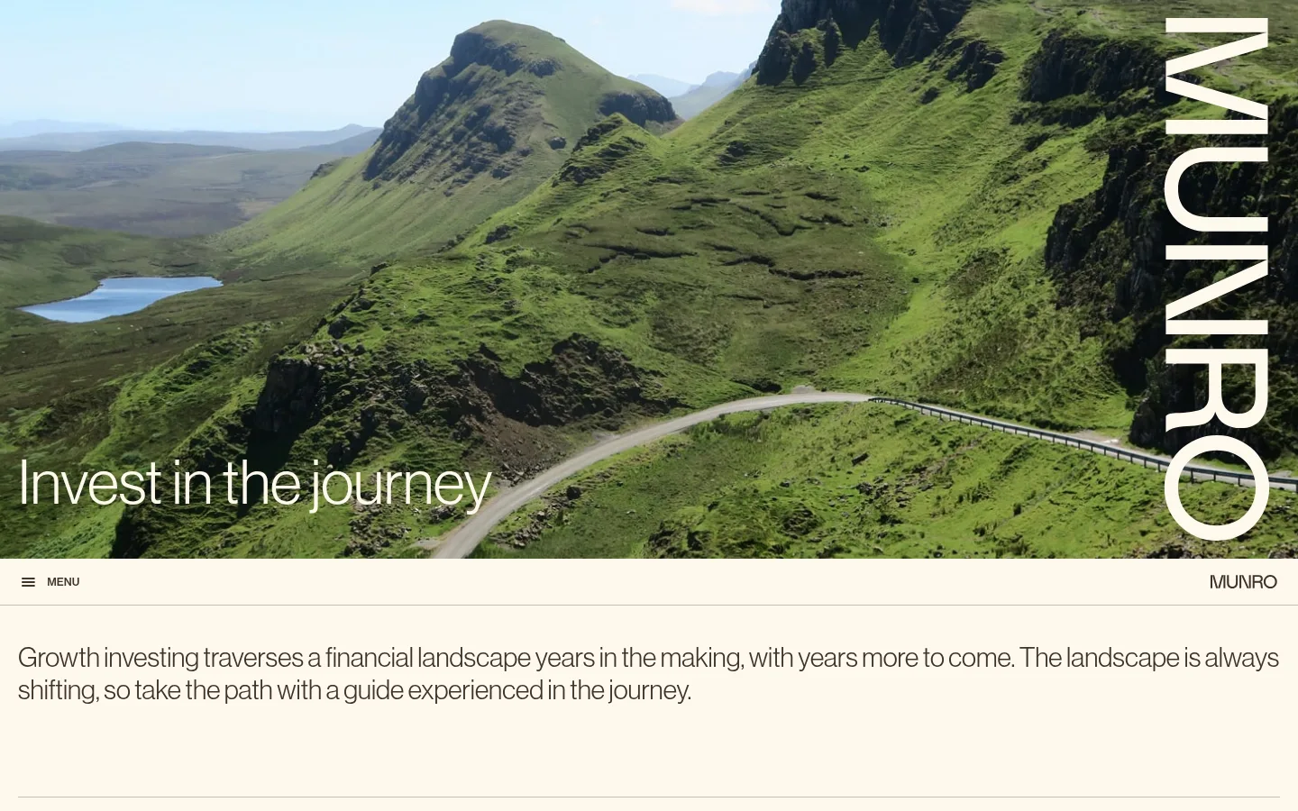
The page pairs a warm ivory canvas (#fff9ee) with dark brown text (#3f322a), creating a softer, less institutional feel than a stark white financial site. A full-width mountain-road photograph opens the experience; its saturated greens and blue sky provide the strongest colour, while oversized vertical Munro lettering and a small lower-left headline make the image feel like a campaign cover. Below, the interface returns to a quiet, single-colour field. Large, light Neue Haas Grotesk Display typography carries the editorial voice, with compact uppercase labels and restrained buttons providing navigation cues. Sections are separated by fine warm-gray rules rather than cards or shadows. The long scroll moves from brand story to fund information, areas of interest, and news, with ample blank space preserving a calm, considered pace. Small plum, teal, pale blue, and yellow accents appear sparingly; they should not overpower the ivory-and-brown identity.
Primary display, headings, body copy, navigation, captions, and links.
Aa 设计
neue-haas-grotesk-text
网络字体 · 字重 500 · 占比 5%
免费替代:Inter
Small uppercase button labels.
角色
示例
字号
字重
行高
字距
特大标题
Oversized hero or campaign-style display lettering.
Munro Partners
68px
400
1
0
一级标题
Primary page and section headline text.
Munro Partners
30px
400
1.2
0
二级标题
Secondary section and content headlines.
The quick brown fox 敏捷的狐狸
22px
400
1.09
0
正文
Introductory narrative and long-form supporting copy.
The quick brown fox 敏捷的狐狸
16px
400
1.5
0.013em
辅助文字
Small fund notes, dates, and legal details.
The quick brown fox 敏捷的狐狸
12px
400
1.17
0.008em
导航
Navigation labels and menu text.
The quick brown fox 敏捷的狐狸
22px
400
1.09
0
链接
Fund, topic, report, and news links.
The quick brown fox 敏捷的狐狸
16px
400
1.5
0
间距与布局
基准单位 4px · 密度:紧凑
40px版块间距
10px元素间距
—卡片内边距
1400px内容最大宽度
3px
4px
5px
6px
8px
10px
20px
40px
The page uses a broad desktop canvas, measured to a maximum width of 1400px, with left-aligned content and occasional multi-column areas. The hero image spans the viewport; following sections return to the warm canvas and are divided by thin horizontal rules. Content density is deliberately low, with long gaps around the who-we-are and fund areas. The fund area is more tabular and multi-column, while interest topics and news remain editorial rather than card-heavy. Maintain a compact component rhythm within sections, but preserve generous overall breathing room.
圆角与层次
按钮 · 2px
图片 · 15px
链接 · 15px
没有测到阴影:页面是扁平的,层次靠底色和描边区分。
The interface is predominantly flat: no measured shadows, raised cards, or prominent layered panels. Use thin warm-gray rules to define section boundaries and table rows, plus restrained outlined controls. Image composition provides the main depth; keep surfaces flush with the canvas and avoid floating-card effects.
组件
下面的预览按实测的按钮、输入框、徽标、卡片样式重建(字体用替代字体)。
Hero image
Full-width mountain landscape with a low-left headline and oversized vertical white Munro lettering along the right edge.
Menu strip
A slim ivory navigation band with a small menu icon and label on the left, brand wordmark on the right, and a fine lower rule.
Intro statement
Large, regular-weight dark-brown copy set left-aligned on ivory, followed by substantial open space and a horizontal separator.
Fund links
Editorial fund information and return figures with thin borders, compact notes, and links rather than elevated cards.
See more button
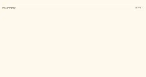
Small uppercase label in medium text weight, outlined with a 1px #c5bdb3 border, subtle 2px radius, and compact padding.
Topic links
Interest-area names presented as simple links, with occasional #ebe5da filled pill styling and a 15px radius.
News list
Latest updates arranged as a restrained editorial feed with dates, prominent headlines, and understated links.
Imagery · Use high-quality, full-bleed landscape photography as the defining brand image: a winding road crossing green mountain terrain, framed wide enough to read as a destination. Keep the photo natural and unembellished, with its own greens and sky blues supplying colour contrast. Place large white vertical brand lettering at the right edge and a light headline low on the left. Supporting sections should not introduce decorative illustration or 3D treatments.
Lead with authentic, expansive landscape photography.
Separate content with thin #c5bdb3 rules.
Use Neue Haas Grotesk-style typography with calm weights.
Keep generous open space between major content groups.
✕ 不该做
Do not turn every section into a bordered card.
Do not use pure white as the main canvas.
Do not let accent colours compete with the landscape.
Do not add shadows or floating UI layers.
Do not center all content or over-tighten the layout.
Do not treat photographic greens as the interface palette.
给 AI 的提示词
想快速出一个同风格的新页面,把这段话连同 DESIGN.md 一起发给 AI。
Build a new page in the Munro Partners visual style. Use Gallery Ivory (#fff9ee) as the main canvas and Walnut Ink (#3f322a) for primary text. Introduce the page with a wide, natural landscape photograph and restrained, large Neue Haas Grotesk-style typography. Keep navigation quiet and compact; use fine Pencil Rule (#c5bdb3) separators rather than cards or shadows. Structure content as spacious editorial sections with clear left alignment, occasional data columns, and small uppercase labels. Use Linen Stone (#ebe5da), Deep Eucalyptus (#004e4e), or Glacier Blue (#bfebfe) only as limited supporting accents. Preserve long stretches of breathing room, especially around section transitions. Keep controls understated, with thin outlines, small labels, and no decorative elevation.