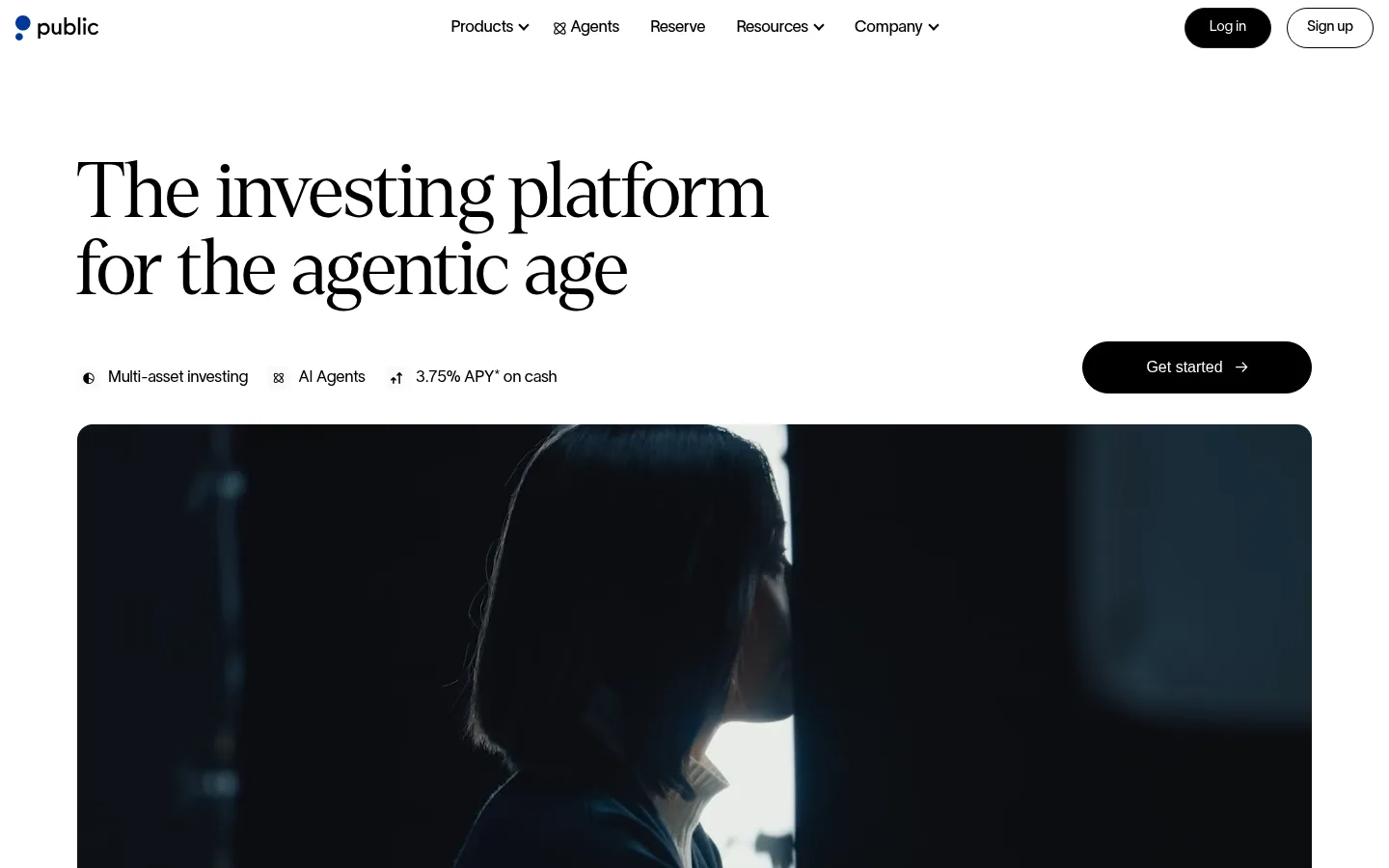
Public 以克制的编辑式排版、高对比黑白区块和细致的产品界面,展示覆盖多类资产的投资平台。宽松的白色版面与深色功能区交替,通过简洁导航和明确行动按钮平衡品牌叙事与金融产品信息。
North star · Let editorial serif headlines and spacious black-and-white layouts lead; use product imagery and restrained blue only to clarify the investing story.
The page uses Gallery White (#ffffff) as its main canvas, letting large Denton serif headlines create an editorial, confident first impression. Ink (#000000) anchors compact navigation, pill-shaped CTAs, text, and several full-width feature sections; the alternating black bands make product claims and security information feel distinct without adding a busy colour system. Inter carries most interface and body copy, while Invest Pro appears in selected headings and CTA labels. The layout moves between generous single-column storytelling, centered asset links, and multi-column product cards, with broad media panels and substantial white space separating content groups. Screenshots and interface mock-ups supply most of the visual detail; restrained blue accents are secondary rather than a dominant page-wide treatment. Pale neutral surfaces and fine borders organize cards and legal material while keeping the overall composition flat and legible.
Primary body copy, navigation, captions, and many compact interface labels.
Aa 设计
Invest Pro
网络字体 · 字重 400 / 500 · 占比 8%
免费替代:Inter
Selected product headings and CTA labels.
Aa 设计
Denton
网络字体 · 字重 300 · 占比 3%
免费替代:Instrument Serif
Large editorial hero and feature headings, including asset-category links.
角色
示例
字号
字重
行高
字距
一级标题
Oversized Denton hero headline introducing the investing platform.
Public
52px
300
1.11
0
二级标题
Large serif section headlines for feature and product narratives.
Public
48px
300
1.12
0
三级标题
Product or feature headings in Invest Pro.
The quick brown fox 敏捷的狐狸
24px
400
1.17
0
四级标题
Smaller feature and card headings in Invest Pro.
The quick brown fox 敏捷的狐狸
20px
400
1.2
0
正文
Main explanatory copy and product descriptions in Inter.
The quick brown fox 敏捷的狐狸
14px
400
1.42
0
辅助文字
Compact supporting labels, notes, and secondary content.
The quick brown fox 敏捷的狐狸
12px
400
1.5
0
导航
Header navigation and primary menu labels in Inter.
The quick brown fox 敏捷的狐狸
14px
400
1.5
0
链接
Small inline and card links, including learn-more actions.
The quick brown fox 敏捷的狐狸
11px
400
1.54
0
间距与布局
基准单位 8px · 密度:适中
32px版块间距
24px元素间距
—卡片内边距
1376px内容最大宽度
1px
2px
3px
4px
6px
8px
9px
12px
14px
16px
18px
20px
24px
32px
40px
56px
The page uses a measured maximum content width of 1376px, with the hero and video media spanning a broad centered container. The composition alternates between single-column editorial sections, a centered multi-line asset-category navigation, card-led feature grids, and black three-column product bands. Headings are often centered in feature sections, while trust and footer content align to the start. Section spacing is generous, with comfortable density; cards sit in light neutral groupings rather than tightly packed dashboard grids.
圆角与层次
按钮 · 9999px
卡片 · 16px
徽标 · 6px
链接 · 6px
md · card
xl · button
Most surfaces are flat, with whitespace and alternating black and white section bands doing the structural work. Cards use restrained outlines or pale backgrounds rather than heavy shadows; the measured card radius is 16px. The main CTA is a black pill, while occasional product imagery sits above a subtle card shadow. Thin dividers provide structure in dark trust sections.
组件
下面的预览按实测的按钮、输入框、徽标、卡片样式重建(字体用替代字体)。
Header navigation
Compact black Inter menu links across the top, with the Public mark at left and black login and outlined sign-up pills at right.
Primary CTA
Black, fully rounded button with white Invest Pro text; the measured Get started control uses a 100px radius.
Asset category links
Centered multi-line row of large Denton serif asset names, separated by small dot-like dividers and occasional compact yield badges.
Product feature cards
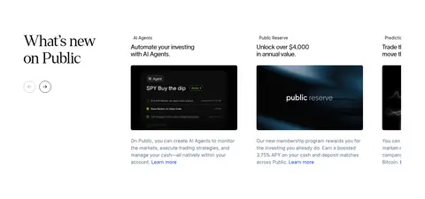
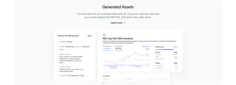
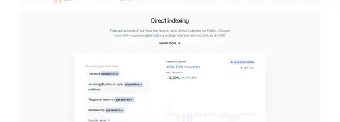
Light cards with concise heading and copy, a product screenshot, and a small learn-more link; measured card radius is 16px.
Dark feature band
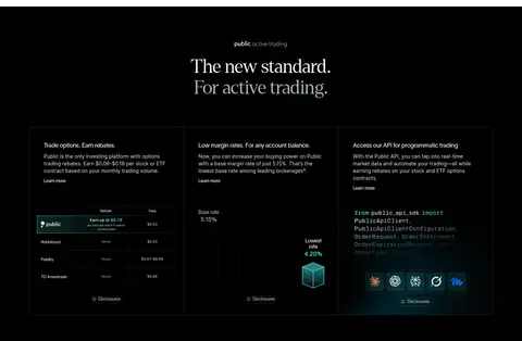
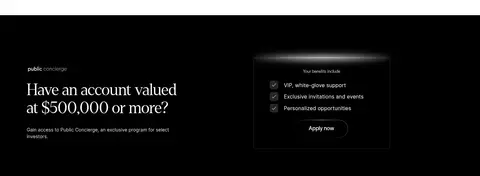
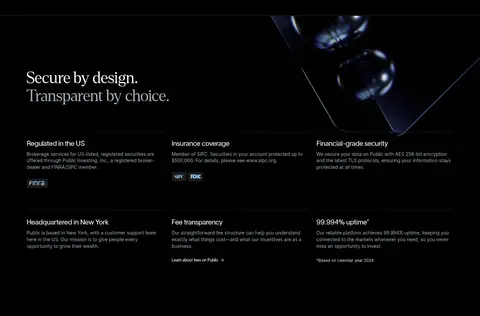
Full-width black section with light serif headline and aligned feature columns, fine outlines, product visuals, and compact links.
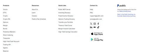
Trust and legal footer
White link directory above a pale legal-information band, with muted compact copy, divider lines, and sparse blue link accents.
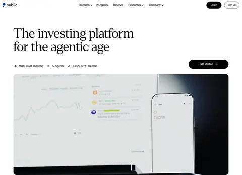
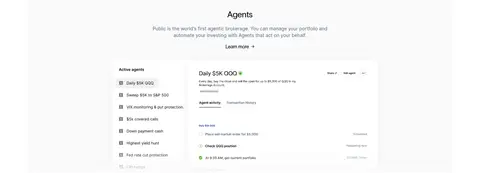
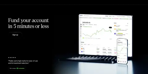
Imagery · Large, wide video and photographic panels anchor the hero and closing account-funding section. Product UI screenshots and interface mock-ups recur throughout the feature cards, giving the page a concrete platform-demo quality. The imagery is framed cleanly with rounded media corners and ample surrounding white or black space. Dark product visuals belong to the media itself; avoid treating their screen colours as the page palette.
Use Denton-style serif headlines for the hero and key editorial moments.
Keep the page canvas white and reserve black for text, CTAs, and select section bands.
Give large headlines and media generous surrounding whitespace.
Use Inter for readable navigation, body copy, and compact labels.
Show product interfaces in clean, restrained cards.
Use blue accents sparingly and only where the measured palette calls for them.
✕ 不该做
Do not make blue the dominant colour or use unmeasured colours.
Do not turn every section into a dark panel.
Do not replace the editorial serif headlines with generic heavy sans-serif display type.
Do not crowd the hero with extra controls or dense copy.
Do not add strong gradients or decorative shadows across ordinary cards.
Do not treat colours inside product mock-ups as core brand colours.
给 AI 的提示词
想快速出一个同风格的新页面,把这段话连同 DESIGN.md 一起发给 AI。
Build a new Public-style investing page with an editorial, high-contrast visual system. Use Gallery White (#ffffff) as the main canvas and Ink (#000000) for headlines, body text, pill CTAs, and selected full-width feature bands. Set large headlines in a light Denton-like serif, with Inter for navigation, body copy, and compact labels; use a restrained Invest Pro-like sans-serif for selected product headings and buttons. Keep the content centered in a broad max-width layout, alternating spacious single-column storytelling with clean product-card grids and occasional dark feature sections. Use pale Cloud Tint (#f1f4f7) for subtle surfaces and borders. Apply Signal Cobalt (#0027b3) sparingly. Feature genuine-looking investing UI imagery, preserve whitespace, and keep elevation understated.