North star · Keep the page bright, spacious, and operationally credible; use violet for guidance and reserve red for genuine urgency.
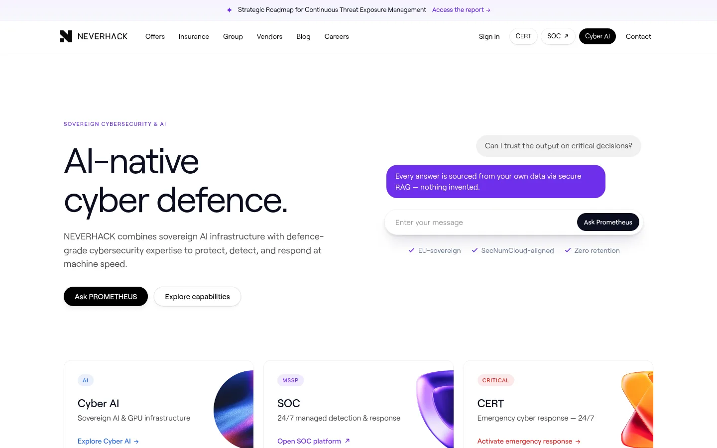
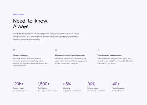
The page is built on a white canvas, with pale lavender-white bands distinguishing the defence-culture section and selected service cards. Ink-dark headings and muted grey body text keep a sober enterprise tone; violet highlights links, eyebrow labels, and AI-related details, while red is reserved for the urgent incident-response CTA. Roobert is used throughout, with regular-weight oversized headlines, compact uppercase eyebrows, and calm, readable body copy. A centered content frame and left-aligned text create consistent structure across the long page, while large vertical gaps separate its major chapters. The hero pairs a clear text proposition with a conversational AI interface; service and certification content uses cards and compact grids. Abstract, glossy 3D forms add colour in service tiles and the emergency-response panel without displacing the restrained palette. Rounded pill actions, fine borders, and light card shadows supply the interface’s limited depth.
Site-wide interface type: navigation, headings, body copy, buttons, badges, and links.
角色
示例
字号
字重
行高
字距
一级标题
Hero proposition and primary page headline.
NEVERHACK
52px
400
1.05
-0.025em
二级标题
Major section headings, including capabilities and culture.
NEVERHACK
32px
400
1.12
-0.02em
三级标题
Service card titles and secondary content headings.
The quick brown fox 敏捷的狐狸
24px
500
1.2
-0.015em
四级标题
Smaller subsection headings within service content.
The quick brown fox 敏捷的狐狸
22px
400
1.2
-0.015em
正文
Service descriptions, explanatory copy, and supporting paragraphs.
The quick brown fox 敏捷的狐狸
16px
400
1.6
0
辅助文字
Compact supporting descriptions and certification details.
The quick brown fox 敏捷的狐狸
15px
400
1.55
0
按钮
Pill-shaped primary and secondary action labels.
The quick brown fox 敏捷的狐狸
15px
500
1
0
导航
Main navigation labels and compact header links.
The quick brown fox 敏捷的狐狸
14px
400
1.5
0
链接
Inline calls to action such as Learn more and Explore Cyber AI.
The quick brown fox 敏捷的狐狸
16px
500
1.5
0
眉题
Uppercase section labels and compact category identifiers.
The quick brown fox 敏捷的狐狸
11px
500
1.5
0.12em
间距与布局
基准单位 4px · 密度:宽松
128px版块间距
6px元素间距
24px卡片内边距
1184px内容最大宽度
2px
4px
5px
6px
8px
10px
12px
14px
16px
20px
22px
24px
28px
32px
40px
48px
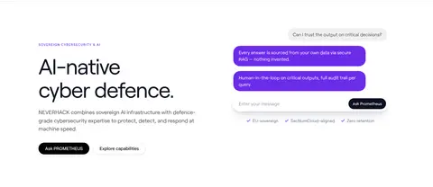
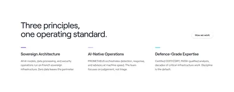
Use a centered content frame with a measured maximum width of 1184px. The hero is a two-column composition: left-aligned proposition and actions beside an AI conversation preview. Follow it with three service cards, then vary between multi-column principles and capability layouts and broad, full-width section bands. Major sections have generous separation; cards use consistent internal padding and restrained content density. Preserve the long-page rhythm and align headings, cards, and footer columns to a shared frame.
圆角与层次
按钮 · 9999px
卡片 · 12px
徽标 · 9999px
导航 · 9999px
链接 · 9999px
md · card
md · button
inset · card
hairline · other
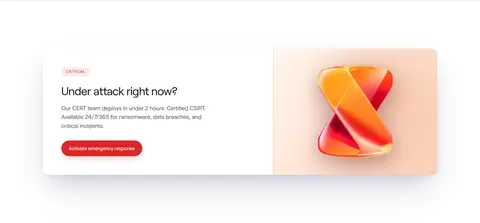
Most sections remain flat against white or pale lavender-white surfaces. Cards use fine light borders, subtle corner rounding, and soft, low-contrast shadows rather than heavy elevation. Black and red pill buttons have modest shadows, while the emergency illustration gains depth from its warm background and glossy form.
组件
下面的预览按实测的按钮、输入框、徽标、卡片样式重建(字体用替代字体)。
Primary black action
Black, white-label pill button with measured 15px medium Roobert type and compact balanced horizontal padding; used for Ask PROMETHEUS.
Critical response action
Red pill button with white text and a soft red-tinted shadow; reserve it for emergency activation.
Service cards
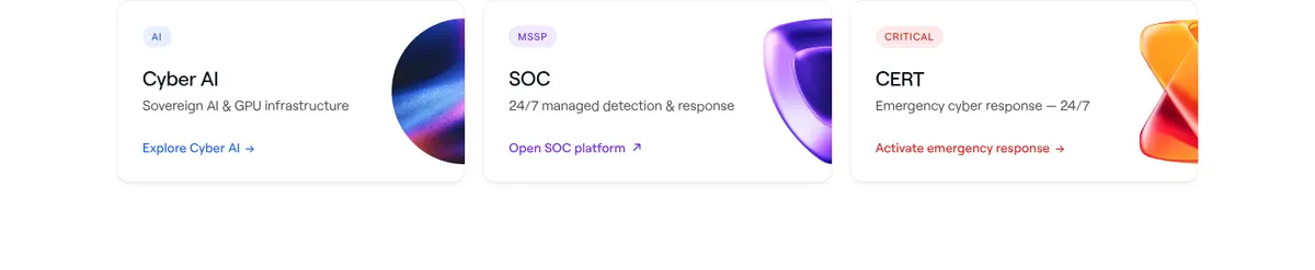
Three aligned service tiles introduce Cyber AI, SOC, and CERT, pairing a small category label and description with an image cropped toward the outer edge.
Capability panels
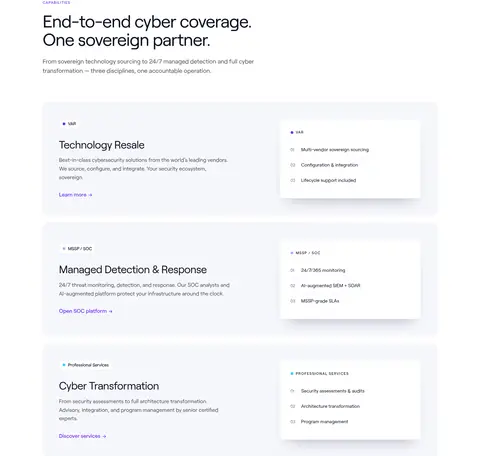
Pale lavender-white rounded panels combine a service summary and violet link with a smaller, lightly elevated checklist card.
Eyebrow badge
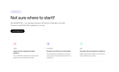
Compact uppercase category text or an outlined violet pill distinguishes sections such as PROMETHEUS AI and certified-for-trust content.
Certification cards
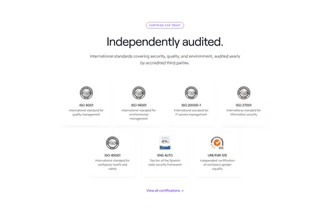
A clean grid of small certification marks and short labels, with subtle card borders and restrained supporting text.
Imagery · Use abstract, glossy 3D objects rather than lifestyle photography. Small, colorful forms sit at the edges of the Cyber AI, SOC, and CERT service cards; a larger warm-toned 3D mark anchors the emergency-response feature. The hero also includes a clean conversational interface mockup. Keep imagery contained, polished, and secondary to text; certification logos are small and informational.
Apply Signal Violet to navigation cues and informational links.
Reserve Alert Red for critical incident actions.
Give major page sections generous breathing room.
Keep service cards aligned and visually restrained.
✕ 不该做
Do not turn warm illustration colours into broad section backgrounds.
Do not use red for ordinary navigation or secondary links.
Do not crowd the hero with extra content.
Do not add heavy shadows or thick borders.
Do not let 3D artwork overpower service descriptions.
Do not replace the sober enterprise tone with playful decoration.
给 AI 的提示词
想快速出一个同风格的新页面,把这段话连同 DESIGN.md 一起发给 AI。
Build a new NEVERHACK page using a bright, restrained cybersecurity visual system. Set the canvas to Gallery White (#ffffff), use Midnight Ink (#0a0f1f) for headings, Graphite Grey (#4e4e4e) for body copy, and Cloud Lavender (#f6f7fc) for selective section bands and cards. Use Signal Violet (#6b2bea) for links and AI cues; reserve Alert Red (#dc2626) for urgent incident actions. Set Roobert throughout, with Inter as a free fallback, and maintain tight, clean headline typography. Align content to a centered frame, preserve generous vertical section spacing, and use rounded cards with fine Mist Blue (#e5edf5) borders and subtle shadows. Favor a clear hero, service-led grids, and contained glossy 3D illustrations. Keep interactions direct, layouts calm, and decoration subordinate to information.