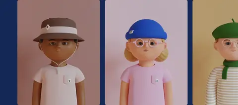
North star · Let the generative characters supply the color and personality; keep the interface calm, editorial, and spacious.
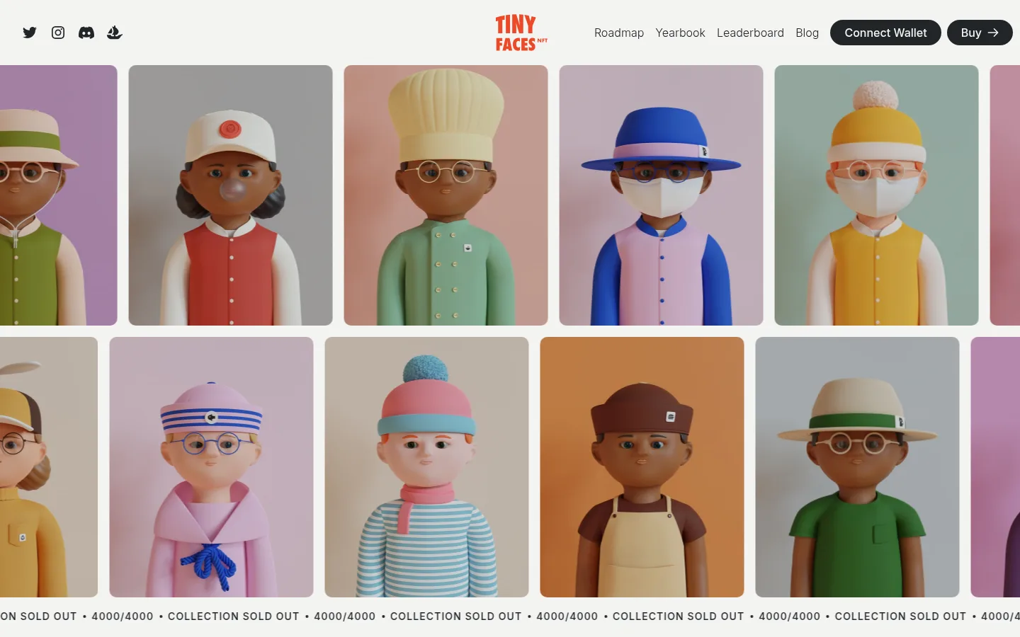
The page uses a warm, nearly white canvas (#f4f4f2) as a quiet frame for colorful character art, with dark charcoal (#212529) carrying navigation, body copy, and controls. Large Migra serif headlines create an editorial voice; Inter handles compact uppercase labels, buttons, and readable explanatory text. The opening is image-led: a continuous, tightly cropped parade of rounded character cards and a repeating sold-out ticker establish the collection before the text narrative begins. Introductory content uses a two-column arrangement, followed by pastel feature panels in blue, pink, and sage. A deep navy gallery band sharply separates the carousel from the FAQ, while hairline rules keep accordion rows light. Broad section spacing gives each story beat room, and the final beige community panel returns to characterful, oversized typography. Keep gradients and ornamental UI out of the system; the characters provide the visual richness.
Navigation, body copy, uppercase labels, FAQ text, buttons, and links.
Aa 设计
Migra
网络字体 · 字重 500 · 占比 6%
免费替代:Cormorant Garamond
Display headlines and large editorial titles.
角色
示例
字号
字重
行高
字距
特大标题
Oversized editorial headline treatment in the community finale.
TinyFaces
187px
500
1.1
0
一级标题
Primary editorial headline introducing the collection.
TinyFaces
64px
500
1.1
0
二级标题
Major section headings, including FAQ and community titles.
TinyFaces
50px
500
1
0
三级标题
Feature-card titles and smaller section-level headlines.
The quick brown fox 敏捷的狐狸
24px
300
1.5
0
四级标题
Secondary explanatory headings and subheads.
The quick brown fox 敏捷的狐狸
20px
300
1.5
0
正文
Compact, tracked uppercase labels and repeating collection ticker text.
The quick brown fox 敏捷的狐狸
14px
500
1.5
0.079em
按钮
Wallet, purchase, and community action labels.
The quick brown fox 敏捷的狐狸
16px
500
2.88
0
链接
Navigation links and lighter-weight inline actions.
The quick brown fox 敏捷的狐狸
16px
300
1.5
0
眉题
Short uppercase labels that introduce content or collection status.
The quick brown fox 敏捷的狐狸
14px
500
1.5
0.079em
间距与布局
基准单位 8px · 密度:适中
32px版块间距
16px元素间距
16px卡片内边距
1230px内容最大宽度
8px
16px
20px
32px
48px
64px
Use a centered content frame with a measured maximum width of 1230px, while letting the opening character parade and major background bands span broadly. The opening navigation sits above a horizontal, cropped card strip. Follow it with a two-column editorial intro, pastel feature cards, and a full-width navy gallery. Return to a two-column FAQ, then finish with a broad community panel. Comfortable spacing and a 32px section-gap measure keep the page airy rather than dense.
圆角与层次
按钮 · 9999px
卡片 · 10px
没有测到阴影:页面是扁平的,层次靠底色和描边区分。
The interface is mostly flat: no measured shadows or gradients define the design. Separation comes from full-width navy and pastel background fields, generous whitespace, rounded character-image cards, and fine gray FAQ rules. Buttons are capsule-shaped; FAQ rows remain open and minimally framed rather than elevated card surfaces.
组件
下面的预览按实测的按钮、输入框、徽标、卡片样式重建(字体用替代字体)。
Top navigation
Place social icons at the left, a compact centered wordmark, and navigation links plus dark capsule wallet and Buy actions at the right.
Character parade
Run rounded portrait cards in horizontal rows beneath the navigation, with varied character backgrounds and a repeating sold-out status ticker below.
Editorial introduction
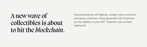
Pair a large Migra serif headline with short Inter explanatory copy in a two-column layout on the off-white canvas.
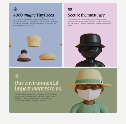
Feature panels
Use blue, blush, and sage panels for collection attributes, rarity, and environmental messaging; combine short text with prominently cropped character imagery.
Gallery carousel
Set a light serif heading and circular outline navigation controls on a #142855 band above a row of portrait cards.
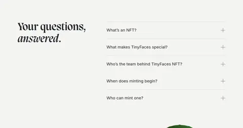
FAQ accordion
Use a large serif title beside simple question rows, fine #d4d5d4 separators, and plus-shaped expand controls.
Community CTA
Finish with a sand-toned character panel, oversized serif community heading, concise copy, and compact pill-shaped social actions.
Imagery · The defining imagery is softly lit, generative 3D character art with distinctive outfits, accessories, and varied skin tones. Show figures front-on in rounded rectangular portrait cards, often cropped around the torso; arrange them in a repeating horizontal parade or carousel. Feature panels can use a single character against a flat pastel field, with the environmental story using a larger figure crop. The captured page also contains a small video element, but the visual language is character-led rather than video-led.
Reserve Migra-style serif typography for display headlines.
Let Inter handle navigation, body copy, and controls.
Make character artwork the main source of color and personality.
Use #142855 as a deliberate full-width gallery band.
Keep FAQ dividers fine and visually quiet.
✕ 不该做
Do not add gradients or strong drop shadows.
Do not turn every content block into a bordered card.
Do not use saturated UI colors to compete with character artwork.
Do not replace the editorial serif headlines with generic sans-serif display type.
Do not crowd the sections; preserve generous breathing room.
Do not use the pastel feature colors as an unstructured page-wide background.
给 AI 的提示词
想快速出一个同风格的新页面,把这段话连同 DESIGN.md 一起发给 AI。
Build a new page in the TinyFaces visual style: an editorial, airy canvas using Gallery White (#f4f4f2), Soft Ink (#212529), and carefully placed color panels. Use an expressive Migra-like serif for large headlines and Inter for navigation, explanatory copy, uppercase labels, and pill buttons. Let distinctive, softly lit 3D character portraits dominate the imagery, presented in rounded gallery cards and selected pastel feature panels. Use Gallery Navy (#142855) for a strong full-width showcase section, with Powder Blue (#a0b1cd), Petal Blush (#e5cce0), and Sage Field (#8d9876) reserved for story cards. Keep layouts spacious and editorial, with clear two-column text sections, quiet divider rules, and a simple FAQ. Avoid gradients, heavy shadows, dense UI, and extra decorative effects.