North star · Use oversized, warmly confident type and decisive violet color blocks on a generous white canvas, with people photography providing the human connection.
The page uses #ffffff as its spacious canvas, letting vivid Nubank Violet (#8d0de3) carry the strongest brand signals across calls to action, selected controls, and oversized headings. The visual rhythm shifts from full-bleed lifestyle photography into open white product sections, then punctuates the scroll with a saturated purple statement panel, a pale butter section, and a deep-plum footer. Display typography is large, rounded, and tightly tracked; supporting text stays compact and legible. Human photography supplies warmth and scale, while product and editorial cards sit quietly within the layout rather than relying on elaborate ornament. Rounded pills unify buttons and segmented controls. Cream surfaces and pale lilac hairlines soften the contrast, while the darkest plum gives security content and the footer a deliberate visual anchor.
Display headlines, section titles, and selected navigation or card headings.
Aa 设计
nuSansText
网络字体 · 字重 600 / 400 / 500 · 占比 42%
免费替代:Inter
Body copy, navigation labels, captions, and most button text.
角色
示例
字号
字重
行高
字距
特大标题
Oversized campaign and community messaging.
Nubank
156px
600
1.03
-0.022em
一级标题
Primary hero headline over the lifestyle photograph.
Nubank
112px
600
0.94
-0.012em
二级标题
Major centered statements and section-level headlines.
Nubank
96px
600
0.94
-0.009em
三级标题
Product and editorial section headings.
Nubank
72px
600
0.94
-0.017em
四级标题
Card titles and compact feature headings.
Nubank
34px
600
1.1
-0.021em
正文
Emphasized supporting copy and key product descriptions.
The quick brown fox 敏捷的狐狸
20px
600
1.2
0
辅助文字
Small descriptive text, card details, and helper copy.
The quick brown fox 敏捷的狐狸
18px
400
1.4
0
导航
Header links and compact navigation labels.
The quick brown fox 敏捷的狐狸
16px
600
1.2
0
间距与布局
基准单位 8px · 密度:适中
88px版块间距
16px元素间距
40px卡片内边距
1264px内容最大宽度
4px
8px
12px
16px
24px
32px
40px
48px
80px
88px
120px
A wide, centered desktop composition uses a measured maximum content width of 1264px, with sections alternating between single-column statements, multi-column product cards, and full-bleed media. The page begins with a horizontal navigation bar over a full-width hero, followed by large areas of white space. Section transitions are deliberate: centered purple headline panel, open product content, then a compact four-card security grid. The measured spacing system is based on an 8px unit, with comfortable section and card gaps. Footer columns become denser while maintaining clear alignment.
圆角与层次
按钮 · 9999px
输入框 · 8px
卡片 · 16px
图片 · 24px
导航 · 9999px
链接 · 9999px
inset · link
inset · nav
The interface is mostly flat: strong color bands, white space, and rounded surfaces establish hierarchy instead of heavy shadows. Card corners are softly rounded, with larger rounding for media and pill-shaped buttons and navigation. Use fine lilac borders or inset outlines for selected controls and links; reserve dark overlays for text readability on imagery.
组件
下面的预览按实测的按钮、输入框、徽标、卡片样式重建(字体用替代字体)。
Top navigation
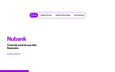
White horizontal header with the Nu mark, compact dark labels, search icon, outlined business login pill, and a solid violet signup pill.
Hero signup form
Layer a large white headline over full-bleed lifestyle photography; place a rounded light form panel at right with CPF input and a violet Continue button.
Segmented product selector
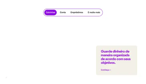
A pill-shaped outlined control with compact options and a solid violet fill for the active item.
Product cards
Use rounded cream cards with ample inset space, restrained dark copy, and small violet links; selected dark-purple cards use cream text.
Editorial content cards
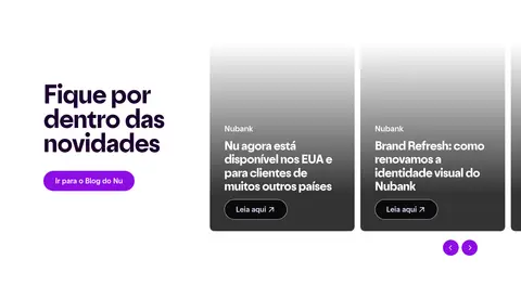
Image-led cards place white text near the bottom over a dark gradient, with a compact outlined pill link.
Security feature grid
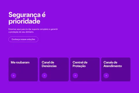
A bright violet section pairs a concise introduction with four dark aubergine rounded cards and circular violet arrow controls.
Footer
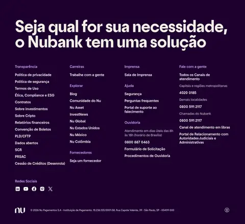
Deep-plum closing section with a large white headline above multiple compact link columns and social icons.
Imagery · Lifestyle photography is the hero’s defining visual, cropped edge to edge with the headline layered over the darker left side and the signup form positioned on the right. Later sections include editorial imagery in cards and small photos embedded in a large community statement. Imagery feels candid and human rather than product-render driven. Gradient overlays help preserve legibility on photographic cards; the measured screenshot palette includes photo colors that should not be treated as brand colors.
Use Nubank Violet (#8d0de3) for the main action and decisive visual accents.
Keep broad white areas between major content moments.
Use oversized, tightly tracked display type for campaign headlines.
Place people-focused photography prominently and crop it confidently.
Use pill shapes for CTAs and segmented selectors.
Switch to Deep Plum (#1e002f) for a strong footer or inverse surface.
✕ 不该做
Do not make every section purple; preserve the white canvas rhythm.
Do not use heavy shadows to create hierarchy.
Do not treat photographic colors as part of the core brand palette.
Do not crowd large headlines with dense supporting copy.
Do not replace the rounded controls with sharp rectangular buttons.
Do not use gradients as a substitute for clear text contrast.
给 AI 的提示词
想快速出一个同风格的新页面,把这段话连同 DESIGN.md 一起发给 AI。
Build a new Nubank-style fintech page with Gallery White (#ffffff) as the open canvas and Nubank Violet (#8d0de3) as the unmistakable CTA and headline accent. Use Deep Plum (#1e002f) for a grounded inverse section, Warm Oat (#f3efe6) for soft cards, and Butter Glow (#eeedb3) only as a selective campaign band. Pair a rounded, bold display face with a clean sans-serif for navigation and body copy. Create a clear vertical rhythm: confident image-led hero, generous white product content, one or two saturated statement sections, and a structured dark footer. Favor candid human photography, pill-shaped controls, subtle Lilac Line (#ecdfff) borders, and restrained elevation. Keep copy and controls legible over images; do not let decorative gradients or photo colors redefine the brand palette.