North star · Make financial help feel reassuring: keep content spacious and legible, anchor it in deep blue, and reserve bright blue for clear actions.
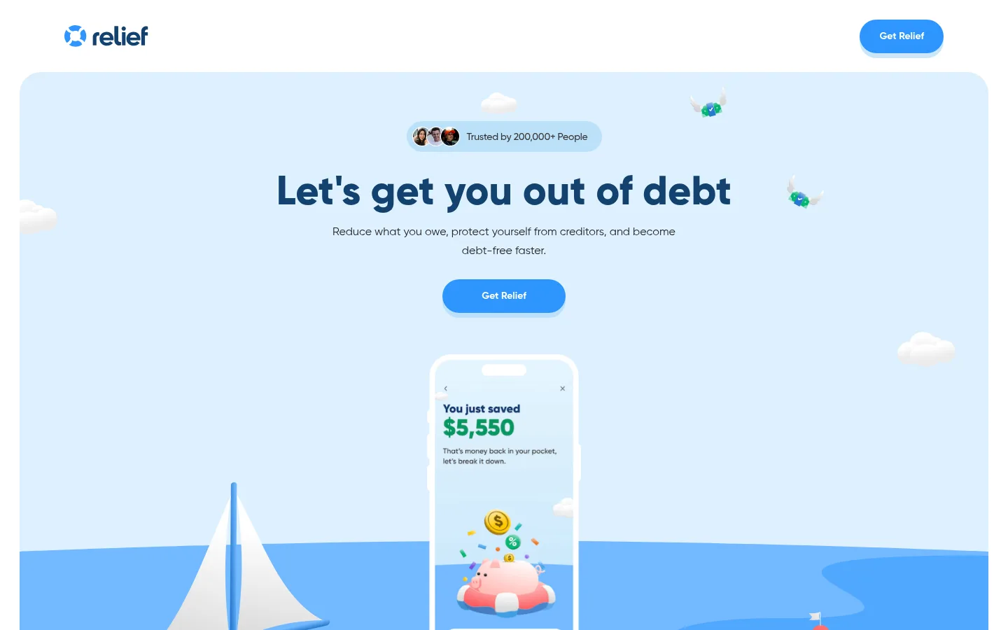
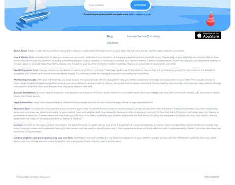
Relief builds a reassuring fintech identity from a small, consistent palette: deep blue anchors the logo, headlines, links, and testimonial cards; bright blue marks primary actions; white keeps the page open; and warm off-white gives the reviews area a quiet change of pace. The hero’s pale-blue sea-and-sky illustration supplies the most prominent color field, but its varied light blues belong to the artwork rather than the measured brand palette. Gilroy is used throughout, with heavy, compact display headlines balanced by regular, readable body copy. The page uses centered hero content, generous white intervals between major sections, and alternating product-benefit compositions rather than dense blocks of copy. Rounded buttons, cards, and section corners soften the financial subject matter. The phone mockup and playful nautical objects turn abstract savings into a tangible app story, while testimonials and FAQs provide proof and reassurance.
Site-wide typeface for headlines, body copy, links, buttons, and captions.
角色
示例
字号
字重
行高
字距
特大标题
Largest promotional headings and high-impact display copy.
Relief
58px
800
1
0
一级标题
Primary page headline, including the centered hero title.
Relief
52.5px
800
1
0
二级标题
Major section headings for product benefits and FAQs.
Relief
49px
800
1.2
0
三级标题
Supporting feature or subsection headings.
Relief
40px
800
1.1
0
四级标题
Compact card headings and smaller content titles.
The quick brown fox 敏捷的狐狸
20.5px
700
1.2
0
正文
Main descriptive copy and standard supporting paragraphs.
The quick brown fox 敏捷的狐狸
16px
400
1.38
0
辅助文字
Small metadata, helper text, and testimonial details.
The quick brown fox 敏捷的狐狸
14px
400
1.43
0
链接
Inline navigation, resource links, and benefit CTAs.
The quick brown fox 敏捷的狐狸
16px
400
1.2
0
间距与布局
基准单位 2px · 密度:适中
56px版块间距
14px元素间距
28px卡片内边距
1384px内容最大宽度
7px
8px
10px
14px
16px
18px
20px
21px
24px
28px
30px
56px
Use a centered, responsive content frame capped at the measured 1384px maximum width. The hero is center-aligned and spacious, while product-benefit sections shift to left-aligned split compositions. Keep substantial breathing room between major blocks; the measured section rhythm is 56px, with comfortable element spacing and 28px card padding. Reviews form a multi-column card band, FAQs return to a single centered column, and the footer organizes resources into four columns.
圆角与层次
按钮 · 9999px
卡片 · 18px
hairline · button
hairline · card
lg · other
hairline · button
Most surfaces feel flat against white, with rounded corners doing more work than borders. Primary bright-blue pill buttons use a visible pale-blue offset shadow; cards use a faint short shadow, while testimonial cards stand out through their deep-blue fill. Keep layering restrained and reserve stronger depth for interface actions and illustration.
组件
下面的预览按实测的按钮、输入框、徽标、卡片样式重建(字体用替代字体)。
Primary CTA
Bright-blue pill button with white bold Gilroy text and a pale-blue offset shadow; repeat the short “Get Relief” label.
Hero panel
Large rounded pale-blue illustrated field with centered social proof, a heavy navy headline, concise copy, CTA, and phone mockup.
Feature split
Benefit-focused text and a supporting product visual arranged as a spacious split composition, with a navy heading and inline link.
Review card
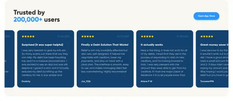
Deep-navy rounded card with light review copy and compact rating or date details; group cards into a multi-column proof band.
FAQ row
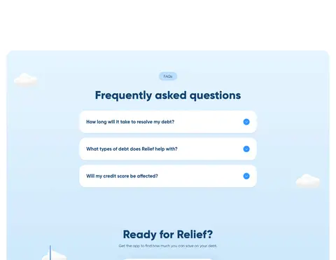
Rounded white question surface on a pale-blue section, with concise navy text and a bright-blue circular expand control.
Phone CTA form
Centered conversion block with a phone-number input, bright-blue submit pill, and small consent text with a cobalt legal link.
Imagery · Favor polished, playful 3D-style illustration over editorial photography. The hero combines a centered phone mockup with a small sailboat, buoy, clouds, and a stylized ocean, framed inside a large pale-blue rounded field. Keep imagery colorful but soft and avoid letting illustration details compete with the headline or CTA. Product and review visuals should support the app story and social proof.
Reserve Relief Blue for prominent actions and small highlights.
Keep the hero headline and CTA centered over the illustration.
Give major sections generous white space.
Use rounded shapes for buttons, cards, and prominent panels.
Keep body copy concise and comfortably readable.
✕ 不该做
Do not introduce unmeasured brand colors as core UI colors.
Do not turn the page into a dense dashboard or financial spreadsheet.
Do not use sharp-edged buttons where the pill treatment is established.
Do not let decorative artwork obscure the headline or CTA.
Do not use heavy borders where surface contrast and rounding suffice.
Do not use all-caps display typography or exaggerated tracking.
给 AI 的提示词
想快速出一个同风格的新页面,把这段话连同 DESIGN.md 一起发给 AI。
Build a new page in Relief’s approachable fintech style. Use Harbor Navy (#13426f) for headings, links, and key brand elements; Relief Blue (#2e96ff) for primary pill CTAs; white (#ffffff) as the main canvas; and Soft Linen (#f9f7f0) for a restrained section change. Set all text in Gilroy or a close rounded sans-serif, with bold, friendly headlines and readable regular body copy. Keep the layout spacious, with a centered illustrated hero, generous section breaks, and rounded cards. Use soft, polished app-oriented illustration rather than stock-heavy photography; treat pale sea blues as artwork, not extra brand tokens. Make the main action obvious, then support it with clear product benefits, credible social proof, accessible FAQs, and a simple contact or signup form.