Parallel以人物摄影、醒目的编辑风衬线标题和克制的暖中性色构建品牌氛围。页面从聚焦的职位搜索入口,依次展开服务介绍、品牌理念、行动号召和宽松的页脚。
North star · Let one cinematic human image and one expressive serif headline lead, while keeping the surrounding interface warm, quiet, and spacious.
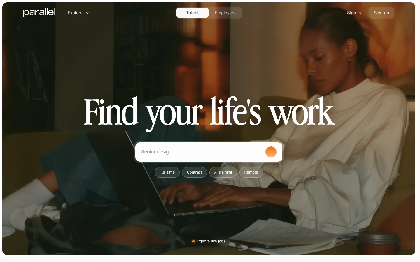
The visual strategy balances an immersive photographic opening with quiet, warm-neutral content sections. The hero image fills a large rounded frame and is darkened enough for white navigation and a large centered serif headline to remain legible; a white search field and translucent job-type pills sit directly over the image. Below, broad pale bands and generous separation let each message feel deliberate rather than crowded. Display headlines use Advercase Demo, with expressive contrast and tight tracking, while body copy, navigation, and controls use a restrained sans serif. Off-white surfaces and muted gray text keep the system calm; orange appears as a small, high-energy search cue rather than a pervasive brand fill. The lower page uses large imagery and a notably oversized wordmark as visual punctuation. Keep cards and controls softly rounded, with borders and shadows subordinate to typography and photography.
配色 点色块复制色值。用途说明来自对页面的实测位置(背景、文字、描边、按钮)与截图判读。
强调色
Ember Orange
#ef6e07
Small search-action accent detected in button styling; use sparingly as an interactive cue.
Apricot Glow
#ffb77d
Supporting warm button accent detected in component data, not a broad section color.
表层色
Porcelain Veil
#fbfaf9
Primary pale surface for cards, search field, selected navigation treatment, and light content areas.
Warm Canvas
#f4f3f1
Main warm-gray page canvas, visible across the brand and lower content sections.
中性色
Soft Graphite
#707070
Muted body and footer text, supporting hierarchy without competing with display headlines.
Quiet Ink
#484847
Primary subdued text and navigation tone on light surfaces.
Dusty Stone
#999694
Low-emphasis text and tonal transitions; not a dominant interface accent.
Mist Gray
#afafad
Subtle section and gradient tonality; keep it secondary to the photographic hero.
Slate Haze
#8d8d8c
Muted section gradient tone; avoid treating it as a defining brand color.
功能色
Deep Charcoal
#222222
Occasional dark text and button treatment in measured component styles.
Near Black
#050505
Sparse strong text detected in page elements; not the primary light-page text color.
Pale Divider
#e3e2e0
Very light footer border or hairline tone for quiet separation.
文字 背景 对比度 WCAG #484847 Quiet Ink#f4f3f1 Warm Canvas8.26:1 AAA #484847 Quiet Ink#fbfaf9 Porcelain Veil8.78:1 AAA #707070 Soft Graphite#f4f3f1 Warm Canvas4.47:1 AA-large #707070 Soft Graphite#fbfaf9 Porcelain Veil4.75:1 AA #fbfaf9 Porcelain Veil#f4f3f1 Warm Canvas1.06:1 不达标
字体 字号阶梯:Augmented Fourth(比例约 1.428,正文 17px)。示例用免费替代字体渲染,数值为实测。
Aa 设计
ui-sans-serif 系统字体 · 字重 400 / 500 / 600 · 占比 73%
免费替代:Inter
Body copy, navigation, captions, and controls
Aa 设计
__Inter_8a0ba0 网络字体 · 字重 500 / 600 · 占比 17%
免费替代:Inter
Selected interface and button text
Aa 设计
Advercase Demo 网络字体 · 字重 400 / 500 · 占比 11%
免费替代:DM Serif Display
Display headlines and prominent section titles
角色 示例 字号 字重 行高 字距 特大标题 Oversized brand or campaign headline treatment.
Parallel
101px 400 1.14 -0.03em 一级标题 Hero headline, centered over the photographic opening.
Parallel
64px 500 1.05 -0.02em 二级标题 Major section and mission statement headings.
Parallel
60px 400 1.2 -0.016em 三级标题 Secondary feature or content headings.
Parallel
40px 500 1.2 -0.02em 四级标题 Compact feature titles and card headings.
The quick brown fox 敏捷的狐狸
23px 500 1.2 -0.02em 正文 Explanatory copy and supporting paragraphs.
The quick brown fox 敏捷的狐狸
17px 400 1.4 0 辅助文字 Small supporting labels and job-search filters.
The quick brown fox 敏捷的狐狸
14px 500 1.5 0 按钮 Search and conversion control labels.
The quick brown fox 敏捷的狐狸
14px 500 1 0 导航 Top-level navigation links and account actions.
The quick brown fox 敏捷的狐狸
16px 500 1.5 0
间距与布局 基准单位 8px · 密度:适中
80px 版块间距
24px 元素间距
4px 卡片内边距
— 内容最大宽度
2px
5px
6px
8px
9px
10px
12px
14px
16px
18px
20px
24px
32px
40px
80px
The hero is a near full-bleed photographic panel inset from the viewport edge, with navigation across the top and the search interaction centered beneath the headline. Subsequent sections alternate broad light bands with a three-column explanatory area and single-column statement or CTA blocks. The measured data gives no fixed maximum content width, so preserve generous side margins and let key text breathe. Section spacing is expansive; content density stays low, and the footer spreads navigation across columns before an oversized wordmark.
圆角与层次 lg · other
sm · other
lg · nav
The page is largely flat: pale surfaces, tonal section bands, and subtle separators do most of the work. The hero image provides the strongest depth through its dark overlay and photographic contrast. Search and navigation surfaces are softly rounded and pale; use shadows only as restrained separation, not as a repeated card treatment.
组件 下面的预览按实测的按钮、输入框、徽标、卡片样式重建(字体用替代字体)。
Hero navigation Overlay the wordmark and Explore link at left, a Talent/Employers switch near center, and Sign in/Sign up at right; use light text over the dark image.
Job search field Place a wide, pale rounded search field below the hero headline, with a short role query and compact orange arrow action.
Job-type filters Show Full time, Contract, AI training, and Remote as small translucent outlined pills beneath the search field.
Feature cards Present the How Parallel Works content in three columns with image-led cards, softly rounded corners, and restrained borders.
Editorial CTA Use a single-column statement and short supporting copy with a compact Read More or Get Started action.
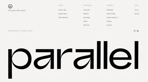
Footer Set grouped talent, employer, company, and legal links against the warm canvas, with the brand mark enlarged as a closing visual.
Imagery · Use candid, editorial workplace photography as the primary visual anchor. The opening image shows a person working at a laptop, cropped wide and darkened with an overlay so white type and controls read clearly. Supporting sections use image-led content rather than decorative illustration. Keep photography warm, human, and natural; avoid synthetic 3D or busy stock-image collages.
页面版块 共 5 个版块,按页面从上到下排列,每个都标了类型、布局和交互套路。
该做与不该做 ✓ 该做 Lead with a warm, human workplace photograph. Use a large, expressive serif for the main headline. Keep the search action visually clear and compact. Use warm off-white surfaces for the content sections. Give major sections generous breathing room. Reserve orange for small interactive emphasis. ✕ 不该做 Do not make the page feel like a dense job-board dashboard. Do not replace the editorial serif headlines with generic heavy sans serif. Do not scatter bright accent colors across the interface. Do not put the hero headline on an untreated busy photograph. Do not fill every section with bordered cards or prominent shadows. Do not invent a fixed content width absent from the measurements. 给 AI 的提示词 想快速出一个同风格的新页面,把这段话连同 DESIGN.md 一起发给 AI。
复制 Build a new Parallel-style page with a calm, human-centered editorial feel. Use Warm Canvas (#f4f3f1) and Porcelain Veil (#fbfaf9) for quiet surfaces, Quiet Ink (#484847) and Soft Graphite (#707070) for text, and reserve Ember Orange (#ef6e07) for small action emphasis. Lead with a wide, darkened workplace photograph, overlay a simple navigation row, and center an expressive serif headline above a pale rounded search control and translucent filter pills. Use Advercase-like serif display typography and clean sans-serif interface text. Keep subsequent sections spacious, with image-led features, single-column statements, and a restrained footer ending in a large wordmark. Favor soft rounding and subtle separation over heavy shadows. Avoid dense dashboards, saturated decoration, and unnecessary card chrome.
DESIGN.md Tailwind v4 CSS 变量 Design Tokens
---
title: "Parallel design system"
variant: extended
source: https://www.useparallel.com/
captured_at: 2026-10-12
theme: light
industry: other
generator: Design DNA (https://four.wiralomi.com/style/useparallel-com)
ai_generated: true
ai_label: "本文件由 AI 辅助生成:数值取自公开网页的实测样式,命名、用途说明与建议为模型解读。商标归原所有者。 / AI-assisted content"
---
# Parallel · Design System
> A human-centered marketplace with an editorial edge.
**Theme:** light · **Industry:** other · **Source:** https://www.useparallel.com/ · **Captured:** 2026-10-12 (1440×900 desktop)
_AI-assisted content: values are measured from the public page at capture time; names, roles and guidance are model-written interpretations. Trademarks belong to their owners._
Parallel pairs a cinematic, people-focused hero with oversized editorial typography and a restrained warm-neutral palette. The page moves from a focused job-search entry point into explanatory content, a mission statement, a closing prompt, and a spacious footer.
## North star
Let one cinematic human image and one expressive serif headline lead, while keeping the surrounding interface warm, quiet, and spacious.
## Overview
The visual strategy balances an immersive photographic opening with quiet, warm-neutral content sections. The hero image fills a large rounded frame and is darkened enough for white navigation and a large centered serif headline to remain legible; a white search field and translucent job-type pills sit directly over the image. Below, broad pale bands and generous separation let each message feel deliberate rather than crowded. Display headlines use Advercase Demo, with expressive contrast and tight tracking, while body copy, navigation, and controls use a restrained sans serif. Off-white surfaces and muted gray text keep the system calm; orange appears as a small, high-energy search cue rather than a pervasive brand fill. The lower page uses large imagery and a notably oversized wordmark as visual punctuation. Keep cards and controls softly rounded, with borders and shadows subordinate to typography and photography.
## Colors
| Name | Hex | Token | Group | Role |
|---|---|---|---|---|
| Porcelain Veil | ` | `--color-porcelain-veil` | surface | Primary pale surface for cards, search field, selected navigation treatment, and light content areas. |
| Warm Canvas | ` | `--color-warm-canvas` | surface | Main warm-gray page canvas, visible across the brand and lower content sections. |
| Soft Graphite | ` | `--color-soft-graphite` | neutral | Muted body and footer text, supporting hierarchy without competing with display headlines. |
| Quiet Ink | ` | `--color-quiet-ink` | neutral | Primary subdued text and navigation tone on light surfaces. |
| Dusty Stone | ` | `--color-dusty-stone` | neutral | Low-emphasis text and tonal transitions; not a dominant interface accent. |
| Mist Gray | ` | `--color-mist-gray` | neutral | Subtle section and gradient tonality; keep it secondary to the photographic hero. |
| Deep Charcoal | ` | `--color-deep-charcoal` | semantic | Occasional dark text and button treatment in measured component styles. |
| Near Black | ` | `--color-near-black` | semantic | Sparse strong text detected in page elements; not the primary light-page text color. |
| Ember Orange | ` | `--color-ember-orange` | accent | Small search-action accent detected in button styling; use sparingly as an interactive cue. |
| Apricot Glow | ` | `--color-apricot-glow` | accent | Supporting warm button accent detected in component data, not a broad section color. |
| Slate Haze | ` | `--color-slate-haze` | neutral | Muted section gradient tone; avoid treating it as a defining brand color. |
| Pale Divider | ` | `--color-pale-divider` | semantic | Very light footer border or hairline tone for quiet separation. |
### Semantic aliases
`--color-canvas` → ` (Warm Canvas) · `--color-surface` → ` (Porcelain Veil) · `--color-text` → ` (Quiet Ink) · `--color-text-muted` → ` (Soft Graphite) · `--color-text-subtle` → ` (Porcelain Veil) · `--color-border` → ` (Porcelain Veil)
### Contrast (WCAG 2.x)
| Text | Background | Ratio | Level |
|---|---|---|---|
| ` | ` | 8.26:1 | AAA |
| ` | ` | 8.78:1 | AAA |
| ` | ` | 4.47:1 | AA-large |
| ` | ` | 4.75:1 | AA |
| ` | ` | 1.06:1 | fail |
### Gradients
- `linear-gradient(rgba(15, 15, 15, 0.4), rgba(15, 15, 15, 0.3), rgba(15, 15, 15, 0.45))`
- `linear-gradient(90deg, rgba(0, 0, 0, 0.28), rgba(0, 0, 0, 0) 55%)`
- `linear-gradient(rgba(255, 255, 255, 0.77), rgba(255, 255, 255, 0.88))`
- `radial-gradient(circle at 20px 20px, rgb(85, 85, 85) 0%, rgb(22, 22, 22) 70%)`
## Typography
| Family | Token | Source | Weights | Role | Free substitute |
|---|---|---|---|---|---|
| ui-sans-serif | `--font-body` | system | 400, 500, 600 | Body copy, navigation, captions, and controls | Inter |
| __Inter_8a0ba0 | `--font-inter-8a0ba0` | webfont | 500, 600 | Selected interface and button text | Inter |
| Advercase Demo | `--font-display` | webfont | 400, 500 | Display headlines and prominent section titles | DM Serif Display |
- **ui-sans-serif:** Measured weights 400–600; use clean sentence case and restrained, neutral tracking.
- **__Inter_8a0ba0:** Webfont subset; measured at medium and semibold weights, with compact interface styling.
- **Advercase Demo:** Expressive serif at regular to medium weights; oversized headings use tight negative tracking and natural casing.
### Type scale — Augmented Fourth (ratio ≈ 1.428, base 17px)
| Role | Size | Weight | Line height | Letter spacing | Case | Family | Used for |
|---|---|---|---|---|---|---|---|
| display | 101px | 400 | 1.14 | -0.03em | — | Advercase Demo | Oversized brand or campaign headline treatment. |
| h1 | 64px | 500 | 1.05 | -0.02em | — | Advercase Demo | Hero headline, centered over the photographic opening. |
| h2 | 60px | 400 | 1.2 | -0.016em | — | Advercase Demo | Major section and mission statement headings. |
| h3 | 40px | 500 | 1.2 | -0.02em | — | Advercase Demo | Secondary feature or content headings. |
| h4 | 23px | 500 | 1.2 | -0.02em | — | ui-sans-serif | Compact feature titles and card headings. |
| body | 17px | 400 | 1.4 | 0 | — | ui-sans-serif | Explanatory copy and supporting paragraphs. |
| caption | 14px | 500 | 1.5 | 0 | — | ui-sans-serif | Small supporting labels and job-search filters. |
| button | 14px | 500 | 1 | 0 | — | ui-sans-serif | Search and conversion control labels. |
| nav | 16px | 500 | 1.5 | 0 | — | ui-sans-serif | Top-level navigation links and account actions. |
## Spacing & layout
- Base unit **8px**, density **comfortable**.
- Scale (most used values): 2, 5, 6, 8, 9, 10, 12, 14, 16, 18, 20, 24, 32, 40, 80 px.
- Section rhythm 80px · element gap 24px · card padding 4px · max content width —.
The hero is a near full-bleed photographic panel inset from the viewport edge, with navigation across the top and the search interaction centered beneath the headline. Subsequent sections alternate broad light bands with a three-column explanatory area and single-column statement or CTA blocks. The measured data gives no fixed maximum content width, so preserve generous side margins and let key text breathe. Section spacing is expansive; content density stays low, and the footer spreads navigation across columns before an oversized wordmark.
## Shape & elevation
- Radius: button `9999px` · card `20px` · nav `12px` · xs `10px` · sm `12px` · md `16px` · lg `20px` · pill `9999px`
- Shadow `lg` (other): `rgba(0, 0, 0, 0) 0px 0px 0px 0px, rgba(0, 0, 0, 0) 0px 0px 0px 0px, rgba(0, 0, 0, 0.18) 0px 12px 36px 0px`
- Shadow `sm` (other): `rgba(0, 0, 0, 0) 0px 0px 0px 0px, rgba(0, 0, 0, 0) 0px 0px 0px 0px, rgb(255, 130, 16) 0px 0px 8px 0px`
- Shadow `lg-2` (nav): `rgba(0, 0, 0, 0) 0px 0px 0px 0px, rgba(0, 0, 0, 0) 0px 0px 0px 0px, rgba(0, 0, 0, 0.07) 0px 6px 27px 0px`
- Motion: standard transition `0.15s cubic-bezier(0.4, 0, 0.2, 1)` on interactive elements.
The page is largely flat: pale surfaces, tonal section bands, and subtle separators do most of the work. The hero image provides the strongest depth through its dark overlay and photographic contrast. Search and navigation surfaces are softly rounded and pale; use shadows only as restrained separation, not as a repeated card treatment.
## Imagery
Use candid, editorial workplace photography as the primary visual anchor. The opening image shows a person working at a laptop, cropped wide and darkened with an overlay so white type and controls read clearly. Supporting sections use image-led content rather than decorative illustration. Keep photography warm, human, and natural; avoid synthetic 3D or busy stock-image collages.
## Components
### Hero navigation
Overlay the wordmark and Explore link at left, a Talent/Employers switch near center, and Sign in/Sign up at right; use light text over the dark image.
### Job search field
Place a wide, pale rounded search field below the hero headline, with a short role query and compact orange arrow action.
### Job-type filters
Show Full time, Contract, AI training, and Remote as small translucent outlined pills beneath the search field.
### Feature cards
Present the How Parallel Works content in three columns with image-led cards, softly rounded corners, and restrained borders.
### Editorial CTA
Use a single-column statement and short supporting copy with a compact Read More or Get Started action.
### Footer
Set grouped talent, employer, company, and legal links against the warm canvas, with the brand mark enlarged as a closing visual.
### Measured component styles
- **Primary button** (“Full time”): background ## Do
- Lead with a warm, human workplace photograph.
- Use a large, expressive serif for the main headline.
- Keep the search action visually clear and compact.
- Use warm off-white surfaces for the content sections.
- Give major sections generous breathing room.
- Reserve orange for small interactive emphasis.
## Don't
- Do not make the page feel like a dense job-board dashboard.
- Do not replace the editorial serif headlines with generic heavy sans serif.
- Do not scatter bright accent colors across the interface.
- Do not put the hero headline on an untreated busy photograph.
- Do not fill every section with bordered cards or prominent shadows.
- Do not invent a fixed content width absent from the measurements.
## Agent prompt
Build a new Parallel-style page with a calm, human-centered editorial feel. Use Warm Canvas (## Page sections (top to bottom)
| # | Type | Layout | UX patterns | UI patterns |
|---|---|---|---|---|
| 1 | hero | Full-bleed inset photo with overlay navigation and centered headline, search, and filter controls. | Job search entry, Talent/employer switch, Account links | Dark photo overlay, Serif display heading, Pale rounded search field, Translucent filter pills |
| 2 | how-it-works | Centered section heading followed by three image-led feature columns on a pale band. | Explain the matching process, Optional assessment, Browse jobs | Three-column feature layout, Image-led cards, Soft neutral background |
| 3 | feature-split | Single-column editorial statement on a warm neutral section with full-bleed supporting media. | Mission-led storytelling, Read More link | Large serif heading, Spacious text block, Photographic support |
| 4 | cta | Single-column closing prompt on the warm neutral canvas. | Conversion prompt, Get Started action | Large editorial heading, Minimal CTA treatment |
| 5 | footer | Three-column footer link groups, legal details, and social links, finished with a very large wordmark. | Grouped site navigation, Legal links, Social destinations | Warm neutral background, Low-contrast link groups, Oversized wordmark |
## Source CSS custom properties (selected)
```css
--app-background: