PlanetScale 以克制、文本优先的页面展示数据库基础设施,并用醒目的客户 Logo 网格和详尽产品说明建立信任。等宽字体、细密深色线框与少量鲜明强调色,让长篇内容保持技术感与可读性。
North star · Make a long, technical page feel navigable through consistent monospace typography, clear left alignment, and precise hairline structure.
The page uses a near-white canvas (#fafafa) throughout, letting compact black and charcoal monospace text carry the identity. Blue links provide the most consistent interactive color; orange marks primary action and occasional emphasis, while yellow is reserved for the full-width announcement strip. The typography is uniformly system monospace, including navigation, paragraphs, buttons, and code-like content, giving the page a deliberately utilitarian, developer-facing voice. A centered content column organizes the long page: introductory copy leads into a tightly ruled customer-logo matrix, then product and performance material and extensive documentation-like sections. Alignment is predominantly left, with headings and body copy following the same text-led rhythm. Spacing is comfortable but the page remains information-dense. Media is largely diagrams, interface captures, and customer marks rather than atmospheric photography. Thin charcoal borders divide cells and outline panels; the overall treatment is flat, with no measured shadows or decorative layering.
Shared type system for body copy, headings, navigation, buttons, links, and code-like product content.
角色
示例
字号
字重
行高
字距
正文
Introductory copy, feature explanations, testimonials, and documentation-like content.
The quick brown fox 敏捷的狐狸
16px
400
1.5
0
按钮
Primary contact and secondary sandbox actions.
The quick brown fox 敏捷的狐狸
16px
600
1.5
0
导航
Main navigation links and account or action links.
The quick brown fox 敏捷的狐狸
16px
400
1.5
0
链接
Inline blue references and case-study links.
The quick brown fox 敏捷的狐狸
16px
400
1.5
0
代码
Technical terminology and code-like product explanations.
const style = 1;
16px
400
1.5
0
间距与布局
基准单位 8px · 密度:适中
48px版块间距
8px元素间距
—卡片内边距
1088px内容最大宽度
4px
8px
10px
12px
16px
24px
40px
48px
A centered content area uses a measured maximum width of 1088px, with left-aligned text and a comfortable but information-rich rhythm. The page opens with a slim announcement band and compact navigation, then moves directly into a long editorial content column. A five-column customer logo matrix creates the strongest grid moment, with equal cells separated by thin rules. Below it, product tabs, diagrams, performance material, and feature sections follow a consistent vertical sequence. The footer returns to a multi-column link layout. Measured spacing uses an 8px base unit and a 48px section gap.
圆角与层次
导航 · 50%
没有测到阴影:页面是扁平的,层次靠底色和描边区分。
The interface is predominantly flat, with no measured shadows. Thin charcoal borders define the logo cells, content panels, tabs, and footer link columns. Dotted or dashed rules separate some long-form sections. Use alignment and linework rather than elevation or layered cards to establish hierarchy.
组件
下面的预览按实测的按钮、输入框、徽标、卡片样式重建(字体用替代字体)。
Announcement strip
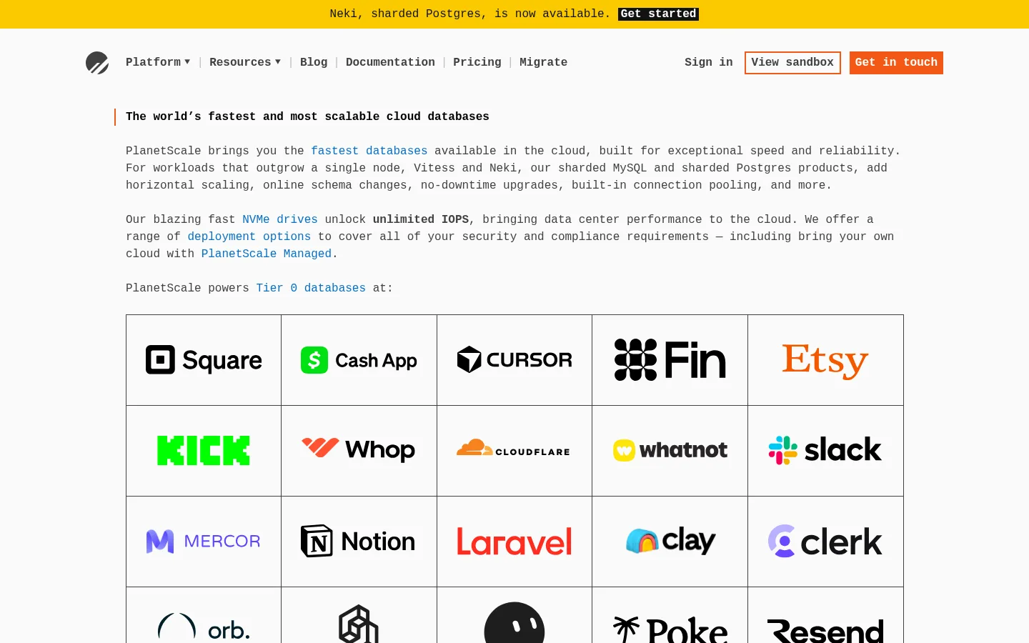
Full-width yellow band above the navigation, with a centered monospace update and a compact dark call-to-action link.
Primary navigation
Compact, left-aligned brand and page links with account actions on the right; the sandbox action is orange-outlined and contact is orange-filled.
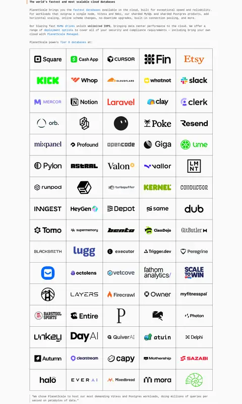
Customer logo matrix
Five-column grid of customer marks on the near-white canvas, using thin charcoal borders to separate each cell.
Product tabs and panel
A bordered product explanation panel begins with a horizontal tab row and continues into copy, a technical diagram, and testimonial text.
Text feature sections
Long-form performance, uptime, cost, security, and feature content uses left-aligned monospace copy, blue inline links, lists, and dotted dividers.
Footer link columns
Multi-column navigation groups and compact legal links are organized with thin rules and small monospace text.
Imagery · Imagery supports the technical story rather than setting an atmospheric mood. The customer section is a dense grid of third-party logos, each shown within a ruled cell. Lower content uses product interface captures and a schematic database topology diagram, alongside small interface or performance visuals. Keep these assets crisp and legible on the light canvas; avoid large, decorative photography or heavy image treatments.
Use ui-monospace consistently across the interface.
Keep the canvas near-white and the content left-aligned.
Use blue for inline links and orange for primary actions.
Separate dense content with thin, deliberate rules.
Keep customer logos inside a consistent ruled grid.
Use yellow only for a clear announcement band.
✕ 不该做
Do not introduce gradients or prominent shadows.
Do not replace the monospace voice with a mixed display-font system.
Do not use large decorative photography as the main visual.
Do not add rounded, elevated card styling.
Do not use accent colors as broad content backgrounds.
Do not compress long technical content into an unstructured block.
给 AI 的提示词
想快速出一个同风格的新页面,把这段话连同 DESIGN.md 一起发给 AI。
Build a new PlanetScale-style page as a restrained, developer-focused editorial interface. Use a #fafafa Cloud Canvas, #414141 Graphite Rule for copy and fine dividers, #0b6ec5 Database Blue for inline links, and #f35815 Signal Orange for the primary action; reserve #fbca00 Launch Yellow for an announcement strip. Set all interface text in a system monospace family, with clear weight contrast rather than decorative type. Keep content within the measured 1088px maximum width, left-align long-form material, and use a measured 8px spacing base with clear section breaks. Structure dense information into short paragraphs, lists, ruled grids, and bordered technical panels. Prefer crisp customer marks, interface captures, or schematic diagrams to photography. Keep surfaces flat, use thin borders instead of shadows, and make navigation and calls to action easy to scan.