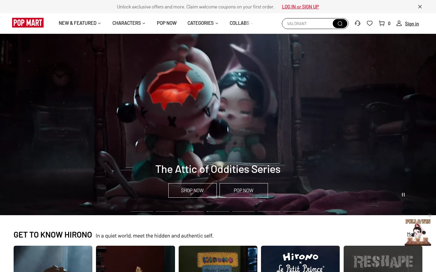
首页以明亮的商品目录布局搭配丰富的潮玩图片,并用富有电影感的深色主视觉开场。黑色标题与克制的红色品牌标识让角色内容、新品信息和购物入口清晰突出。
North star · Keep the storefront quiet and structured so vivid character imagery—not decorative interface chrome—owns the attention.
The page uses a predominantly white canvas to let colorful character photography carry the personality. Pale gray bands quietly distinguish selected content areas, while black text and occasional fine gray rules organize the long retail journey. POP MART red is concentrated in the compact logo and a few promotional details rather than spread across every action. Barlow provides a clear, slightly condensed retail voice: bold uppercase section titles, medium-weight navigation and controls, and regular-weight product details. A cinematic, dark full-width hero provides contrast at the top; the rest of the page alternates between product grids, promotional image tiles, editorial character features, and store listings. Generous white intervals separate these varied modules, while product cards remain visually dense and image-first. Most controls are square-cornered and outlined, keeping the system crisp rather than soft or heavily elevated.
配色 点色块复制色值。用途说明来自对页面的实测位置(背景、文字、描边、按钮)与截图判读。
品牌色
Collector Ink
#000000
Primary headings, navigation, product links, icons, outlined controls, and the solid footer background.
强调色
POP Signal
#e60021
Small, high-impact brand accent in the logo and occasional promotional or action details.
表层色
Gallery White
#ffffff
Main page canvas, product-grid ground, and white type or outlined controls over dark hero imagery.
Soft Mist
#f5f5f5
Subtle navigation, footer, and section-band surface that differentiates content without competing with product art.
中性色
Quiet Graphite
#666666
Muted text and gray section treatment, including secondary information and restrained supporting copy.
Smoke Fade
#939393
Appears chiefly in measured section gradients; use only as a subtle image-overlay tone, not a core brand fill.
Silver Haze
#acaeaf
Minor footer gradient or supporting neutral detail; not a defining page surface.
Badge Charcoal
#333333
Launch-time badge backgrounds, badge text, and small secondary footer details.
Footer Silver
#cccccc
Low-emphasis footer text and minor supporting details.
Pale Rule
#dddddd
Subtle separators and low-contrast footer or utility borders.
功能色
Cool Divider
#ebf0f4
Fine borders and hairlines, particularly around footer and utility regions.
文字 背景 对比度 WCAG #000000 Collector Ink#ffffff Gallery White21:1 AAA #000000 Collector Ink#f5f5f5 Soft Mist19.26:1 AAA #000000 Collector Ink#666666 Quiet Graphite3.66:1 AA-large #666666 Quiet Graphite#ffffff Gallery White5.74:1 AA #666666 Quiet Graphite#f5f5f5 Soft Mist5.27:1 AA #666666 Quiet Graphite#000000 Collector Ink3.66:1 AA-large
字体 字号阶梯:Minor Third(比例约 1.191,正文 16px)。示例用免费替代字体渲染,数值为实测。
Aa 设计
Barlow-Regular 网络字体 · 字重 400 · 占比 70%
免费替代:Barlow
Body copy, section support text, and regular-weight interface labels.
Aa 设计
Barlow-Medium 网络字体 · 字重 400 / 500 · 占比 22%
免费替代:Barlow
Navigation, buttons, launch badges, and medium-emphasis labels.
Aa 设计
Barlow-Bold 网络字体 · 字重 700 / 400 / 600 · 占比 6%
免费替代:Barlow
Primary and section headings.
Aa 设计
Barlow 网络字体 · 字重 400 / 700 · 占比 1%
免费替代:Barlow
Fallback or shared family declaration across text styles.
角色 示例 字号 字重 行高 字距 一级标题 Main hero or page-level headline, set bold with clear breathing room.
The quick brown fox 敏捷的狐狸
27px 700 1.57 0 二级标题 Uppercase section headings for featured collections and shopping modules.
The quick brown fox 敏捷的狐狸
21px 700 1 0 三级标题 Medium-weight product or subsection titles.
The quick brown fox 敏捷的狐狸
20px 500 normal 0 正文 Descriptions, introductory copy, and supporting page text.
The quick brown fox 敏捷的狐狸
16px 400 1.57 0 辅助文字 Compact product metadata, prices, and secondary labels.
The quick brown fox 敏捷的狐狸
12px 400 1.4 0 按钮 Small, medium-weight text inside outlined or filled actions.
The quick brown fox 敏捷的狐狸
12px 400 1.57 0
间距与布局 基准单位 2px · 密度:适中
40px 版块间距
18px 元素间距
— 卡片内边距
1350px 内容最大宽度
4px
5px
6px
9px
12px
15px
18px
21px
29px
30px
60px
A full-width retail homepage is organized into a long vertical sequence of distinct modules. The content grid is measured at a 1350px maximum width, with centered page sections and left-aligned headings. Product rows use multi-column grids, while themed promotions and character features mix wider tiles with smaller companion cards. Section spacing creates clear pauses between dense product collections. The first viewport starts with a slim announcement strip, a horizontal navigation bar, and a full-bleed hero before returning to a white content canvas.
圆角与层次 hairline · button
hairline · footer
The interface is mostly flat: white cards sit directly on the canvas, and section changes rely more on whitespace and pale bands than on shadows. Borders are thin and restrained. Buttons are typically square-cornered and outlined; launch badges use a small radius. Keep overlays limited to hero text legibility and avoid adding heavy card elevation.
组件 下面的预览按实测的按钮、输入框、徽标、卡片样式重建(字体用替代字体)。
Announcement strip A compact, pale top bar carries a short offer message, red account link, and close control.
Primary navigation A horizontal white header combines the red logo, uppercase category links, search field, utility icons, and sign-in link.
Hero carousel Full-width cinematic imagery carries a centered white title, adjacent thin white-outline actions, slide indicators, and a pause control.
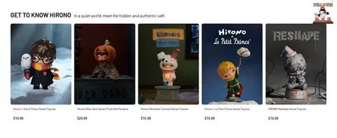
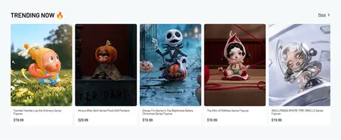
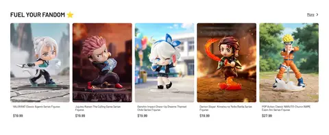
Product card Image-first product tile with a linked name, compact price, and, for launches, a charcoal label and small outlined notification action.
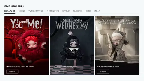
Featured series grid Large promotional character tiles sit in a multi-column layout with uppercase section labels and small outlined view-more controls.
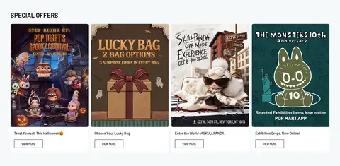
Special-offer tiles Campaign artwork is arranged as a row of image-led cards with short captions and compact outlined calls to action.
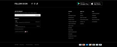
Dark footer Black footer groups social links, newsletter signup, contact details, site navigation, app badges, and low-contrast legal information.
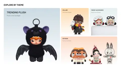
Imagery · Character photography and rendered collectible figures dominate the page, with product images usually framed as individual cards or promotional artwork. A cinematic, full-bleed hero uses dark video-like imagery and overlaid white title and controls. Other modules mix lifestyle scenes, illustrated campaign graphics, storefront photography, and clean character portraits. Keep imagery vivid and let each IP retain its own palette.
页面版块 共 15 个版块,按页面从上到下排列,每个都标了类型、布局和交互套路。
该做与不该做 ✓ 该做 Use white as the default page canvas. Let character artwork provide most of the color. Set section headings in bold uppercase Barlow. Use POP Signal red sparingly for brand emphasis. Separate major modules with generous white intervals. Keep buttons and dividers crisp and mostly square-cornered. ✕ 不该做 Do not flood the page with red accents. Do not place heavy shadows beneath product cards. Do not replace product photography with generic illustrations. Do not make every section a uniform card grid. Do not use rounded, pill-shaped controls as the default. Do not let labels or navigation overpower the collectible imagery. 给 AI 的提示词 想快速出一个同风格的新页面,把这段话连同 DESIGN.md 一起发给 AI。
复制 Build a new POP MART-style retail page with a clean Gallery White (#ffffff) canvas, occasional Soft Mist (#f5f5f5) bands, and Collector Ink (#000000) typography. Use POP Signal (#e60021) only for small brand moments. Set section titles in bold uppercase Barlow and use regular or medium Barlow for body copy, navigation, and controls. Lead with a wide, image-rich hero that can support a dark overlay and thin white outlined actions. Follow with varied, image-first product grids and campaign tiles, keeping product names and prices compact. Use whitespace and pale hairlines instead of heavy shadows. Favor crisp square controls, restrained charcoal launch badges, and strong alignment within a centered wide content area. Keep the artwork vivid and let it define each collection's mood.
DESIGN.md Tailwind v4 CSS 变量 Design Tokens
---
title: "POP MART design system"
variant: extended
source: https://www.popmart.com/us
captured_at: 2026-10-12
theme: light
industry: ecommerce
generator: Design DNA (https://four.wiralomi.com/style/popmart-com)
ai_generated: true
ai_label: "本文件由 AI 辅助生成:数值取自公开网页的实测样式,命名、用途说明与建议为模型解读。商标归原所有者。 / AI-assisted content"
---
# POP MART · Design System
> Gallery-like calm for character collectibles
**Theme:** light · **Industry:** ecommerce · **Source:** https://www.popmart.com/us · **Captured:** 2026-10-12 (1440×900 desktop)
_AI-assisted content: values are measured from the public page at capture time; names, roles and guidance are model-written interpretations. Trademarks belong to their owners._
A bright, catalog-led storefront pairs clean white space with dense collectible product imagery and an atmospheric, cinematic hero. Strong black typography and restrained red branding keep character worlds, launches, and shopping actions in focus.
## North star
Keep the storefront quiet and structured so vivid character imagery—not decorative interface chrome—owns the attention.
## Overview
The page uses a predominantly white canvas to let colorful character photography carry the personality. Pale gray bands quietly distinguish selected content areas, while black text and occasional fine gray rules organize the long retail journey. POP MART red is concentrated in the compact logo and a few promotional details rather than spread across every action. Barlow provides a clear, slightly condensed retail voice: bold uppercase section titles, medium-weight navigation and controls, and regular-weight product details. A cinematic, dark full-width hero provides contrast at the top; the rest of the page alternates between product grids, promotional image tiles, editorial character features, and store listings. Generous white intervals separate these varied modules, while product cards remain visually dense and image-first. Most controls are square-cornered and outlined, keeping the system crisp rather than soft or heavily elevated.
## Colors
| Name | Hex | Token | Group | Role |
|---|---|---|---|---|
| Gallery White | ` | `--color-gallery-white` | surface | Main page canvas, product-grid ground, and white type or outlined controls over dark hero imagery. |
| Soft Mist | ` | `--color-soft-mist` | surface | Subtle navigation, footer, and section-band surface that differentiates content without competing with product art. |
| Collector Ink | ` | `--color-collector-ink` | brand | Primary headings, navigation, product links, icons, outlined controls, and the solid footer background. |
| Quiet Graphite | ` | `--color-quiet-graphite` | neutral | Muted text and gray section treatment, including secondary information and restrained supporting copy. |
| Smoke Fade | ` | `--color-smoke-fade` | neutral | Appears chiefly in measured section gradients; use only as a subtle image-overlay tone, not a core brand fill. |
| POP Signal | ` | `--color-pop-signal` | accent | Small, high-impact brand accent in the logo and occasional promotional or action details. |
| Silver Haze | ` | `--color-silver-haze` | neutral | Minor footer gradient or supporting neutral detail; not a defining page surface. |
| Cool Divider | ` | `--color-cool-divider` | semantic | Fine borders and hairlines, particularly around footer and utility regions. |
| Badge Charcoal | ` | `--color-badge-charcoal` | neutral | Launch-time badge backgrounds, badge text, and small secondary footer details. |
| Footer Silver | ` | `--color-footer-silver` | neutral | Low-emphasis footer text and minor supporting details. |
| Pale Rule | ` | `--color-pale-rule` | neutral | Subtle separators and low-contrast footer or utility borders. |
### Semantic aliases
`--color-canvas` → ` (Gallery White) · `--color-surface` → ` (Soft Mist) · `--color-surface-2` → ` (Quiet Graphite) · `--color-surface-3` → ` (Collector Ink) · `--color-text` → ` (Collector Ink) · `--color-text-muted` → ` (Quiet Graphite) · `--color-text-subtle` → ` (Gallery White) · `--color-border` → ` (Cool Divider) · `--color-accent` → ` (POP Signal)
### Contrast (WCAG 2.x)
| Text | Background | Ratio | Level |
|---|---|---|---|
| ` | ` | 21:1 | AAA |
| ` | ` | 19.26:1 | AAA |
| ` | ` | 3.66:1 | AA-large |
| ` | ` | 5.74:1 | AA |
| ` | ` | 5.27:1 | AA |
| ` | ` | 3.66:1 | AA-large |
| ` | ` | 1.09:1 | fail |
| ` | ` | 5.74:1 | AA |
| ` | ` | 21:1 | AAA |
| ` | ` | 4.79:1 | AA |
### Gradients
- `linear-gradient(rgba(0, 0, 0, 0), rgba(0, 0, 0, 0.4))`
- `linear-gradient(rgba(255, 255, 255, 0), rgba(0, 0, 0, 0.3))`
- `linear-gradient(90deg, rgb(240, 216, 170), rgb(254, 238, 209))`
## Typography
| Family | Token | Source | Weights | Role | Free substitute |
|---|---|---|---|---|---|
| Barlow-Regular | `--font-body` | webfont | 400 | Body copy, section support text, and regular-weight interface labels. | Barlow |
| Barlow-Medium | `--font-barlow-medium` | webfont | 400, 500 | Navigation, buttons, launch badges, and medium-emphasis labels. | Barlow |
| Barlow-Bold | `--font-display` | webfont | 700, 400, 600 | Primary and section headings. | Barlow |
| Barlow | `--font-barlow` | webfont | 400, 700 | Fallback or shared family declaration across text styles. | Barlow |
- **Barlow-Regular:** Use a clean regular weight for descriptions and product metadata; keep tracking neutral.
- **Barlow-Medium:** Medium weight gives compact controls clear presence without turning them into display headlines.
- **Barlow-Bold:** Section headings are bold and uppercase; preserve the measured zero tracking.
- **Barlow:** Use as the family fallback; measured page styling favors regular, medium, and bold variants.
### Type scale — Minor Third (ratio ≈ 1.191, base 16px)
| Role | Size | Weight | Line height | Letter spacing | Case | Family | Used for |
|---|---|---|---|---|---|---|---|
| h1 | 27px | 700 | 1.57 | 0 | — | Barlow-Bold | Main hero or page-level headline, set bold with clear breathing room. |
| h2 | 21px | 700 | 1 | 0 | uppercase | Barlow-Bold | Uppercase section headings for featured collections and shopping modules. |
| h3 | 20px | 500 | normal | 0 | — | Barlow-Medium | Medium-weight product or subsection titles. |
| body | 16px | 400 | 1.57 | 0 | — | Barlow-Regular | Descriptions, introductory copy, and supporting page text. |
| caption | 12px | 400 | 1.4 | 0 | — | Barlow-Regular | Compact product metadata, prices, and secondary labels. |
| button | 12px | 400 | 1.57 | 0 | — | Barlow-Medium | Small, medium-weight text inside outlined or filled actions. |
OpenType features in use: `"tnum"` .
## Spacing & layout
- Base unit **2px**, density **comfortable**.
- Scale (most used values): 4, 5, 6, 9, 12, 15, 18, 21, 29, 30, 60 px.
- Section rhythm 40px · element gap 18px · card padding — · max content width 1350px.
A full-width retail homepage is organized into a long vertical sequence of distinct modules. The content grid is measured at a 1350px maximum width, with centered page sections and left-aligned headings. Product rows use multi-column grids, while themed promotions and character features mix wider tiles with smaller companion cards. Section spacing creates clear pauses between dense product collections. The first viewport starts with a slim announcement strip, a horizontal navigation bar, and a full-bleed hero before returning to a white content canvas.
## Shape & elevation
- Radius: input `2px` · media `50%` · badge `3px` · xs `2px` · sm `3px` · md `6px` · lg `9px` · pill `9999px`
- Shadow `hairline` (button): `rgba(0, 0, 0, 0.016) 0px 2px 0px 0px`
- Shadow `hairline-2` (footer): `rgba(0, 0, 0, 0.15) 1px 1px 1px 0px`
- Motion: standard transition `0.3s ease` on interactive elements.
The interface is mostly flat: white cards sit directly on the canvas, and section changes rely more on whitespace and pale bands than on shadows. Borders are thin and restrained. Buttons are typically square-cornered and outlined; launch badges use a small radius. Keep overlays limited to hero text legibility and avoid adding heavy card elevation.
## Imagery
Character photography and rendered collectible figures dominate the page, with product images usually framed as individual cards or promotional artwork. A cinematic, full-bleed hero uses dark video-like imagery and overlaid white title and controls. Other modules mix lifestyle scenes, illustrated campaign graphics, storefront photography, and clean character portraits. Keep imagery vivid and let each IP retain its own palette.
## Components
### Announcement strip
A compact, pale top bar carries a short offer message, red account link, and close control.
### Primary navigation
A horizontal white header combines the red logo, uppercase category links, search field, utility icons, and sign-in link.
### Hero carousel
Full-width cinematic imagery carries a centered white title, adjacent thin white-outline actions, slide indicators, and a pause control.
### Product card
Image-first product tile with a linked name, compact price, and, for launches, a charcoal label and small outlined notification action.
### Featured series grid
Large promotional character tiles sit in a multi-column layout with uppercase section labels and small outlined view-more controls.
### Special-offer tiles
Campaign artwork is arranged as a row of image-led cards with short captions and compact outlined calls to action.
### Dark footer
Black footer groups social links, newsletter signup, contact details, site navigation, app badges, and low-contrast legal information.
### Measured component styles
- **Primary button** (“EXPLORE MORE”): transparent background · text ## Do
- Use white as the default page canvas.
- Let character artwork provide most of the color.
- Set section headings in bold uppercase Barlow.
- Use POP Signal red sparingly for brand emphasis.
- Separate major modules with generous white intervals.
- Keep buttons and dividers crisp and mostly square-cornered.
## Don't
- Do not flood the page with red accents.
- Do not place heavy shadows beneath product cards.
- Do not replace product photography with generic illustrations.
- Do not make every section a uniform card grid.
- Do not use rounded, pill-shaped controls as the default.
- Do not let labels or navigation overpower the collectible imagery.
## Agent prompt
Build a new POP MART-style retail page with a clean Gallery White (## Page sections (top to bottom)
| # | Type | Layout | UX patterns | UI patterns |
|---|---|---|---|---|
| 1 | hero | Full-width, single-column hero region beneath the site header. | Carousel controls, Pause control | Dark full-bleed media, Centered white title, Outlined actions |
| 2 | product-grid | Left-aligned heading and introduction above a five-column product row. | Product links, Price display | Character photography, Compact captions, White background |
| 3 | feature-grid | Section heading and character tabs above a three-column image grid. | Category tabs, View-more links | Large promotional imagery, Uppercase heading, Outlined tile actions |
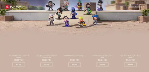
| 4 | product-showcase | Full-width media band with an overlaid showcase and product details below. | Online discovery, Product actions | Character scene, Image overlay, Pale neutral band |
| 5 | feature-grid | One large tile alongside smaller promotional tiles in an asymmetric grid. | Theme browsing, Promotional links | Mixed tile sizes, Character-led art, Pale campaign backgrounds |
| 6 | category-nav | Compact heading above two rows of small linked topic items. | Quick topic navigation, Popular query links | Small character thumbnails, Short labels, Open spacing |
| 7 | product-grid | Section heading and more link above a five-column product row. | Product links, More discovery | Large product images, Compact price captions, White canvas |
| 8 | product-grid | Section heading and more link above a five-column product row. | Fandom discovery, Product links | Character merchandise, Image-first cards, Compact metadata |
| 9 | feature-grid | Campaign heading above a four-column row of image-led offer cards. | Offer discovery, View-more actions | Campaign artwork, Short captions, Outlined buttons |
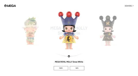
| 10 | product-showcase | Wide, minimal showcase with a centered featured collectible and supporting links. | Featured item browsing, Size selection | Large figure imagery, Minimal text, Outlined selectors |
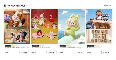
| 11 | product-grid | Heading and explore link above four columns of new-launch products. | Launch information, Notify-me actions | Launch badges, Outlined notification buttons, Product imagery |
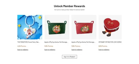
| 12 | product-grid | Centered heading and intro above a centered four-column rewards row. | Points redemption, Sign-in prompt | Reward item cards, Points labels, Outlined sign-in action |
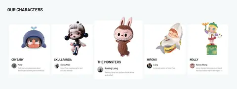
| 13 | team | Section heading above a five-column set of character profiles. | Character discovery, Profile browsing | Character portraits, Names and descriptions, Pale section band |
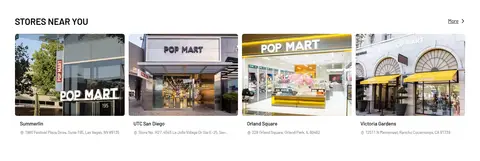
| 14 | other | Heading and more link above a six-column store listing area. | Store discovery, Location details | Storefront photographs, Address captions, White background |
| 15 | footer | Black footer organized into social, newsletter/contact, and navigation columns. | Email signup, Social links, Support navigation | Black background, Light text, Thin separators |
## Source CSS custom properties (selected)
```css
--swiper-theme-color: