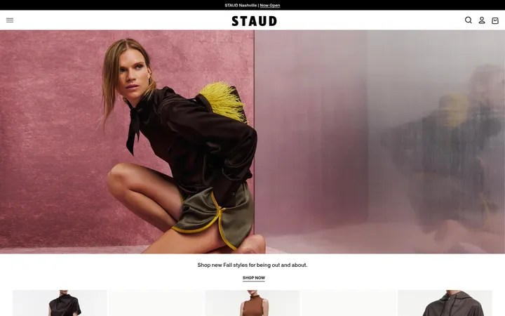
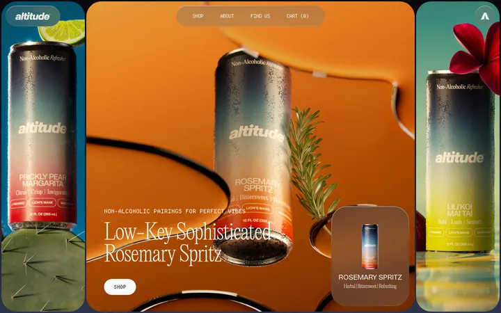
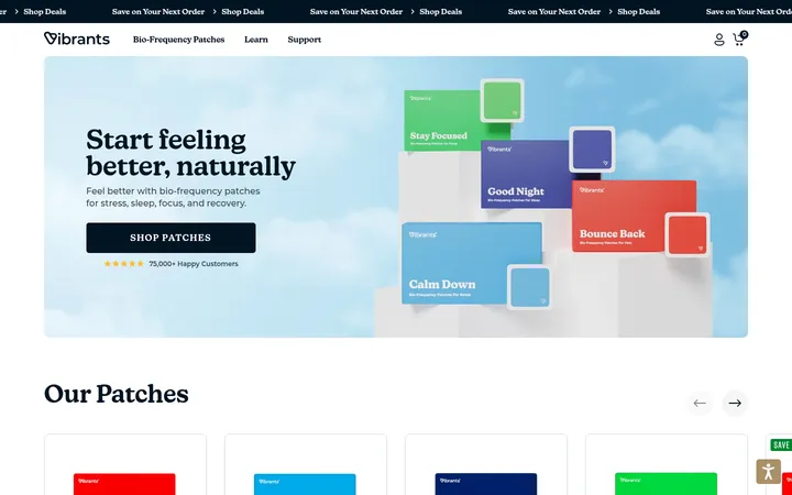
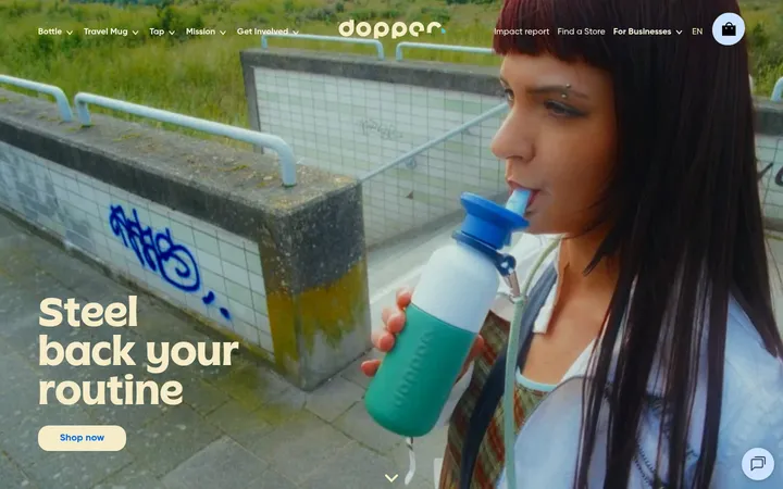
North star · Keep the interface quiet and flat so oversized type and full-bleed product photography carry the story.
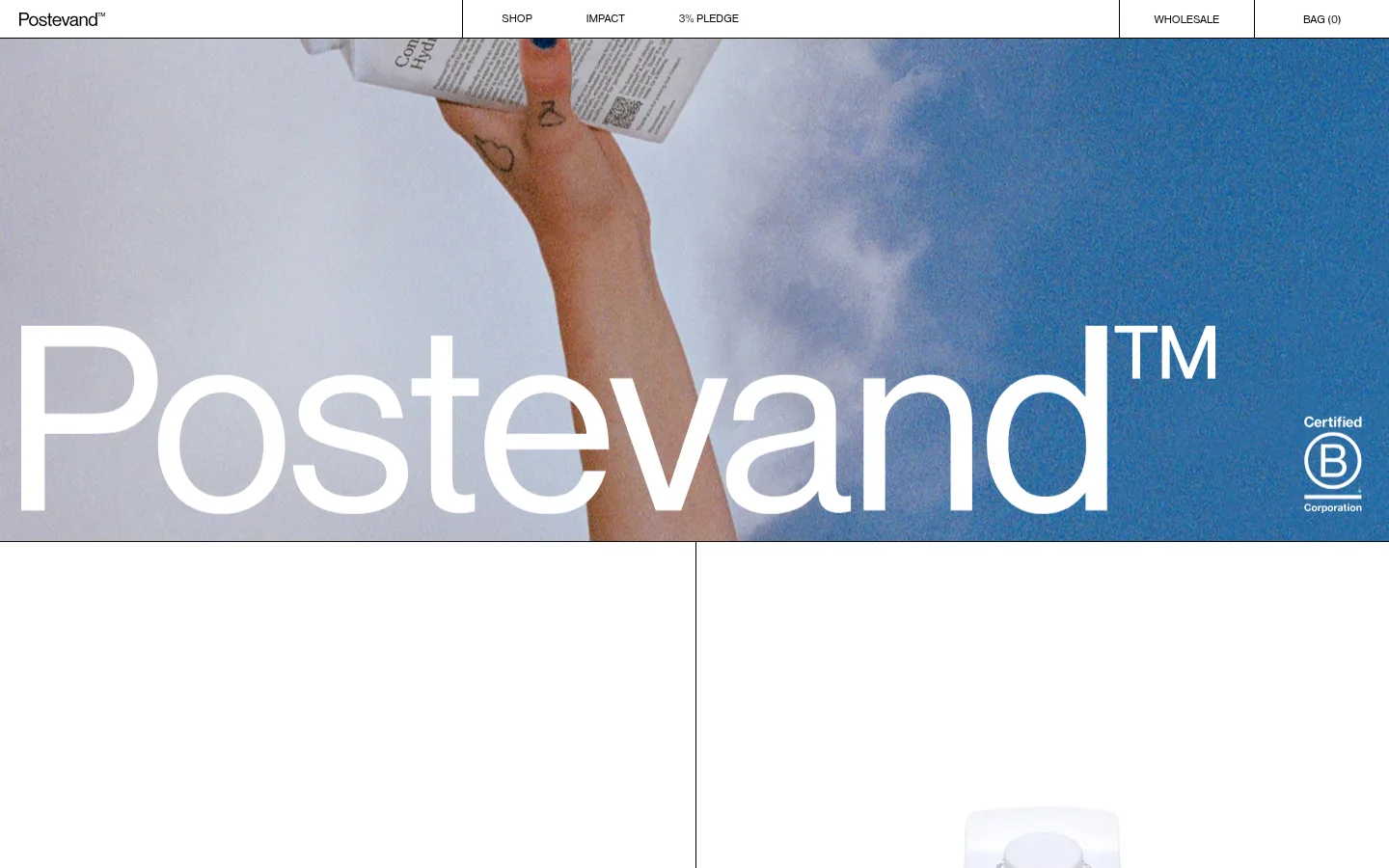
The visual strategy keeps the interface nearly monochrome: white is the main canvas, black carries navigation and text, and a very light gray-green marks occasional section or card surfaces. Blue and other saturated hues appear mainly in the hero photograph, so treat them as image content rather than recurring interface accents. Nimbus Sans D OT supplies a consistent voice, from compact uppercase navigation to oversized, regular-weight display lettering. The opening image runs edge to edge and uses the product-in-hand scene as the page’s strongest colour and texture. Fine black dividers structure the header and split content without adding shadows or decorative containers. The overall layout is spacious and low-density, with large blank white areas around content; keep type and imagery direct, and avoid introducing extra colour, gradients, or ornamental effects.
The page-wide typeface for display, headings, body copy, captions, and navigation.
角色
示例
字号
字重
行高
字距
特大标题
Oversized brand wordmark over the opening lifestyle image.
Postevand
80px
400
1
-0.01em
一级标题
Primary page headline and prominent introductory messaging.
Postevand
56px
400
1.2
-0.01em
二级标题
Major section headings, including lifecycle and impact content.
Postevand
42px
400
normal
-0.013em
三级标题
Secondary feature or product-story headings.
Postevand
40px
400
normal
-0.02em
正文
Explanatory product, materials, and sustainability copy.
The quick brown fox 敏捷的狐狸
16px
400
1.4
0
辅助文字
Compact supporting labels and image details.
The quick brown fox 敏捷的狐狸
10px
400
1.4
0
导航
Small uppercase labels in the primary navigation.
The quick brown fox 敏捷的狐狸
12px
400
1
0
间距与布局
基准单位 2px · 密度:紧凑
40px版块间距
1px元素间距
—卡片内边距
—内容最大宽度
1px
4px
6px
10px
20px
22px
28px
40px
60px
67px
180px
A compact horizontal header sits above a full-bleed photographic hero. Content below uses a divided, multi-column editorial structure, with thin black rules defining boundaries rather than filled-in cards. Text is left-aligned, and the page maintains a notably low visual density, leaving broad stretches of white canvas around content. Keep section transitions calm and use the light gray-green surface selectively. No measured maximum content width is available, so preserve the screenshot’s generous, edge-to-edge feeling rather than imposing an invented container size.
圆角与层次
没有测到阴影:页面是扁平的,层次靠底色和描边区分。
The page is predominantly flat, with no measured shadows or rounded corners. Use thin black dividers for structural separation, especially in the header and split content. Keep cards square and restrained; contrast comes from white versus pale gray-green surfaces and from photography, not floating panels or layered effects.
组件
下面的预览按实测的按钮、输入框、徽标、卡片样式重建(字体用替代字体)。
Top navigation
White horizontal header with the Postevand wordmark, small uppercase links for Shop, Impact, 3% Pledge, and Wholesale, plus a Bag count. Separate key areas with fine black rules.
Photographic hero
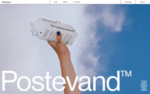
Edge-to-edge campaign image with a person holding the carton, oversized white Postevand lettering, and a small certification mark.
Editorial feature area
Multi-column content introduces lifecycle results and product benefits, using left-aligned headings and restrained black text.
Product information card
Square-cornered, flat card treatment; white or #f0f1ef surfaces sit behind compact black product copy.
Structural dividers
Fine black lines distinguish navigation zones and split content without shadows or decorative framing.
Imagery · The hero is a full-width lifestyle photograph showing a person holding a Postevand carton against a blue sky. Large white brand lettering overlays the lower part of the image, while the B Corp mark sits within the photograph. Product and campaign imagery is central; saturated blues and incidental skin tones belong to photography, not the core interface palette.
Reserve #f0f1ef for subtle section or card contrast.
Use Nimbus Sans D OT throughout the interface.
Keep navigation small, uppercase, and visually compact.
Let product photography run edge to edge where the story calls for it.
✕ 不该做
Do not promote photographic blues into recurring UI colours.
Do not add gradients, ornamental shadows, or floating panels.
Do not round card corners.
Do not crowd the page with dense content or decorative elements.
Do not replace the restrained divider-based structure with heavy borders.
给 AI 的提示词
想快速出一个同风格的新页面,把这段话连同 DESIGN.md 一起发给 AI。
Build a new Postevand-style page with a quiet, editorial visual system. Use #ffffff as the main canvas, #000000 for navigation, copy, and fine dividing rules, and #f0f1ef only for occasional soft section or card surfaces. Set all interface typography in Nimbus Sans D OT, or a close sans-serif substitute; keep navigation compact and uppercase, and give large headings subtly tight tracking. Create a simple horizontal header and use generous open space around left-aligned content. Where imagery is appropriate, let an authentic product or lifestyle photograph dominate the width; treat its colours as photography, not UI accents. Keep containers flat and square-cornered, with no shadows or gradients. Preserve a low-density rhythm and let the product, typography, and image do the visual work.