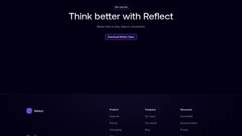
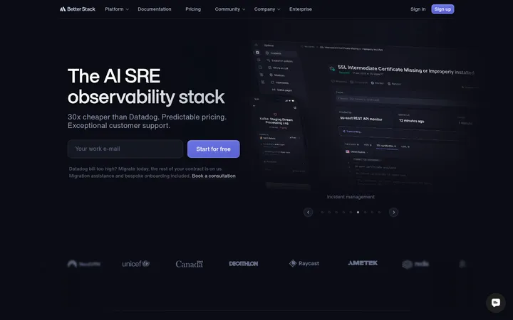
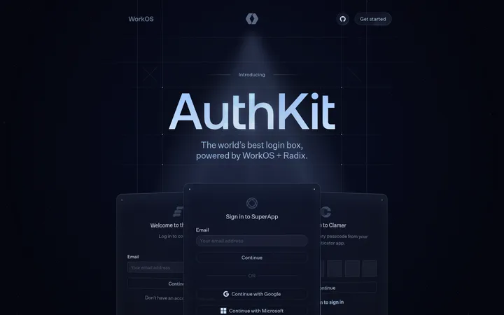
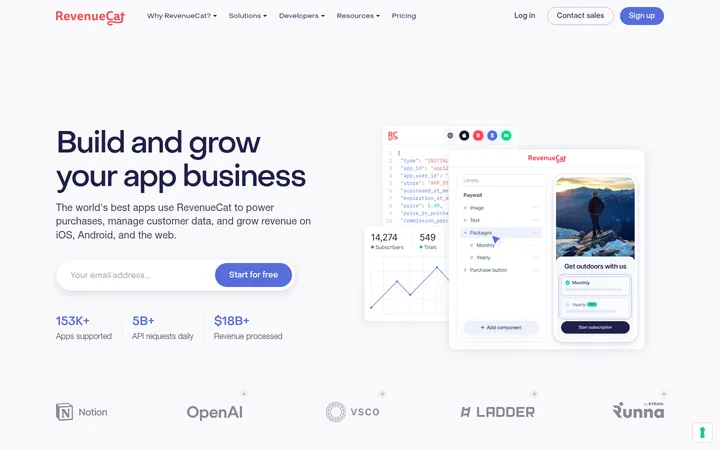
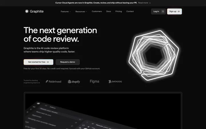
North star · Let a near-black violet canvas and spacious centered storytelling make luminous product details—not decorative UI—the focal point.
Build the page around the measured near-black violet canvas (#030014), which stays consistent across the long sequence of sections. Use soft off-white for prominent headings, muted grays for explanatory copy, and lavender for links and small emphasis. Stronger indigo-violet is reserved for primary actions and selected interface details. Typography pairs AeonikPro’s rounded, restrained display character with Inter V for body copy, labels, and controls; keep headings centered and sentence case. The page alternates centered text blocks, feature grids, and wide product demonstrations, with substantial vertical pauses between major stories. Product imagery provides the vivid contrast: purple light blooms, glowing interface details, and dark app mockups sit against the quiet canvas. Cards remain dark and understated, defined mostly by subtle borders and restrained inset effects rather than prominent shadows. Maintain the sparse, technical, calm mood throughout.
Body copy, navigation, captions, buttons, links, and interface labels.
Aa 设计
AeonikPro
网络字体 · 字重 500 · 占比 5%
免费替代:Manrope
Display headlines and section headings.
角色
示例
字号
字重
行高
字距
特大标题
Large hero headline introducing the product’s central promise.
Reflect
72px
500
1.11
0
一级标题
Primary hero title and major page-level statements.
Reflect
56px
500
1.14
0
二级标题
Centered feature, pricing, team, and academy section headings.
Reflect
48px
500
1.17
0
三级标题
Secondary headings within feature and product sections.
Reflect
32px
500
1.25
0
四级标题
Compact subheadings and smaller card or feature titles.
The quick brown fox 敏捷的狐狸
24px
500
1.33
0
正文
Main explanatory paragraphs and testimonial copy.
The quick brown fox 敏捷的狐狸
16px
400
1.5
0
辅助文字
Supporting notes, fine-print pricing details, and eyebrow labels.
The quick brown fox 敏捷的狐狸
14px
400
1.43
0
按钮
Download actions and compact interactive controls.
The quick brown fox 敏捷的狐狸
13px
400
normal
0
链接
Inline navigation, social handles, and calls to explore.
The quick brown fox 敏捷的狐狸
16px
400
1.5
0
间距与布局
基准单位 4px · 密度:紧凑
32px版块间距
12px元素间距
8px卡片内边距
744px内容最大宽度
4px
5px
6px
8px
12px
14px
15px
16px
20px
24px
28px
32px
36px
56px
The page uses a narrow centered content measure, with the measured maximum width of 744px guiding text and compact content groups. Center-aligned hero and section introductions alternate with two-column feature areas and broad product demonstrations. The canvas remains continuous, so section changes come from content, imagery, and vertical pauses rather than contrasting background bands. Grids are compact and fine-lined; the long-page rhythm leaves generous breathing room around major product stories. Navigation and footer links use compact groupings.
圆角与层次
按钮 · 6px
卡片 · 24px
徽标 · 4px
链接 · 8px
inset · other, link
hairline · other
hairline · other
hairline · other
Keep surfaces mostly flat against the canvas. Use subtle one-pixel dark-purple hairlines to distinguish cards and controls, with rounded card corners and a faint inset highlight where measured. Avoid heavy drop shadows; depth comes from overlapping interface imagery, restrained borders, and luminous gradients.
组件
下面的预览按实测的按钮、输入框、徽标、卡片样式重建(字体用替代字体)。
Top navigation
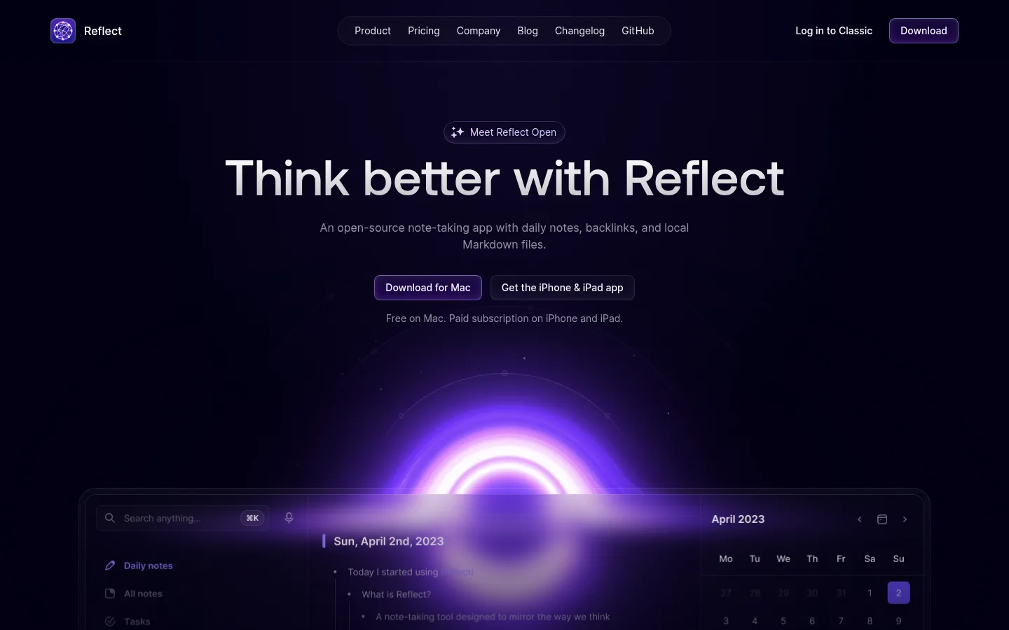
Compact horizontal header with logo at left, centered pill-like navigation, and utility links plus a purple Download action at right.
Hero
Centered eyebrow badge, large AeonikPro headline, muted explanatory copy, paired download links, and a luminous product demonstration below.
Feature grid
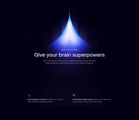
Small icon-led feature items arranged in a compact grid; use muted descriptions, fine dark dividers, and no bright card fills.
Product card
Dark interface panel with a subtle #1d1a2c border, restrained inset highlight, and rounded corners; imagery supplies most of its contrast.
Primary action
Compact indigo-violet filled control with white Inter V text, a measured 6px radius, and understated border.
Pricing choice
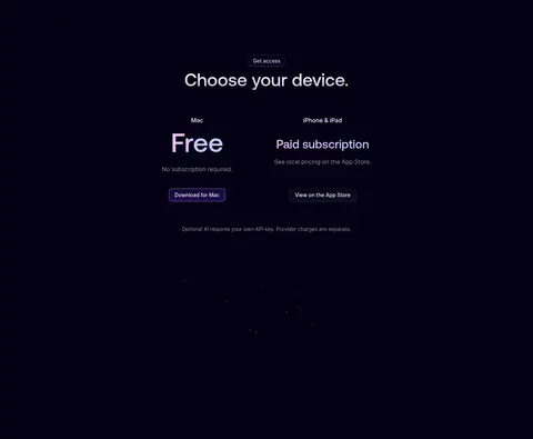
Centered device options in two columns, separating free Mac access from paid iPhone and iPad access with concise supporting details.
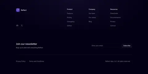
Newsletter footer
Dark footer band with grouped product, company, and resource links above a compact email subscription row and legal details.
Imagery · The product is shown through dark app-interface mockups and full-width video or media moments, not conventional lifestyle photography. Luminous purple and occasional cyan-blue effects create a focal glow behind interface panels. Keep imagery cropped dramatically and integrated into the dark canvas; treat the bright bloom as product illustration, not a page-wide color palette.
Keep the page canvas consistently near-black violet.
Use lavender accents sparingly for links and emphasis.
Reserve brighter violet fills for primary actions and UI details.
Center section introductions and keep headings in sentence case.
Use generous vertical pauses between major product stories.
Let product imagery provide the strongest color and glow.
✕ 不该做
Do not introduce bright section backgrounds.
Do not turn the glow colors into large solid surfaces.
Do not use heavy shadows to separate every card.
Do not make supporting copy compete with the headlines.
Do not crowd the spacious page rhythm with dense content.
Do not treat mockup-only colors as core brand colors.
给 AI 的提示词
想快速出一个同风格的新页面,把这段话连同 DESIGN.md 一起发给 AI。
Create a new Reflect-style page using Midnight Violet (#030014) as a continuous canvas. Use Moonlit Text (#f4f0ff) for prominent copy, Quiet Lilac (#aaa7b9) and Dusk Gray (#908ea0) for supporting text, and Soft Signal (#9382ff) for links. Reserve Action Indigo (#5046e4) for primary filled controls and Glow Lavender (#b7a4fb) for localized product-art gradients. Set display headings in AeonikPro or a close geometric sans substitute, with Inter for body text and controls. Center the major introductions; alternate them with compact feature grids and broad dark product demonstrations. Keep cards understated with thin Graphite Plum (#1d1a2c) borders, rounded corners, and minimal elevation. Preserve generous vertical pauses, concise copy, and strong contrast between quiet interface surfaces and luminous product imagery.