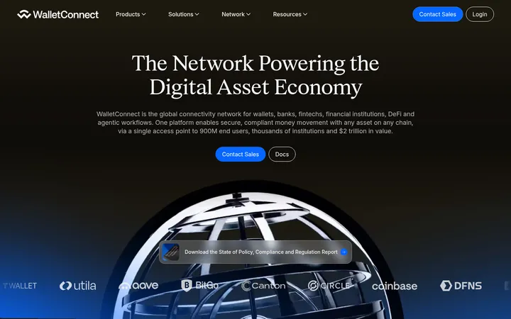
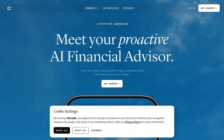
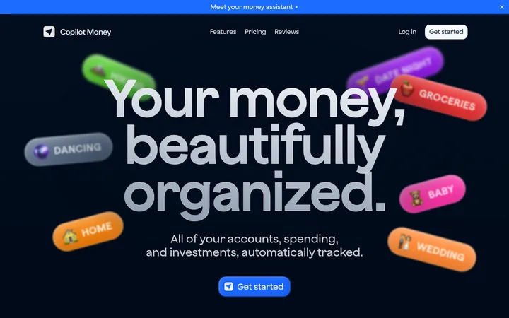
North star · Let immersive, high-contrast photography lead, then keep interface elements crisp, pill-shaped, and typographically restrained.
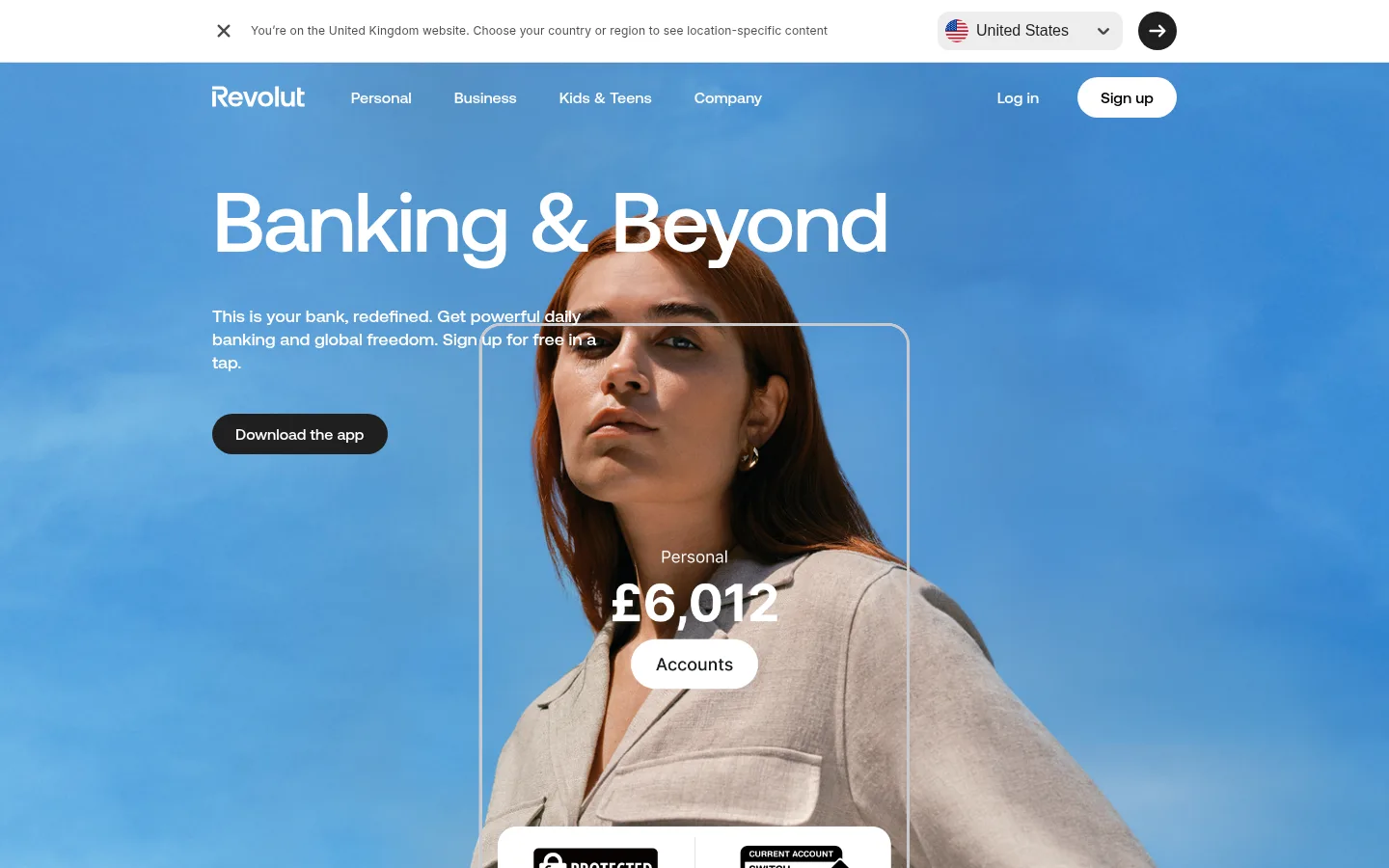
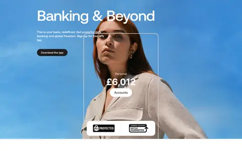
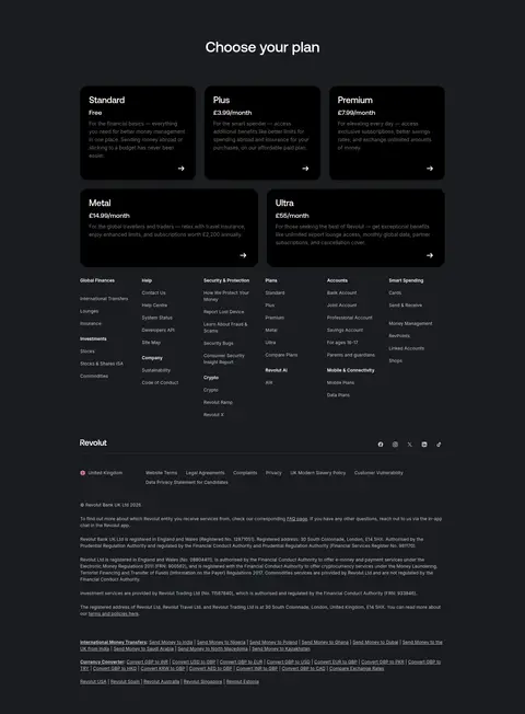
The page opens with a full-bleed blue hero photograph, placing large white Aeonik Pro display text over the image and a compact download CTA beneath the supporting copy. The blue gradient belongs to the hero treatment; the measured blue gradient stops are #4c8acc and #3991d8, while photographic color should not be mistaken for additional brand tokens. White sections provide a quiet reset for proof points and security content. Near the bottom, a broad #191c1f plan and footer region creates a strong tonal anchor, with white headings and compact information arranged in columns. Aeonik Pro supplies rounded, confident headlines and body text; Inter appears in small captions and legal or utility links. Layout favors centered, constrained content with occasional full-bleed media. Controls are pill-shaped, cards are rounded, and borders are light and restrained rather than relying on prominent shadows.
配色
点色块复制色值。用途说明来自对页面的实测位置(背景、文字、描边、按钮)与截图判读。
强调色
表层色
中性色
功能色
页面底色 · Gallery White表层 · Pure Ink表层 2 · Night Slate主文字 · Graphite Ink次要文字 · Soft Alloy弱文字 · Gallery White描边 · Soft Alloy强调 · Sky Current强调 2 · Clear Current
Compact captions, small links, and utility or legal copy.
Aa 设计
Aeonik Pro
网络字体 · 字重 400 / 500 · 占比 21%
免费替代:Manrope
Display and section headings, body copy, navigation, and primary CTA labels.
角色
示例
字号
字重
行高
字距
特大标题
Oversized hero headline over full-bleed photography.
Revolut
87.5px
500
1
-0.024em
一级标题
Primary page or major section heading.
Revolut
52px
500
1
-0.012em
二级标题
Section titles, including plan selection and editorial blocks.
Revolut
40px
500
1.2
-0.01em
三级标题
Card titles and subordinate content headings.
The quick brown fox 敏捷的狐狸
24px
500
1.17
-0.01em
正文
Hero supporting copy and standard explanatory text.
The quick brown fox 敏捷的狐狸
18px
400
1.33
0
辅助文字
Small captions, awards context, and legal notes.
The quick brown fox 敏捷的狐狸
12px
400
1.5
0.015em
导航
Main navigation labels and menu items.
The quick brown fox 敏捷的狐狸
16px
500
1.38
0
链接
Compact informational and footer links.
The quick brown fox 敏捷的狐狸
12px
400
1.5
0.015em
间距与布局
基准单位 8px · 密度:适中
64px版块间距
8px元素间距
—卡片内边距
1000px内容最大宽度
4px
8px
10px
12px
16px
18px
20px
24px
40px
80px
Use a centered content frame with a measured maximum width of 1000px, while letting hero photography and major dark bands span the viewport. The hero aligns headline and copy to the left over centered subject imagery; later content returns to more restrained centered or column-based arrangements. Maintain a comfortable density with an 8px base spacing unit, measured 64px section gap, and clear separation between white content and the dark plan/footer block. Pricing content is denser and multi-column; keep its hierarchy legible.
圆角与层次
按钮 · 9999px
卡片 · 23px
图片 · 23px
导航 · 9999px
没有测到阴影:页面是扁平的,层次靠底色和描边区分。
The interface reads mostly flat: broad color fields and photography provide depth rather than heavy shadows. Cards use generous rounded corners, and measured card borders are light gray. Pill buttons create clear, compact control silhouettes. Layered account UI on the hero is outlined and legible against the image; preserve contrast without adding unmeasured shadow treatments.
组件
下面的预览按实测的按钮、输入框、徽标、卡片样式重建(字体用替代字体)。
Hero navigation
Place brand and primary menu over the blue hero, with light navigation labels and a contrasting sign-up pill.
Download CTA
Use a dark #1f1f1f pill with white text; measured buttons use 16px Aeonik Pro and 10px 24px padding.
Hero account overlay
Layer a fine outlined account panel and compact account details over the lifestyle image, keeping the subject visible.
Trust and award strip
Set proof points on white with small logos and compact captions; treat logo colors as supplied artwork, not page palette.
Security media section
Use broad cinematic media and minimal surrounding interface to create an atmospheric break between content areas.
Plan cards
Present multiple tiers on #191c1f with light text, rounded card shapes, compact descriptions, and clear plan hierarchy.
Footer columns
Organize dense navigation and legal links into columns on a dark surface, using small muted text and subtle separators.
Imagery · Use cinematic, full-bleed lifestyle photography as the primary hero device, with a person framed prominently against a saturated blue background. Product-account interface elements can layer over the photograph as crisp outlined panels. Further down, large video or photographic sections create an atmospheric transition; keep image color and awards artwork distinct from the core brand palette.
Use the measured blue gradient only as a hero treatment.
Keep hero headlines large, white, and clearly readable over photography.
Use Aeonik Pro for prominent headings and primary interface text.
Reserve Inter for compact captions, links, and legal details.
Separate white editorial sections from the near-black plan and footer band.
Use rounded pill silhouettes for prominent buttons.
✕ 不该做
Do not treat colors inside photographs or award logos as brand palette tokens.
Do not add unmeasured accent colors to interface elements.
Do not rely on heavy drop shadows for card hierarchy.
Do not make all content blocks full-bleed; preserve quiet white sections.
Do not let dense footer links compete with the main heading hierarchy.
Do not use sharp, square buttons in place of the measured pill controls.
给 AI 的提示词
想快速出一个同风格的新页面,把这段话连同 DESIGN.md 一起发给 AI。
Build a new fintech page in Revolut’s visual style. Use Gallery White (#ffffff) for clean content bands, Graphite Ink (#1f1f1f) for primary text and dark CTAs, and Night Slate (#191c1f) for a substantial dark information section. For a vivid media-led hero, use the measured gradient stops Sky Current (#4c8acc) and Clear Current (#3991d8), or place them behind photographic imagery. Set headlines and core interface text in Aeonik Pro or Manrope; use Inter for compact captions and utility links. Keep a centered content frame, with full-bleed hero media and generous separation between sections. Use rounded pill buttons and restrained card borders, not heavy shadows. Make the photographic subject and headline dominant, keep secondary copy concise, and reserve dense multi-column layouts for plans or the footer.