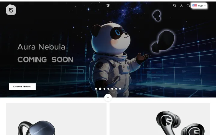
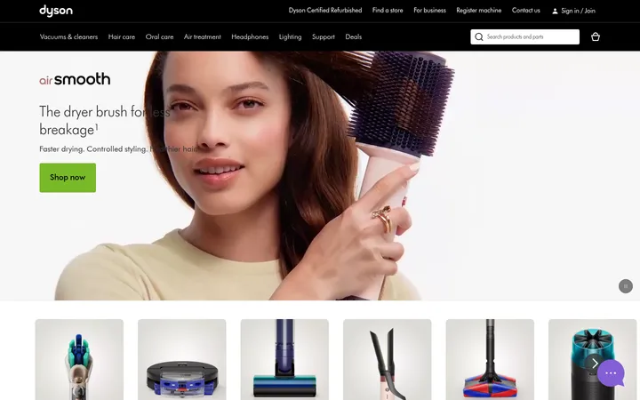
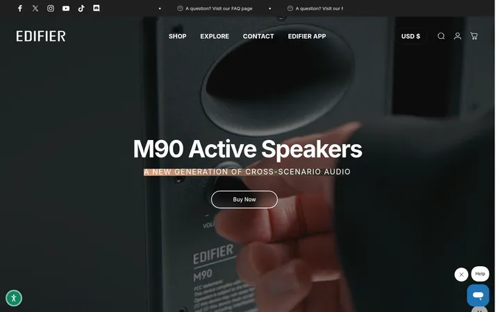
North star · Let cinematic product imagery lead, then make the catalog easy to scan with quiet surfaces and unmistakable cyan actions.
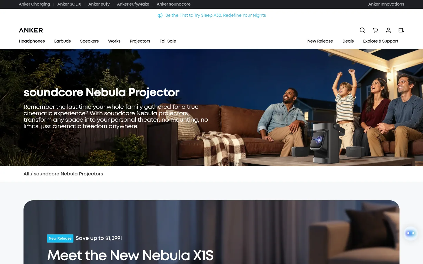
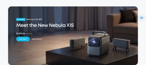
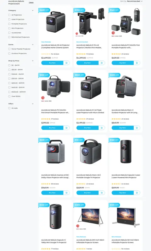
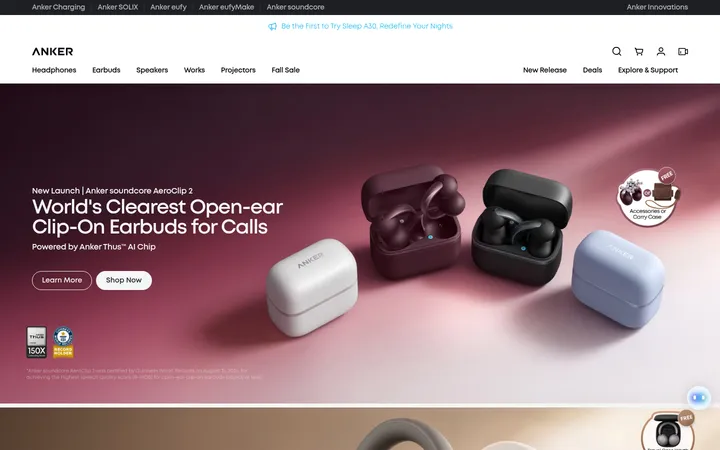
The visual system balances a pale cool canvas (#f7f8f9) with white product cards and near-black footer bands (#111111). Black headings and charcoal body text keep the interface legible, while cyan (#17bbef) marks purchase actions, badges, and links. The collection hero is a wide lifestyle photograph with white overlay copy; a second rounded campaign panel brings product imagery and a prominent release message into the shopping flow. MontForAnker supplies a consistent geometric sans-serif voice, with bold, tightly tracked headings and compact, heavy navigation and controls. The catalog uses a three-column product-card area beside a narrow category and filter rail, keeping product imagery central while exposing shopping controls. Generous transitions between the catalog, editorial overview, FAQ, and footer prevent the long page from feeling like one continuous grid. Rounded cards and pill-shaped CTAs soften the otherwise precise retail layout; thin gray rules organize FAQ rows and form details.
Site-wide type for navigation, headings, product cards, body copy, buttons, and FAQs.
角色
示例
字号
字重
行高
字距
一级标题
Collection hero headline and primary page title.
soundcore
48px
700
1.5
-0.04em
二级标题
Campaign and editorial section headings.
The quick brown fox 敏捷的狐狸
24px
700
1.5
-0.02em
三级标题
Subsection titles and prominent product or FAQ headings.
The quick brown fox 敏捷的狐狸
20px
600
1.1
-0.02em
正文
Product descriptions, editorial copy, and supporting page text.
The quick brown fox 敏捷的狐狸
16px
700
1.5
-0.02em
辅助文字
Compact product metadata, labels, and secondary details.
The quick brown fox 敏捷的狐狸
14px
700
1.5
-0.02em
按钮
Buy Now and other purchase or form actions.
The quick brown fox 敏捷的狐狸
14px
700
1.5
0
导航
Global navigation and category navigation labels.
The quick brown fox 敏捷的狐狸
14px
700
1.4
-0.02em
链接
Inline editorial, FAQ, and supporting navigation links.
The quick brown fox 敏捷的狐狸
16px
700
1.5
-0.02em
间距与布局
基准单位 4px · 密度:适中
72px版块间距
4px元素间距
—卡片内边距
1280px内容最大宽度
2px
4px
6px
8px
10px
11px
12px
14px
16px
20px
24px
64px
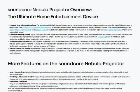
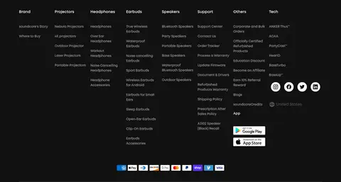
The page uses a wide centered retail frame, with measured content capped at 1280px. A full-width photographic collection hero leads into a large campaign panel, followed by a three-column product grid and a filter rail. The long editorial overview and FAQ return to a single-column reading flow. A generous section rhythm separates shopping, information, and conversion areas; the catalog itself is comparatively dense. The footer switches to a dark background and distributes utility links across multiple columns.
圆角与层次
按钮 · 9999px
输入框 · 8px
卡片 · 24px
图片 · 32px
徽标 · 2px
md · button
The interface is mostly flat, relying on white cards against a cool light canvas rather than strong shadows. Rounded card corners separate catalog items, while hairline gray borders and separators organize controls and FAQ rows. Large campaign imagery supplies the main depth; the dark footer forms a clear full-width layer.
组件
下面的预览按实测的按钮、输入框、徽标、卡片样式重建(字体用替代字体)。
Collection hero
Full-width cinematic lifestyle photography with white title and supporting copy overlaid on the image.
Campaign panel
Large rounded promotional media card with a New Release badge, product headline, price, cyan Buy Now action, and Learn More link.
Filter rail
Compact category, scene, price, and offer filters sit beside the product grid, using checkbox controls and expandable groups.
Product card
White rounded card with product photography, discount badge, title, review and price details, and a cyan purchase button.
FAQ accordion
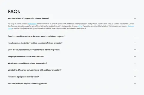
Single-column question rows with subtle separators and chevron controls; expanded answers include inline links.
Newsletter form
Centered subscription prompt in the dark footer, with a pill-like email field and cyan subscribe action.
Imagery · Photography is the dominant visual storytelling device: a full-width family cinema scene establishes the collection, while the campaign panel and catalog show projectors and accessories. Product images sit on clean card backgrounds for easy comparison. Warm, cinematic scenes and darker product mockups provide contrast against the pale interface. No illustration style defines the brand palette; the cyan accent remains in UI labels and actions.
Keep the main content on the measured cool light canvas.
Use Signal Cyan for primary purchase actions and release badges.
Let large product and lifestyle photography carry the campaign story.
Keep the catalog scannable with a filter rail and repeated card structure.
Use MontForAnker or a close geometric sans-serif substitute.
Separate the informational content from the catalog with clear section rhythm.
✕ 不该做
Do not replace the cyan accent with a second saturated interface color.
Do not put dense catalog controls over the campaign photography.
Do not give every section a dark background; reserve near-black for footer bands.
Do not add heavy shadows where cards and borders already define structure.
Do not make product cards typographically loose or editorially oversized.
Do not treat colors found only in product imagery as brand UI colors.
给 AI 的提示词
想快速出一个同风格的新页面,把这段话连同 DESIGN.md 一起发给 AI。
Build a new soundcore-style consumer-electronics page with a clean, shoppable visual system. Use Cool Canvas (#f7f8f9) for the main background, Gallery White (#ffffff) for cards, Product Ink (#000000) for headings, and Signal Cyan (#17bbef) for primary actions, links, and badges. Use MontForAnker or a close geometric sans alternative, with bold, tightly tracked headings and compact product UI. Lead with a wide cinematic photograph and overlay readable white copy, then present a rounded campaign feature and a filterable three-column product catalog. Keep product photography central and cards flat, with restrained gray separators. Follow with readable editorial content and a simple FAQ accordion. Finish with a full-width Footer Charcoal (#111111) section, centered newsletter form, and multi-column utility links.