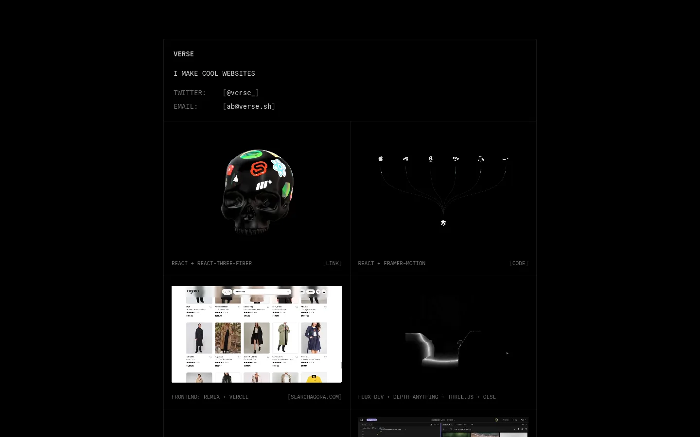
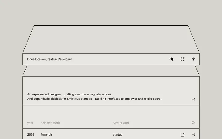
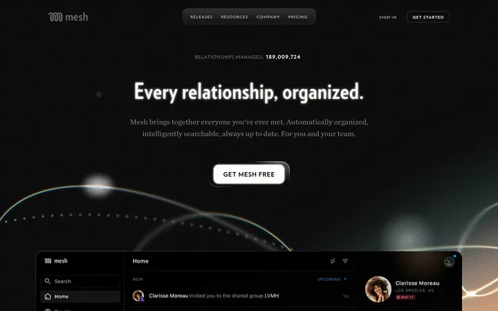
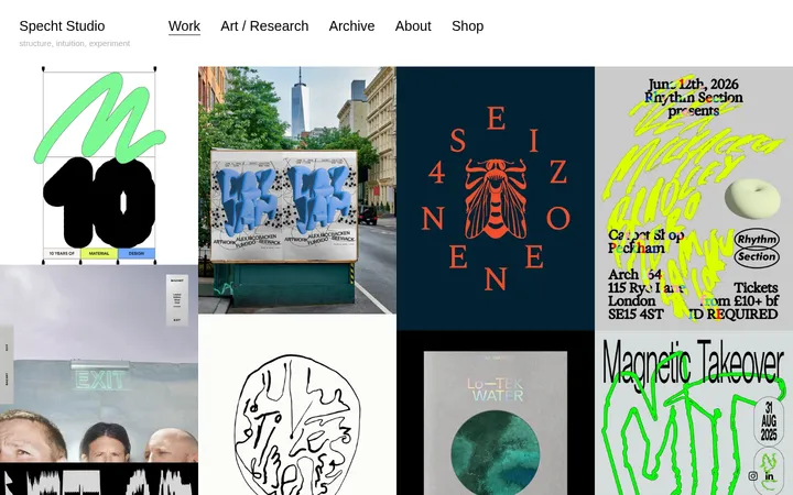
North star · Keep the interface nearly black and typographically quiet; let a precise, thin-lined project grid frame the work without competing with it.
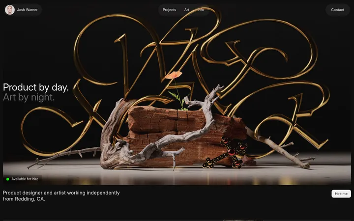
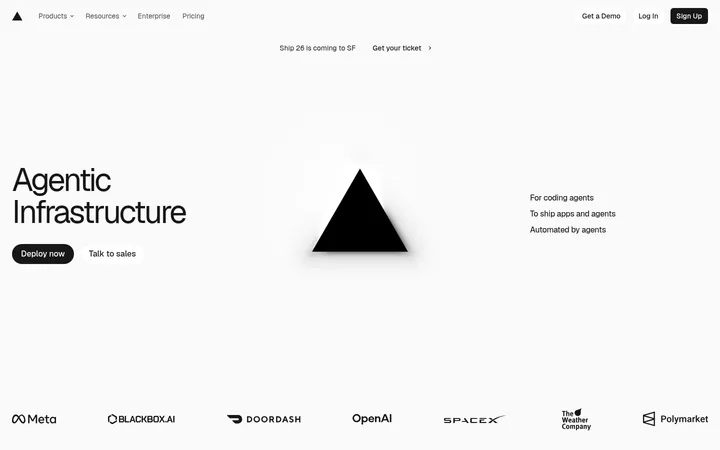
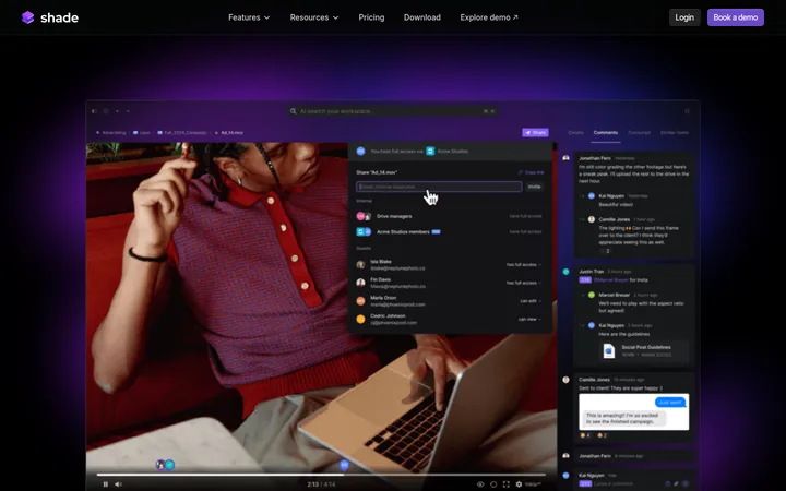
The page is built around an almost entirely black canvas, with measured gray text and hairline borders providing its interface contrast. The opening identity block is small and understated; the portfolio grid, rather than a large hero, becomes the main event. Commit Mono gives headings, labels, links, and project captions a consistent coded, uppercase voice. At a glance, the page reads as a carefully organized index: two-column project cells, thin dividers, and compact captions keep the long collection legible without adding decorative chrome. Project thumbnails vary widely—storefront screenshots, code interfaces, abstract forms, and 3D objects—but they sit inside the same dark frame, so their brighter colors remain contained. Spacing is measured and calm, with generous separation between the canvas edge and the centered content, while the grid itself stays dense and repetitive. Flat surfaces and square corners preserve the utilitarian portfolio character.
All measured text, including introduction, project captions, links, and contact details.
角色
示例
字号
字重
行高
字距
正文
Introductory copy and general page text, set in uppercase monospace.
The quick brown fox 敏捷的狐狸
14px
400
1.43
0
辅助文字
Small uppercase project captions and supporting labels.
The quick brown fox 敏捷的狐狸
11px
400
1.5
0
按钮
Contact action text in regular monospace, without forced uppercase.
The quick brown fox 敏捷的狐狸
14px
400
1.43
0
链接
Compact uppercase link labels beneath or beside project previews.
The quick brown fox 敏捷的狐狸
11px
400
1.5
0
代码
Small uppercase code-related labels associated with project entries.
const style = 1;
11px
400
1.5
0
间距与布局
基准单位 8px · 密度:适中
80px版块间距
16px元素间距
20px卡片内边距
—内容最大宽度
16px
20px
A centered, narrow portfolio column sits within large black margins; the measured data gives no fixed maximum width. A compact identity and contact panel leads into a long, mostly two-column project grid. Fine borders divide rows and columns, while short captions align to the lower edge of each project cell. The grid repeats at a measured section rhythm, but its varied preview heights and occasional wide content keep the page from feeling mechanically uniform. Overall density is comfortable: open canvas around the column, closely organized work within it.
圆角与层次
没有测到阴影:页面是扁平的,层次靠底色和描边区分。
The interface is flat: measured shadows and gradients are absent, and components use square corners. Thin #171717 borders provide the main separation between the introduction and portfolio cells. Avoid card elevation or layered effects; depth comes from the contrast and lighting inside the project artwork itself.
组件
下面的预览按实测的按钮、输入框、徽标、卡片样式重建(字体用替代字体)。
Identity panel
Compact bordered introduction with the VERSE name, a short uppercase statement, and aligned social and email contact rows.
Project grid
Long two-column collection of portfolio entries separated by thin #171717 rules on a #000000 canvas.
Project preview
Artwork or captured interface displayed inside a grid cell; previews range from 3D objects to commerce and code screenshots.
Project caption
Small uppercase gray project or technology label aligned along the bottom of its entry.
Link label
Compact uppercase #737373 link text, sometimes paired with a bracketed destination label.
Contact link
Plain #d4d4d4 monospace email action with no filled button surface or visible border.
Imagery · The portfolio mixes live-site captures, developer-tool screenshots, abstract graphics, and dark 3D renders. Each preview is framed as project content within the grid, not as a page-level background. Black surroundings suppress visual noise, while bright product imagery and saturated 3D details remain confined to their individual cells. Keep source artwork intact rather than applying a uniform filter.
该做与不该做
✓ 该做
Use #000000 as the dominant canvas.
Set interface copy in a consistent monospace face.
Keep the identity block compact and low-key.
Separate project entries with thin charcoal rules.
Use subdued gray for secondary captions and links.
Let project previews provide the page’s visual variety.
✕ 不该做
Do not add gradients or shadows to interface panels.
Do not introduce rounded cards or pill controls.
Do not compete with project artwork using bright interface accents.
Do not turn the portfolio into oversized marketing hero sections.
Do not use ornamental typefaces or mixed font families.
Do not apply a single color treatment to varied project previews.
给 AI 的提示词
想快速出一个同风格的新页面,把这段话连同 DESIGN.md 一起发给 AI。
Build a new page in Verse’s portfolio style: use a #000000 canvas, a centered narrow content column, and a restrained introduction followed by a fine-ruled project grid. Use Commit Mono or a close monospace substitute throughout. Set primary copy in #d4d4d4; use #737373 for secondary links and captions, and #171717 for unobtrusive borders. Keep headings and supporting labels compact, often uppercase, and align captions consistently within each project cell. Use square, flat surfaces with no shadows or gradients. Project imagery may vary between screenshots, abstract graphics, and 3D renders, but keep each preview contained in its own grid area. Preserve generous outer black space and a steady, readable rhythm; avoid decorative interface elements that distract from the work.