North star · Treat the page as a clear editorial diagram: use black lines and type on white, then let the artwork supply the colour.
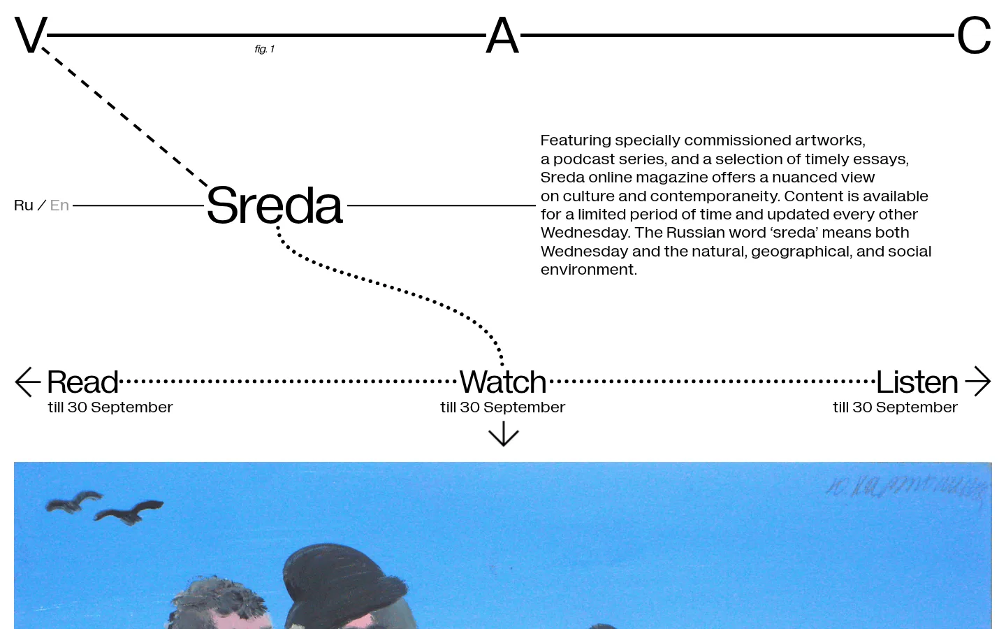
The page is defined by a white canvas (#ffffff) and black typography and linework (#000000), with colour entering mainly through the commissioned artwork rather than through interface decoration. Diagramatika Display gives the masthead and section title their distinctive editorial presence; Diagramatika Text carries navigation and explanatory copy in a clear, rounded sans-serif voice. The opening composition behaves like a printed diagram stretched across the viewport: oversized V–A–C markers anchor a horizontal rule, dashed and dotted paths connect the Sreda title to three content modes, and compact explanatory text sits to the right. Generous open space keeps these fine lines and text legible. A broad artwork image begins below the diagram, adding an expressive blue field and human figures without changing the monochrome interface palette. The result is editorial rather than promotional: flat, high-contrast, typographic, and deliberately spacious.
配色
点色块复制色值。用途说明来自对页面的实测位置(背景、文字、描边、按钮)与截图判读。
表层色
中性色
页面底色 · Gallery White主文字 · Editorial Ink
文字
背景
对比度
WCAG
#000000 Editorial Ink
#ffffff Gallery White
21:1
AAA
字体
字号阶梯:Custom(比例约 1.826,正文 24px)。示例用免费替代字体渲染,数值为实测。
Aa 设计
Diagramatika Text
网络字体 · 字重 400 · 占比 93%
免费替代:Inter
Navigation, explanatory copy, and link labels.
Aa 设计
Diagramatika Display
网络字体 · 字重 400 · 占比 7%
免费替代:Manrope
Oversized V–A–C masthead, Sreda heading, and caption-style labels.
角色
示例
字号
字重
行高
字距
特大标题
Oversized V–A–C letters form the top masthead.
V–A–C Sreda
80px
400
normal
0
一级标题
The Sreda title anchors the central diagram.
V–A–C Sreda
48px
400
normal
0
正文
Introductory editorial description at the right.
The quick brown fox 敏捷的狐狸
24px
400
1.1
0
辅助文字
Small figure label and supporting content labels.
The quick brown fox 敏捷的狐狸
16px
400
normal
0
导航
Language switch and reading-mode navigation.
The quick brown fox 敏捷的狐狸
24px
400
normal
0
间距与布局
基准单位 4px · 密度:适中
48px版块间距
20px元素间距
—卡片内边距
1400px内容最大宽度
12px
13px
16px
20px
48px
50px
89px
115px
A spacious, full-width composition places the diagrammatic masthead across the top, with the Sreda title and language switch aligned along a horizontal connector. Explanatory copy occupies the right side, while reading, watching, and listening links span the width below. The measured page maximum is 1400px; the screenshot shows generous open space and a four-column structure. A full-bleed-feeling artwork panel begins beneath the navigation diagram, establishing the next content layer.
圆角与层次
没有测到阴影:页面是扁平的,层次靠底色和描边区分。
The interface is flat: no measured shadows, gradients, rounded cards, or elevated surfaces. Separate elements with white space and fine black rules, dashed connectors, and dotted paths. Keep the artwork visually distinct through its image content rather than a shadow or decorative frame.
组件
下面的预览按实测的按钮、输入框、徽标、卡片样式重建(字体用替代字体)。
Diagrammatic masthead
Oversized V, A, and C letters sit along a thin black horizontal rule, with a small figure label beneath the line.
Language switch
Compact Ru / En text sits at the left of the Sreda title line.
Sreda title node
Large display lettering overlaps a horizontal connector and acts as the central node of the diagram.
Introductory copy
A paragraph set to the right of the title explains the magazine in black text on white.
Content-mode navigation
Read, Watch, and Listen labels are linked by a dotted horizontal path, with small date captions and directional arrows.
Featured artwork
A wide commissioned image begins below the navigation and supplies the opening section’s vivid colour.
Imagery · The opening artwork is a large, landscape-oriented image, framed by a narrow white margin in the viewport. It contains a vivid blue sky, human figures, birds, and painterly texture. Treat imagery as commissioned editorial art: preserve its original character and allow its colour to contrast with the otherwise monochrome interface. The artwork is not a source for brand UI colours.
Keep the interface palette to measured white and black.
Use rules and dotted paths to connect editorial elements.
Give the masthead and title a strong display scale.
Set supporting copy in the text family.
Preserve generous white space around the diagram.
Let commissioned art provide the main colour.
✕ 不该做
Do not add unmeasured interface colours.
Do not apply gradients, shadows, or rounded cards.
Do not turn the diagram into conventional boxed navigation.
Do not use bold or all-caps styling as a substitute for hierarchy.
Do not crowd the introductory text or connectors.
Do not treat artwork colours as interface palette tokens.
给 AI 的提示词
想快速出一个同风格的新页面,把这段话连同 DESIGN.md 一起发给 AI。
Build a new editorial page in the V–A–C Sreda style. Use Gallery White (#ffffff) as the uninterrupted canvas and Editorial Ink (#000000) for text, rules, arrows, and diagram connectors. Set display titles in Diagramatika Display or a close free alternative, and use Diagramatika Text for navigation and body copy. Organize the page as a spacious, full-width diagram: connect a prominent masthead and title with thin lines, then arrange a few clear content paths with dotted or dashed connectors. Keep interface elements flat, without shadows, gradients, or rounded cards. Use compact supporting labels and calm paragraph copy. Introduce a wide commissioned artwork as a distinct editorial image region; preserve its natural colour and texture rather than sampling it for UI accents. Maintain generous white space and a readable hierarchy.