North star · Keep the interface monochrome and let oversized editorial typography, open space, and event imagery carry the page.
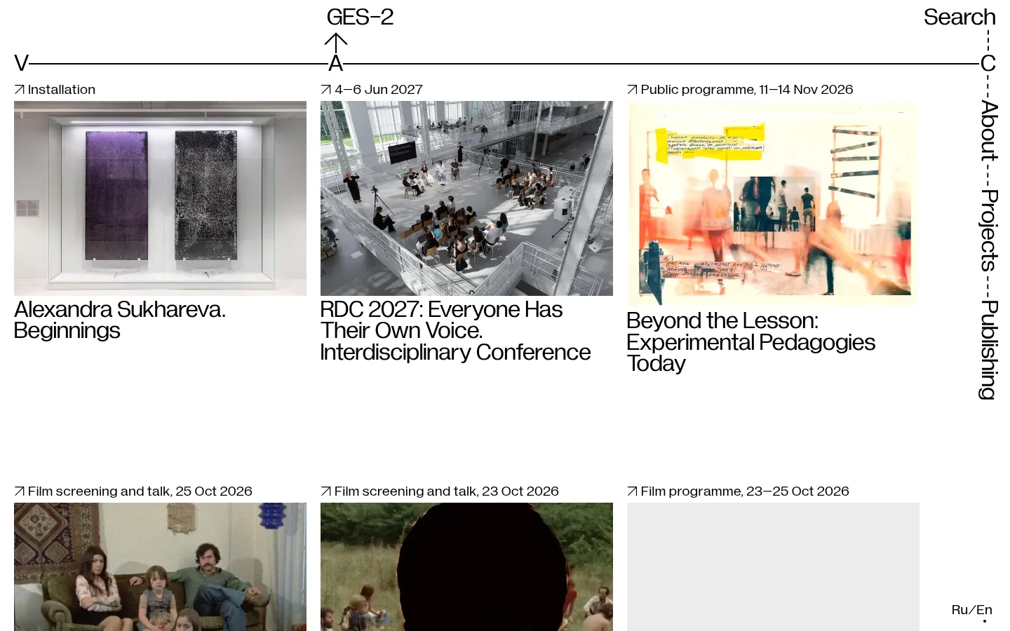
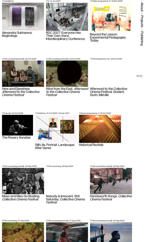
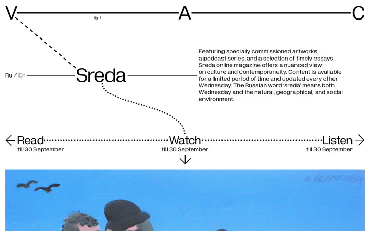
The page uses a white canvas and black typography as its entire measured interface palette, making the work feel closer to a gallery index than a conventional promotional homepage. Colour comes chiefly from the event photographs and video thumbnails, not from decorative UI accents. Oversized Diagramatika Display text gives navigation and event titles a distinctive, compressed editorial presence; Diagramatika Text handles smaller metadata and utility copy. A single, three-column feed places short event labels above images and titles below, while large open gaps separate rows and preserve a calm viewing rhythm. The opening navigation stretches across the top and turns the V–A–C identity into a thin horizontal diagram, with Search and About-related links integrated at the edges. Images vary in subject and palette but share a straightforward rectangular presentation. The overall strategy is to keep the interface nearly invisible so cultural programming remains the content.
Oversized navigation labels, event titles, and prominent utility actions.
Aa 设计
Diagramatika Text
网络字体 · 字重 400 · 占比 40%
免费替代:DM Sans
Event metadata, smaller links, and compact utility labels.
角色
示例
字号
字重
行高
字距
一级标题
Primary page-level display heading or prominent navigation text.
V–A–C
35px
400
0.88
0
二级标题
Secondary display headings and large editorial labels.
V–A–C
34px
400
0.9
0
三级标题
Event titles and smaller section headings.
The quick brown fox 敏捷的狐狸
24px
400
1.15
0
正文
Supporting descriptions and general editorial copy.
The quick brown fox 敏捷的狐狸
20px
400
1.1
0
按钮
Utility actions such as language selection and loading more entries.
The quick brown fox 敏捷的狐狸
20px
400
1.15
0
导航
Oversized navigation labels, including Search and About.
V–A–C
35px
400
0.88
0
间距与布局
基准单位 1px · 密度:宽松
150px版块间距
20px元素间距
—卡片内边距
—内容最大宽度
5px
10px
20px
35px
40px
150px
A single-page, three-column event feed sits beneath a sparse top navigation. At the 1440px viewport, columns span most of the page width, with narrow gutters and a reserved right edge for vertical navigation and utility links. Align card labels and titles to the left. The first row begins close to the header, then substantial vertical gaps distinguish later rows. Maintain the observed spacious rhythm without imposing an invented maximum width; on narrower screens, adapt the columns while preserving legible titles and image order.
圆角与层次
没有测到阴影:页面是扁平的,层次靠底色和描边区分。
Keep the interface flat: the measured palette contains no border colour, shadows, or gradients. Separate cards through white space and image placement, not containers or raised surfaces. The thin navigation rules and connectors act as graphic structure rather than card outlines; avoid decorative layering.
组件
下面的预览按实测的按钮、输入框、徽标、卡片样式重建(字体用替代字体)。
Diagrammatic header
A thin horizontal navigation line anchors the page; V–A–C letterforms, GES–2, Search, and vertical About-related links sit along its edges.
Event feed card
A compact event label precedes a rectangular image, followed by a large, left-aligned title in Diagramatika Display.
Event metadata
Small black text identifies event type and date above each image, using Diagramatika Text.
Language switcher
A minimal Ru/En utility sits at the page edge without a filled button or bordered container.
Load more
A plain text action appears centered beneath the final visible feed entry, with no button fill or shadow.
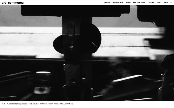
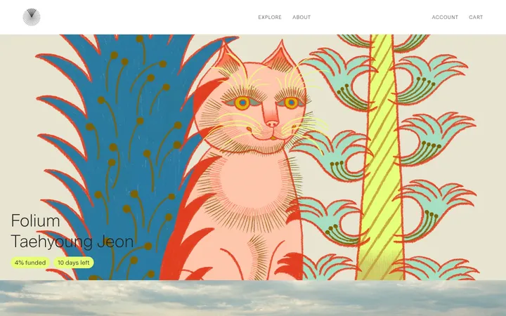
Imagery · Use rectangular event photography and video stills as the main source of colour and subject variety. Images include artworks, venues, performances, and film scenes; keep them documentary and unoverlaid rather than applying a shared brand tint. Preserve their natural aspect and let each card’s image sit between its event label and title.
Use oversized display type for navigation and event titles.
Place event labels above images and titles below.
Let documentary imagery supply the colour.
Use generous vertical gaps between feed rows.
✕ 不该做
Do not add accent colours to interface controls.
Do not place cards in boxed or shadowed containers.
Do not apply a uniform tint to event photography.
Do not center-align the event feed.
Do not crowd the page with extra explanatory copy.
Do not make navigation look like conventional pill buttons.
给 AI 的提示词
想快速出一个同风格的新页面,把这段话连同 DESIGN.md 一起发给 AI。
Build a new V–A–C-style cultural programme page with a #ffffff Gallery White canvas and #000000 Editorial Ink interface text. Keep the interface flat and restrained; do not add gradients, shadows, or decorative card fills. Use Diagramatika Display, or a close free alternative such as Space Grotesk, for oversized navigation and event titles. Use Diagramatika Text or DM Sans for compact event metadata and utility links. Organize events as a left-aligned, three-column editorial feed with each event label above a rectangular documentary image and its title below. Use images as the main source of colour. Create a sparse, diagrammatic header with a horizontal rule, letter-based identity, and edge-aligned navigation. Preserve generous row spacing and adapt the feed responsively without losing its editorial character.