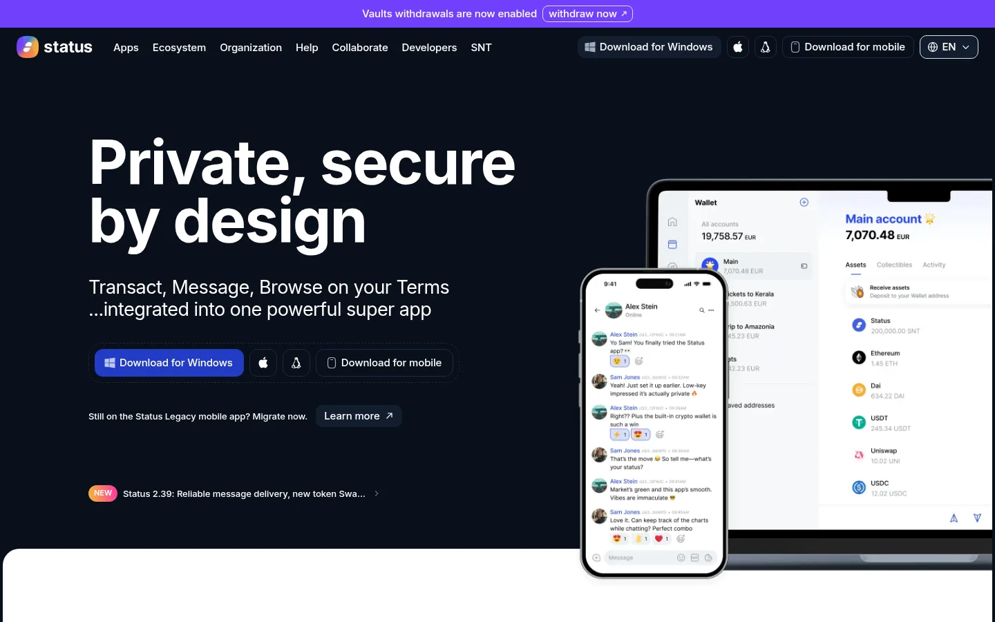
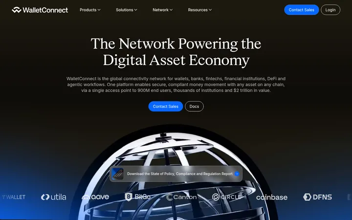
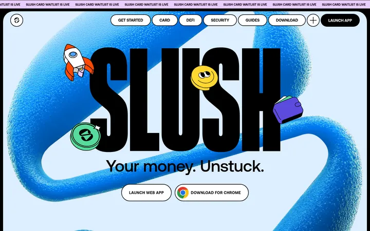
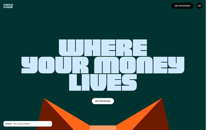
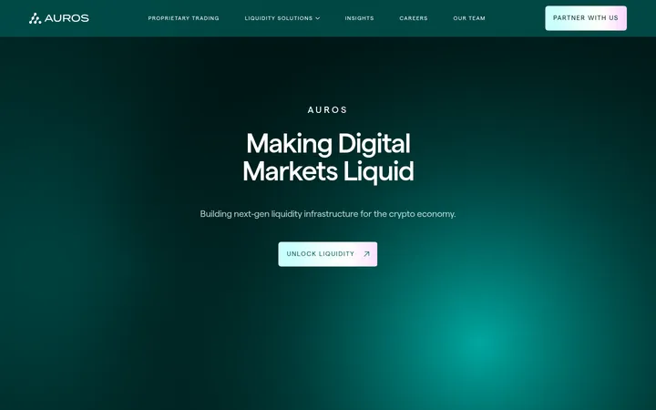
Status 以高对比深色首屏搭配大面积白色产品版块,展示私密通讯、钱包与浏览器。醒目的 Inter 标题、蓝色行动按钮和彩色插画,与细致的产品界面截图形成理性又亲切的视觉平衡。
North star · Let the product content breathe: pair a near-black or clean white canvas with bold Inter type, restrained blue actions, and expressive media.
The page opens on a deep Ink Navy canvas (#09101c), where white display type and compact navigation make the product promise immediately legible. Most of the page then shifts to Gallery White (#ffffff), creating a clean stage for feature explanations and wallet or messenger screenshots. Black headings and body copy provide crisp contrast; blue buttons supply the clearest interaction cue, while purple, teal, and warm yellow appear as restrained gradients or illustration colors rather than a competing background system. Inter is used throughout, with very large, tightly tracked bold headlines and quieter, readable body text. Layout alternates between feature grids, text-and-product splits, and centered full-bleed artwork. Generous whitespace and a comfortable density keep the long page calm. Rounded media, fine pale borders, and restrained shadows soften interface mockups without making the overall system feel card-heavy.
All page typography, from oversized hero headlines to navigation, body copy, and buttons.
角色
示例
字号
字重
行高
字距
特大标题
Oversized hero headline and prominent closing call to action.
Status
88px
700
0.95
-0.021em
一级标题
Primary feature and section headlines throughout the page.
Status
64px
700
1.06
-0.02em
二级标题
Supporting section statements and secondary feature headings.
The quick brown fox 敏捷的狐狸
27px
400
1.19
-0.021em
正文
Feature descriptions and hero supporting copy.
The quick brown fox 敏捷的狐狸
19px
400
1.47
-0.016em
辅助文字
Small labels, metadata, and supporting notes.
The quick brown fox 敏捷的狐狸
15px
500
1.45
-0.009em
按钮
Download actions and compact interactive controls.
The quick brown fox 敏捷的狐狸
15px
500
1.45
-0.009em
导航
Primary header navigation and footer category links.
The quick brown fox 敏捷的狐狸
15px
500
1.45
-0.009em
间距与布局
基准单位 4px · 密度:适中
68px版块间距
4px元素间距
—卡片内边距
1432px内容最大宽度
4px
8px
10px
12px
16px
20px
24px
40px
48px
80px
160px
A wide, centered page uses a measured maximum content width of 1432px and a comfortable density. The hero is a two-column composition, with left-aligned copy and right-side device mockups; later blocks alternate between three-column feature grids, split text-and-media sections, centered artwork, and editorial feeds. White sections dominate and are punctuated by deep navy hero, privacy, CTA, and footer bands. The measured section rhythm is 68px, with a 4px base spacing unit and ample whitespace around major content.
圆角与层次
按钮 · 12px
卡片 · 20px
图片 · 24px
导航 · 10px
链接 · 12px
md · section
md · link
The page is mostly flat, relying on strong canvas changes and whitespace rather than stacked cards. Product media and selected links receive soft, dark-tinted shadows; pale borders and hairlines define limited controls and link modules. Rounded media and CTA corners soften the otherwise clean, high-contrast layouts.
组件
下面的预览按实测的按钮、输入框、徽标、卡片样式重建(字体用替代字体)。
Primary download button
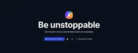
Blue (#223bc4) filled button with white 15px, 500-weight Inter text and a measured 12px radius; a compact variant uses a 10px radius.
Header navigation
Compact Inter navigation sits on the dark hero canvas, alongside product download controls and a language selector.
Announcement strip
Narrow violet announcement band above the navigation, with centered white copy and a compact outlined action.
Product media
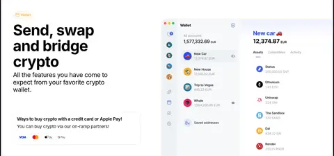
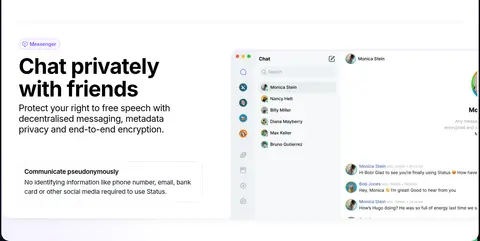
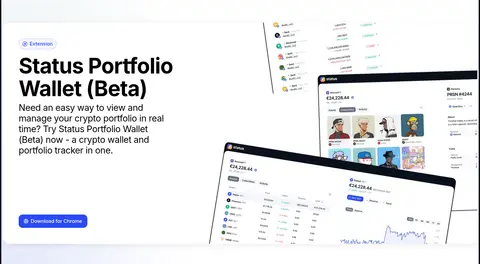
Wallet, chat, and portfolio interface imagery placed within feature compositions; measured media radius is 24px.
Feature grid
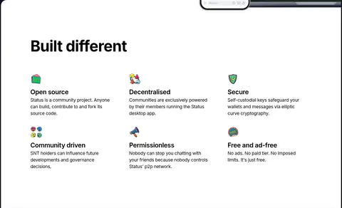
Open white section with a strong heading and three columns of concise benefit statements, small colorful icons, and minimal framing.
Editorial link cards
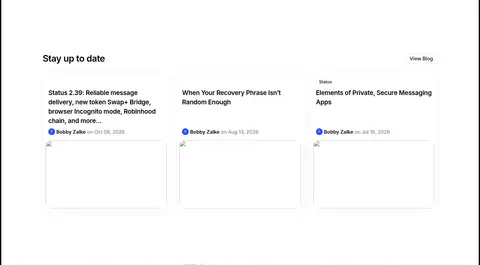
Three-column update and article feed with understated borders, black text, and small author or date metadata.
Closing CTA
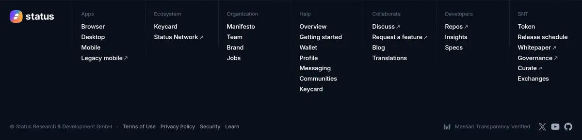
Centered headline and download actions on Ink Navy (#09101c), followed by a dense multi-column footer.
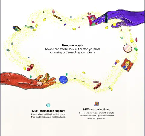
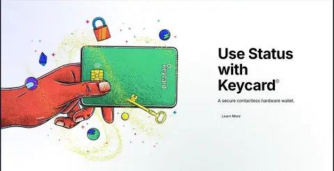
Imagery · Product screenshots and device mockups show the wallet, chat, communities, and portfolio interfaces in crisp, light UI against the page’s contrasting bands. Hand-drawn, colorful illustrations bring a more expressive tone to the crypto and privacy storytelling. Large media is framed as part of the section composition rather than as a detached card; one privacy section uses video, and hardware-wallet artwork sits beside its headline.
Use Ink Navy (#09101c) for deliberate, high-contrast dark bands.
Keep white content sections open and generous.
Set headlines in bold Inter with tight tracking.
Use blue fills for primary download actions.
Alternate product screenshots with concise feature copy.
Reserve vivid gradients and illustration colors for accents and media.
✕ 不该做
Do not turn every section into a bordered card.
Do not spread vivid accent colors across large page backgrounds.
Do not let interface mockups overwhelm the headline and copy.
Do not use a different type family for isolated sections.
Do not make all sections dark or all layouts identical.
Do not add unmeasured colors, sizes, spacing, or corner radii.
给 AI 的提示词
想快速出一个同风格的新页面,把这段话连同 DESIGN.md 一起发给 AI。
Build a new Status-style page with a calm, comfortable rhythm and a clear editorial hierarchy. Use Ink Navy (#09101c) for a dramatic hero or CTA band and Gallery White (#ffffff) for most content. Set all text in Inter: bold, tightly tracked headlines; regular body copy; medium-weight controls. Use Status Cobalt (#223bc4) for primary actions and Action Blue (#2a4af5) sparingly for secondary emphasis. Arrange content in wide, centered grids and split layouts, pairing concise copy with realistic product-interface media. Use colorful illustrations as occasional story moments, not background decoration everywhere. Keep borders pale and fine, shadows soft, and rounded media intentional. Alternate section compositions to sustain interest, preserve generous whitespace, and ensure every CTA remains visually distinct.