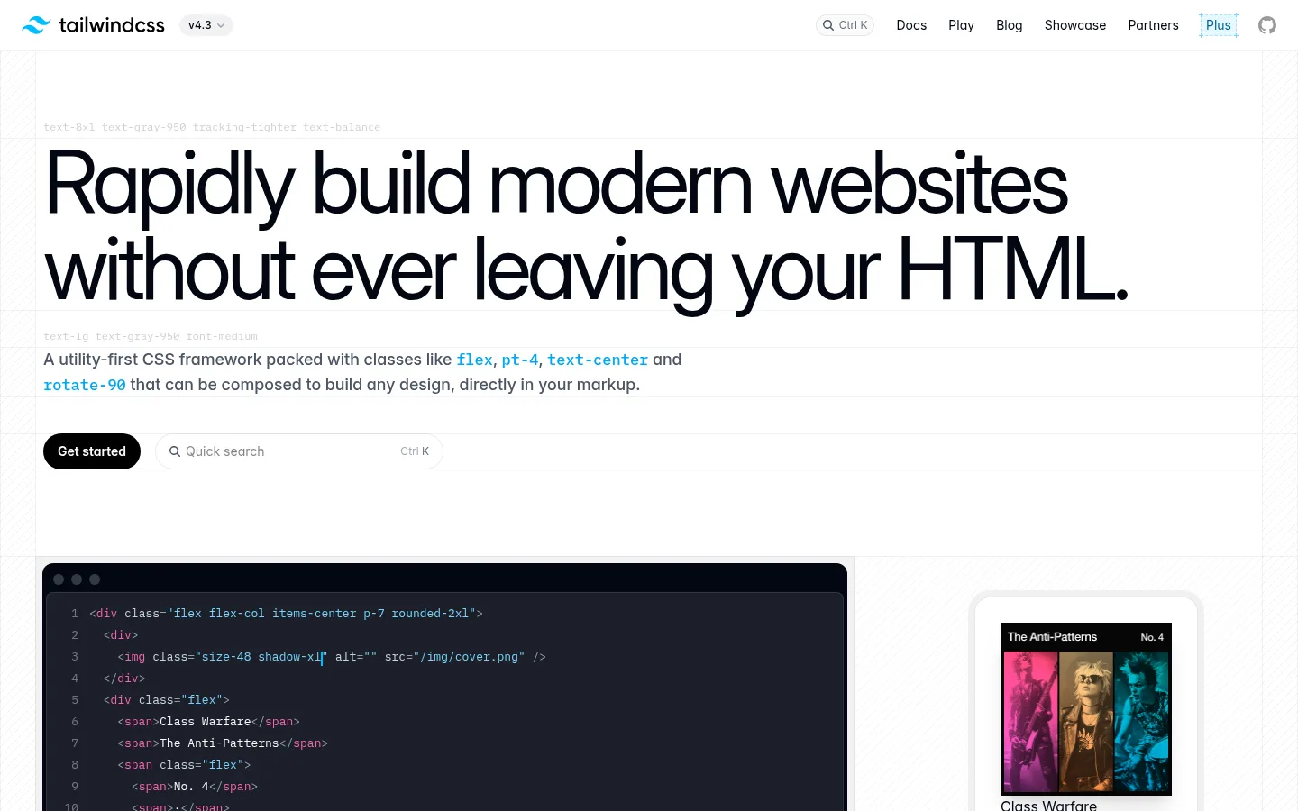
Tailwind CSS 以醒目的大标题开场,搭配代码演示、功能卡片和真实网站作品集。近乎纯白的页面与深色文字保持清爽克制,少量鲜亮色彩则突出代码细节和交互重点。
North star · Keep the page bright and spacious, and let dark code panels and restrained syntax accents carry the visual emphasis.
The page uses white as an expansive canvas, with pale gray bands and hairlines gently distinguishing content rather than enclosing every section. Near-black headings provide strong contrast; cool muted grays carry supporting copy, while cyan, mint, and pink appear as compact accents in code, labels, and selected controls. Inter supplies the large, tightly tracked hero and clear sans-serif hierarchy. Plex Mono gives technical labels, snippets, and small metadata a distinctly developer-oriented voice. The layout alternates a spacious single-column opening with split product demonstrations, a dense four-column sponsor field, and a varied feature-card grid. Dark code panels create focused contrast against the light page; screenshots, UI examples, and the site gallery provide visual variety without changing the underlying design language. Rounded pill CTAs and softly rounded cards keep the otherwise precise, grid-based system approachable.
配色 点色块复制色值。用途说明来自对页面的实测位置(背景、文字、描边、按钮)与截图判读。
品牌色
Night Ink
#030712
Primary text and dark inverse surfaces, including code-led demo panels and footer details.
强调色
Sky Syntax
#74d4ff
Bright cyan syntax and highlighted technical text, not a broad page background.
Signal Pink
#f6339a
Occasional pink CTA and small interface or syntax highlight.
Mint Syntax
#96f7e4
Mint syntax highlight and small technical accents, most visible in code examples.
Rose Syntax
#fb64b6
Secondary pink syntax or illustration highlight, rather than a large surface.
表层色
Gallery White
#ffffff
Main page canvas and the open background behind hero, feature sections, sponsor marks, and footer.
Editor Charcoal
#1d202a
Deep code-card surface visible in editor demonstrations against the white page.
中性色
Mist Divider
#f2f2f3
Pale section surface and frequent hairline border separating cards and page regions.
Slate Copy
#4a5565
Muted supporting text and explanatory copy on the light canvas.
Soft Rule
#ececed
Subtle card edges and secondary separators; keep less prominent than the main pale border.
Frost Text
#f8fafc
Light secondary text within dark code or inverse interface examples.
Blue Gray
#90a1b9
Muted code and interface text, chiefly inside dark product illustrations.
Pale Steel
#cad5e2
Low-emphasis text and code details within dark mock interfaces.
Quiet Silver
#cccccc
Low-contrast text or small interface details; avoid using as primary copy.
Graphite Detail
#42454d
Dark secondary text and fine interface details, especially within demonstrations.
功能色
Deep Link Blue
#00598a
Rare darker blue link or illustration detail; not a dominant brand color.
文字 背景 对比度 WCAG #030712 Night Ink#ffffff Gallery White20.13:1 AAA #030712 Night Ink#f2f2f3 Mist Divider18:1 AAA #030712 Night Ink#1d202a Editor Charcoal1.24:1 不达标 #4a5565 Slate Copy#ffffff Gallery White7.56:1 AAA #4a5565 Slate Copy#f2f2f3 Mist Divider6.76:1 AA #4a5565 Slate Copy#030712 Night Ink2.66:1 不达标
字体 字号阶梯:Perfect Fifth(比例约 1.492,正文 13px)。示例用免费替代字体渲染,数值为实测。
Aa 设计
inter 网络字体 · 字重 400 / 500 / 600 / 700 · 占比 62%
免费替代:Inter
Hero and section headings, navigation, body copy, links, and primary controls.
Aa 设计
plexMono 网络字体 · 字重 400 / 500 / 600 · 占比 38%
免费替代:IBM Plex Mono
Code, technical captions, uppercase eyebrows, and compact metadata.
角色 示例 字号 字重 行高 字距 特大标题 Oversized hero statement at the top of the homepage.
Tailwind CSS
96px 400 1 -0.05em 一级标题 Primary page title and prominent heading treatment.
Tailwind CSS
40px 500 1 -0.05em 二级标题 Major section titles, such as feature and showcase introductions.
Tailwind CSS
36px 600 1.33 0 三级标题 Feature-card and subsection headings.
Tailwind CSS
30px 600 1.2 0 四级标题 Smaller content headings and demonstration labels.
The quick brown fox 敏捷的狐狸
24px 500 1.67 0 正文 Compact monospaced technical and supporting copy.
The quick brown fox 敏捷的狐狸
13px 400 1.85 0 辅助文字 Small metadata, code labels, and secondary annotations.
The quick brown fox 敏捷的狐狸
12px 400 2 0 按钮 CTA labels and compact interface controls.
The quick brown fox 敏捷的狐狸
12px 400 1.67 0 链接 Navigation, footer links, and inline destinations.
The quick brown fox 敏捷的狐狸
14px 400 1.71 0 眉题 Uppercase section markers above major headings.
The quick brown fox 敏捷的狐狸
12px 600 1.33 0.1em 代码 Syntax-highlighted examples inside editor-style panels.
const style = 1;
13px 400 1.85 0
间距与布局 基准单位 8px · 密度:紧凑
32px 版块间距
8px 元素间距
8px 卡片内边距
1360px 内容最大宽度
4px
8px
12px
16px
24px
32px
40px
64px
The page sits on a centered, wide canvas with a measured maximum width of 1360px. It opens with a single-column, left-aligned hero, then moves through split demonstrations, a four-column sponsor field, and a varied multi-column feature grid. Large white intervals separate major stories; inside cards, content is compact and carefully aligned. The measured spacing system uses an 8px base, with density described as compact. The footer returns to a simple three-column link arrangement followed by a separate copyright row.
圆角与层次 inset · other, media
inset · card
inset · card, button
inset · card
The overall treatment is mostly flat: white canvas, subtle gray borders, and carefully separated card surfaces. Measured cards use 16px rounding; buttons are pill-shaped in the primary CTA treatment. Use restrained inset edge definition and a light media shadow only where the screenshot or product mockup needs separation, not as a page-wide effect.
组件 下面的预览按实测的按钮、输入框、徽标、卡片样式重建(字体用替代字体)。
Pill CTA A dark, white-label primary action with a pill silhouette; the measured Get started buttons use a 32px radius and compact horizontal padding.
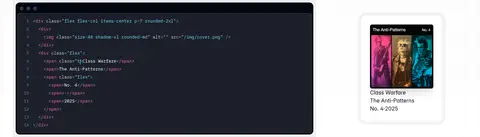
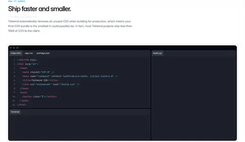
Code editor panel A dark charcoal rounded surface containing monospaced, syntax-colored snippets, line numbers, and restrained editor chrome.
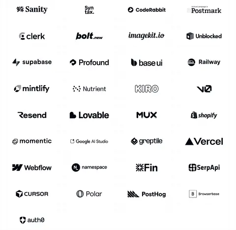
Sponsor grid A clean multi-column field of partner logos on white, with generous separation and no heavy card framing.
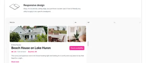
Feature card A softly rounded white card pairing a concise title and copy with a product UI example, screenshot, or small illustrative icon.
Section eyebrow A compact uppercase monospaced label in a small accent color, placed immediately above a larger Inter section heading.
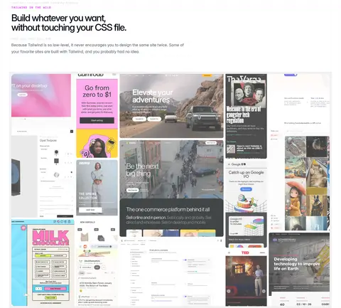
Product gallery A dense collage of real website screenshots, framed as a broad visual field rather than a uniform set of identical tiles.
Imagery · Images are primarily product evidence: dark editor panels, UI mockups, interface screenshots, and a gallery of varied real websites. Feature examples include property photography and interface previews, while sponsor logos add a typographic rather than photographic image field. Keep assets in clean, softly rounded cards; preserve screenshot content and color where present, and avoid adding decorative imagery that competes with code.
页面版块 共 8 个版块,按页面从上到下排列,每个都标了类型、布局和交互套路。
该做与不该做 ✓ 该做 Use white as the dominant page canvas. Reserve near-black for strong headings and dark code surfaces. Use cyan, mint, and pink as small technical accents. Pair Inter interface text with Plex Mono technical labels. Let whitespace separate major sections. Use pale hairlines to define cards without heavy framing. ✕ 不该做 Do not turn accent colors into large page backgrounds. Do not add decorative gradients unsupported by the page. Do not use heavy shadows on every card. Do not crowd the hero with extra content. Do not make supporting copy compete with the headline. Do not standardize the varied gallery into repetitive placeholders. 给 AI 的提示词 想快速出一个同风格的新页面,把这段话连同 DESIGN.md 一起发给 AI。
复制 Build a new developer-tools page in Tailwind CSS's bright, code-centric visual language. Use Gallery White (#ffffff) as the dominant canvas, Night Ink (#030712) for headings and key contrast, and Mist Divider (#f2f2f3) for quiet card edges. Use Slate Copy (#4a5565) for supporting text. Pair Inter with Plex Mono for code, metadata, and uppercase section eyebrows. Keep the opening headline large, left aligned, and spacious; follow it with product evidence in dark Editor Charcoal (#1d202a) panels. Add only small Sky Syntax (#74d4ff), Mint Syntax (#96f7e4), and Signal Pink (#f6339a) accents. Organize later content into crisp grids, screenshot-led feature cards, and a broad real-product gallery. Use restrained borders, rounded cards, and a dark pill CTA; keep the page flat, readable, and distinctly technical.
DESIGN.md Tailwind v4 CSS 变量 Design Tokens
---
title: "Tailwind CSS design system"
variant: extended
source: https://tailwindcss.com/
captured_at: 2026-10-12
theme: light
industry: devtools
generator: Design DNA (https://four.wiralomi.com/style/tailwindcss-com)
ai_generated: true
ai_label: "本文件由 AI 辅助生成:数值取自公开网页的实测样式,命名、用途说明与建议为模型解读。商标归原所有者。 / AI-assisted content"
---
# Tailwind CSS · Design System
> A bright canvas for code, craft, and utility.
**Theme:** light · **Industry:** devtools · **Source:** https://tailwindcss.com/ · **Captured:** 2026-10-12 (1440×900 desktop)
_AI-assisted content: values are measured from the public page at capture time; names, roles and guidance are model-written interpretations. Trademarks belong to their owners._
Tailwind CSS pairs an oversized, restrained hero with code-led product demonstrations and a broad gallery of real-world examples. A near-white canvas and crisp dark typography keep the page calm while small vivid accents add energy to technical details.
## North star
Keep the page bright and spacious, and let dark code panels and restrained syntax accents carry the visual emphasis.
## Overview
The page uses white as an expansive canvas, with pale gray bands and hairlines gently distinguishing content rather than enclosing every section. Near-black headings provide strong contrast; cool muted grays carry supporting copy, while cyan, mint, and pink appear as compact accents in code, labels, and selected controls. Inter supplies the large, tightly tracked hero and clear sans-serif hierarchy. Plex Mono gives technical labels, snippets, and small metadata a distinctly developer-oriented voice. The layout alternates a spacious single-column opening with split product demonstrations, a dense four-column sponsor field, and a varied feature-card grid. Dark code panels create focused contrast against the light page; screenshots, UI examples, and the site gallery provide visual variety without changing the underlying design language. Rounded pill CTAs and softly rounded cards keep the otherwise precise, grid-based system approachable.
## Colors
| Name | Hex | Token | Group | Role |
|---|---|---|---|---|
| Gallery White | ` | `--color-gallery-white` | surface | Main page canvas and the open background behind hero, feature sections, sponsor marks, and footer. |
| Mist Divider | ` | `--color-mist-divider` | neutral | Pale section surface and frequent hairline border separating cards and page regions. |
| Slate Copy | ` | `--color-slate-copy` | neutral | Muted supporting text and explanatory copy on the light canvas. |
| Night Ink | ` | `--color-night-ink` | brand | Primary text and dark inverse surfaces, including code-led demo panels and footer details. |
| Soft Rule | ` | `--color-soft-rule` | neutral | Subtle card edges and secondary separators; keep less prominent than the main pale border. |
| Sky Syntax | ` | `--color-sky-syntax` | accent | Bright cyan syntax and highlighted technical text, not a broad page background. |
| Editor Charcoal | ` | `--color-editor-charcoal` | surface | Deep code-card surface visible in editor demonstrations against the white page. |
| Signal Pink | ` | `--color-signal-pink` | accent | Occasional pink CTA and small interface or syntax highlight. |
| Deep Link Blue | ` | `--color-deep-link-blue` | semantic | Rare darker blue link or illustration detail; not a dominant brand color. |
| Frost Text | ` | `--color-frost-text` | neutral | Light secondary text within dark code or inverse interface examples. |
| Blue Gray | ` | `--color-blue-gray` | neutral | Muted code and interface text, chiefly inside dark product illustrations. |
| Pale Steel | ` | `--color-pale-steel` | neutral | Low-emphasis text and code details within dark mock interfaces. |
| Mint Syntax | ` | `--color-mint-syntax` | accent | Mint syntax highlight and small technical accents, most visible in code examples. |
| Quiet Silver | ` | `--color-quiet-silver` | neutral | Low-contrast text or small interface details; avoid using as primary copy. |
| Rose Syntax | ` | `--color-rose-syntax` | accent | Secondary pink syntax or illustration highlight, rather than a large surface. |
| Graphite Detail | ` | `--color-graphite-detail` | neutral | Dark secondary text and fine interface details, especially within demonstrations. |
### Semantic aliases
`--color-canvas` → ` (Gallery White) · `--color-surface` → ` (Mist Divider) · `--color-surface-2` → ` (Night Ink) · `--color-surface-3` → ` (Editor Charcoal) · `--color-text` → ` (Night Ink) · `--color-text-muted` → ` (Slate Copy) · `--color-text-subtle` → ` (Frost Text) · `--color-border` → ` (Mist Divider) · `--color-accent` → ` (Sky Syntax) · `--color-accent-2` → ` (Signal Pink) · `--color-accent-3` → ` (Mint Syntax) · `--color-on-accent` → ` (Gallery White)
### Contrast (WCAG 2.x)
| Text | Background | Ratio | Level |
|---|---|---|---|
| ` | ` | 20.13:1 | AAA |
| ` | ` | 18:1 | AAA |
| ` | ` | 1.24:1 | fail |
| ` | ` | 7.56:1 | AAA |
| ` | ` | 6.76:1 | AA |
| ` | ` | 2.66:1 | fail |
| ` | ` | 2.15:1 | fail |
| ` | ` | 1.05:1 | fail |
| ` | ` | 1.07:1 | fail |
| ` | ` | 19.24:1 | AAA |
### Gradients
- `radial-gradient(oklab(0.129999 -0.00404751 -0.027702 / 0.05) 1px, rgba(0, 0, 0, 0) 0px)`
- `repeating-linear-gradient(315deg, oklab(0 0 0 / 0.05) 0px, oklab(0 0 0 / 0.05) 1px, rgba(0, 0, 0, 0) 0px, rgba(0, 0, 0, 0) 50%)`
- `linear-gradient(rgba(0, 0, 0, 0) 0%, rgba(0, 0, 0, 0) 50%, lab(1.90334 0.278696 -5.48866) 100%)`
- `linear-gradient(to right, lab(66.9756 -58.27 19.5419) 0%, lab(70.687 -23.6078 -45.9483) 100%)`
## Typography
| Family | Token | Source | Weights | Role | Free substitute |
|---|---|---|---|---|---|
| inter | `--font-display` | webfont | 400, 500, 600, 700 | Hero and section headings, navigation, body copy, links, and primary controls. | Inter |
| plexMono | `--font-mono` | webfont | 400, 500, 600 | Code, technical captions, uppercase eyebrows, and compact metadata. | IBM Plex Mono |
- **inter:** Use a clean sans-serif range from regular to bold; hero lettering is notably tight, while labels remain understated.
- **plexMono:** Monospaced text gives technical content its own voice; eyebrow labels use uppercase and expanded tracking.
### Type scale — Perfect Fifth (ratio ≈ 1.492, base 13px)
| Role | Size | Weight | Line height | Letter spacing | Case | Family | Used for |
|---|---|---|---|---|---|---|---|
| display | 96px | 400 | 1 | -0.05em | — | inter | Oversized hero statement at the top of the homepage. |
| h1 | 40px | 500 | 1 | -0.05em | — | inter | Primary page title and prominent heading treatment. |
| h2 | 36px | 600 | 1.33 | 0 | — | inter | Major section titles, such as feature and showcase introductions. |
| h3 | 30px | 600 | 1.2 | 0 | — | inter | Feature-card and subsection headings. |
| h4 | 24px | 500 | 1.67 | 0 | — | inter | Smaller content headings and demonstration labels. |
| body | 13px | 400 | 1.85 | 0 | — | plexMono | Compact monospaced technical and supporting copy. |
| caption | 12px | 400 | 2 | 0 | — | plexMono | Small metadata, code labels, and secondary annotations. |
| button | 12px | 400 | 1.67 | 0 | — | inter | CTA labels and compact interface controls. |
| link | 14px | 400 | 1.71 | 0 | — | inter | Navigation, footer links, and inline destinations. |
| eyebrow | 12px | 600 | 1.33 | 0.1em | uppercase | plexMono | Uppercase section markers above major headings. |
| code | 13px | 400 | 1.85 | 0 | — | plexMono | Syntax-highlighted examples inside editor-style panels. |
OpenType features in use: `"cv02", "cv03", "cv04", "cv11"` , `"ss02", "zero"` .
## Spacing & layout
- Base unit **8px**, density **compact**.
- Scale (most used values): 4, 8, 12, 16, 24, 32, 40, 64 px.
- Section rhythm 32px · element gap 8px · card padding 8px · max content width 1360px.
The page sits on a centered, wide canvas with a measured maximum width of 1360px. It opens with a single-column, left-aligned hero, then moves through split demonstrations, a four-column sponsor field, and a varied multi-column feature grid. Large white intervals separate major stories; inside cards, content is compact and carefully aligned. The measured spacing system uses an 8px base, with density described as compact. The footer returns to a simple three-column link arrangement followed by a separate copyright row.
## Shape & elevation
- Radius: button `9999px` · card `16px` · media `50%` · xs `4px` · sm `8px` · md `12px` · lg `16px` · pill `9999px`
- Shadow `inset` (other, media): `rgba(0, 0, 0, 0) 0px 0px 0px 0px, oklab(0.129999 -0.00404751 -0.027702 / 0.1) 0px 0px 0px 1px inset, rgba(0, 0, 0, 0) 0px 0px 0px 0px, rgba(0, 0, 0, 0) 0px 0px 0px 0px, rgba(0, 0, 0, 0) 0px 0px 0px 0p`
- Shadow `inset-2` (card): `rgba(0, 0, 0, 0) 0px 0px 0px 0px, oklab(0.999994 0.0000455678 0.0000200868 / 0.2) 0px 0px 0px 1px inset, rgba(0, 0, 0, 0) 0px 0px 0px 0px, oklab(0.129999 -0.00404751 -0.027702 / 0.1) 0px 0px 0px 1px, `
- Shadow `inset-3` (card, button): `rgba(0, 0, 0, 0) 0px 0px 0px 0px, oklab(0.999994 0.0000455678 0.0000200868 / 0.05) 0px 0px 0px 1px inset, rgba(0, 0, 0, 0) 0px 0px 0px 0px, rgba(0, 0, 0, 0) 0px 0px 0px 0px, rgba(0, 0, 0, 0) 0px 0px 0`
- Shadow `inset-4` (card): `rgba(0, 0, 0, 0) 0px 0px 0px 0px, oklab(0.999994 0.0000455678 0.0000200868 / 0.1) 0px 0px 0px 1px inset, rgba(0, 0, 0, 0) 0px 0px 0px 0px, rgba(0, 0, 0, 0) 0px 0px 0px 0px, rgba(0, 0, 0, 0) 0px 0px 0p`
- Shadow `sm` (media): `rgba(0, 0, 0, 0) 0px 0px 0px 0px, rgba(0, 0, 0, 0) 0px 0px 0px 0px, rgba(0, 0, 0, 0) 0px 0px 0px 0px, rgba(0, 0, 0, 0) 0px 0px 0px 0px, rgba(0, 0, 0, 0.1) 0px 1px 3px 0px, rgba(0, 0, 0, 0.1) 0px 1px 2`
- Shadow `hairline` (card): `rgba(0, 0, 0, 0) 0px 0px 0px 0px, rgba(0, 0, 0, 0) 0px 0px 0px 0px, rgba(0, 0, 0, 0) 0px 0px 0px 0px, oklab(0.129999 -0.00404751 -0.027702 / 0.05) 0px 0px 0px 1px, rgba(0, 0, 0, 0) 0px 0px 0px 0px`
- Motion: standard transition `0.15s cubic-bezier(0.4, 0, 0.2, 1)` on interactive elements.
The overall treatment is mostly flat: white canvas, subtle gray borders, and carefully separated card surfaces. Measured cards use 16px rounding; buttons are pill-shaped in the primary CTA treatment. Use restrained inset edge definition and a light media shadow only where the screenshot or product mockup needs separation, not as a page-wide effect.
## Imagery
Images are primarily product evidence: dark editor panels, UI mockups, interface screenshots, and a gallery of varied real websites. Feature examples include property photography and interface previews, while sponsor logos add a typographic rather than photographic image field. Keep assets in clean, softly rounded cards; preserve screenshot content and color where present, and avoid adding decorative imagery that competes with code.
## Components
### Pill CTA
A dark, white-label primary action with a pill silhouette; the measured Get started buttons use a 32px radius and compact horizontal padding.
### Code editor panel
A dark charcoal rounded surface containing monospaced, syntax-colored snippets, line numbers, and restrained editor chrome.
### Sponsor grid
A clean multi-column field of partner logos on white, with generous separation and no heavy card framing.
### Feature card
A softly rounded white card pairing a concise title and copy with a product UI example, screenshot, or small illustrative icon.
### Section eyebrow
A compact uppercase monospaced label in a small accent color, placed immediately above a larger Inter section heading.
### Product gallery
A dense collage of real website screenshots, framed as a broad visual field rather than a uniform set of identical tiles.
### Measured component styles
- **Primary button** (“Check availability”): background ## Do
- Use white as the dominant page canvas.
- Reserve near-black for strong headings and dark code surfaces.
- Use cyan, mint, and pink as small technical accents.
- Pair Inter interface text with Plex Mono technical labels.
- Let whitespace separate major sections.
- Use pale hairlines to define cards without heavy framing.
## Don't
- Do not turn accent colors into large page backgrounds.
- Do not add decorative gradients unsupported by the page.
- Do not use heavy shadows on every card.
- Do not crowd the hero with extra content.
- Do not make supporting copy compete with the headline.
- Do not standardize the varied gallery into repetitive placeholders.
## Agent prompt
Build a new developer-tools page in Tailwind CSS's bright, code-centric visual language. Use Gallery White (## Page sections (top to bottom)
| # | Type | Layout | UX patterns | UI patterns |
|---|---|---|---|---|
| 1 | hero | Single-column, left-aligned headline and supporting copy, followed by CTA and search, with product demo below. | Primary start action, Quick search | Oversized heading, Dark pill CTA, Code preview |
| 2 | logo-cloud | Introductory copy and CTA above a four-column logo field. | Sponsor discovery, Become a sponsor | Logo grid, Monochrome marks, Small eyebrow |
| 3 | feature-grid | Large multi-column card grid with a wide opening feature and varied card spans. | Feature exploration, Interactive UI examples | Soft card borders, Screenshot previews, Compact icons |
| 4 | feature-grid | Three-column feature area with a wide top card and smaller examples beneath. | Responsive demo, Feature comparison | Light-gray section band, Rounded cards, Interface mockups |
| 5 | how-it-works | Left-aligned section introduction paired with a wide code-and-output demonstration. | Explain build process, Show production result | Eyebrow label, Dark editor panel, Split interface |
| 6 | gallery | Left-aligned headline and copy above a wide, dense collage of website imagery. | Browse examples, Discover use cases | Masonry-like collage, Real website screenshots, Varied tile sizes |
| 7 | footer | Three columns of link groups aligned across a quiet white footer. | Browse documentation, Explore resources | Text-link columns, Small group headings, Minimal framing |
| 8 | footer | Single-row closing strip with small controls at left and legal links at right. | Open legal policy, Access appearance controls | Compact metadata, Low-contrast footer details |
---
本文件由 AI 辅助生成:数值取自公开网页的实测样式,命名、用途说明与建议为模型解读。商标归原所有者。
Generated by Design DNA · https://four.wiralomi.com/style/tailwindcss-com