North star · Keep interface chrome quiet and let full-bleed MekaVerse scenes, framed by crisp white type, dominate the page.
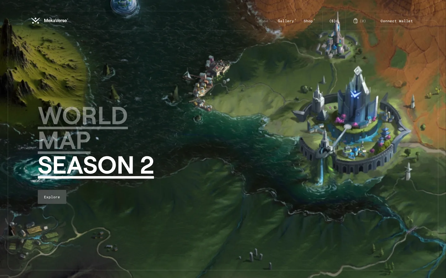
The page uses a near-black canvas (#151416) and black supporting bands to frame immersive, full-bleed fantasy game artwork. The measured interface palette stays deliberately quiet: white carries navigation and prominent headings, while gray tones appear in surfaces and fine outlines. The map and citadel imagery introduce greens, blue water, and vivid architectural color; these are media colors, not a separate interface accent system. Roobert provides the large, clean uppercase display voice, with underline strokes giving the hero title extra definition. GT America Mono Regular lends navigation and small supporting text a technical, collectible-world feel. Layout keeps controls near the top edge and places oversized left-aligned campaign titles over the imagery. Generous separation between media-led blocks and the spacious measured section rhythm make each scene feel like a destination rather than a conventional content card.
配色
点色块复制色值。用途说明来自对页面的实测位置(背景、文字、描边、按钮)与截图判读。
品牌色
表层色
中性色
功能色
页面底色 · Meka Charcoal表层 · Void Black表层 2 · Alloy Gray主文字 · Signal White次要文字 · Void Black描边 · Pale Steel
文字
背景
对比度
WCAG
#ffffff Signal White
#151416 Meka Charcoal
18.36:1
AAA
#ffffff Signal White
#000000 Void Black
21:1
AAA
#ffffff Signal White
#b8bab9 Alloy Gray
1.95:1
不达标
#000000 Void Black
#151416 Meka Charcoal
1.14:1
不达标
#000000 Void Black
#b8bab9 Alloy Gray
10.76:1
AAA
字体
字号阶梯:Custom(比例约 2.582,正文 12px)。示例用免费替代字体渲染,数值为实测。
Aa 设计
GT America Mono Regular
网络字体 · 字重 400 · 占比 67%
免费替代:Space Mono
Navigation, body copy, captions, and code-like utility text.
Aa 设计
Roobert
网络字体 · 字重 400 · 占比 33%
免费替代:Inter
Display headings, page titles, and prominent action labels.
角色
示例
字号
字重
行高
字距
特大标题
Oversized uppercase campaign title over the hero artwork.
MekaVerse
80px
400
1
0
一级标题
Section or page heading, including destination names.
MekaVerse
30px
400
1
0
正文
Compact supporting copy and interface text.
The quick brown fox 敏捷的狐狸
12px
400
1
0
辅助文字
Small secondary labels and image-related details.
The quick brown fox 敏捷的狐狸
10px
400
1.3
-0.02em
导航
Top navigation links and wallet controls.
The quick brown fox 敏捷的狐狸
12px
400
1
0
代码
Technical or utility-style metadata where present.
const style = 1;
12px
400
1
0
间距与布局
基准单位 4px · 密度:宽松
142px版块间距
20px元素间距
—卡片内边距
1300px内容最大宽度
4px
7px
15px
16px
17px
20px
25px
30px
35px
40px
85px
118px
125px
142px
The measured page uses a spacious rhythm, a 1300px maximum content width, and full-bleed media that can extend beyond text bounds. The first viewport places a slim navigation row over the scene, then anchors the campaign heading to the left. Large image-led blocks follow in sequence, with section titles overlaid rather than boxed into cards. Keep controls aligned and restrained, preserve open space around text, and avoid dense multi-column content grids.
圆角与层次
按钮 · 4px
导航 · 10px
链接 · 2px
没有测到阴影:页面是扁平的,层次靠底色和描边区分。
The interface reads as mostly flat, with no measured shadows. Separate controls and sections through thin outlines, subtle dark bands, and contrast rather than raised cards. Overlay navigation and headings directly on imagery, using the scene itself as the visual depth layer.
组件
下面的预览按实测的按钮、输入框、徽标、卡片样式重建(字体用替代字体)。
Overlay navigation
Compact white links and wallet controls sit along the top of the scene, with understated hairline borders and no opaque card treatment.
Campaign title
Large Roobert heading in uppercase, aligned left over the artwork; use prominent underline strokes to divide and emphasize title lines.
Explore link
Small dark-gray action surface with white text, placed immediately beneath the hero heading.
Connect Wallet
Outlined compact control with a 4px measured radius and a thin dark border; measured variants include white or black text.
Discord CTA
Black filled button with white text and a 2px measured radius, contrasting against lighter surrounding imagery.
Scene section
Full-bleed destination artwork with a short overlaid heading, minimal supporting controls, and no prominent card frame.
Imagery · Large, cinematic game-world scenes dominate the page: the first view shows a detailed map with water, terrain, and a citadel, followed by a colorful architectural environment. The screenshot suggests rendered or illustrated 3D environments presented as wide, edge-to-edge media. Keep image color and detail inside the artwork; do not turn those scene hues into interface accents.
Let full-bleed world artwork dominate each campaign block.
Keep navigation small, restrained, and legible over imagery.
Set display headings in Roobert with uppercase treatment.
Use GT America Mono Regular for compact utility text.
Reserve white for high-contrast text and controls.
Separate content with dark bands and fine borders.
✕ 不该做
Do not add bright interface accents absent from the measured palette.
Do not put the hero artwork inside a rounded card.
Do not compete with scene colors using decorative UI.
Do not make navigation or utility text oversized.
Do not apply shadows to create unmeasured elevation.
Do not crowd the page with dense grids or excess copy.
给 AI 的提示词
想快速出一个同风格的新页面,把这段话连同 DESIGN.md 一起发给 AI。
Build a new MekaVerse-style page with a near-black #151416 canvas and quiet #000000 section bands. Use Signal White (#ffffff) for navigation and strong headings, with Pale Steel (#e2e2e2) or Graphite Edge (#2d2c2e) only for subtle outlines. Keep any #b8bab9 and #383739 surfaces secondary. Lead with expansive, cinematic mecha-world artwork; its greens and vivid colors belong to the media, not UI accents. Overlay compact GT America Mono Regular-style navigation at the top and a left-aligned, uppercase Roobert-style title on the scene. Use restrained actions, generous separation between media blocks, fine borders, and flat surfaces without shadows. Keep the interface sparse so the artwork remains the main event.