North star · Keep the shopping interface quiet and precise so vivid campaign photography and circular-footwear storytelling carry the personality.
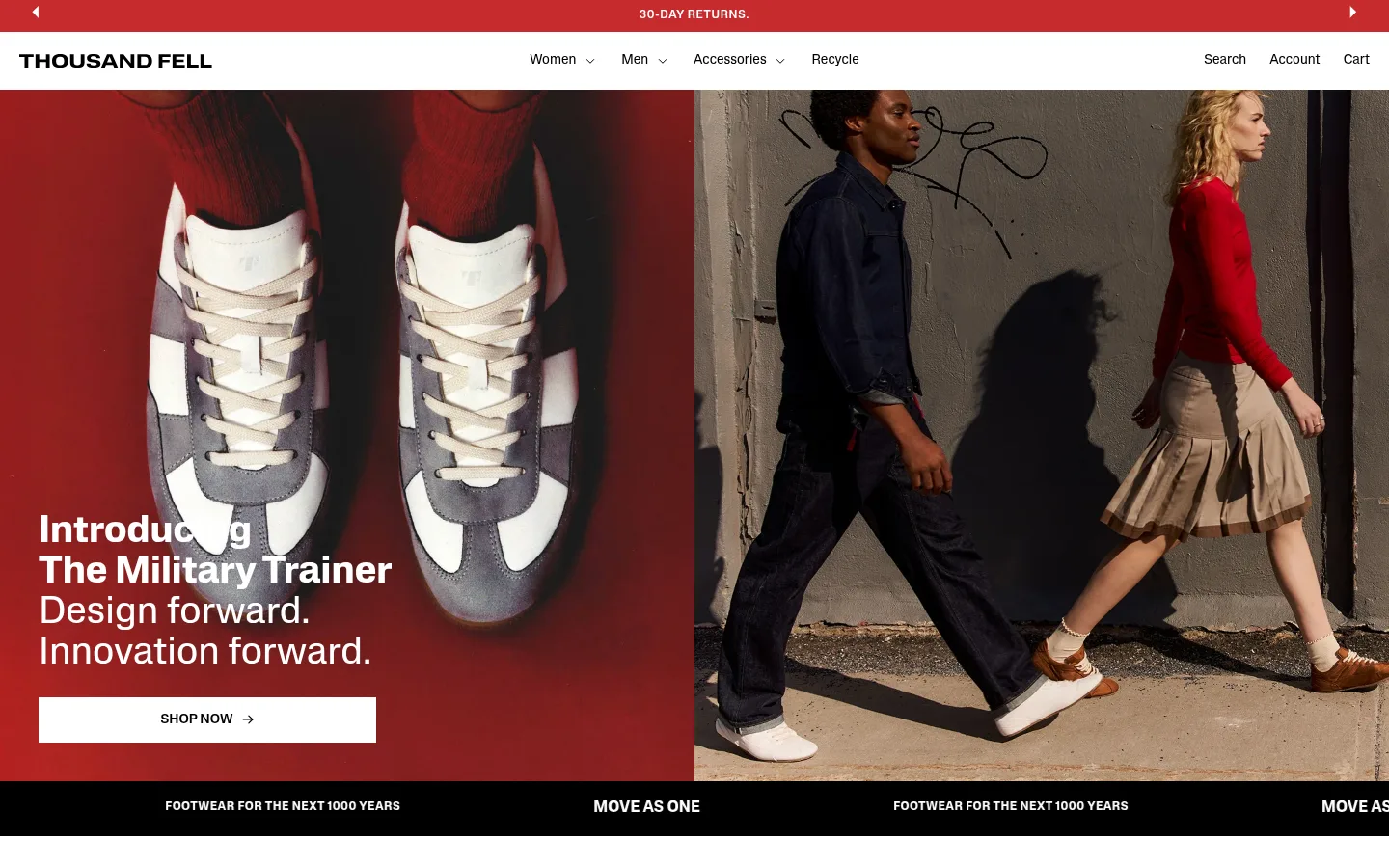
The page sets a clean white canvas against black text and pale product-card surfaces, letting footwear and campaign photography provide most of the visual color. A measured red accent appears in the announcement strip, recycling story panels, and footer, while the hero itself uses a dramatic red photographic field rather than decorative interface color. Lateral is the workhorse: compact navigation, readable product details, and confident headings stay direct and contemporary. Larger display moments use Lateral Extended for a distinctive, weightier editorial voice. The layout alternates between spacious centered statements, wide split-image stories, and dense product carousels, creating a rhythm between brand narrative and shopping. Images are large, tightly framed, and often edge-to-edge; product imagery sits on quiet light backgrounds. Flat surfaces, square controls, and minimal borders keep the interface crisp, while generous gaps separate content without adding ornamental chrome.
Core interface type for navigation, body copy, headings, links, product details, and buttons.
Aa 设计
Lateral Extended
网络字体 · 字重 500 / 700 · 占比 2%
免费替代:Space Grotesk
Distinctive display treatment for prominent editorial statements.
Aa 设计
Univers LT Std
网络字体 · 字重 400 / 300 · 占比 1%
免费替代:Arial
Occasional compact product-interface details, such as variant-count labels.
角色
示例
字号
字重
行高
字距
特大标题
Prominent editorial statements and oversized brand messaging.
Thousand Fell
64px
500
1.05
0
一级标题
Primary page or campaign headline.
Thousand Fell
40px
400
1.05
0
二级标题
Section headings for brand stories and product areas.
Thousand Fell
32px
600
1.25
0
三级标题
Product-category and supporting content headings.
The quick brown fox 敏捷的狐狸
20px
700
1.25
0
正文
Product descriptions, recycling information, and explanatory copy.
The quick brown fox 敏捷的狐狸
14px
400
1.4
0
辅助文字
Small uppercase labels and compact metadata.
The quick brown fox 敏捷的狐狸
10.5px
400
1.2
0.05em
按钮
Uppercase shopping and action controls.
The quick brown fox 敏捷的狐狸
14px
500
1.25
0
导航
Header links and compact navigation items.
The quick brown fox 敏捷的狐狸
12px
400
1.67
0
链接
Product, category, and informational links.
The quick brown fox 敏捷的狐狸
14px
400
1.4
0
眉题
Uppercase introductory labels above content.
The quick brown fox 敏捷的狐狸
10.5px
400
1.2
0.05em
间距与布局
基准单位 4px · 密度:适中
60px版块间距
8px元素间距
—卡片内边距
780px内容最大宽度
1px
2px
3px
4px
5px
6px
8px
12px
16px
20px
24px
27px
40px
60px
100px
A wide storefront canvas alternates between two-column campaign stories, product carousels, centered statements, four-item category rows, and three-column editorial features. The measured content max width is 780px, while campaign and closing media can stretch full bleed. Headings align left for stories and shopping modules, with a centered treatment for the “Made to live many lives” statement. Comfortable density and pronounced section gaps separate distinct content modes; product areas carry more compact, repeated information.
圆角与层次
没有测到阴影:页面是扁平的,层次靠底色和描边区分。
The interface is predominantly flat, with no measured shadows. Product cards rely on white or pale grey backgrounds rather than raised containers, and square corners reinforce the straightforward retail feel. Separation comes from image blocks, whitespace, and occasional fine rules; avoid adding decorative layers or elevated panels.
组件
下面的预览按实测的按钮、输入框、徽标、卡片样式重建(字体用替代字体)。
Announcement strip
A slim red banner at the very top presents short campaign or service messaging in small uppercase white text.
Primary navigation
White horizontal header with a bold wordmark, compact black links, and shopping utilities; keep the navigation visually quiet.
Campaign hero
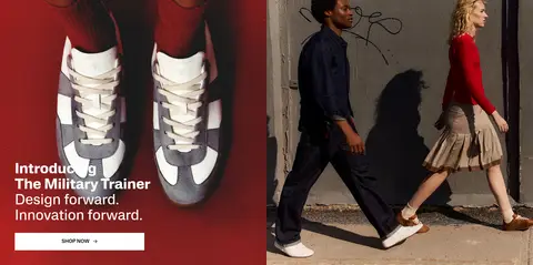
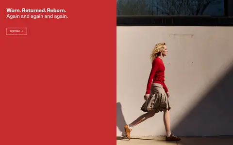
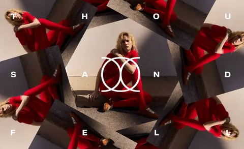
Large split campaign area combining a red-toned shoe image with lifestyle photography, overlaid white heading and a contrasting shop action.
Product carousel cards
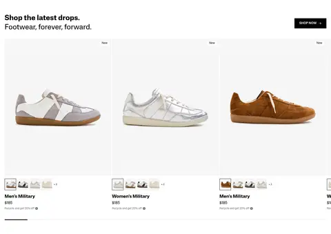
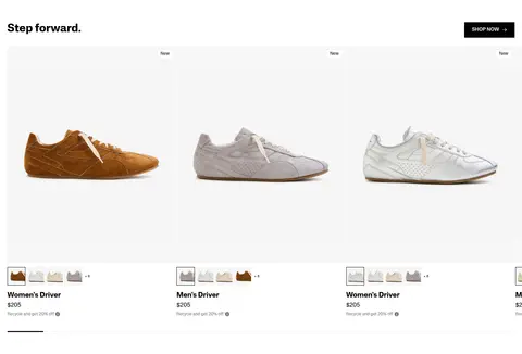
Footwear sits on #f7f7f7 image fields; white information areas carry product name, price, small variant thumbnails, and muted supporting copy.
Category tiles
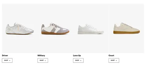
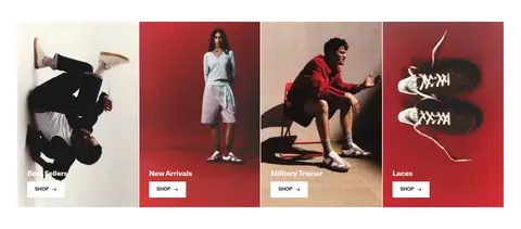
A row of four footwear categories uses large product imagery, concise labels, and simple shop links beneath.
Recycling story panel
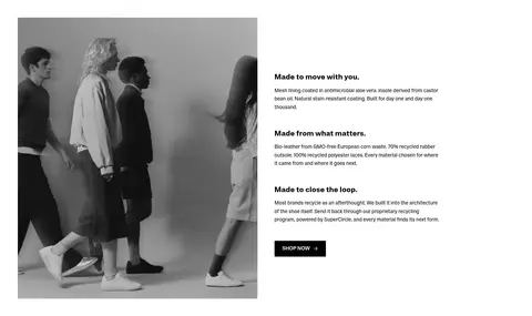
A split editorial feature places white text and an outlined action on a strong red field alongside lifestyle photography.
Footer
A broad red closing area combines a white brand mark, compact link columns, and supporting brand or social details.
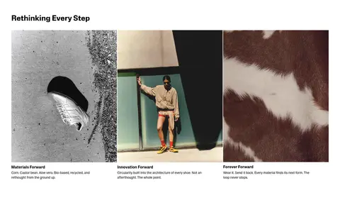
Imagery · Photography is the page’s main expressive layer: lifestyle campaigns show people wearing the shoes in urban settings, while product cards isolate individual sneakers against light grey. Red campaign imagery connects the hero, recycling story, category tiles, and footer. A later full-bleed fashion collage closes the page. Small editorial image groups show materials and everyday wear; imagery is photographic rather than illustrative or 3D-led.
Let footwear and campaign photography provide visual impact.
Use #c62b2e for announcement and recycling-story moments.
Keep product imagery on quiet pale surfaces.
Use black text and square, direct action controls.
Alternate commerce modules with editorial story sections.
✕ 不该做
Do not add gradients or decorative shadows.
Do not round product cards or primary controls.
Do not make every section red or image-heavy.
Do not crowd product cards with oversized text.
Do not introduce bright interface colors beyond the measured palette.
Do not replace campaign photography with generic illustrations.
给 AI 的提示词
想快速出一个同风格的新页面,把这段话连同 DESIGN.md 一起发给 AI。
Build a new Thousand Fell-style footwear storefront page with a restrained, editorial commerce aesthetic. Use Gallery White (#ffffff) as the main canvas, Carbon Ink (#000000) for copy and primary controls, Cloud Grey (#f7f7f7) behind product photography, Campaign Red (#c62b2e) for selected campaign bands, and Soft Graphite (#767676) for secondary text. Set the interface in a clean sans-serif close to Lateral, with compact navigation, clear section headings, uppercase action labels, and a distinctive extended display face for one or two major statements. Alternate product grids and category rows with split lifestyle stories and spacious editorial breaks. Favor large, authentic footwear photography, flat square-edged components, quiet borders, and comfortable whitespace. Keep shopping details legible and the brand storytelling visually vivid without adding ornamental effects.