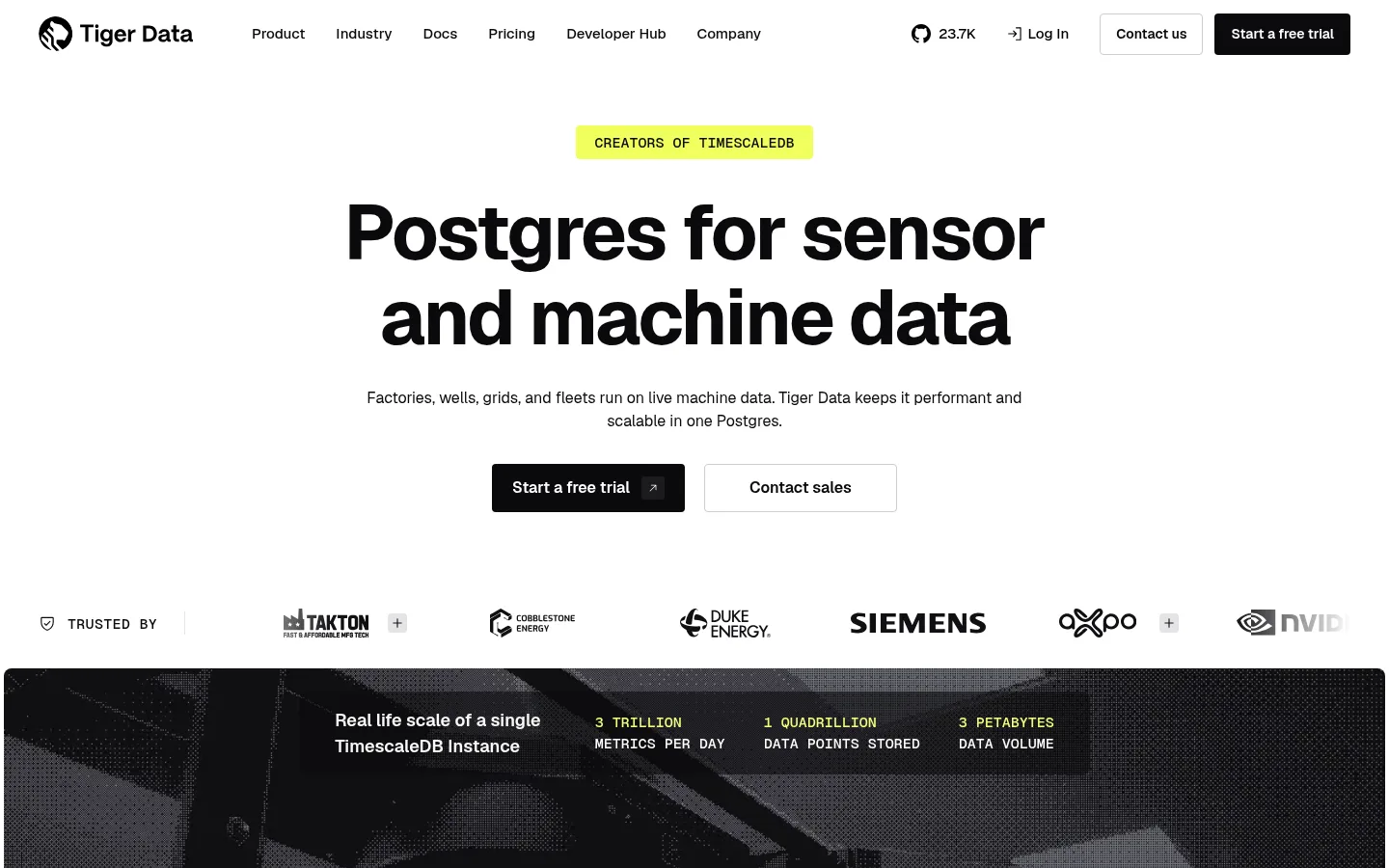
Tiger Data 将高对比的简洁界面与工业影像、克制的黄绿色点缀结合。醒目的大标题、紧凑的技术标签和清晰的转化入口,营造直接、面向开发者的体验。
North star · Use a white canvas and bold black typography as the default, reserving dark bands and lime details for purposeful contrast.
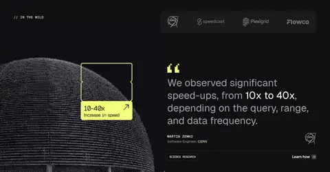
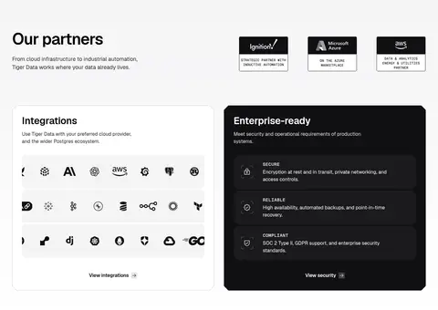
The page is built on a white canvas, using near-black typography and dark, full-width bands to establish contrast without relying on a broad colour system. A vivid yellow-green appears selectively in the hero badge, data callouts, testimonial detail and footer gradient; it acts as a signal, not a general-purpose fill. Geist Sans carries the interface, from the oversized, tightly tracked hero heading to compact navigation and body copy. Geist Mono adds a technical voice to uppercase labels and numerical data. The hero is centered and spacious, then the page shifts into split feature content, a dark testimonial panel, and partner and integration cards. Industrial video and monochrome customer marks give the product context, while thin grey borders separate controls and cards. Sections stay mostly flat, with consistent whitespace and straightforward button styling keeping the focus on evidence and action.
Headings, navigation, body text, buttons, and interface labels
Aa 设计
GeistMono
网络字体 · 字重 500 · 占比 8%
免费替代:Roboto Mono
Technical labels and uppercase data callouts
角色
示例
字号
字重
行高
字距
特大标题
Large, bold campaign or hero statement.
Tiger Data
80px
700
1.1
-0.03em
一级标题
Primary hero heading, tightly tracked and prominent.
Tiger Data
52px
600
1.1
-0.03em
二级标题
Major section headings and partner or CTA titles.
Tiger Data
44px
400
1.25
0
三级标题
Feature-group and prominent card headings.
Tiger Data
32px
600
1.2
-0.01em
四级标题
Feature-row titles and smaller content headings.
The quick brown fox 敏捷的狐狸
22px
600
1.5
-0.01em
正文
Paragraphs, descriptions, and general interface copy.
The quick brown fox 敏捷的狐狸
16px
400
1.5
0
辅助文字
Compact supporting text and attribution details.
The quick brown fox 敏捷的狐狸
15px
400
1.5
0
导航
Primary navigation links.
The quick brown fox 敏捷的狐狸
15px
500
1.5
0
链接
Inline and card action links.
The quick brown fox 敏捷的狐狸
0px
400
normal
0
代码
Uppercase technical labels and data annotations.
const style = 1;
15px
500
1.4
0.02em
间距与布局
基准单位 4px · 密度:紧凑
40px版块间距
8px元素间距
—卡片内边距
1360px内容最大宽度
2px
4px
6px
8px
12px
16px
20px
24px
28px
32px
36px
40px
48px
60px
The page uses a centered hero, a horizontal customer-logo strip, and a measured content width capped at 1360px. Below the hero, a wide industrial media block leads into a two-column feature split, followed by a dark testimonial area and a partner section with a three-column card arrangement. The overall rhythm alternates broad, open sections with denser lists and cards. Alignment changes by purpose: centered for the hero and CTA, left-aligned for content sections, and compact columns in the footer. Spacing follows a compact scale, with whitespace doing much of the separation.
圆角与层次
按钮 · 4px
输入框 · 4px
卡片 · 8px
链接 · 8px
hairline · input
sm · footer
The interface is mostly flat: white sections meet without prominent shadows, and grey hairlines define outlined buttons, inputs, and card edges. Dark panels create depth through tonal contrast rather than elevation. Rounded corners are restrained on controls and cards; media and broad bands remain visually direct, with layering mainly reserved for callouts over imagery.
组件
下面的预览按实测的按钮、输入框、徽标、卡片样式重建(字体用替代字体)。
Primary CTA
Near-black button with white text, compact 4px corner radius, and a direct trial action.
Secondary CTA
White or transparent button with a #ccccd5 outline, dark text, and matching compact control proportions.
Hero badge
Small, bright lime label centered above the headline; uppercase technical phrasing gives it a mono-like feel.
Feature list
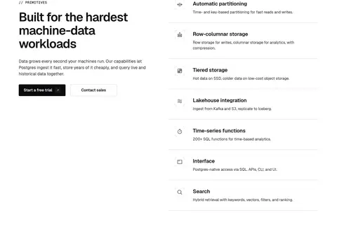
Two-column feature section with a left-aligned heading and copy beside stacked rows separated by subtle hairlines.
Customer proof strip
Horizontal trust label and customer marks, positioned between the hero actions and industrial media.
Dark feature card
Near-black security panel with white copy, grouped benefits, and low-contrast internal divisions.
Newsletter form
Footer email field with a thin grey outline and a full-width dark submit button.
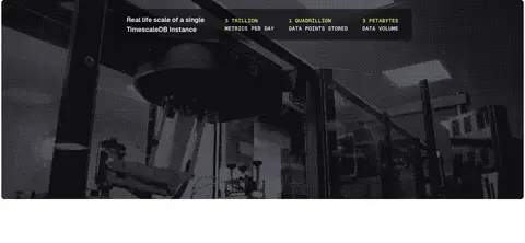
Imagery · An industrial video or photographic scene anchors the upper page, treated in near-monochrome so the interface remains cohesive. The testimonial pairs a dark background with a technical dotted or point-cloud visual and small lime callouts. Customer and partner marks appear as a restrained logo strip; integration logos sit in cards. Illustration details support product explanation rather than becoming a separate colourful visual identity.
Keep the main canvas white and typography near-black.
Use lime only for small, high-salience signals.
Set the hero headline large, centered, and tightly tracked.
Use dark bands to frame testimonials or inverse content.
Separate feature rows with fine grey hairlines.
Pair industrial imagery with restrained monochrome treatment.
✕ 不该做
Do not turn lime into a broad section background.
Do not add colourful gradients beyond the measured lime footer treatment.
Do not overuse shadows or layered floating cards.
Do not make every section centered; content areas are often left-aligned.
Do not style technical labels like oversized marketing headlines.
Do not introduce extra colours outside the measured palette.
给 AI 的提示词
想快速出一个同风格的新页面,把这段话连同 DESIGN.md 一起发给 AI。
Build a new Tiger Data page with a white Gallery White (#ffffff) canvas, True Ink (#000000) headings, and Button Black (#0a0a0c) primary actions. Use Geist Sans or a close Inter substitute for interface and headings, with Geist Mono or Roboto Mono for compact uppercase technical labels. Keep lime accents limited to Signal Lime (#f1ff5c) highlights rather than large fills. Make the layout spacious but compact in its controls: a strong centered opening, then left-aligned content splits, restrained cards, and clear hairline dividers in Soft Divider (#ccccd5). Use dark inverse sections in Carbon Panel (#101013) selectively. Favor monochrome industrial imagery, evidence-led content, and simple CTAs. Keep elevation low and corners modest; preserve strong contrast and clear scanning order.