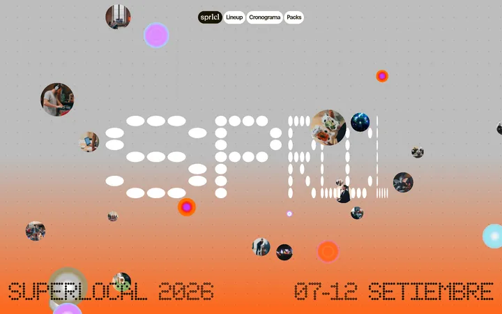
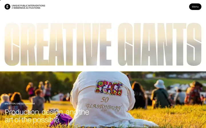
North star · Pair oversized, confident typography and theatrical photography with disciplined blocks of warm canvas, deep purple, and vivid accent colour.
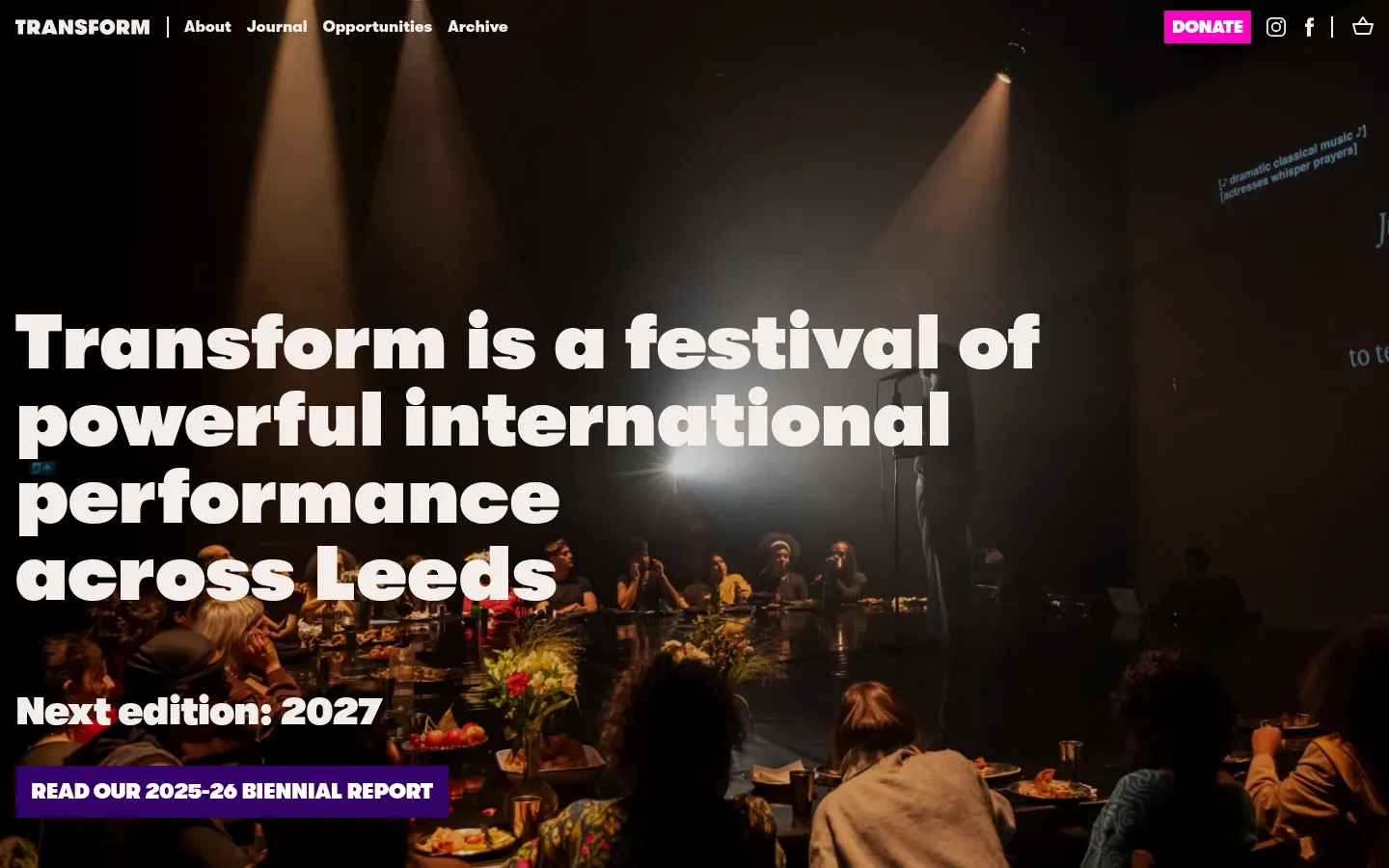
The page opens with full-bleed performance photography: the dim, warm-toned image sets a theatrical mood, while a very large white headline sits directly over it for immediate contrast. The Walsheim sans-serif family is used throughout, with display and heading styles set especially heavy and compact; the navigation and body copy remain much quieter. Pale warm canvas sections break up deep purple bands, while bright pink marks the donation and signup actions and red appears in testimonial emphasis and news-card headlines. News is arranged as a centered four-column card row, then the contact and mailing-list content returns to a full-width purple field. Spacing is comfortable rather than dense, with clear section breaks and generous breathing room around headings. The visual language stays flat and graphic: square-edged cards and buttons, minimal borders, no measured shadows, and imagery doing most of the atmospheric work.
配色
点色块复制色值。用途说明来自对页面的实测位置(背景、文字、描边、按钮)与截图判读。
品牌色
强调色
表层色
中性色
功能色
页面底色 · Warm Canvas表层 · Stage Black表层 2 · Media Gray表层 3 · Gallery White主文字 · Stage Black次要文字 · Warm Canvas弱文字 · Gallery White描边 · Control Gray强调 · Electric Pink强调 2 · Signal Red
Site-wide typeface for hero and section headings, body copy, navigation, buttons, and form text.
角色
示例
字号
字重
行高
字距
特大标题
Oversized hero or brand display lettering.
Transform
80px
800
1
0
一级标题
Primary hero headline and major page titles.
Transform
56px
800
1.1
-0.02em
二级标题
Section titles such as Latest news.
Transform
40px
800
1.1
-0.02em
三级标题
News-card titles and supporting content headings.
The quick brown fox 敏捷的狐狸
24px
900
1.2
-0.02em
四级标题
Uppercase labels including CONTACT and PRESS.
The quick brown fox 敏捷的狐狸
22px
800
1
-0.02em
正文
News descriptions, supporting copy, and footer text.
The quick brown fox 敏捷的狐狸
16px
400
1.38
0
按钮
Donation and report CTA labels.
The quick brown fox 敏捷的狐狸
18px
400
1.45
0
导航
Header navigation and site links.
The quick brown fox 敏捷的狐狸
16px
400
1.38
0
间距与布局
基准单位 8px · 密度:适中
48px版块间距
16px元素间距
16px卡片内边距
1408px内容最大宽度
1px
2px
3px
8px
15px
16px
20px
24px
30px
32px
40px
48px
56px
80px
120px
The page uses full-width horizontal section bands with content aligned to a broad centered frame. The hero is a single-column, full-bleed image composition with left-aligned text; the news area shifts to a centered four-column card grid. Contact details use two columns, followed by a centered newsletter form. Section changes are clear and spacious, with comfortable content density and strong alignment contrasts between left-led hero content and centered news and signup content.
圆角与层次
按钮 · 50%
没有测到阴影:页面是扁平的,层次靠底色和描边区分。
The interface is predominantly flat, using solid colour bands and square-edged cards rather than shadows. Strong contrast and full-width section backgrounds provide hierarchy. The hero creates its own depth through the low-light stage photograph, while card separation comes from spacing and pale surfaces instead of raised effects.
组件
下面的预览按实测的按钮、输入框、徽标、卡片样式重建(字体用替代字体)。
Header navigation
Compact brand and link row over the hero, with pale text and a bright pink uppercase donation action.
Hero
Full-bleed performance image with oversized bold white headline, edition announcement, and purple report CTA.
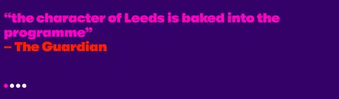
Testimonial band
Full-width deep-purple section featuring oversized quote text, pink emphasis, red attribution, and carousel indicators.
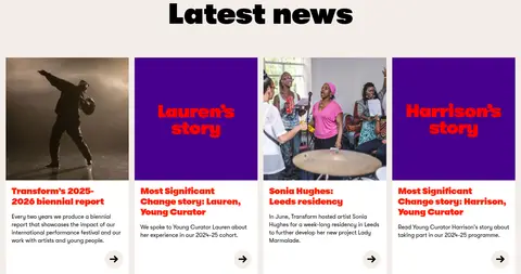
News cards
Four-column row on the warm canvas; rectangular image or graphic tile above bold red title, short copy, and a small circular arrow affordance.
Contact block
Deep-purple area with a large centered Transform wordmark and two contact columns, using pink details.
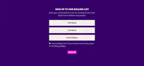
Mailing-list form
Centered signup content on purple with stacked pale inputs, consent text, and a bright pink uppercase submit action.
Footer
A narrow black donation strip precedes a pale footer with compact links, partner marks, and legal copy.
Imagery · Photography anchors the page: a dark, warm-toned performance scene fills the hero, while news cards use documentary-style images of performers and participants. Some cards use bold purple graphic tiles with red lettering instead of photographs. Images are rectangular and prominent, with no visible decorative framing; the hero crop keeps the text legible over a darker area.
Use Walsheim or a close geometric sans-serif substitute consistently.
Make hero and major section headings bold, large, and easy to scan.
Use Festival Violet (#340068) for substantial content bands.
Reserve Electric Pink (#fb00c2) for prominent actions and selected emphasis.
Use full-width performance photography for the hero.
Keep card edges and buttons visually flat and square.
Preserve clear contrast between pale canvas and dark sections.
✕ 不该做
Do not add gradients or decorative shadows.
Do not round card corners or primary rectangular buttons.
Do not use a delicate serif style for headings.
Do not replace the theatrical hero image with a generic illustration.
Do not spread pink and red accents uniformly across every section.
Do not compress the news cards into a dense text-only list.
给 AI 的提示词
想快速出一个同风格的新页面,把这段话连同 DESIGN.md 一起发给 AI。
Build a new Transform page in a bold, theatrical editorial style. Use Walsheim throughout, or DM Sans if unavailable; make major headlines very heavy and tightly tracked, with quieter body and navigation text. Set warm canvas (#f4ede9) against broad Festival Violet (#340068) bands. Use Electric Pink (#fb00c2) sparingly for primary actions and Signal Red (#ff1e00) for selected editorial emphasis. Lead with a full-bleed, low-light performance photograph and place large white type over a legible dark area. Organize supporting stories into a clean four-column card grid with rectangular imagery, bold titles, concise copy, and simple arrow affordances. Keep form controls stacked and clear. Prefer flat surfaces, square corners, strong section breaks, and comfortable spacing; avoid gradients, shadows, and ornamental decoration.