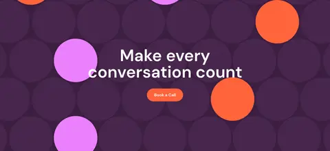
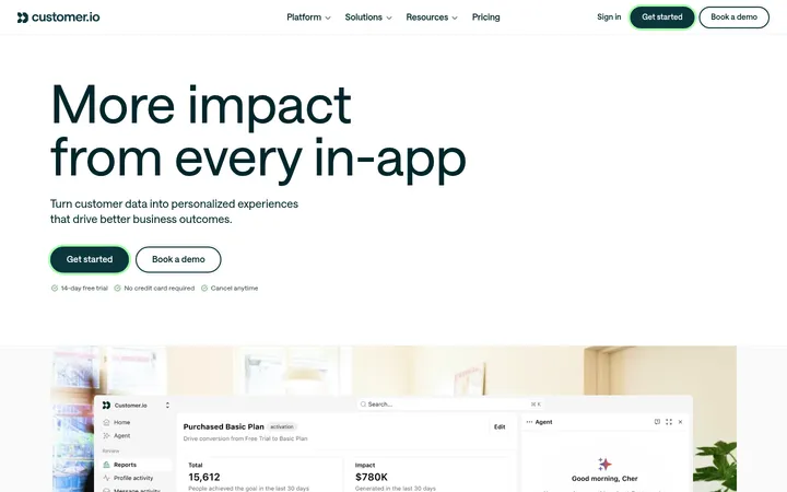
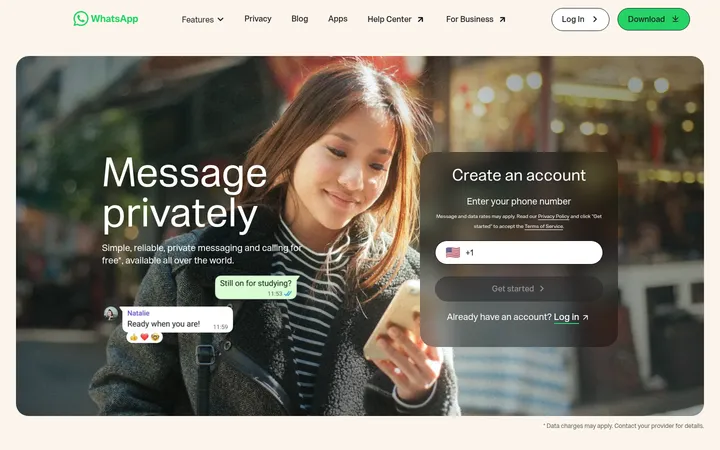
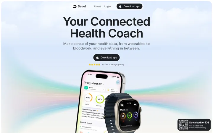
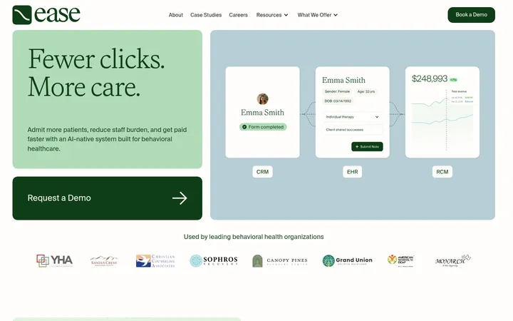
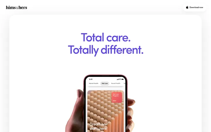
North star · Anchor the page in deep green, then use clear DM Sans hierarchy, human health imagery, and distinct color-coded modules to make complex care workflows feel approachable.
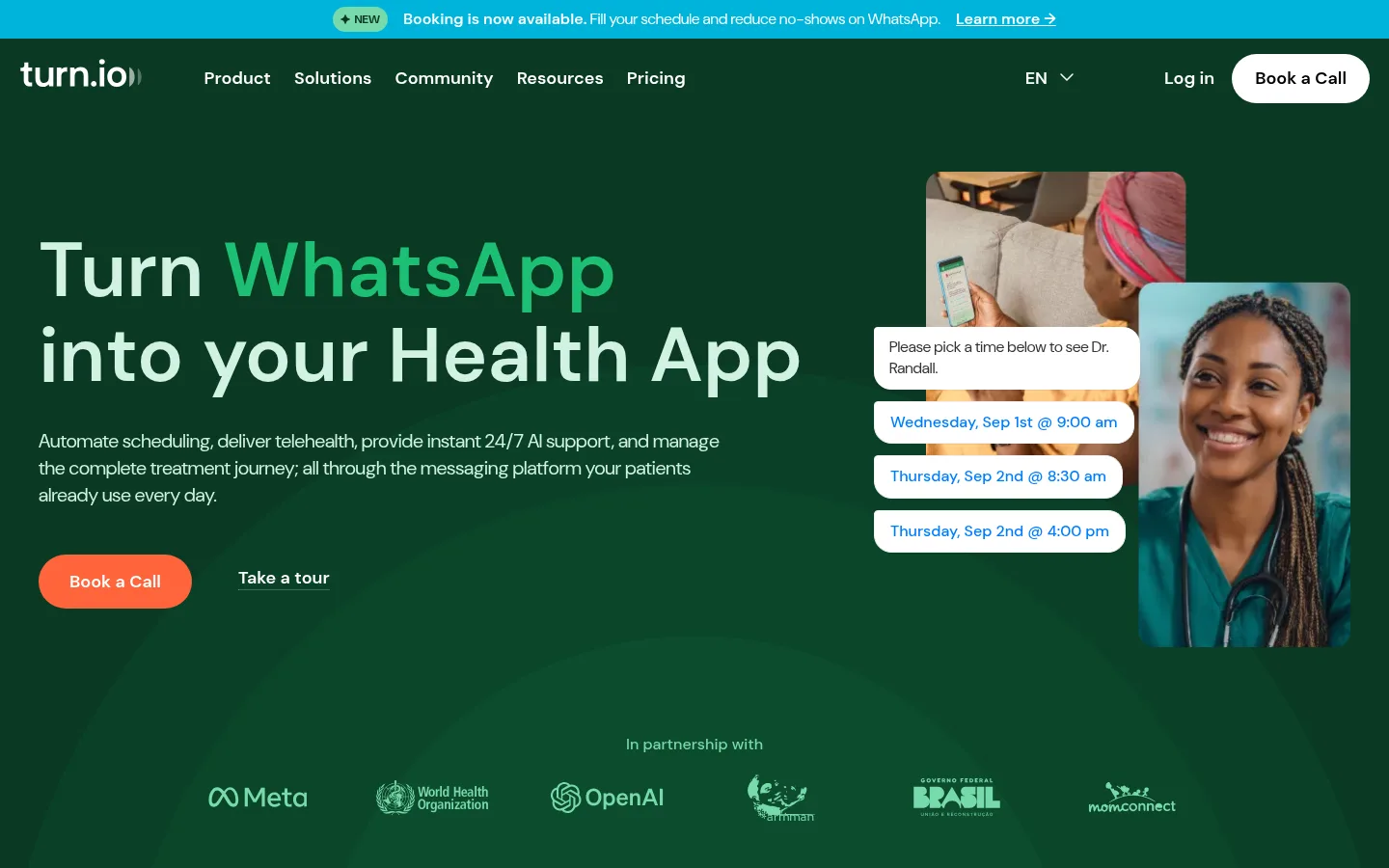
The page opens on a deep forest-green hero that anchors the brand, with pale mint display text and a brighter green highlight picking out “WhatsApp.” A cyan announcement strip and orange pill CTA provide the sharpest color contrast. DM Sans carries everything from oversized, compact headlines to clear navigation and small supporting copy; weights do the hierarchy work rather than decorative type treatments. The layout uses a broad centered content area, generous section breaks, and modular cards. White backgrounds give the feature grid and customer evidence room to breathe, while saturated purple and pale lavender distinguish the journey-automation and toolkit sections. Photography focuses on patients and health workers, paired with interface mockups that make the software concrete. Rounded card silhouettes, restrained hairlines, and minimal shadow keep the page approachable and clean despite its long, information-dense structure.
All page typography, from navigation and buttons to display headings and body copy.
角色
示例
字号
字重
行高
字距
特大标题
Oversized hero emphasis and large brand-scale statements.
Turn.io
116px
600
1
0
一级标题
Primary hero headline.
Turn.io
80px
600
1.1
0
二级标题
Major section titles, including feature and results headings.
Turn.io
72px
600
1
0
三级标题
Subsection headlines and prominent card titles.
Turn.io
69px
600
1
0
四级标题
Supporting feature and product headings.
Turn.io
52px
600
1.1
-0.019em
正文
Main explanatory and descriptive paragraph copy.
The quick brown fox 敏捷的狐狸
17.5px
400
1.2
0
辅助文字
Small labels, annotations, and supporting metadata.
The quick brown fox 敏捷的狐狸
16px
500
1.4
0
按钮
Calls to action such as Book a Call and Take a tour.
The quick brown fox 敏捷的狐狸
18px
600
1.33
0
导航
Primary navigation and prominent menu items.
The quick brown fox 敏捷的狐狸
18px
600
0.89
0
间距与布局
基准单位 4px · 密度:紧凑
40px版块间距
5px元素间距
30px卡片内边距
1360px内容最大宽度
4px
5px
8px
10px
12px
16px
20px
24px
30px
32px
40px
50px
55px
64px
120px
Use a broad centered content area, measured at a 1360px page maximum, with left-aligned hero copy and modular sections. The first screen pairs a large text column with layered product and human imagery; subsequent white sections use card grids and centered proof points. Maintain clear vertical pauses between content bands, with the measured spacing scale available for implementation. Overall density is compact within cards but spacious between major sections; alternate dark, white, purple, and pale-lavender bands to guide the long scroll.
圆角与层次
按钮 · 9999px
卡片 · 24px
图片 · 12px
导航 · 8px
hairline · text
The design is largely flat, with color blocks and rounded card surfaces doing most of the grouping. Use light hairlines sparingly; the measured shadow is only a subtle hairline. Layered hero media and interface mockups create depth through overlap rather than strong drop shadows.
组件
下面的预览按实测的按钮、输入框、徽标、卡片样式重建(字体用替代字体)。
Announcement strip
A bright cyan message bar sits above the dark-green navigation, with a small NEW badge and an underlined learn-more link.
Pill CTA
Book a Call uses a rounded pill shape; primary CTA is orange with white text, with a white-and-black variant in navigation.
Hero composition
Large left-aligned headline and short copy sit opposite overlapping clinician photography and appointment-message UI.
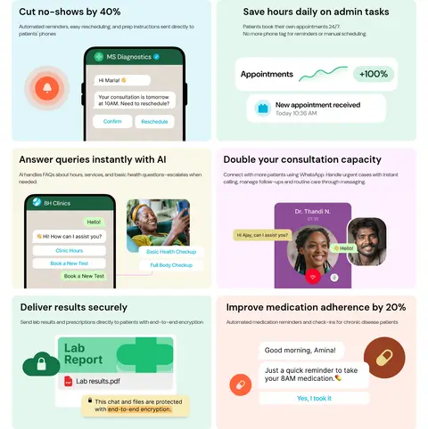
Feature cards
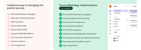
A multi-row grid of rounded pastel cards pairs concise benefit headings with small product or messaging illustrations.
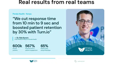
Customer proof card
A testimonial combines a light cyan text panel, prominent quote, measured outcomes, and a clinician portrait.
Colored product bands
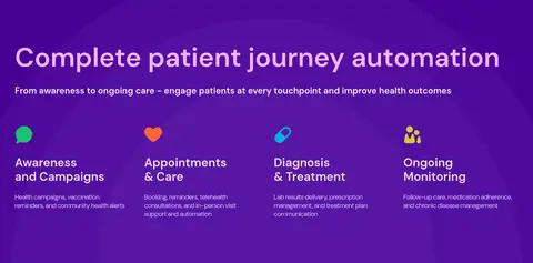
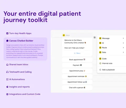
Use a saturated violet journey-automation band and pale lavender toolkit area to frame product content.
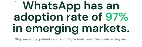
Impact section
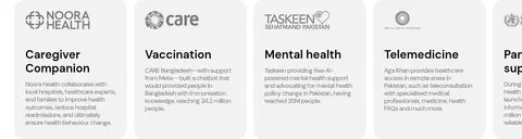
A full-bleed dark-green panel centers a large reach statistic among portraits and partner marks.
Imagery · Use real, warm portraits of patients and clinicians as the emotional anchor, especially in the hero and impact section. Pair photography with crisp product-interface mockups and small, colorful illustration details inside feature cards. Crop media into rounded rectangles, keep interface imagery legible, and avoid ornamental stock-image styling. People and product visuals should feel integrated rather than isolated in a decorative gallery.
Use Forest Canvas (#0a3922) to anchor hero and impact sections.
Set all interface text in DM Sans or a close sans-serif substitute.
Reserve Signal Orange (#ff643b) for high-priority CTA emphasis.
Keep headlines large, bold, and sentence case.
Use soft pastel cards for individual patient-care benefits.
Pair product UI with authentic healthcare photography.
Separate major content groups with clear background-color bands.
✕ 不该做
Do not introduce colors outside the measured palette.
Do not make every section dark; retain broad white content areas.
Do not use heavy shadows to separate cards.
Do not crowd the hero with additional copy or controls.
Do not replace the human photography with decorative 3D art.
Do not use sharp, square corners for prominent cards and buttons.
给 AI 的提示词
想快速出一个同风格的新页面,把这段话连同 DESIGN.md 一起发给 AI。
Build a new Turn.io-style healthcare SaaS page with a clear, human-centered tone. Use Forest Canvas (#0a3922) for the hero and impact moments, Gallery White (#ffffff) for core content, and Signal Orange (#ff643b) for the primary CTA. Create distinct product modules with Vivid Violet (#460095) and Lavender Mist (#eee2ff), and use Mint Wash (#d2f2e3) for selected feature cards. Set the entire interface in DM Sans, using bold oversized sentence-case headings and readable compact body copy. Pair authentic patient or clinician photography with crisp messaging and dashboard mockups. Favor a broad centered layout, modular rounded cards, restrained borders, and minimal shadows. Keep generous pauses between sections, alternate background bands for long-page rhythm, and make each CTA visually unmistakable.