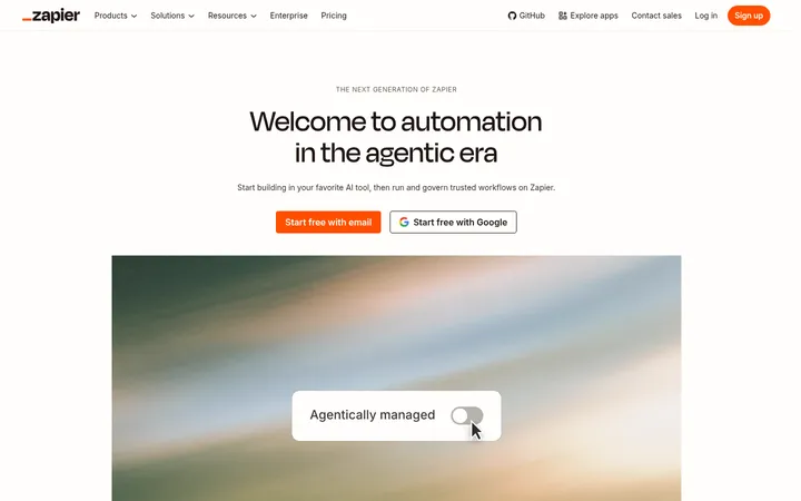
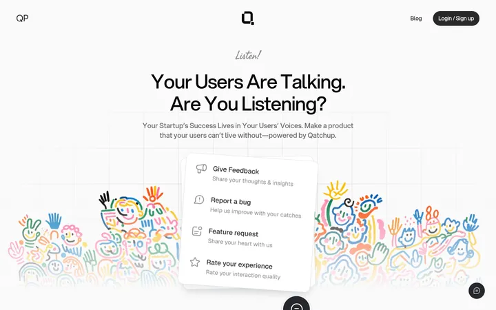
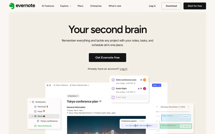
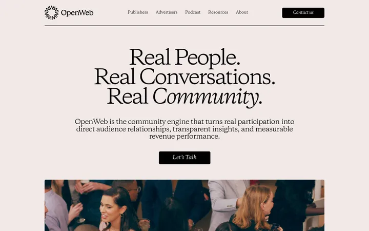
North star · Keep the warm canvas and confident green accents quiet enough that real human moments and product imagery lead.
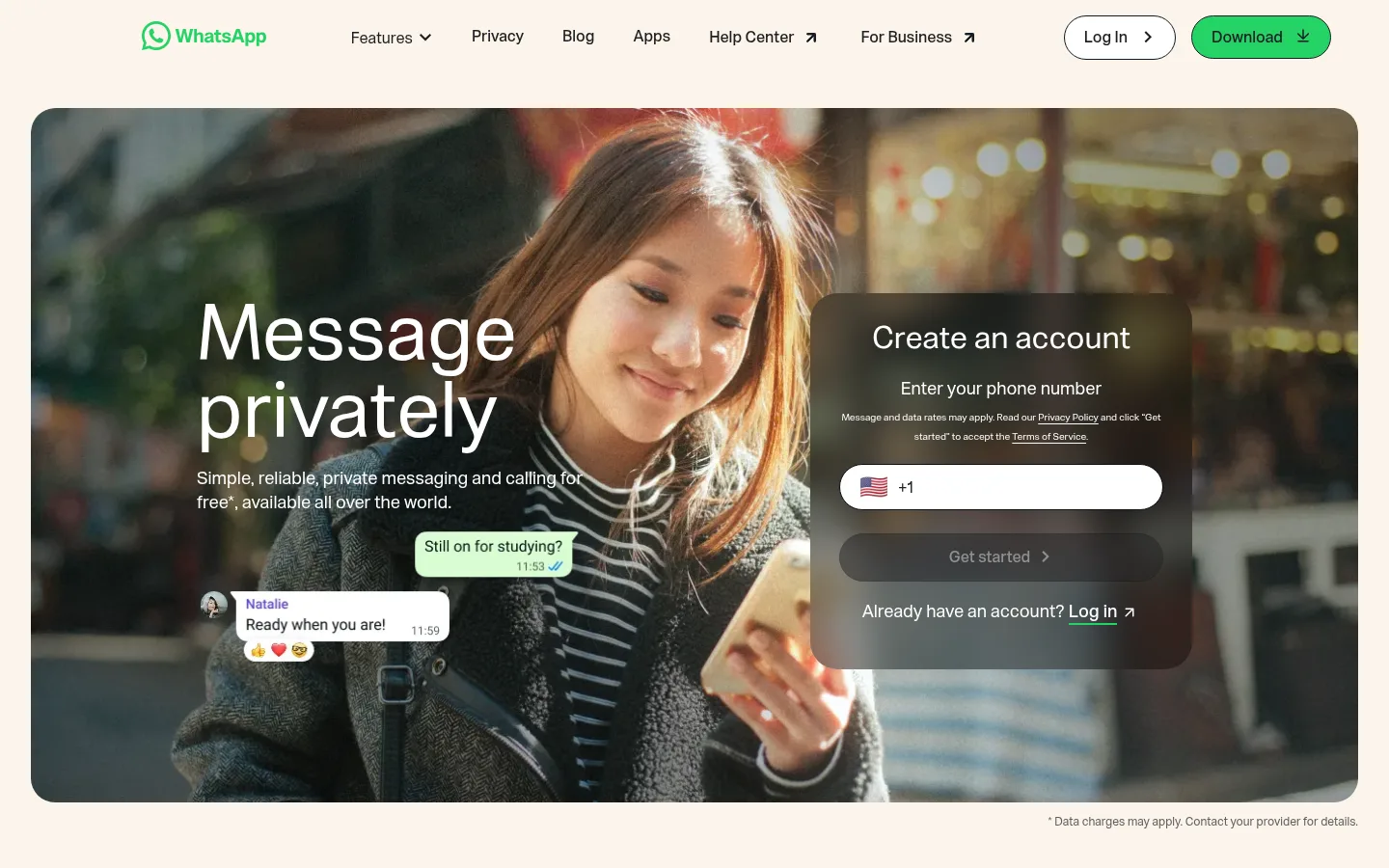
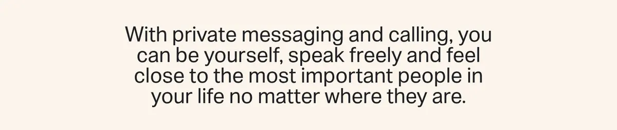
The page is anchored by Gallery Cream (#fcf5eb), which gives the long homepage a warm, continuous canvas. Ink (#1c1e21) carries most headings and body copy, while WhatsApp Green (#25d366) is reserved for the logo, primary download actions, and small product-interface details. White feature surfaces and the pale green news band create occasional changes of pace; a deep blue-black section and footer provide strong contrast. WhatsApp Sans Var uses unembellished, regular-weight headings with generous scale and comfortable body leading. The hero is a wide, rounded photograph with copy and an account form layered over the image. Below it, spacious two-column feature sections alternate text and device imagery, with a centered statement and floating message fragments breaking the rhythm. The design keeps cards, borders, and shadows subordinate to photography, clear alignment, and open space.
Site-wide display headings, body copy, navigation, buttons, and supporting labels.
角色
示例
字号
字重
行高
字距
特大标题
Large hero and campaign headlines.
WhatsApp
80px
400
1
0
一级标题
Primary page and prominent feature headings.
WhatsApp
60px
400
1
0
二级标题
Feature-section headings and large statement copy.
WhatsApp
48px
400
1
0
三级标题
Secondary feature and news-card headings.
WhatsApp
32px
400
1
0
四级标题
Smaller card titles and supporting subheads.
The quick brown fox 敏捷的狐狸
24px
400
1.34
0
正文
Feature descriptions and explanatory copy.
The quick brown fox 敏捷的狐狸
18px
400
1.39
0
辅助文字
Small notes, labels, and secondary interface copy.
The quick brown fox 敏捷的狐狸
16px
400
1.38
0
导航
Header navigation labels and menu items.
The quick brown fox 敏捷的狐狸
16px
500
1
0
间距与布局
基准单位 8px · 密度:适中
32px版块间距
16px元素间距
56px卡片内边距
1080px内容最大宽度
8px
12px
13px
16px
18px
20px
24px
28px
30px
32px
56px
Use a centered, wide content area with a measured maximum width of 1080px and a comfortable density. The header sits above a broad, rounded hero; most feature sections use two columns, alternating copy and media placement. Insert occasional full-width visual or centered statement sections to interrupt the split layout. Preserve generous measured card padding and open intervals between elements rather than compressing content. Finish with a two-column news band and a compact multi-column footer.
圆角与层次
按钮 · 9999px
卡片 · 25px
图片 · 25px
没有测到阴影:页面是扁平的,层次靠底色和描边区分。
The page relies on flat color fields and media rather than measured shadows. Use thin dark outlines on pill-shaped actions and rounded card edges for definition. Layer the hero account form over the photograph, and keep phone mockups and chat fragments visually distinct without adding invented elevation effects.
组件
下面的预览按实测的按钮、输入框、徽标、卡片样式重建(字体用替代字体)。
Header navigation
Compact horizontal brand and link row over the light canvas, with a pill-shaped outlined Log In action and a filled green Download action.
Hero with account form
Wide rounded lifestyle photograph with large white headline and supporting copy on the left; a dark translucent account panel with a white phone-entry field overlays the right.
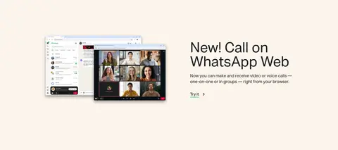
Feature split
Alternating two-column text and product-media sections; use ink headings, concise copy, and understated underlined links.
Floating message montage
Open cream-colored area with small chat bubbles and avatar fragments surrounding a centered statement, not boxed into a conventional card.
Download and text actions
Green filled Download pills use dark text and a fine dark outline; secondary actions use outlined pill styling or simple underlined text links.
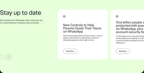
News cards
Pale mint updates band pairs introductory copy with white rounded cards; card content is ink-colored and Read More actions are outlined pills.
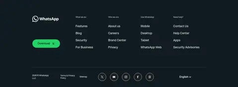
Footer
Deep blue-black footer with reversed logo and text, grouped link columns, a green Download button, and a separated legal and social row.
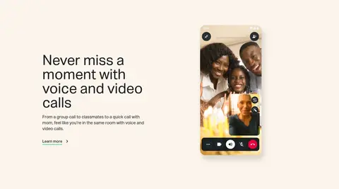
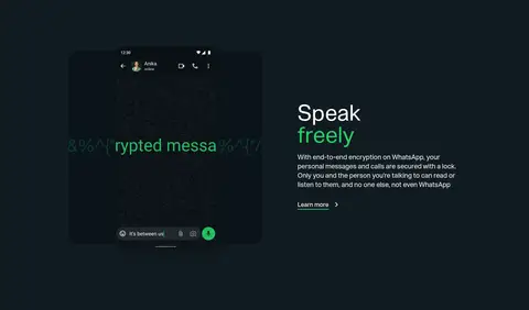
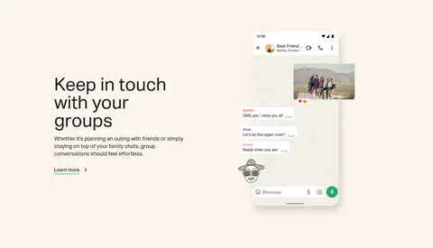
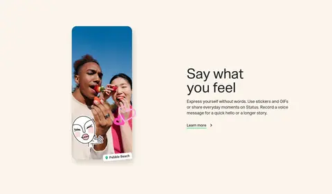
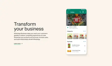
Imagery · Lead with warm, natural lifestyle photography showing people using phones, framed as a wide rounded hero image. Feature sections use clean device mockups and screenshots—video calls, chats, stickers, and a business catalog—against the cream canvas. Some message fragments and interface details float around the main content. Keep product imagery legible and let its varied colors remain inside the media rather than extending them into the brand palette.
Reserve WhatsApp Green for brand signals and primary actions.
Keep headings large, regular-weight, and sentence case.
Alternate text and device imagery across feature sections.
Let lifestyle photography feel natural and human.
Use dark bands sparingly for strong section contrast.
✕ 不该做
Do not introduce gradients or decorative shadows.
Do not use bright green as a large page background.
Do not turn every feature into a boxed card.
Do not overdecorate navigation or add heavy iconography.
Do not let product mockup colors redefine the site palette.
Do not compress the generous spacing between sections.
给 AI 的提示词
想快速出一个同风格的新页面,把这段话连同 DESIGN.md 一起发给 AI。
Build a new WhatsApp-style page with a spacious, centered layout and a warm Gallery Cream canvas (#fcf5eb). Use Message Ink (#1c1e21) for clear, regular-weight headings and body copy, and WhatsApp Sans Var or Inter as its closest substitute. Keep WhatsApp Green (#25d366) focused on the logo and pill-shaped primary actions. Create a wide, rounded lifestyle-photo hero with readable copy and a contrasting account panel; follow with alternating two-column feature sections using real-looking messaging and device media. Use Clean White (#ffffff) for cards, Chat Mint (#e6ffda) for a restrained updates band, and Midnight Teal (#111b21) for one high-contrast section or footer. Favor open spacing, thin outlines, and flat surfaces. Do not add gradients, heavy shadows, or invented palette colors.