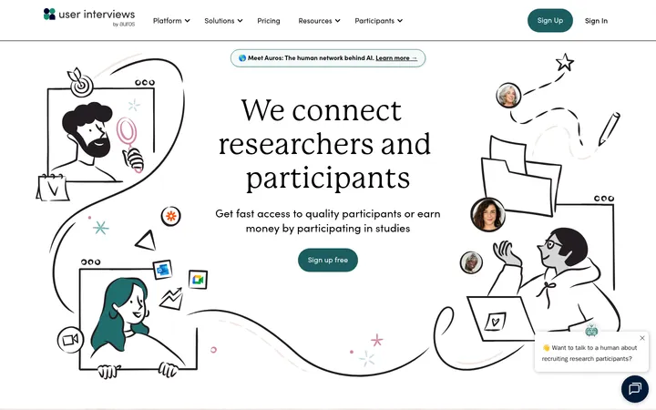
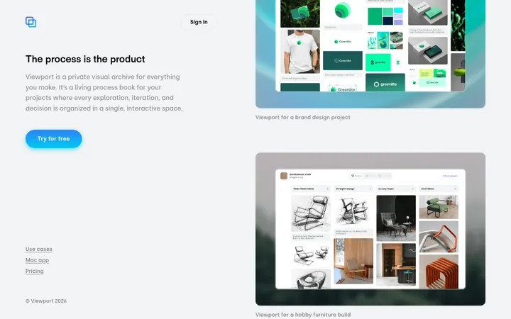
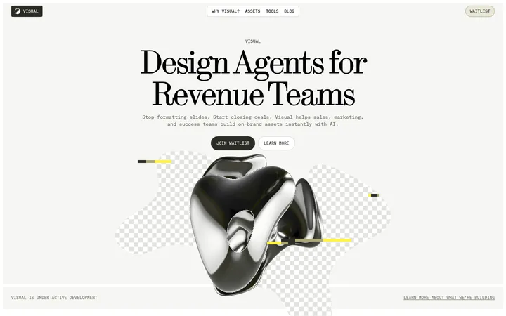
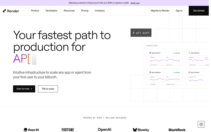
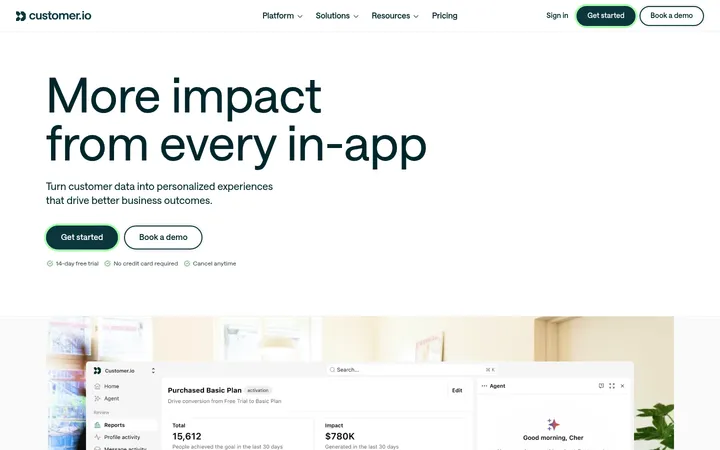
North star · Keep the page airy and product-led: let readable analytics UI carry the story, with violet-blue accents used sparingly to guide action.
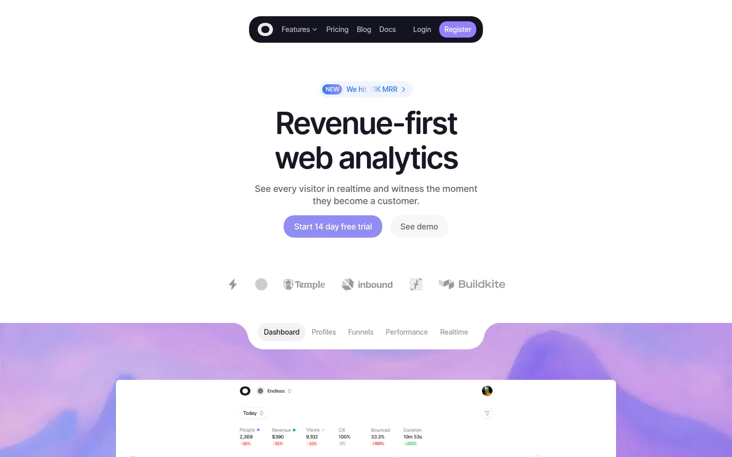
The visual strategy is clean and product-led: white dominates, while near-black headings and muted gray copy keep the analytics message legible and calm. Violet is reserved for the primary trial action, selected controls, and soft transitions; pale blue joins it in gradients and announcement details. OpenRunde gives the page a friendly, rounded character, with compact supporting text and large, tightly tracked headlines. Content is centered within a restrained page width, with generous whitespace separating the hero, feature cards, comparison, pricing, FAQ, and final CTA. The dashboard is the main visual proof point: a crisp white interface sits over a vivid, atmospheric violet-blue landscape, contrasting with otherwise quiet sections. Cards rely more on subtle tinted surfaces and fine borders than on strong shadows. Rounded pills, light dividers, and small colored data marks maintain continuity without making the page feel dense.
All page typography, including display headings, body copy, navigation, labels, and buttons.
角色
示例
字号
字重
行高
字距
特大标题
Large, tightly tracked hero display headline.
Visitors
60px
600
1.13
-0.05em
一级标题
Primary page headline and major feature-section titles.
Visitors
48px
500
1
-0.007em
二级标题
Section headings for feature, comparison, pricing, and FAQ blocks.
Visitors
36px
500
1.22
-0.017em
三级标题
Feature-card titles and prominent subsection headings.
The quick brown fox 敏捷的狐狸
24px
500
1.17
-0.013em
四级标题
Smaller card headings and compact content titles.
The quick brown fox 敏捷的狐狸
20px
500
1.4
-0.016em
正文
Feature descriptions, explanatory copy, and pricing details.
The quick brown fox 敏捷的狐狸
14px
500
1.43
-0.023em
辅助文字
Badges, chart labels, footnotes, and small helper text.
The quick brown fox 敏捷的狐狸
12px
400
1.33
-0.027em
按钮
Trial, registration, and secondary action labels.
The quick brown fox 敏捷的狐狸
16px
500
1.5
-0.02em
导航
Header navigation labels and compact menu items.
The quick brown fox 敏捷的狐狸
14px
500
1.43
-0.023em
间距与布局
基准单位 8px · 密度:适中
64px版块间距
8px元素间距
48px卡片内边距
984px内容最大宽度
3px
4px
6px
8px
10px
12px
16px
20px
24px
32px
48px
64px
Use a centered content column with a measured maximum width of 984px and generous white space between sections. The hero is vertically centered, followed by a wide dashboard presentation; later sections shift between centered single-column introductions, two-column feature cards, a comparison table, and a pricing panel. The measured spacing system uses an 8px base, a 64px section gap, and comfortable density. Keep headings centered where shown, while card and table content aligns to its own grid.
圆角与层次
按钮 · 50%
卡片 · 24px
图片 · 50%
徽标 · 6px
导航 · 24px
链接 · 9999px
hairline · button
hairline · button, nav
md · other
sm · media
Favor flat white surfaces, subtle gray borders, and pale neutral card backgrounds. Use restrained hairline shadows only where a control or media preview needs separation; avoid deep, dramatic elevation. Layer the dashboard as a clean white panel over the colorful hero backdrop, with rounded corners and simple interface framing.
组件
下面的预览按实测的按钮、输入框、徽标、卡片样式重建(字体用替代字体)。
Pill navigation
Compact dark rounded capsule centered above the hero; muted links sit beside a violet Register action.
Announcement link
Small pale-blue pill with a blue NEW badge, short milestone copy, and a trailing chevron.
Primary trial CTA
White-text Start 14 day free trial action on Lavender Signal (#918df6), shaped as a full pill.
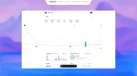
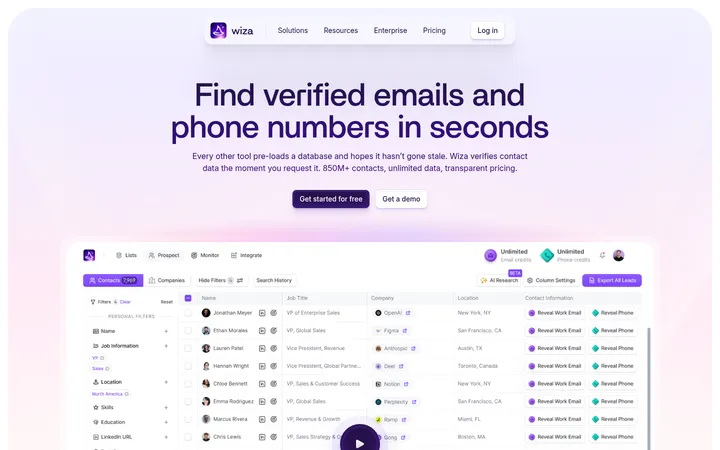
Dashboard showcase
Large white analytics panel layered over a violet-blue landscape, with tabs above and charts, metrics, and map-like data inside.
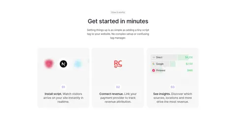
Feature cards
Pale neutral rounded cards arranged in a two-column grid, combining colored labels, concise copy, and product UI previews.
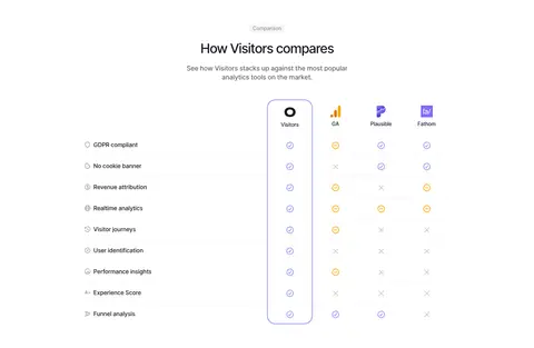
Comparison table
Centered tool comparison with a highlighted Visitors column and lightweight rows of feature labels and status symbols.
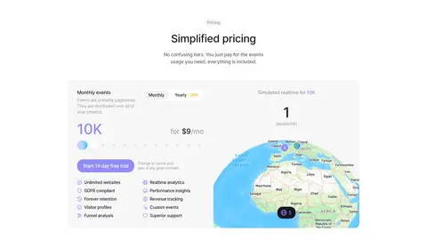
Pricing panel
Soft neutral two-part card pairing event-based pricing and included features with a live map-style product preview.
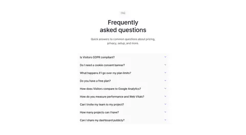
FAQ accordion
Narrow centered list of questions with compact row separators and small trailing chevrons.
Imagery · Use product UI as the primary imagery: white analytics dashboards with charts, metrics, maps, and small status colors. The hero dashboard is framed against a soft, vivid violet-to-blue landscape that supplies the strongest visual color. Feature and pricing panels show cropped interface previews rather than lifestyle photography. Keep screenshots crisp, lightly rounded, and clearly subordinate to the headline and CTA.
Reserve Lavender Signal for the main conversion action.
Let product dashboards provide the primary visual detail.
Use generous whitespace between major sections.
Keep cards rounded, quiet, and lightly separated.
✕ 不该做
Do not introduce dark full-width section bands.
Do not use saturated accents as large background fills.
Do not add heavy shadows to ordinary cards.
Do not crowd the hero with competing content.
Do not use photography where product UI is the proof point.
Do not let illustration-only colors redefine the brand palette.
给 AI 的提示词
想快速出一个同风格的新页面,把这段话连同 DESIGN.md 一起发给 AI。
Build a new SaaS page in the Visitors visual style. Use Canvas White (#ffffff) as the dominant background, Midnight Ink (#181925) for headings, and Soft Graphite (#666666) for explanatory copy. Set rounded OpenRunde-like sans typography with compact body text and large, tightly tracked headlines. Center the main message and primary Lavender Signal (#918df6) pill CTA; use Periwinkle Mist (#bed5fe) and Cloud Blue (#ebf2ff) only for restrained gradients or subtle emphasis. Present product analytics through crisp white dashboard panels, small charts, and pale neutral feature cards. Maintain a measured 984px content maximum, generous section gaps, clear centered introductions, and varied but orderly grids. Use fine gray borders and minimal shadows; avoid dark section fills, loud decoration, and dense layouts.