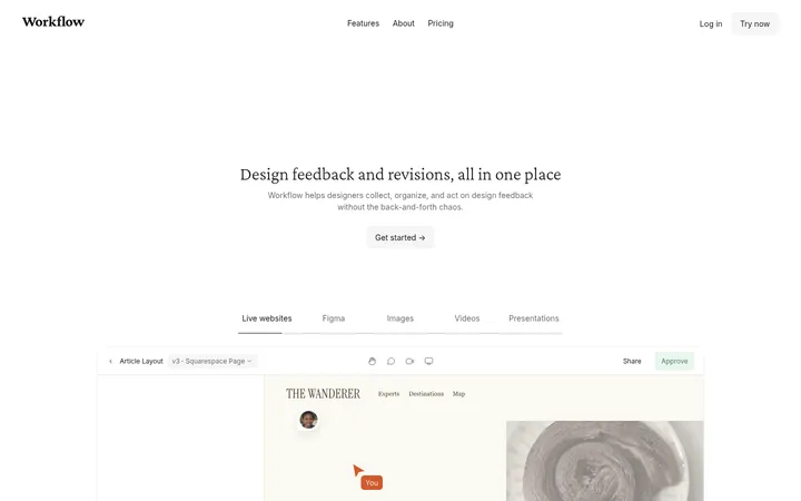
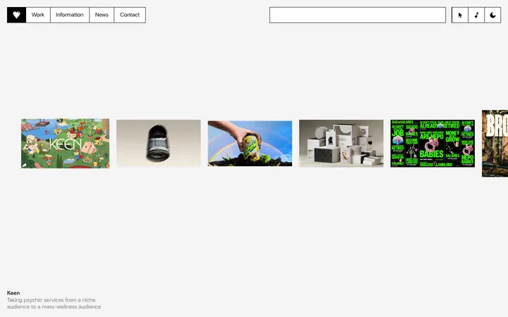
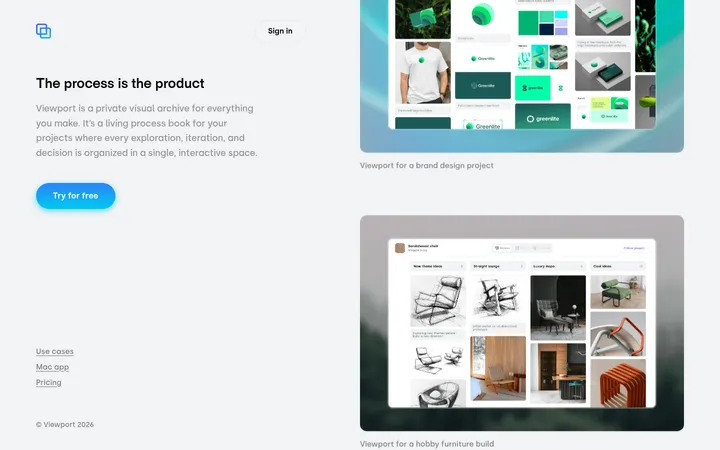
North star · Keep the interface quiet and let a spacious, edge-to-edge ribbon of rounded brand imagery command attention.
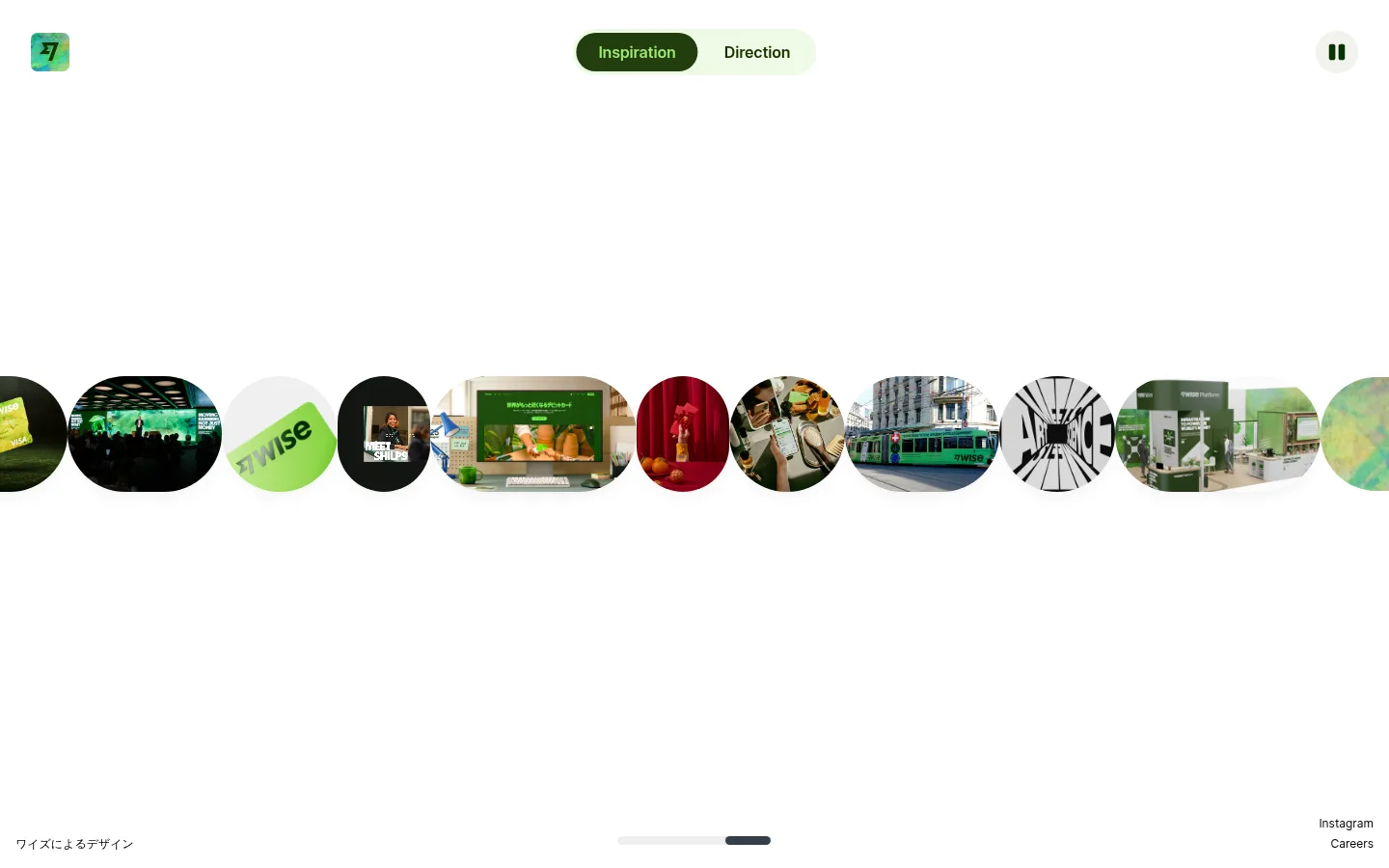
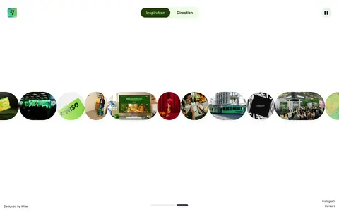
The first viewport is deliberately sparse: a white canvas surrounds a narrow horizontal filmstrip of circular and pill-shaped media. The measured black and green tones anchor the interface, while bright lime appears in the small brand mark, selected navigation, and imagery rather than as a broad background. Inter supplies the interface typography; the visible labels are compact and unobtrusive, leaving the gallery as the visual center. Navigation sits near the top edge, with a pause control opposite the small logo. A tiny Japanese credit and social links settle near the bottom, reinforcing the gallery-like composition. The media strip spans the viewport and mixes photographs, video stills, and brand artifacts, with varied crop and color but consistently rounded framing. Large expanses of untouched white space separate these elements, creating a calm, spacious rhythm. Build the page as a focused visual experience, not a conventional content-heavy landing page.
Measured body text; supports clear, compact interface labeling.
Aa 设计
Inter:Regular
网络字体 · 字重 400 · 占比 31%
免费替代:Inter
Small caption and footer-style text.
Aa 设计
Inter
网络字体 · 字重 400 · 占比 31%
免费替代:Inter
General interface text and navigation fallback.
角色
示例
字号
字重
行高
字距
正文
Compact interface labels and primary navigation text.
The quick brown fox 敏捷的狐狸
16px
600
1.5
-0.011em
辅助文字
Small supporting labels, credits, and social links.
The quick brown fox 敏捷的狐狸
12px
400
1.5
0
间距与布局
基准单位 2px · 密度:宽松
150px版块间距
3px元素间距
—卡片内边距
1376px内容最大宽度
3px
4px
5px
7px
16px
23px
32px
100px
150px
Use a wide, full-viewport composition with a 12-column measured grid and a spacious overall density. The content area can extend to the measured 1376px maximum width, but the gallery itself reads edge to edge. Keep navigation near the top, the media ribbon around the viewport's middle, and secondary credit and social links close to the bottom. Preserve broad unoccupied areas between these anchors; avoid stacking conventional content sections.
圆角与层次
按钮 · 9999px
卡片 · 9999px
链接 · 9999px
md · card, other
The page is predominantly flat, with no prominent borders or visible card shadows. Rounded media frames provide the main sense of shape and separation. Keep controls clearly distinct through their green fills and pill forms rather than adding heavy outlines or layered panels.
组件
下面的预览按实测的按钮、输入框、徽标、卡片样式重建(字体用替代字体)。
Brand mark
Small rounded-square identity mark near the upper-left corner; retain its colorful branded artwork without enlarging it into a hero.
Mode switch
Two adjacent pill options, Inspiration and Direction; Inspiration is the selected dark green option against a pale green backing.
Media ribbon
Viewport-spanning horizontal sequence of varied photographs and video stills, clipped into circular and elongated rounded frames.
Playback control
Small pause control positioned near the upper-right corner to signal motion in the gallery.
Bottom credits
Minimal design credit at the lower left and compact Instagram and Careers links at the lower right.
Progress indicator
Thin, understated horizontal track near the bottom center with a darker segment indicating gallery position.
Imagery · The central feature is a horizontal ribbon of photographic and video-based brand material: events, products, signage, people, and visual experiments. Images use varied crops inside circular or elongated rounded windows, creating an irregular but continuous sequence. Keep source imagery colorful and authentic; these greens and other hues belong to the media, not a uniform page background.
Use green selectively for active controls and brand details.
Preserve large areas of open space.
✕ 不该做
Do not fill the canvas with a green background.
Do not add dense explanatory copy above the gallery.
Do not impose a rigid rectangular card grid.
Do not make navigation visually dominant.
Do not treat colors inside photos as interface tokens.
Do not add heavy borders or dramatic shadows.
给 AI 的提示词
想快速出一个同风格的新页面,把这段话连同 DESIGN.md 一起发给 AI。
Build a new page in the Wise Design visual style as a quiet, full-viewport gallery experience. Use Gallery White (#ffffff) as the dominant canvas, Pure Ink (#000000) for compact interface labels, and reserve Fresh Lime (#9fe870), Forest Ink (#163300), and Moss Button (#223d0d) for brand details and selected controls. Set interface typography in Inter, keeping labels restrained and clear. Place a small brand mark and pill-style mode switch near the top, with a pause control opposite. Let a horizontal ribbon of authentic photographs or video stills span the page, clipped into varied circles and elongated rounded frames. Preserve generous open space around it, with a subtle progress marker and tiny credits or links near the bottom. Avoid dense copy, heavy borders, and ornamental shadows.