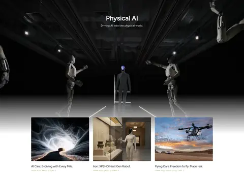
North star · Let cinematic automotive imagery create drama, while typography, color, and layout remain quiet and precisely controlled.
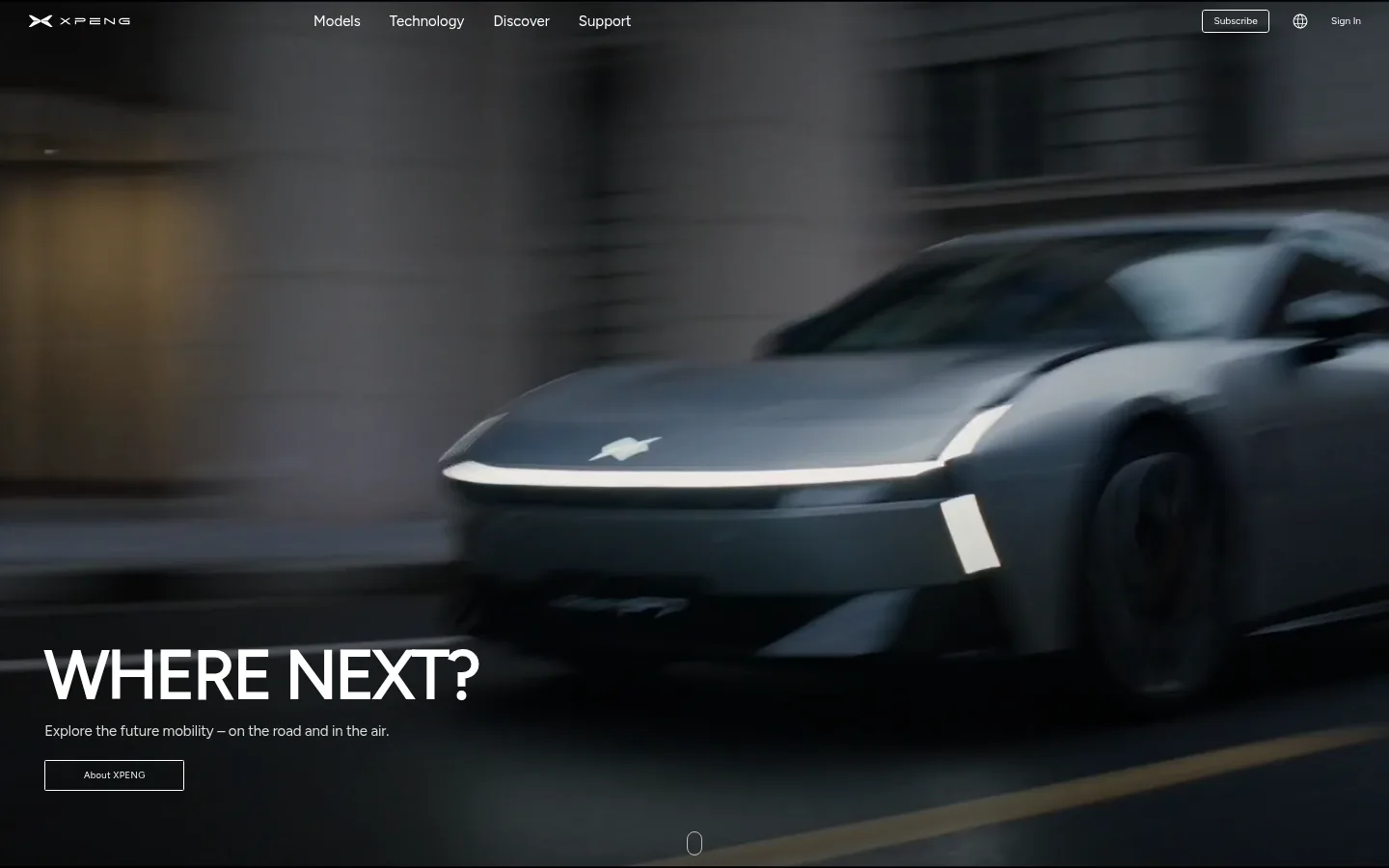
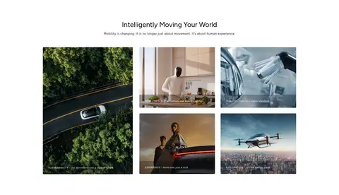
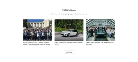
The visual system balances crisp white space with immersive, full-bleed vehicle footage. The hero places large white messaging over a dark moving image, while the model selector uses a soft warm-gray band to distinguish product browsing from the surrounding white sections. Black and muted charcoal establish the primary text and inverse surfaces; restrained green appears as a sustainability link accent rather than a dominant brand wash. Figtree carries the page’s headings, body copy, and links, with compact, widely tracked uppercase button labels. Layouts alternate between centered editorial introductions, horizontal feature cards, image mosaics, and a three-column news feed. The measured page width is 1043px, with generous section gaps and low visual density. Thin pale borders and nearly square corners keep controls and cards precise; imagery, rather than gradients or decoration, supplies most of the atmosphere.
Primary typeface for display, headings, body copy, captions, links, and eyebrows.
角色
示例
字号
字重
行高
字距
特大标题
Large hero headline over full-bleed video.
XPENG
69.5px
600
1.04
-0.03em
一级标题
Primary section headings and prominent page titles.
XPENG
39.5px
600
1.04
-0.03em
二级标题
Secondary editorial and feature-section headings.
XPENG
29px
400
1.2
0
三级标题
Feature card and supporting content headings.
The quick brown fox 敏捷的狐狸
23px
400
1.4
0
正文
Introductory copy, descriptions, and explanatory text.
The quick brown fox 敏捷的狐狸
15px
400
1.55
-0.01em
辅助文字
Compact image, card, and supporting labels.
The quick brown fox 敏捷的狐狸
11px
400
1.55
0
按钮
Small uppercase labels on compact controls.
The quick brown fox 敏捷的狐狸
9px
400
normal
0.14em
链接
Navigation and inline content links.
The quick brown fox 敏捷的狐狸
14px
400
0.78
0
眉题
Small tracked uppercase section or category labels.
The quick brown fox 敏捷的狐狸
8px
500
1.4
0.14em
间距与布局
基准单位 2px · 密度:宽松
108px版块间距
10px元素间距
—卡片内边距
1043px内容最大宽度
6px
7px
8px
9px
10px
12px
14px
16px
17px
19px
20px
23px
35px
46px
87px
108px
The measured content max width is 1043px, set within a spacious page that alternates full-bleed media with contained editorial content. The hero is left-aligned; the vehicle selector is centered in a warm-gray band. Feature cards flow horizontally, followed by a large media-led story area, centered brand storytelling, a three-column news feed, and a multi-column footer. Sections have generous vertical separation and low information density.
圆角与层次
按钮 · 1px
卡片 · 1px
图片 · 3px
hairline · button
lg · section
Keep the interface mostly flat. Pale hairline borders define card and button edges, and controls have nearly square corners. A subtle shadow may support an elevated section or control, but imagery and dark overlays—not layered panels—provide depth. Avoid conspicuous gradients and heavy card shadows.
组件
下面的预览按实测的按钮、输入框、徽标、卡片样式重建(字体用替代字体)。
Hero navigation
Compact navigation overlaid on the hero footage, with light logo and links plus small outlined utility actions.
Full-bleed hero
Viewport-filling video with large white left-aligned display text and a fine outlined CTA.
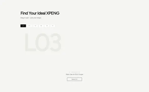
Model selector
Warm-gray product band with a centered title, compact model choices, and a prominent vehicle presentation.
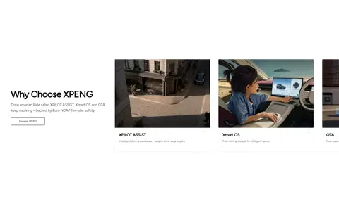
Feature cards
Horizontal image-led cards with pale 1px borders, restrained labels, and minimal framing.
Story mosaic
Editorial image grid pairing a larger sustainability tile with smaller technology and experience stories.
News feed
Three-column news cards with photographic thumbnails, compact summaries, and a restrained learn-more control.
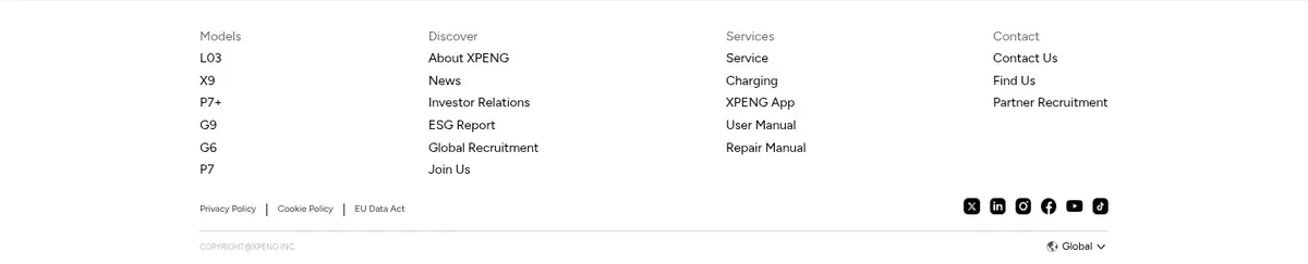
Footer links
Multi-column navigation on white, grouped by models, discovery, services, and contact.
Imagery · Use cinematic, photorealistic vehicle video and photography as the principal visual material. The opening footage fills the viewport, with dark overlays supporting white copy. Product and technology cards use wide image crops, while brand storytelling combines varied landscape and portrait-like tiles in an orderly mosaic. Some imagery depicts robotics and flying vehicles; these are page-specific story content, not a separate illustration style.
Keep primary content on white or warm-gray fields.
Reserve green for occasional sustainability accents.
Use Figtree for headings, copy, and links.
Keep borders pale, thin, and understated.
Give sections generous breathing room.
✕ 不该做
Do not use a saturated, colorful interface palette.
Do not turn every section into a raised card.
Do not crowd the spacious editorial layouts.
Do not apply green as a dominant background.
Do not add decorative gradients without a clear need.
Do not let UI compete with vehicle photography.
给 AI 的提示词
想快速出一个同风格的新页面,把这段话连同 DESIGN.md 一起发给 AI。
Build a new automotive brand page with XPENG’s restrained, cinematic visual language. Use Gallery White (#ffffff) for the main canvas and Warm Porcelain (#f5f5f2) for a distinct product-selection band. Keep Carbon Ink (#000000) typography crisp, Stone Gray (#63635c) secondary, and Leaf Signal (#6d9427) limited to occasional sustainability accents. Use Figtree throughout, with compact tracked uppercase button labels. Anchor the page in full-bleed, darkened vehicle photography, then alternate spacious editorial sections, image-led feature cards, a story mosaic, and a compact news grid. Constrain reading content to the measured 1043px maximum width where appropriate, while allowing hero media to span the viewport. Prefer pale hairlines and flat surfaces over heavy shadows. Keep controls nearly square, content airy, and interface decoration subordinate to imagery.