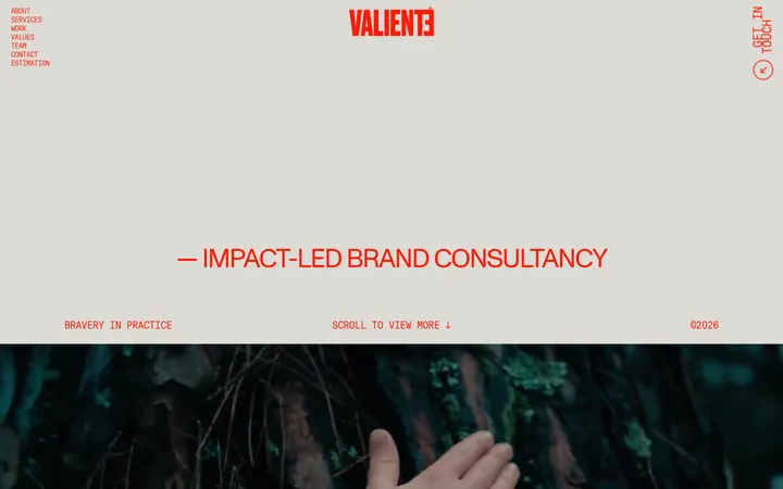
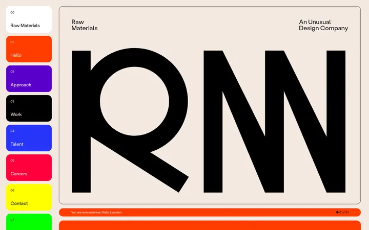
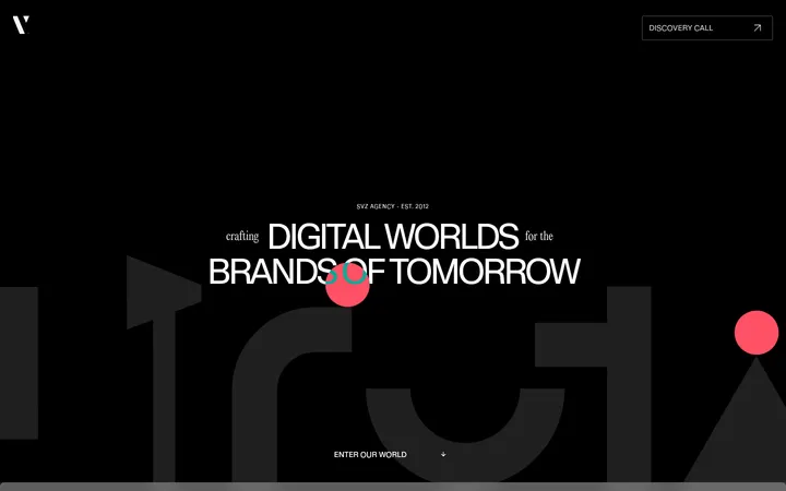
Zeus Jones以温暖克制的底色搭配醒目的编辑式大标题,并用精炼的客户作品展示鲜明的创意表达。页面从品牌主张依次展开至精选项目、服务介绍、订阅内容、客户名单和简洁的联系页脚。
North star · Keep the page quiet and typographic so vivid project imagery, not decorative UI, carries the contrast.
The page is anchored by Gallery Cream (#fcfaf3), a warm near-white canvas that occupies most of the experience and gives the work a calm editorial frame. Ink (#1a1c2c) supplies the logo, navigation, headings, body copy, links, hairlines, and dark pill CTAs; Pale Stone (#ebe9e4) is reserved for the newsletter card rather than used as a broad section band. Large, expressive headlines combine a light serif with a clean sans, including selectively underlined words and italic serif emphasis. A small logo and menu sit at the top, while the hero statement is left aligned with substantial surrounding whitespace. The portfolio uses a compact multi-column rhythm and colorful, rounded project imagery as contrast against the restrained shell. Service and client-list sections return to typography-led layouts, and the footer stays sparse and functional. Rounded media and pill buttons soften the otherwise flat, high-contrast composition.
配色
点色块复制色值。用途说明来自对页面的实测位置(背景、文字、描边、按钮)与截图判读。
品牌色
表层色
中性色
页面底色 · Gallery Cream表层 · Studio Ink表层 2 · Pale Stone主文字 · Studio Ink描边 · Studio Ink
Primary sans for display, navigation, headings, body, links, labels, and buttons.
Aa 设计
FeatureDeckLight
网络字体 · 字重 100 · 占比 9%
免费替代:Cormorant Garamond
Light serif voice in the hero and editorial display headings.
角色
示例
字号
字重
行高
字距
特大标题
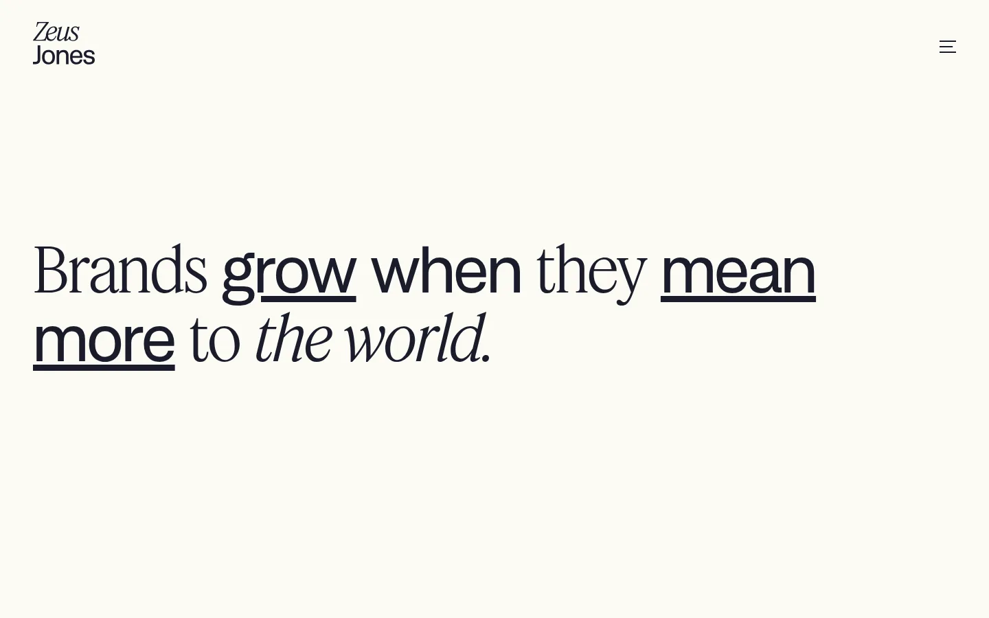
Oversized hero statement, combining expressive serif and sans emphasis.
Zeus Jones
90px
400
1.11
-0.02em
一级标题
Light serif editorial headline treatment.
Zeus Jones
60px
100
1.07
0
二级标题
Large section or service heading in the primary sans.
Zeus Jones
48px
400
1.6
0
三级标题
Project and content feature headings.
Zeus Jones
40px
400
1.2
0
四级标题
Compact card or subsection heading.
The quick brown fox 敏捷的狐狸
24px
400
1.25
0
正文
Project descriptions, service copy, and supporting paragraphs.
The quick brown fox 敏捷的狐狸
18px
400
1.6
0
辅助文字
Small uppercase project labels and metadata.
The quick brown fox 敏捷的狐狸
12px
500
1
0.05em
按钮
Pill CTA and newsletter sign-up labels.
The quick brown fox 敏捷的狐狸
16px
400
1
0
导航
Large menu links when the navigation is opened.
Zeus Jones
48px
400
1.6
0
链接
Inline project, editorial, and utility links.
The quick brown fox 敏捷的狐狸
18px
400
1.6
0
眉题
Small uppercase labels introducing content sections.
The quick brown fox 敏捷的狐狸
12px
500
1
0.05em
间距与布局
基准单位 8px · 密度:宽松
120px版块间距
—元素间距
—卡片内边距
1424px内容最大宽度
2px
7px
8px
10px
12px
15px
16px
20px
24px
32px
40px
64px
120px
Use a wide, spacious canvas with a measured page max width of 1424px and left-aligned content. The opening hero gives the statement generous breathing room before a thin divider introduces the project gallery. The work section uses a responsive multi-column grid; later service and client-list blocks return to simpler editorial layouts. Keep the section rhythm spacious, with a measured section gap of 120px, and avoid filling every area with cards or controls.
圆角与层次
按钮 · 9999px
卡片 · 20px
图片 · 20px
没有测到阴影:页面是扁平的,层次靠底色和描边区分。
The interface is predominantly flat, with no measured shadows. Separate major content through whitespace and occasional thin Ink rules rather than stacked surfaces. Use the Pale Stone card surface for the newsletter feature and soft rounded corners on cards and media; reserve pill-shaped rounding for buttons.
组件
下面的预览按实测的按钮、输入框、徽标、卡片样式重建(字体用替代字体)。
Header
Compact brand mark at the upper left and a simple menu control at the upper right, both in Studio Ink on Gallery Cream.
Hero statement
Large, left-aligned editorial headline with mixed sans and light serif voices, selective italics, and underlined emphasis.
Project gallery
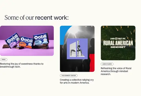
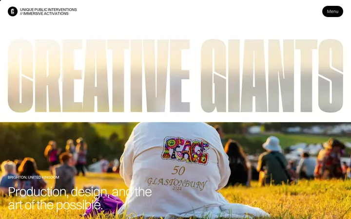
Recent work presented as a multi-column set of linked image cards with rounded media, small uppercase client labels, and concise descriptions.
Service carousel
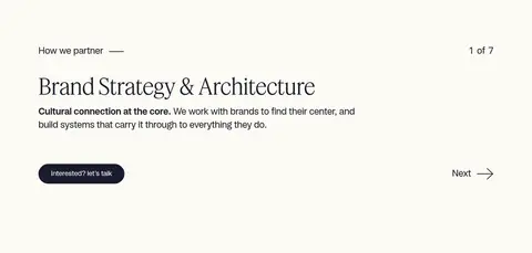
One service at a time, with a numbered progress cue, heading, short explanation, dark pill contact CTA, and next control.
Newsletter feature
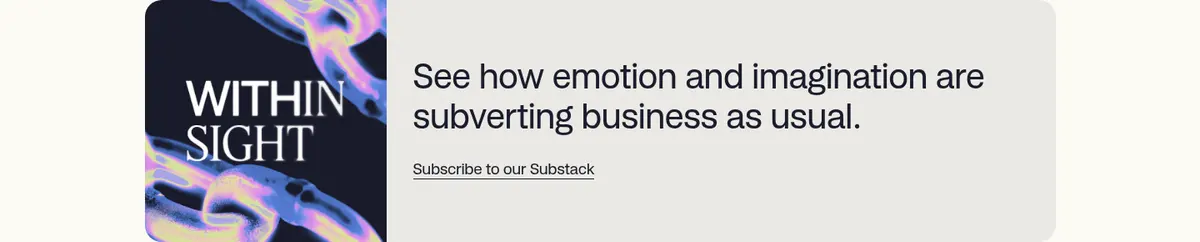
Rounded Pale Stone card pairing a cover visual with a headline, short copy, and a simple subscription link.
Client list
A typography-led roster of client names introduced by a small eyebrow and short rule.
Footer signup
Sparse two-column contact and newsletter details with a minimal email field, dark Sign up pill, and certification note.
Imagery · Use client work as the page’s main source of visual variation: colorful packaging, campaign imagery, and brand-led photography sit in rounded media frames against the restrained canvas. The newsletter feature pairs a graphic cover image with copy in a light card. Favor vivid, art-directed crops with simple framing; the color variety inside the work is illustrative content, not an expanded interface palette.
Use Gallery Cream (#fcfaf3) as the dominant page canvas.
Set core text, links, and rules in Studio Ink (#1a1c2c).
Pair the clean sans with a light editorial serif for display contrast.
Let whitespace create section separation instead of decorative panels.
Use rounded frames for portfolio media and the newsletter feature.
Keep CTAs simple, high-contrast pills with concise labels.
✕ 不该做
Do not introduce unmeasured brand colors into interface surfaces.
Do not make every section a card or add unnecessary shadows.
Do not center all content; preserve the left-aligned editorial flow.
Do not let project imagery dictate the site-wide interface palette.
Do not replace the mixed-type hero with a uniform heavy sans.
Do not crowd the header or add dense navigation to the resting view.
给 AI 的提示词
想快速出一个同风格的新页面,把这段话连同 DESIGN.md 一起发给 AI。
Build a new page in the Zeus Jones visual style: a spacious, editorial agency canvas using Gallery Cream (#fcfaf3) as the dominant background and Studio Ink (#1a1c2c) for text, links, rules, and primary CTA fills. Use Pale Stone (#ebe9e4) only for a quiet feature surface. Pair a clean sans similar to Inter with a light editorial serif similar to Cormorant Garamond; make the main statement large, left aligned, and selectively emphasize words with serif italics or underlining. Keep the header minimal, sections clearly separated by generous whitespace, and project imagery vivid but contained in rounded media frames. Favor typography-led service and client sections, subtle hairlines, and flat surfaces without shadows. Use simple pill buttons and keep controls secondary to the content.