zkPass 以暗色编辑风格展示隐私保护验证协议,重点呈现证明、信任与开发者工具。大幅衬线标题、细密网格线和醒目的荧绿强调色,让技术严谨感拥有鲜明视觉辨识度。
North star · Keep the canvas nearly black and spacious, using lime sparingly to signal the most important proof, action, or active state.
The page is built on a near-black canvas, with a subtle dotted grid and occasional faint radial or scanline effects adding texture without competing with content. Vivid lime is reserved for the launch CTA, emphasized words, active states, and selected proof details; restrained gray and white carry navigation, copy, and technical labels. Large editorial serif headlines provide contrast against compact sans-serif UI text and monospaced protocol-like details. Content spans a spacious, centered frame and alternates between split introductions, dense product demonstrations, and broad tabular feature sections. Fine dark borders divide panels instead of shadows or rounded containers. A typographic world map and large green protocol mark supply graphic drama, while most product examples are treated as interface evidence. Generous vertical breathing room lets the page feel cinematic despite its information-rich grids.
配色 点色块复制色值。用途说明来自对页面的实测位置(背景、文字、描边、按钮)与截图判读。
品牌色
Protocol Black
#000000
Dominant page canvas, hero backdrop, and recurring section background.
Proof White
#ffffff
Primary headline, navigation, and high-contrast text on dark surfaces.
强调色
Proof Lime
#c5ff4a
Primary CTA fill, highlighted headline words, active rows, badges, and proof-status emphasis.
Olive Signal
#5c7624
Muted olive badge outlines and restrained supporting details near green proof accents.
表层色
Night Moss
#070905
Near-black gradient tone for subtle section atmosphere, not a dominant flat surface.
Obsidian Panel
#060606
Slightly lifted dark card surface for proof examples and product panels.
Moss Panel
#0c0f04
Green-tinted dark surface for proof status and selected cards.
中性色
Slate Muted
#6e7173
Low-emphasis supporting text and subdued interface annotations.
Cool Haze
#b4b8bd
Secondary descriptive copy against the black canvas.
Pale Alloy
#edf0f2
Bright supporting text and selected explanatory copy.
Graphite Rule
#252525
Primary hairlines and separators across navigation, panels, cards, and section boundaries.
Carbon Edge
#1f1f1f
Subtle secondary outlines and dark structural details.
Iron Border
#313131
Card edges and button or badge outlines where stronger separation is needed.
Soft Silver
#c5c5c5
Occasional subdued heading or text detail.
Footer Gray
#7a7a7a
Low-priority footer text and subdued supporting labels.
文字 背景 对比度 WCAG #ffffff Proof White#000000 Protocol Black21:1 AAA #ffffff Proof White#060606 Obsidian Panel20.26:1 AAA #ffffff Proof White#0c0f04 Moss Panel19.34:1 AAA #6e7173 Slate Muted#000000 Protocol Black4.27:1 AA-large #6e7173 Slate Muted#060606 Obsidian Panel4.12:1 AA-large #6e7173 Slate Muted#0c0f04 Moss Panel3.94:1 AA-large
字体 字号阶梯:Major Third(比例约 1.25,正文 13px)。示例用免费替代字体渲染,数值为实测。
Aa 设计
JetBrains Mono 系统字体 · 字重 500 / 400 / 600 · 占比 89%
免费替代:IBM Plex Mono
Protocol labels, compact technical data, and code-like UI details.
Aa 设计
Inter Tight 网络字体 · 字重 400 / 500 / 600 · 占比 9%
免费替代:Inter
Navigation, body copy, captions, buttons, and interface labels.
Aa 设计
PT Serif 网络字体 · 字重 400 / 300 · 占比 1%
免费替代:Lora
Editorial headlines and selected card or product titles.
角色 示例 字号 字重 行高 字距 正文 Compact explanatory copy beside headlines and within product and feature panels.
The quick brown fox 敏捷的狐狸
13px 400 1.55 0.03em 辅助文字 Small uppercase labels, indices, and contextual metadata.
The quick brown fox 敏捷的狐狸
11px 400 1.55 0.18em 眉题 Tracked uppercase section markers above major headings.
The quick brown fox 敏捷的狐狸
11px 400 1.55 0.18em 代码 Tiny monospaced technical snippets and proof-interface details.
const style = 1;
7px 500 0.92 0
间距与布局 基准单位 2px · 密度:宽松
132px 版块间距
10px 元素间距
— 卡片内边距
1408px 内容最大宽度
2px
4px
6px
7px
8px
10px
12px
14px
16px
18px
20px
22px
24px
28px
30px
32px
The measured page frame reaches a maximum width of 1408px, with content aligned to a consistent wide grid. The navigation is a full-width row divided into bordered cells. Long vertical gaps separate major sections, while individual sections switch between two-column editorial layouts, multi-column product panels, and dense table-like demonstrations. Headings align to the start of their content blocks; the closing CTA centers its headline above two side-by-side links. The overall density is spacious, with information compressed into framed product examples rather than scattered cards.
圆角与层次
sm · other
lg · other
lg · other
sm · other
The design is predominantly flat: thin graphite and iron borders define the hierarchy instead of rounded cards or broad drop shadows. Panels sit close to the black canvas, with occasional subtly green-tinted surfaces. Lime glows appear only as small decorative or status effects; they should not become a general elevation treatment.
组件 下面的预览按实测的按钮、输入框、徽标、卡片样式重建(字体用替代字体)。
Segmented navigation Full-width, uppercase Inter Tight navigation in individually divided cells with fine dark borders; the Launch cell is filled Proof Lime.
Primary action button Square-cornered Proof Lime button with black uppercase label, compact sans-serif type, and minimal visual ornament.
Editorial headline Large white PT Serif headline, often split across lines; italic lime words act as focused emphasis.
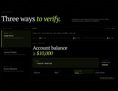
Proof demonstration panel Dark rectangular interface card with thin Iron Border outlines, small technical labels, and clear query-to-proof status.
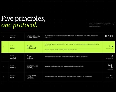
Numbered principles table Wide, finely ruled rows organize indexed protocol principles, explanatory copy, and right-aligned technical outcomes; active row turns lime.
Section eyebrow Small tracked uppercase Inter Tight marker in muted text above an editorial section title.
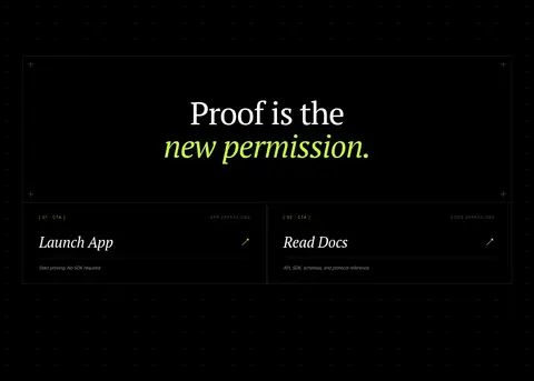
CTA link card Bordered, side-by-side destination panels with an indexed uppercase label, serif title, short helper line, and arrow cue.
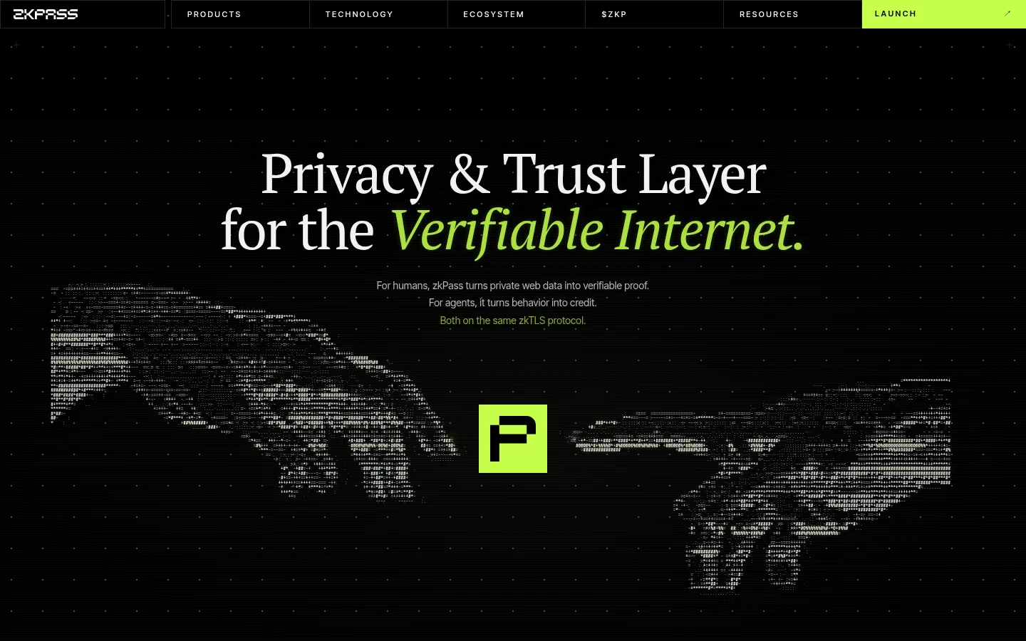
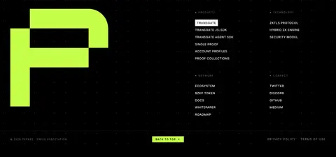
Imagery · Avoid conventional lifestyle photography. The hero uses a typographic, data-like map graphic with a centered lime protocol mark over a black field; subtle dots and scanline texture support its digital character. Small interface illustrations and product mockups show claims, status, code, and verification results. A large abstract logo mark anchors the footer. Keep graphics monochrome or near-black, reserving bright lime for meaningful proof details.
页面版块 共 10 个版块,按页面从上到下排列,每个都标了类型、布局和交互套路。
该做与不该做 ✓ 该做 Use Protocol Black as the dominant canvas. Reserve Proof Lime for actions and meaningful emphasis. Pair editorial serif headlines with compact sans-serif UI. Use thin borders to structure panels and tables. Keep labels uppercase, tracked, and concise. Leave generous vertical space between major sections. ✕ 不该做 Do not introduce unmeasured colors. Do not use rounded, soft consumer-style cards. Do not fill the page with lime accents. Do not add stock photography or decorative lifestyle imagery. Do not rely on heavy shadows for hierarchy. Do not make technical panels visually louder than the main headlines. 给 AI 的提示词 想快速出一个同风格的新页面,把这段话连同 DESIGN.md 一起发给 AI。
复制 Build a new zkPass page as a dark, editorial protocol interface. Use Protocol Black (#000000) for the canvas and Proof Lime (#c5ff4a) sparingly for primary actions, active states, and italic headline emphasis. Set large editorial headings in PT Serif, interface copy and uppercase labels in Inter Tight, and compact technical details in JetBrains Mono. Structure content within a wide grid using split layouts, dense proof demonstrations, and ruled feature rows. Use Graphite Rule (#252525) and Iron Border (#313131) for square-cornered panel divisions; keep surfaces subtly differentiated with Obsidian Panel (#060606) or Moss Panel (#0c0f04). Add restrained dotted-grid or scanline texture, not decorative gradients that dominate. Prioritize generous section spacing, concise technical labels, and clear query-to-proof hierarchy.
DESIGN.md Tailwind v4 CSS 变量 Design Tokens
---
title: "zkPass design system"
variant: extended
source: https://zkpass.org/
captured_at: 2026-10-12
theme: dark
industry: crypto
generator: Design DNA (https://four.wiralomi.com/style/zkpass-org)
ai_generated: true
ai_label: "本文件由 AI 辅助生成:数值取自公开网页的实测样式,命名、用途说明与建议为模型解读。商标归原所有者。 / AI-assisted content"
---
# zkPass · Design System
> A dark technical canvas punctuated by vivid proof-green.
**Theme:** dark · **Industry:** crypto · **Source:** https://zkpass.org/ · **Captured:** 2026-10-12 (1440×900 desktop)
_AI-assisted content: values are measured from the public page at capture time; names, roles and guidance are model-written interpretations. Trademarks belong to their owners._
zkPass presents its privacy-preserving verification protocol through a dark, editorial homepage built around proof, trust, and developer tools. Oversized serif headlines, fine grid lines, and sharp lime accents balance cryptographic rigor with a distinctive visual identity.
## North star
Keep the canvas nearly black and spacious, using lime sparingly to signal the most important proof, action, or active state.
## Overview
The page is built on a near-black canvas, with a subtle dotted grid and occasional faint radial or scanline effects adding texture without competing with content. Vivid lime is reserved for the launch CTA, emphasized words, active states, and selected proof details; restrained gray and white carry navigation, copy, and technical labels. Large editorial serif headlines provide contrast against compact sans-serif UI text and monospaced protocol-like details. Content spans a spacious, centered frame and alternates between split introductions, dense product demonstrations, and broad tabular feature sections. Fine dark borders divide panels instead of shadows or rounded containers. A typographic world map and large green protocol mark supply graphic drama, while most product examples are treated as interface evidence. Generous vertical breathing room lets the page feel cinematic despite its information-rich grids.
## Colors
| Name | Hex | Token | Group | Role |
|---|---|---|---|---|
| Protocol Black | ` | `--color-protocol-black` | brand | Dominant page canvas, hero backdrop, and recurring section background. |
| Proof Lime | ` | `--color-proof-lime` | accent | Primary CTA fill, highlighted headline words, active rows, badges, and proof-status emphasis. |
| Olive Signal | ` | `--color-olive-signal` | accent | Muted olive badge outlines and restrained supporting details near green proof accents. |
| Night Moss | ` | `--color-night-moss` | surface | Near-black gradient tone for subtle section atmosphere, not a dominant flat surface. |
| Slate Muted | ` | `--color-slate-muted` | neutral | Low-emphasis supporting text and subdued interface annotations. |
| Cool Haze | ` | `--color-cool-haze` | neutral | Secondary descriptive copy against the black canvas. |
| Pale Alloy | ` | `--color-pale-alloy` | neutral | Bright supporting text and selected explanatory copy. |
| Graphite Rule | ` | `--color-graphite-rule` | neutral | Primary hairlines and separators across navigation, panels, cards, and section boundaries. |
| Proof White | ` | `--color-proof-white` | brand | Primary headline, navigation, and high-contrast text on dark surfaces. |
| Carbon Edge | ` | `--color-carbon-edge` | neutral | Subtle secondary outlines and dark structural details. |
| Iron Border | ` | `--color-iron-border` | neutral | Card edges and button or badge outlines where stronger separation is needed. |
| Obsidian Panel | ` | `--color-obsidian-panel` | surface | Slightly lifted dark card surface for proof examples and product panels. |
| Soft Silver | ` | `--color-soft-silver` | neutral | Occasional subdued heading or text detail. |
| Moss Panel | ` | `--color-moss-panel` | surface | Green-tinted dark surface for proof status and selected cards. |
| Footer Gray | ` | `--color-footer-gray` | neutral | Low-priority footer text and subdued supporting labels. |
### Semantic aliases
`--color-canvas` → ` (Protocol Black) · `--color-surface` → ` (Obsidian Panel) · `--color-surface-2` → ` (Moss Panel) · `--color-text` → ` (Proof White) · `--color-text-muted` → ` (Slate Muted) · `--color-text-subtle` → ` (Cool Haze) · `--color-border` → ` (Graphite Rule) · `--color-accent` → ` (Proof Lime) · `--color-on-accent` → ` (Protocol Black)
### Contrast (WCAG 2.x)
| Text | Background | Ratio | Level |
|---|---|---|---|
| ` | ` | 21:1 | AAA |
| ` | ` | 20.26:1 | AAA |
| ` | ` | 19.34:1 | AAA |
| ` | ` | 4.27:1 | AA-large |
| ` | ` | 4.12:1 | AA-large |
| ` | ` | 3.94:1 | AA-large |
| ` | ` | 10.53:1 | AAA |
| ` | ` | 10.16:1 | AAA |
| ` | ` | 9.7:1 | AAA |
| ` | ` | 17.78:1 | AAA |
### Gradients
- `radial-gradient(70% 50%, rgba(40, 48, 30, 0.18), rgba(0, 0, 0, 0) 72%)`
- `repeating-linear-gradient(rgba(255, 255, 255, 0.024) 0px, rgba(255, 255, 255, 0.024) 1px, rgba(0, 0, 0, 0) 1px, rgba(0, 0, 0, 0) 3px)`
- `radial-gradient(80% 60%, rgba(0, 0, 0, 0) 0%, rgba(0, 0, 0, 0) 70%)`
- `radial-gradient(80% 60%, rgba(197, 255, 74, 0.02) 0%, rgba(0, 0, 0, 0) 70%)`
## Typography
| Family | Token | Source | Weights | Role | Free substitute |
|---|---|---|---|---|---|
| JetBrains Mono | `--font-mono` | system | 500, 400, 600 | Protocol labels, compact technical data, and code-like UI details. | IBM Plex Mono |
| Inter Tight | `--font-body` | webfont | 400, 500, 600 | Navigation, body copy, captions, buttons, and interface labels. | Inter |
| PT Serif | `--font-pt-serif` | webfont | 400, 300 | Editorial headlines and selected card or product titles. | Lora |
- **JetBrains Mono:** Most prevalent measured family; use compact, crisp monospaced details with restrained weight.
- **Inter Tight:** Tight sans-serif UI; captions and eyebrows are uppercase with widely tracked letters.
- **PT Serif:** Use expressive serif contrast in large headlines; occasional italic emphasis highlights key words.
### Type scale — Major Third (ratio ≈ 1.25, base 13px)
| Role | Size | Weight | Line height | Letter spacing | Case | Family | Used for |
|---|---|---|---|---|---|---|---|
| body | 13px | 400 | 1.55 | 0.03em | — | Inter Tight | Compact explanatory copy beside headlines and within product and feature panels. |
| caption | 11px | 400 | 1.55 | 0.18em | uppercase | Inter Tight | Small uppercase labels, indices, and contextual metadata. |
| eyebrow | 11px | 400 | 1.55 | 0.18em | uppercase | Inter Tight | Tracked uppercase section markers above major headings. |
| code | 7px | 500 | 0.92 | 0 | — | JetBrains Mono | Tiny monospaced technical snippets and proof-interface details. |
## Spacing & layout
- Base unit **2px**, density **spacious**.
- Scale (most used values): 2, 4, 6, 7, 8, 10, 12, 14, 16, 18, 20, 22, 24, 28, 30, 32 px.
- Section rhythm 132px · element gap 10px · card padding — · max content width 1408px.
The measured page frame reaches a maximum width of 1408px, with content aligned to a consistent wide grid. The navigation is a full-width row divided into bordered cells. Long vertical gaps separate major sections, while individual sections switch between two-column editorial layouts, multi-column product panels, and dense table-like demonstrations. Headings align to the start of their content blocks; the closing CTA centers its headline above two side-by-side links. The overall density is spacious, with information compressed into framed product examples rather than scattered cards.
## Shape & elevation
- Shadow `sm` (other): `rgba(197, 255, 74, 0.45) 0px 0px 8px 0px`
- Shadow `lg` (other): `rgba(197, 255, 74, 0.65) 0px 0px 10px 2px, rgba(197, 255, 74, 0.2) 0px 0px 22px 6px`
- Shadow `lg-2` (other): `rgba(255, 255, 255, 0.6) 0px 0px 10px 2px, rgba(255, 255, 255, 0.18) 0px 0px 22px 6px`
- Shadow `sm-2` (other): `rgba(197, 255, 74, 0.7) 0px 0px 8px 0px`
- Shadow `md` (other): `rgba(197, 255, 74, 0.537) 0px 0px 8.26267px 0px`
- Motion: standard transition `0.22s ease` on interactive elements.
The design is predominantly flat: thin graphite and iron borders define the hierarchy instead of rounded cards or broad drop shadows. Panels sit close to the black canvas, with occasional subtly green-tinted surfaces. Lime glows appear only as small decorative or status effects; they should not become a general elevation treatment.
## Imagery
Avoid conventional lifestyle photography. The hero uses a typographic, data-like map graphic with a centered lime protocol mark over a black field; subtle dots and scanline texture support its digital character. Small interface illustrations and product mockups show claims, status, code, and verification results. A large abstract logo mark anchors the footer. Keep graphics monochrome or near-black, reserving bright lime for meaningful proof details.
## Components
### Segmented navigation
Full-width, uppercase Inter Tight navigation in individually divided cells with fine dark borders; the Launch cell is filled Proof Lime.
### Primary action button
Square-cornered Proof Lime button with black uppercase label, compact sans-serif type, and minimal visual ornament.
### Editorial headline
Large white PT Serif headline, often split across lines; italic lime words act as focused emphasis.
### Proof demonstration panel
Dark rectangular interface card with thin Iron Border outlines, small technical labels, and clear query-to-proof status.
### Numbered principles table
Wide, finely ruled rows organize indexed protocol principles, explanatory copy, and right-aligned technical outcomes; active row turns lime.
### Section eyebrow
Small tracked uppercase Inter Tight marker in muted text above an editorial section title.
### CTA link card
Bordered, side-by-side destination panels with an indexed uppercase label, serif title, short helper line, and arrow cue.
### Measured component styles
- **Primary button** (“LAUNCH ↗”): background ## Do
- Use Protocol Black as the dominant canvas.
- Reserve Proof Lime for actions and meaningful emphasis.
- Pair editorial serif headlines with compact sans-serif UI.
- Use thin borders to structure panels and tables.
- Keep labels uppercase, tracked, and concise.
- Leave generous vertical space between major sections.
## Don't
- Do not introduce unmeasured colors.
- Do not use rounded, soft consumer-style cards.
- Do not fill the page with lime accents.
- Do not add stock photography or decorative lifestyle imagery.
- Do not rely on heavy shadows for hierarchy.
- Do not make technical panels visually louder than the main headlines.
## Agent prompt
Build a new zkPass page as a dark, editorial protocol interface. Use Protocol Black (## Page sections (top to bottom)
| # | Type | Layout | UX patterns | UI patterns |
|---|---|---|---|---|
| 1 | hero | Full-screen-feeling centered headline over a dark graphic field; segmented navigation runs across the top. | Launch shortcut, Scroll-led discovery | Bordered segmented nav, Serif hero headline, Lime emphasis, Data-map graphic |
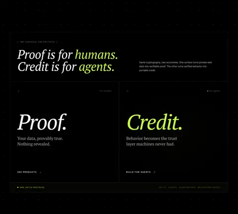
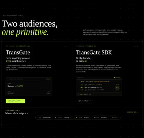
| 2 | feature-split | Two-column comparison beneath an introductory split headline and description. | Choose human or agent path, Product discovery links | Divided proof and credit panels, Italic serif headings, Fine borders, Small protocol footer |
| 3 | product-showcase | Section heading and copy above a multi-column product index with a large verification interface. | Select product demo, Inspect generated proof | Product selector, Proof status panel, Technical metadata, Framed interface |
| 4 | feature-grid | Introductory split heading followed by two product panels and a full-width schema strip. | Choose browser extension or SDK, Browse schema marketplace | Two audience cards, Code-like interface snippets, Lime install action, Schema chips |
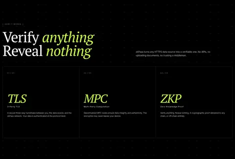
| 5 | how-it-works | Split section introduction followed by three equal, bordered explanation columns. | Scan the three protocol stages | Large italic stage names, Numbered labels, Thin column dividers |
| 6 | comparison | Editorial heading above a full-width table of five numbered principles. | Compare principles row by row, Highlight key performance result | Numbered table rows, Fine dividers, Lime active row, Right-aligned metrics |
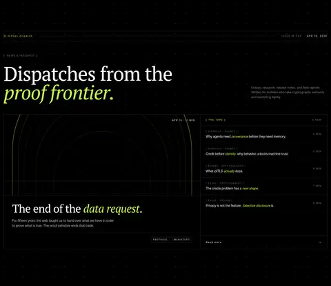
| 7 | content-feed | Editorial heading and intro above a two-column dispatch panel with featured story and list. | Read featured article, Scan dispatch list | Issue metadata, Article list, Framed feature artwork, Small category labels |
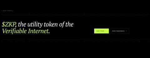
| 8 | cta | Single horizontal band with a large left-aligned serif statement and actions on the right. | View token, Read tokenomics | Thin horizontal rules, Lime primary button, Outlined secondary action |
| 9 | cta | Centered headline above two equal destination cards within a bordered block. | Launch app, Open documentation | Centered serif headline, Two CTA link panels, Arrow cues, Fine borders |
| 10 | footer | Large logo mark on the left; grouped navigation columns on the right; thin legal bar below. | Navigate product and protocol links, Back to top | Oversized lime logo, Grouped link lists, Compact legal footer |
## Source CSS custom properties (selected)
```css
--bg: #000;
--bg-invert: